X and Y position correlations with PCs in the Eevee dataset

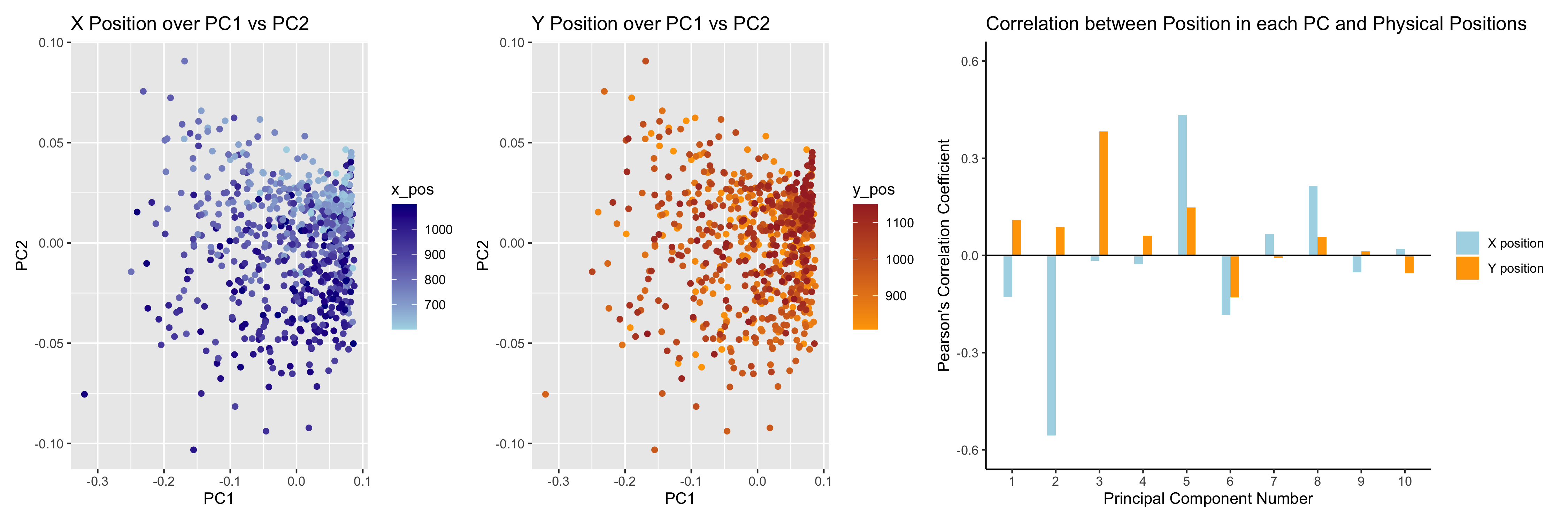
I believe that my data visualization is effective because the 3 panels connect by both visualizing the positional information of the data in gene expression space and quantifying the correlations, and it uses the Gestalt principles of similarity and proximity and knowledge about perceptiveness of visual encodings to increase its saliency. In the left two panels of my data visualization, I visualized 3 types of quantitative data (PC1 value, PC2 value, and either X position or Y position) by using the geometric primitive of a point. I encoded the PC1 value using the position along the x axis, PC2 value using the position along the y axis, and the X or Y position value using color hue. In the right-most panel, I used the geometric primitive of a line to visualize the quantitative data of the Pearson’s coefficient values, categorical data of the X and Y position groups, and ordinal data of the PC numbers. The Pearson’s coefficient values were encoded using the position along the y axis of the end of the lines, X or Y position category was encoded using color hue, and PC number was encoded using position along the x axis. In this 3-panel figure, I wanted to make salient the different correlations between PC values and X or Y positions across PC numbers to demonstrate. I also wanted to make salient the fact that the magnitude of the correlation coefficients is larger for the X position than the Y position for 7/10 of the top 10 PCs, which likely indicates that gene expression tends to correlate with X position more than Y position, but neither position is the dominant source of variation in gene expression since neither X or Y position have a high magnitude of correlation with PC1. To increase the saliency of these points in my data visualization, I used the Gestalt principles of similarity in hue throughout the 3 figures (with blue always marking X position and orange always marking Y position) and proximity in the right-most panel, where I kept the two bars (one for X position and one for Y position) for each PC number closer to each other than those of the other PC number to indicate that they belonged to the same ordinal category. Finally, I chose my encodings using knowledge about the perceptiveness of visual encodings. In the left two panels, I used position to encode two of the quantitative data types since position is the most easily perceived encoding for quantitative data, and I used hue to distinguish the third quantitative data type because I did not need to be able to identify specific values for the X or Y positions but wanted to be able to see the gradient over the PC1 vs PC2 space, which would have been difficult with dots of different size or saturation obscuring each other. In the right-most panel, I chose position along the y axis to encode the quantitative data of the correlation coefficients for the same reasons as in the left graphs, and I selected position along the x axis to encode the ordinal data of PC number since position is also the best for perception of ordered data. Finally, I used hue to distinguish the categories of X position or Y position for correlation with the PC location values since hue is the second best encoding for categorical data and 2D both positions had been used for other data types.
Attribution: When writing my code for the right-most graph, I consulted ChatGPT-4 for how to create a column chart with the X position and Y position columns next to each other for each PC and how to create different spacing between these paired values and the other pairs (line 45 of my code).
1
2
3
4
5
6
7
8
9
10
11
12
13
14
15
16
17
18
19
20
21
22
23
24
25
26
27
28
29
30
31
32
33
34
35
36
37
38
39
40
41
file <- '/Users/alexgorham/Desktop/genomic-data-visualization-2025/data/eevee.csv.gz'
data <- read.csv(file)

pos <- data[,3:4]
rownames(pos) <-data$barcode
gexp <- data[,5:ncol(data)]
rownames(gexp) <- data$barcode

topgenes <- names(sort(colSums(gexp),decreasing = TRUE)[1:1000])
gexpsub <- gexp[,topgenes]

norm <- gexpsub/rowSums(gexpsub)

pcs <- prcomp(norm)

df <- data.frame(pcs$x[,1:4], x_pos = pos$aligned_x, y_pos = pos$aligned_y)
g1 <- ggplot(df, aes(x = PC1, y = PC2, colour = x_pos)) + geom_point() +
  scale_color_gradient(low = 'lightblue', high = 'darkblue') +
  labs(title = "X Position over PC1 vs PC2")
g2 <- ggplot(df, aes(x = PC1, y = PC2, colour = y_pos)) + geom_point() +
  scale_color_gradient(low = 'orange', high = 'brown') +
  labs(title = "Y Position over PC1 vs PC2")

x_cors = data.frame(PC = 1:10, cor = cor(pcs$x[,1:10], df$x_pos), label = "X position")
y_cors = data.frame(PC = 1:10, cor = cor(pcs$x[,1:10], df$y_pos), label = "Y position")
cors = rbind(x_cors, y_cors)

g3 <- ggplot(cors, aes(x = factor(PC), y = cor, fill = label)) +
  geom_col(position = position_dodge(width = 0.4), width = 0.4) +
  geom_hline(yintercept = 0, color = "black", linetype = "solid", size = 0.5) +
  scale_y_continuous(limits = c(-0.6, 0.6)) +
  labs(
    x = "Principal Component Number",
    y = "Pearson's Correlation Coefficient",
    title = "Correlation between Position in each PC and Physical Positions") +
  scale_fill_manual(values = c("X position" = "lightblue", "Y position" = "orange")) +
  guides(fill = guide_legend(title = NULL)) +
  theme_classic()

panels <- g1 + g2 + g3 + plot_layout(widths = c(1, 1, 1.5))
ggsave("HW2_agorham3.png", panels, width = 15, height = 5, dpi = 300)