Visualization of Cellular PCA Space and Gene Feature Correlations

1. What data types are you visualizing?
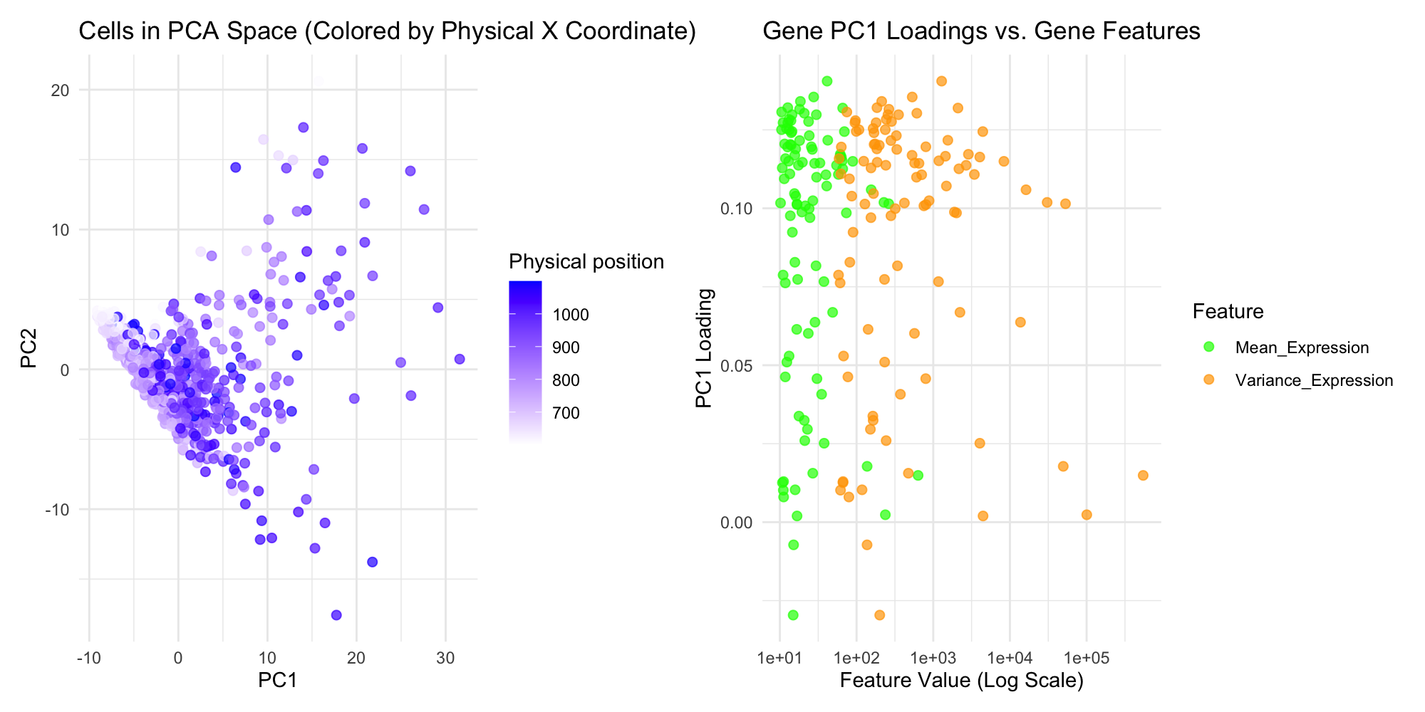
This data visualization is trying to show insights into the spatial transcriptomics dataset using two panels that focus on distinct yet complementary aspects of the data. The first panel visualizes the relationship between cells in PCA space, highlighting transcriptional similarity, with color encoding the physical spatial location, which is aligned X-coordinate. This dual representation emphasizes how transcriptionally similar cells may cluster in gene expression space and how their physical proximity relates The second panel examines how gene features, such as mean and variance of expression, relate to PC1 loadings, using position and color to differentiate between features. A logarithmic scale for feature values ensures that both small and large values are visible, maintaining accuracy and reducing visual distortion. This panel highlights how gene features influence PCA loadings, with separate colors enhancing clarity and supporting direct comparisons.
2. What data encodings (geometric primitives and visual channels) are you using to visualize these data types?
The scatter plot is used as the geometric primitive, to show the individual genes and cells. The color saturation of each point shows the physical position of the cells, with a gradient from blue to white, and in the second plot, two color difference shows mean and variance on one plot. The position of the scatter plot coordinates shows the PCA coordinates, PCA1 and PCA2, on the first plot, and feature value in log scale and PC1 loading on the second plot.
3. What about the data are you trying to make salient through this data visualization?
First Plot: The key aspect being highlighted is the spatial distribution of cells in the PCA space, specifically how the cells’ physical proximity correlates with their placement in the first two principal components of PC1 and PC2. The color gradient helps emphasize the relationship between physical position and PCA representation, showing how physical location influences gene expression profiles. Second Plot: The main focus is the relationship between gene characteristics, mean expression and variance in expression, and their contribution to PC1. This allows for identifying which genes with high or low expression levels are driving the variance in the PCA space and understanding how different gene features correlate with principal component loadings.
4. What Gestalt principles or knowledge about perceptiveness of visual encodings are you using to accomplish this?
The principle of proximity is used in the first plot to show the spatial relationship between cells in PCA space, with nearby points indicating similar expression patterns. Color is leveraged to distinguish between physical positions in the first plot and gene features in the second, highlighting patterns and enhancing perceptibility. The contrast between the green and orange colors in the second plot makes it easy to differentiate between mean expression and variance expression. Additionally, figure-ground contrast ensures that data points stand out clearly, and grouping through color coding in the second plot helps organize information by feature type, guiding the viewer’s focus.
5. Code (paste your code in between the ``` symbols)
1
2
3
4
5
6
7
8
9
10
11
12
13
14
15
16
17
18
19
20
21
22
23
24
25
26
27
28
29
30
31
32
33
34
35
36
37
38
39
40
41
42
43
44
45
46
47
48
49
50
51
52
53
54
55
56
57
58
59
# data import
data = read.csv('~/Desktop/genomic-data-visualization-2025/data/eevee.csv.gz')
gexp = data[,5:ncol(data)]
rownames(gexp) = data$barcode
topgenes = names(sort(colSums(gexp),decreasing = T)[1:100])
gexpsub = gexp[,topgenes]
# position
pos = data[,3:4]
rownames(pos) = data$barcode
# perform PCA
pca <- prcomp(gexpsub, center = TRUE, scale. = TRUE)
pca_coords <- as.data.frame(pca$x[, 1:2])
colnames(pca_coords) <- c("PCA1", "PCA2")
pca_coords$barcode <- rownames(pca_coords)
pos$barcode <- rownames(pos)
pos_pca <- merge(pos, pca_coords, by = "barcode")
# PCA loading extract
pc1_loadings <- pca$rotation[, 1]
gene_means <- colMeans(gexpsub)
gene_variances <- apply(gexpsub, 2, var)
# data frame
gene_stats <- data.frame(
  Gene = colnames(gexpsub),
  PC1_Loading = pc1_loadings,
  Mean_Expression = gene_means,
  Variance_Expression = gene_variances
)
# cells in PCA space with physical ploximity
library(ggplot2)
library(tidyr)
panel1 <- ggplot(pos_pca, aes(x = PCA1, y = PCA2, color = aligned_x)) +
  geom_point(alpha = 0.7, size = 2) +
  scale_color_gradient(low = "white", high = "blue", name = "Physical position") +
  ggtitle("Cells in PCA Space (Colored by Physical X Coordinate)") +
  xlab("PC1") +
  ylab("PC2") +
  theme_minimal()
# PC1 loading vs mean and variance
gene_stats_long <- data.frame(
  Feature = c(rep("Mean_Expression", nrow(gene_stats)), rep("Variance_Expression", nrow(gene_stats))),
  Value = c(gene_stats$Mean_Expression, gene_stats$Variance_Expression),
  PC1_Loading = c(gene_stats$PC1_Loading, gene_stats$PC1_Loading)
)
library(ggplot2)
panel2 <- ggplot(gene_stats_long, aes(x = Value, y = PC1_Loading, color = Feature)) +
  geom_point(alpha = 0.7, size = 2) +
  scale_x_log10() +  # Log scale for better clarity
  ggtitle("Gene PC1 Loadings vs. Gene Features") +
  xlab("Feature Value (Log Scale)") +
  ylab("PC1 Loading") +
  scale_color_manual(values = c("Mean_Expression" = "green",
                                "Variance_Expression" = "orange")) +
  theme_minimal()

# show plots in patchwork
library(patchwork)
combined_plot <- panel1 + panel2 + plot_layout(ncol = 2,width = 14, height = 6)
print(combined_plot)