HW2 Post

1. Why the Visualization is Effective?
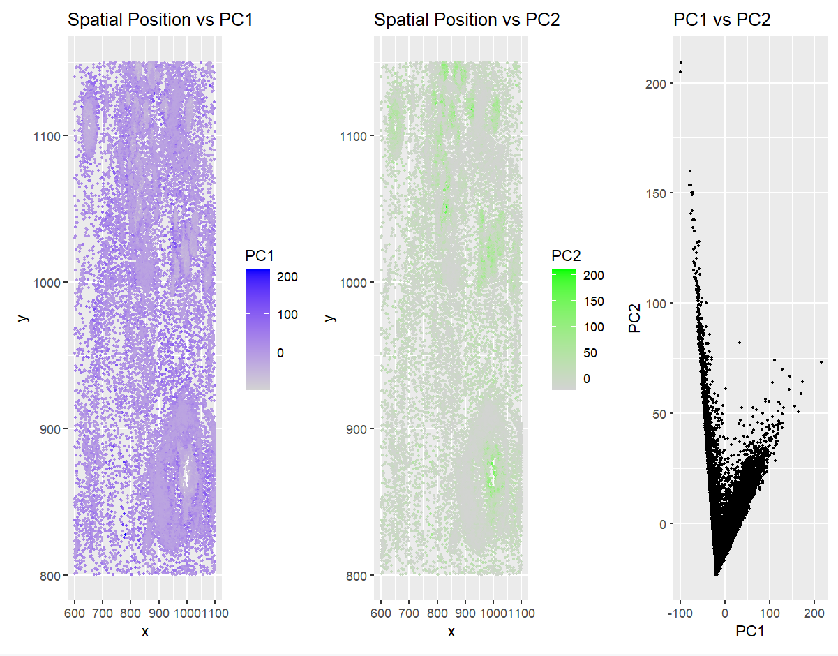
The visualization approach I used in this homework combined three plots to compare spatial positioning and gene expression patterns through PCA. I applied Gestalt principles such as similarity (done via grouping points that share similar properties like color or size), proximity (points that are close together are perceived as related), and continuity (elements are seen as part of a smooth group rather than broken)— I created a clearer understanding of how data points relate to one another. The first two plots (Spatial Position vs PC1 and Spatial Position vs PC2) show how gene expression, represented by the principal components, is distributed across spatial coordinates. This helps identify patterns in gene expression based on location. The third plot (PC1 vs PC2) illustrates how the two components relate to each other, helping identify any clusters or trends. This method of visualizing quantitative data (numerical values) in a spatial context using different data encodings (such as color for PC1 and PC2) enhances the salience of the important data points, guiding the viewer’s focus to the most relevant information.
2. Code (paste your code in between the ``` symbols)
1
2
3
4
5
6
7
8
9
10
11
12
13
14
15
16
17
18
19
20
21
22
23
24
25
26
27
28
29
30
31
32
33
34
35
36
37
38
39
40
41
42
43
44
45
46
# Load required libraries
library(ggplot2)
library(patchwork)

# Load data
file <- 'C:/Users/ishit/GenomicVis/genomic-data-visualization-2025/data/pikachu.csv.gz'
data <- read.csv(file)
data[1:5, 1:10]

# Extract spatial positions and gene expression data
pos <- data[, 5:6]
rownames(pos) <- data$cell_id
gexp <- data[, 7:ncol(data)]
rownames(gexp) <- data$barcode

# Normalize gene expression based on cell area
norm <- gexp / log10(data$cell_area + 1) * 3

# Perform PCA
pcs <- prcomp(norm)

# Create a dataframe for visualization
df <- data.frame(
  PC1 = pcs$x[,1], PC2 = pcs$x[,2],
  x = data$aligned_x, y = data$aligned_y
)

#above code was based off what we did in class

# Comparing spatial and expression-based clustering
p1 <- ggplot(df, aes(x = x, y = y, col = PC1)) +
  geom_point(size = 0.5) + scale_color_gradient(low = 'lightgrey', high = 'blue') +
  ggtitle("Spatial Position vs PC1")

p2 <- ggplot(df, aes(x = x, y = y, col = PC2)) +
  geom_point(size = 0.5) + scale_color_gradient(low = 'lightgrey', high = 'green') +
  ggtitle("Spatial Position vs PC2")

p3 <- ggplot(df, aes(x = PC1, y = PC2)) +
  geom_point(size = 0.5) + ggtitle("PC1 vs PC2")

#used chat-gpt help to format these graphs nicely, but graphed PCA graphs how we did in class

# Combine plots
p1 + p2 + p3