PCA Dimensionality Reduction vs Physical Space

Write a description explaining why you believe your data visualization is effective using vocabulary terms from Lesson 1
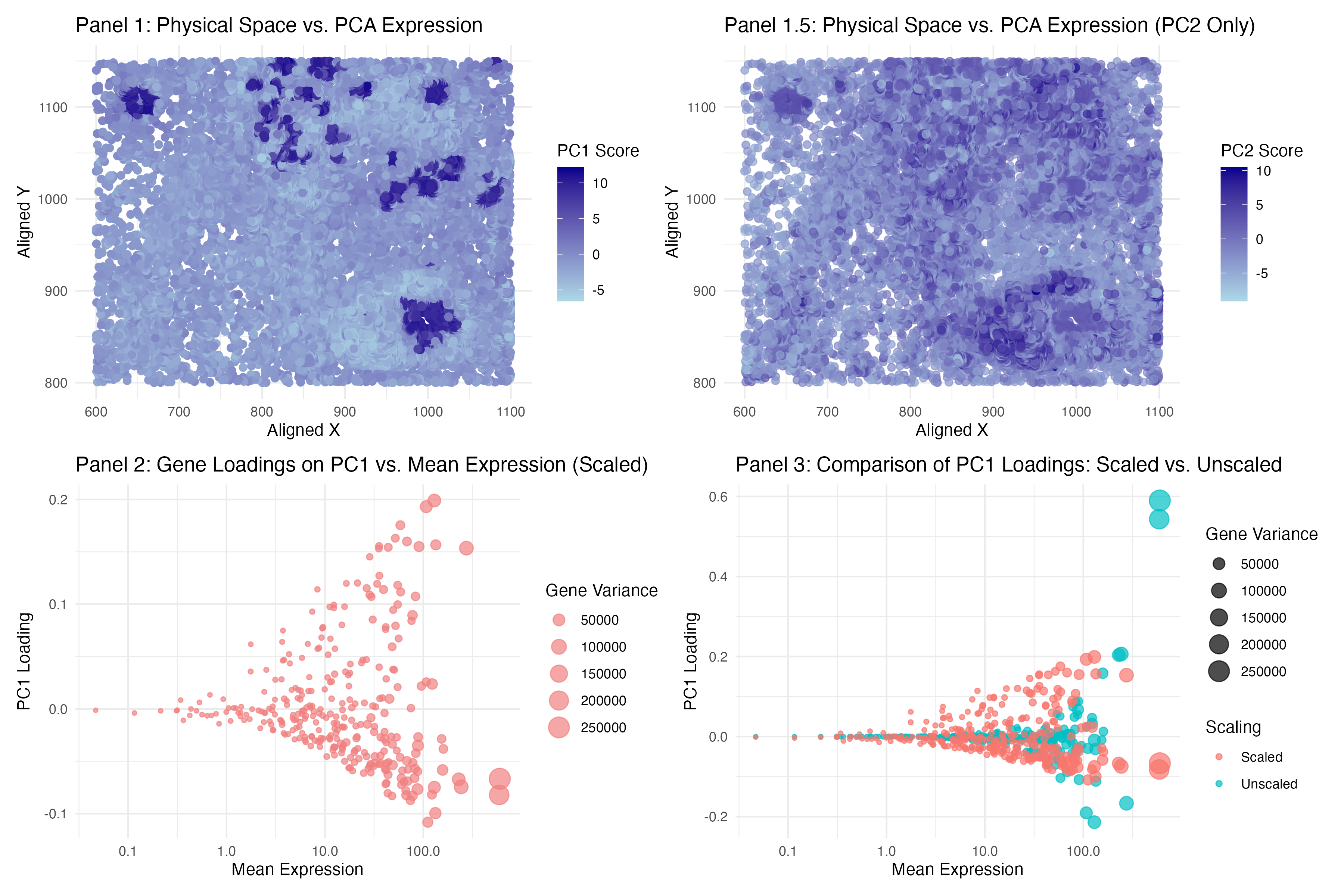
To answer question 1, I used PC1 and PC2 scores separately (in 2 panels) and placed it in relative to spatial coordinate (physical space). For both PC I used color gradient and hue (dark blue to light blue) to reveal the transcriptional clusters in physical space. I used points primarily as my geometric primitives. And visual channels are color and position. I believed it is more effective in term of how it used the Similarity and Proximity features of Gestalt Principle, similar dots are clustered together and it is shades out if it is less significance. Also to answer question 1, I think the answer will be yes - cells that are transcriptionally similar (high PC1 scores) tend to cluster together in physical space. This is because the dark blue regions represent areas where cells have similar high PC1 which means transcriptional similarity. And as color faded out gradually suggests that transcriptionally distinct cells physically close. And this is supported by the PC2 panel. Comparing to PC1, the higher score are more spread out, but still formed some sort of a cluster (like a mix).
To answer question 2, I used gene loadings in relative to mean expression and variance. While bubble size encodes variance, it also helps identify key contributors to PC1. Again, I used points as my geometric primitives. And visual channels are just size and shapes. However if we look at plot 3 which compares scale and unscaled data, visual channels will also included color difference to differentiate out 2 groups on top of size and shapes. I think the proximity feature of Gestalt Principle is what makes it effective. From left to right are the mean value (low to high) and the dot size are the variance (again low to high (high will be large point). The color and grouping makes the points stand out from each other makes it easier to interpret.
To answer the question 2 again, just like what’s said in the class, genes with higher mean expression tend to have higher PC1 loadings. I think this is normal because this suggests that highly expressed genes contribute more to PC1 and PC1 are supposed to capture most of the variance. And fun fact, if we looked at the unscaled data, the PC loading will be even higher ( or much higher in high mean expression). Looking at the dots size (variance), larger points (high-variance genes) tend to have higher PC1 values for both scale and unscaled data. Therefore in conclusion, gene loadings on PC1 are positively correlated with mean expression and variance.
I didn’t realized we just need to finished 1 questions until I have everything done :(
Code (paste your code in between the ``` symbols)
1
2
3
4
5
6
7
8
9
10
11
12
13
14
15
16
17
18
19
20
21
22
23
24
25
26
27
28
29
30
31
32
33
34
35
36
37
38
39
40
41
42
43
44
45
46
47
48
49
50
51
52
53
54
55
56
57
58
59
60
61
62
63
64
65
66
67
68
library(prcomp)
library(ggplot2)
library(dplyr)
library(patchwork)
# data exploratory
file <- '/Users/harriethe/GenomicDataVisualization/genomic-data-visualization-2025/data/pikachu.csv.gz'
pikachu_data <- read.csv(file)
head(pikachu_data)
dim(pikachu_data)
# 319-6 = 313 genes
# 17136 cells
ncol(pikachu_data)
nrow(pikachu_data)
gexp <- pikachu_data[, 7:ncol(pikachu_data)]
cpm_norm <- gexp / rowSums(gexp) * 10000
pcs <- prcomp(cpm_norm, scale = TRUE)
pikachu_data$PC1 <- pcs$x[, 1]
pikachu_data$PC2 <- pcs$x[, 2]

#question1
Panel1 <- ggplot(pikachu_data, aes(x = aligned_x, y = aligned_y, color = PC1)) +
  geom_point(size = 2, alpha = 0.7) +
  scale_color_gradient(low = "lightblue", high = "darkblue", name = "PC1 Score") +
  labs(title = "Panel 1: Physical Space vs. PCA Expression (PC1 Only)",
       x = "Aligned X", y = "Aligned Y") +
  theme_minimal()

panel1_5 <- ggplot(pikachu_data, aes(x = aligned_x, y = aligned_y, color = PC2)) +
  geom_point(size = 2, alpha = 0.7) +
  scale_color_gradient(low = "lightblue", high = "darkblue", name = "PC2 Score") +
  labs(title = "Panel 1.5: Physical Space vs. PCA Expression (PC2 Only)",
       x = "Aligned X", y = "Aligned Y") +
  theme_minimal()

#question2
gene_loadings <- data.frame(
  gene = colnames(cpm_norm),
  PC1_loading = pcs$rotation[, 1],
  mean_expression = colMeans(cpm_norm),
  variance_expression = apply(cpm_norm, 2, var),
  Scaling = "Scaled"
)
panel2 <- ggplot(gene_loadings, aes(x = mean_expression, y = PC1_loading, size = variance_expression)) +
  geom_point(alpha = 0.7, color = "lightcoral") +
  scale_x_log10() +
  labs(title = "Panel 2: Gene Loadings on PC1 vs. Mean Expression (Scaled)",
       x = "Mean Expression", y = "PC1 Loading", size = "Gene Variance") +
  theme_minimal()

#non scale version
pcs_unscaled <- prcomp(cpm_norm, scale = FALSE)
gene_loadings_unscaled <- data.frame(
  gene = colnames(cpm_norm),
  PC1_loading = pcs_unscaled$rotation[, 1],
  mean_expression = colMeans(cpm_norm),
  variance_expression = apply(cpm_norm, 2, var),
  Scaling = "Unscaled"
)
gene_loading_both <- rbind(gene_loadings_unscaled, gene_loadings)
panel3 <- ggplot(gene_loading_both, aes(x = mean_expression, y = PC1_loading, size = variance_expression, color = Scaling)) +
  geom_point(alpha = 0.7) +
  scale_x_log10() +
  labs(title = "Panel 3: Comparison of PC1 Loadings: Scaled vs. Unscaled",
       x = "Mean Expression", y = "PC1 Loading", size = "Gene Variance", color = "Scaling") + theme(plot.title = element_text(size = 7))+
  theme_minimal()
combined_plot <- (panel1 | panel1_5)/ (panel2 | panel3)
print(combined_plot)
ggsave("jhe46.png", combined_plot, width = 12, height = 8, dpi = 300)
#Reference: I looked at https://www.bioconductor.org/packages/devel/bioc/vignettes/PCAtools/inst/doc/PCAtools.html the bioconductor handbook for function explore. And one of the graph in their paper inspired me for panel 1 and panel 1.5. Jolliffe, I. T., & Cadima, J. (2016). Principal component analysis: a review and recent developments. Philosophical Transactions of the Royal Society A, 374(2065), 20150202. https://doi.org/10.1098/rsta.2015.0202