Impact of Scaling on PCA: Relationship Between PC1 Loadings and Gene Expression

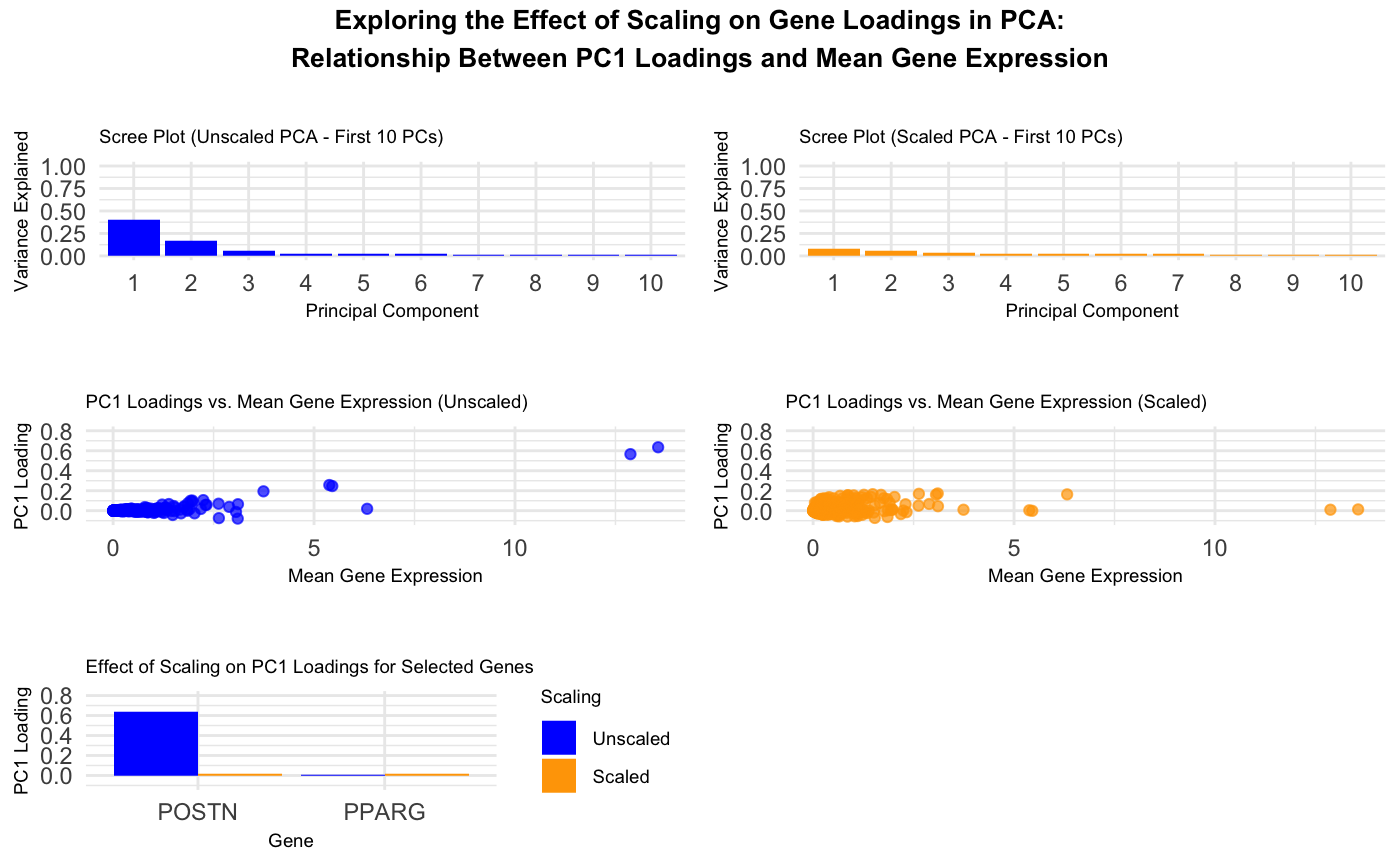
This visualization explores the relationship between gene loadings on the first principal component (PC1) and mean gene expression. The results show that in unscaled data, genes with higher mean expression tend to have higher PC1 loadings. However, after scaling, the impact of highly expressed genes on PC1 diminishes significantly.
The top two visualizations are scree plots for the unscaled and scaled PCA. These show the proportion of variance explained by each of the first ten principal components. The unscaled scree plot indicates that PC1 dominates. Conversely, the scaled scree plot demonstrates a more balanced distribution of variance across components, indicating that scaling reduces the dominance of a single principal component in the analysis.
The middle two plots are scatter plots of PC1 loadings versus Mean Gene Expression. The left plot using unscaled data shows that genes with higher mean expression tend to have higher PC1 loadings, indicating that PCA captures expression magnitude in the first component. The right plot shows that after scaling, PC1 loadings are more evenly spread across genes, demonstrating that scaling removes dependence on raw expression levels.
The last plot is a bar chart showing how scaling transforms PC1 loadings. The chart compares POSTN and PPARG. POSTN was chosen because it has a high mean gene expression, a high PC1 loading before scaling, and a low PC1 loading after scaling. PPARG was chosen because it has a low mean gene expression and a low PC1 loading both before and after scaling. This shows that scaling alters how PCA distributes importance across genes.
The data types used are quantitative data (mean gene expression values and PC1 loadings), categorical data (scaling method and gene names in the bar plot), and ordinal data (ordered principal components on the x-axis in the scree plots).
The geometric primitives include points (scatter plots and scree plots), lines (scree plots), and area (bar plot heights).
The visual channels are position (x-y coordinates showing the quantitative relationship between mean gene expression and PC1 loadings), color (differentiating unscaled and scaled data, blue is unscaled and orange is scaled across the plots), and size (all points are the same size, ensuring equal weighting in perception, and the scatter plots and scree plots have the same scale for easy visual comparison).
The Gestalt principles applied were Proximity, Similarity, and Continuity. Proximity - in the scatter plots, data points are placed close together when they share similar values of mean gene expression or PC1 loading. This makes it easier to identify clusters of genes with similar characteristics. In the bar plot, bars for the same gene (scaled vs. unscaled) are placed next to each other, reinforcing the comparison.
Similarity - Color encoding is used to differentiate between unscaled (blue) and scaled (orange) values. This makes it easy to quickly associate related data points across different plots. Also, similar geometric shapes (points in scatter plots, bars in bar plots) help distinguish between different types of information while maintaining consistency in each plot.
Continuity - The scree plots use a line connecting data points, helping viewers follow the trend of variance explained across principal components. The scatter plots show a trend in gene loadings vs. mean gene expression, making it easier to observe patterns and correlations.
This data visualization shows how PCA behaves with and without scaling. Without scaling, genes with high mean expression drive PC1. After scaling, this effect is eliminated, leading to a more balanced contribution of all genes.
Help from ChatGPT with writing code.
library(tidyverse)
library(ggpubr)

data <- read.csv("~/Desktop/pikachu.csv.gz")

# Remove non-gene columns (keeping only gene expression data)
genes_only <- data %>%
  select(-c(X, cell_id, cell_area, nucleus_area, aligned_x, aligned_y))

# Check if column names have unwanted spaces and fix them
colnames(genes_only) <- trimws(colnames(genes_only))

# Compute gene-wise statistics: Mean and Variance
gene_stats <- genes_only %>%
  summarise(across(everything(), list(mean = mean, var = var), na.rm = TRUE)) %>%
  pivot_longer(cols = everything(), names_to = c("Gene", ".value"),
               names_pattern = "(.+)_(mean|var)")

# Convert the dataset to a matrix for PCA
gene_matrix <- as.matrix(genes_only)

# Perform PCA on raw (unscaled) data
pca_unscaled <- prcomp(gene_matrix, center = TRUE, scale. = FALSE)

# Perform PCA on scaled data
pca_scaled <- prcomp(gene_matrix, center = TRUE, scale. = TRUE)

# Create Scree Plot Data for Unscaled PCA, first 10 principal components
scree_unscaled <- data.frame(PC = 1:10,
                             Variance_Explained = (pca_unscaled$sdev^2 / sum(pca_unscaled$sdev^2))[1:10])

# Create Scree Plot Data for Scaled PCA, first 10 principal components
scree_scaled <- data.frame(PC = 1:10,
                           Variance_Explained = (pca_scaled$sdev^2 / sum(pca_scaled$sdev^2))[1:10])

# Scree Plot for Unscaled Data
p_scree_unscaled <- ggplot(scree_unscaled, aes(x = factor(PC), y = Variance_Explained)) +
  geom_bar(stat = "identity", fill = "blue") +
  labs(title = "Scree Plot (Unscaled PCA - First 10 PCs)",
       x = "Principal Component",
       y = "Variance Explained") +
  ylim(0, 1) +
  theme_minimal() +
  theme(plot.title = element_text(size = 7),
        axis.title = element_text(size = 7))

# Scree Plot for Scaled Data
p_scree_scaled <- ggplot(scree_scaled, aes(x = factor(PC), y = Variance_Explained)) +
  geom_bar(stat = "identity", fill = "orange") +
  labs(title = "Scree Plot (Scaled PCA - First 10 PCs)",
       x = "Principal Component",
       y = "Variance Explained") +
  ylim(0, 1) +
  theme_minimal() +
  theme(plot.title = element_text(size = 7),
        axis.title = element_text(size = 7))

# Extract PC1 loadings for each gene
loadings_unscaled <- data.frame(Gene = colnames(gene_matrix),
                                PC1_Loading_Unscaled = pca_unscaled$rotation[, 1])

loadings_scaled <- data.frame(Gene = colnames(gene_matrix),
                              PC1_Loading_Scaled = pca_scaled$rotation[, 1])

# Merge PCA results with mean gene and variance
pca_data_unscaled <- left_join(gene_stats, loadings_unscaled, by = "Gene")
pca_data_scaled <- left_join(gene_stats, loadings_scaled, by = "Gene")

# Plot PC1 Loadings vs. Mean Gene (Unscaled)
p1 <- ggplot(pca_data_unscaled, aes(x = mean, y = PC1_Loading_Unscaled)) +
  geom_point(color = "blue", alpha = 0.7) +
  labs(title = "PC1 Loadings vs. Mean Gene Expression (Unscaled)",
       x = "Mean Gene Expression",
       y = "PC1 Loading") +
  ylim(-0.1, 0.8) +
  theme_minimal() +
  theme(plot.title = element_text(size = 7),
        axis.title = element_text(size = 7))

# Plot PC1 Loadings vs. Mean Gene (Scaled)
p2 <- ggplot(pca_data_scaled, aes(x = mean, y = PC1_Loading_Scaled)) +
  geom_point(color = "orange", alpha = 0.7) +
  labs(title = "PC1 Loadings vs. Mean Gene Expression (Scaled)",
       x = "Mean Gene Expression",
       y = "PC1 Loading") +
  ylim(-0.1, 0.8) +
  theme_minimal() +
  theme(plot.title = element_text(size = 7),
        axis.title = element_text(size = 7))

# Compare PC1 loadings of selected POSTN and PPARG genes
selected_genes <- c("POSTN", "PPARG")
scaling_comparison <- pca_data_scaled %>%
  filter(Gene %in% selected_genes) %>%
  select(Gene, Scaled = PC1_Loading_Scaled) %>%
  left_join(pca_data_unscaled %>% select(Gene, Unscaled = PC1_Loading_Unscaled), by = "Gene") %>%
  pivot_longer(cols = c(Scaled, Unscaled), names_to = "Scaling", values_to = "PC1_Loading")

# Convert Gene column to a factor with a specified order
scaling_comparison$Gene <- factor(scaling_comparison$Gene, levels = selected_genes)

# Ensure "Unscaled" appears first
scaling_comparison$Scaling <- factor(scaling_comparison$Scaling, levels = c("Unscaled", "Scaled"))

# Bar Plot: Effect of Scaling on PC1 Loadings for Selected Genes
p3 <- ggplot(scaling_comparison, aes(x = Gene, y = PC1_Loading, fill = Scaling)) +
  geom_bar(stat = "identity", position = "dodge") +
  scale_fill_manual(values = c("Unscaled" = "blue", "Scaled" = "orange")) +
  labs(title = "Effect of Scaling on PC1 Loadings for Selected Genes",
       x = "Gene",
       y = "PC1 Loading") +
  ylim(-0.1, 0.8) +
  theme_minimal() +
  theme(
    plot.title = element_text(size = 7),
    axis.title = element_text(size = 7),
    legend.key.size = unit(0.5, "cm"),
    legend.text = element_text(size = 7),
    legend.title = element_text(size = 7)
  )

# Print plots
combined_plot <- ggarrange(p_scree_unscaled, p_scree_scaled, NULL,NULL, p1, p2, NULL,NULL, p3,
                           ncol=2, nrow=5, heights=c(1, 0.2, 1, 0.2, 1))

final_plot <- annotate_figure(combined_plot,
                              top = text_grob("Exploring the Effect of Scaling on Gene Loadings in PCA:\nRelationship Between PC1 Loadings and Mean Gene Expression\n",
                              face = "bold", size = 10))
print(final_plot)