Comparison of Pikachu Cells Within Gene Expression Space and Physical Space

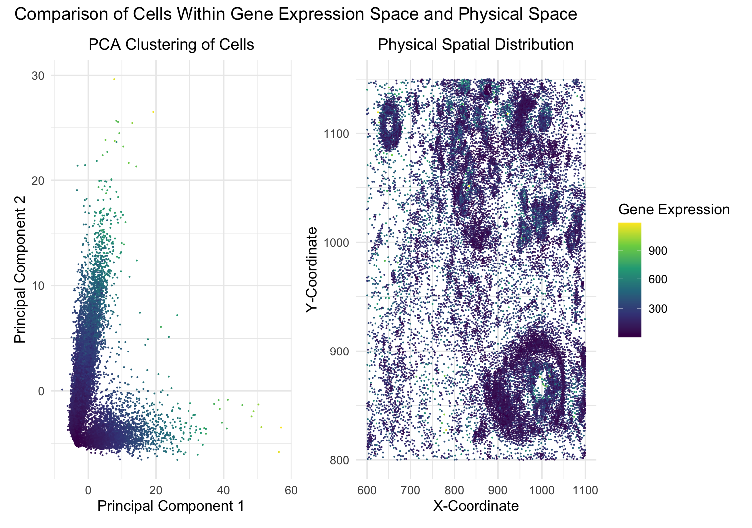
This data visualization utilizes the Pikachu dataset to investigate how cells are related in the gene expression space as compared to their physical space distribution. Even more, the visualization uncovers where transcriptionally similar cells are also in close physical proximity to each other in the tissue through principal component analysis (PCA). Through this linear reduction, I aimed to visualize whether gene expression patterns are spatially organized or randomly assorted throughout the tissue.
To begin, the visualization consists of two panels: a PCA plot of the cells along with a spatial distribution of the cells within the tissue. The first panel, “PCA Clustering of Cells”, portrays the cells from the gene expression space in the first two principal components (PC1 and PC2) from PCA. A color gradient with the viridis color map encodes the aligned x-coordinate of each cell, allowing us to explore whether transcriptionally similar cells (grouped together in PCA space) also share proximity to one another spatially. The second panel, “Physical Spatial Distribution”, maps the actual spatial locations of cells within the tissue. The x and y axes represent the spatial X- and Y-coordinates, while the color gradient encodes the aligned y-coordinate of the cells. Comparing these two panels of the PCA plot and spatial distribution allows us to determine whether transcriptionally similar cells identified through PCA are also physically close in the tissue.
This visualization mainly utilizes the data types of quantitative and spatial data. The quantitative data includes the principal component values (PC1, PC2) obtained from PCA, as well as the total gene expression levels. The spatial data consists of the aligned x- and y-coordinates, which describe the physical location of each cell in the tissue. By integrating these data types, the visualization allows for a comparison between transcriptional similarity and physical proximity. In addition, to effectively convey the data, several geometric primitives and visual channels are also utilized. Points within the scatter plots act as the geometric primitive, where each point represents a single cell in both the PCA space and physical space. Both panels also utilize the visual channel of position encoding, where cells are plotted in PCA space in the first panel and physical space in the second panel. Color hue and saturation encoding are applied through a continuous gradient of colors ranging from yellow, green, blue, and purple, where aligned_x is mapped to color in PCA space and aligned_y is mapped to color in physical space. This helps highlight spatial patterns, making it easier to detect relationships between transcriptionally similar cells and their physical locations. The main goal of this visualization is also to make the relationship between transcriptional similarity and spatial organization salient. If the transcriptionally similar cells are also physically close to each other, the visually-encoded color channels depict a pattern that gene expression similarity is structured according to spatial location. In addition, this visualization employs multiple Gestalt principles to improve the clarity and interoperability of the data. The principle of proximity is used in PCA clustering, where cells that are transcriptionally similar appear as clusters of cells that are proximally closer to each other. The principle of similarity is reinforced through the consistent use of the same viridis color scales in both panels, helping viewers link patterns between PCA clusters and the cells’ physical locations. The principle of continuity is applied through the use of a continuous color gradient, which allows smooth transitions between high and low values, aiding in the detection of spatial patterns. These design choices enhance the efficacy of visual perception, making the relationships of the cells in the Pikachu data more apparent. Ultimately, I believe this data visualization effectively portrayed the Pikachu dataset in order to emphasize the relationship of cells within the gene expression space as compared to their physical spatial distribution.
1
2
3
4
5
6
7
8
9
10
11
12
13
14
15
16
17
18
19
20
21
22
23
24
25
26
27
28
29
30
31
32
33
34
35
36
37
38
39
40
41
42
43
44
45
46
47
48
49
50
51
52
53
54
55
56
57
58
59
60
61
# Necessary libraries loaded
library(ggplot2)
library(dplyr)
library(viridis)
library(patchwork)

# Loads Pikachu Dataset
file <- '~/Desktop/genomic-data-visualization-2025/data/pikachu.csv.gz'
data <- read.csv(file)

# Extracts spatial coordinates and gene expression data from cell_id, aligned_x, and aligned_y columns
pos <- data[, c("cell_id", "aligned_x", "aligned_y")]  # Ensure these columns exist
gexp <- data[, 7:ncol(data)]  # Assuming gene expression starts from the 7th column
rownames(gexp) <- data$cell_id

# Computes total gene expression per cell
total_gene_expression <- rowSums(gexp)

# Performs PCA on gene expression data
pcs <- prcomp(gexp, scale = TRUE)

# Merges PCA results with spatial coordinates and gene expression
pca_results <- as.data.frame(pcs$x[, 1:2])  # First two principal components
colnames(pca_results) <- c("PC1", "PC2")
pca_results$cell_id <- rownames(gexp)
pca_results$total_gene_expression <- total_gene_expression  # Adds gene expression data

# Merges data with spatial position data for plots
merged_data <- merge(pos, pca_results, by = "cell_id")

# Creates the first panel: PCA clustering of cells with total gene expression
p1 <- ggplot(merged_data, aes(x = PC1, y = PC2, color = total_gene_expression)) +
  geom_point(size = 0.01) + scale_color_viridis_c() + theme_minimal() +
  theme(plot.title = element_text(size = 12, hjust = 0.5)) +  # Centers the title
  labs(title = "PCA Clustering of Cells",
       x = "Principal Component 1", y = "Principal Component 2", color = "Gene Expression")

# Create the second panel: Physical spatial distribution of cells
p2 <- ggplot(merged_data, aes(x = aligned_x, y = aligned_y, color = total_gene_expression)) +
  geom_point(size = 0.01) +  scale_color_viridis_c() +  theme_minimal() +
  theme(plot.title = element_text(size = 12, hjust = 0.5)) +  # Centers the title
  labs(title = "Physical Spatial Distribution",
       x = "X-Coordinate", y = "Y-Coordinate", color = "Gene Expression")

# Arranges the two panels side by side through patchwork
p1 + p2 + plot_layout(guides = "collect") +  #Collects legends of both plots to avoid redundancy
  plot_annotation(title = "Comparison of Cells Within Gene Expression Space and Physical Space")  #Title of entire plot

# Sources:
# https://www.rdocumentation.org/packages/RcppMeCab/versions/0.0.1.2/topics/pos
# https://sqlpad.io/tutorial/understanding-c/
# https://www.statology.org/r-ncol-function/
# https://www.statology.org/rowsums-function-in-r/
# https://www.rdocumentation.org/packages/stats/versions/3.6.2/topics/prcomp
# https://www.geeksforgeeks.org/convert-an-object-to-data-frame-in-r-programming-as-data-frame-function/
# https://www.codecademy.com/resources/docs/r/data-frames/colnames
# https://www.rdocumentation.org/packages/base/versions/3.6.2/topics/merge
# https://cran.r-project.org/web/packages/viridis/vignettes/intro-to-viridis.html
# https://ggplot2.tidyverse.org/reference/theme.html
# https://stackoverflow.com/questions/61077254/combine-and-merge-legends-in-ggplot2-with-patchwork
# https://rpubs.com/DragonflyStats/Dataviz-Patchwork