Making a Multi-Panel Data Visualization

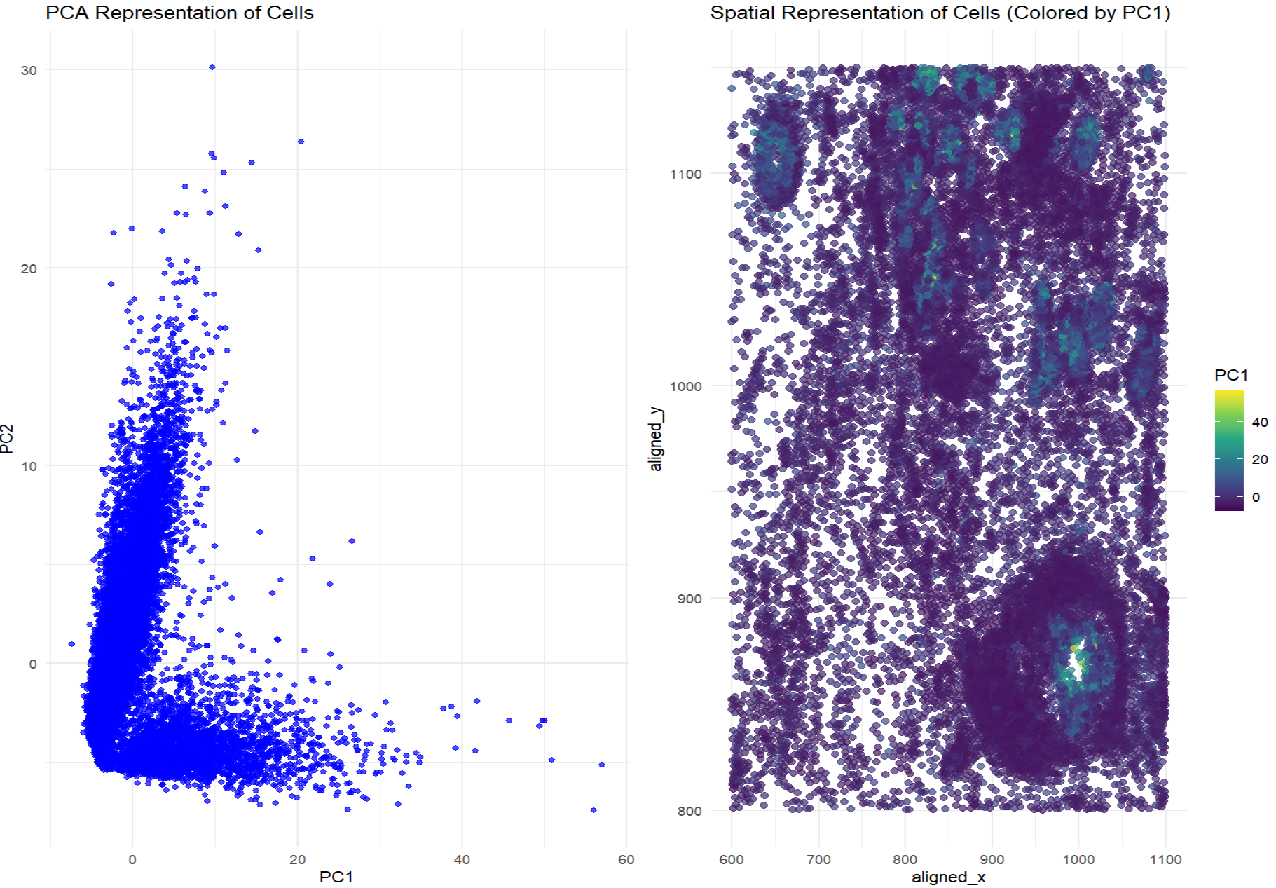
The visualization effectively conveys relationships between gene expression and spatial organization by utilizing dimensionality reduction (PCA) to simplify high-dimensional gene expression data. The PCA scatter plot helps distinguish patterns in transcriptional variability, while the spatial plot with a color gradient enhances interpretability by mapping expression variation onto physical space. This data visualization is effective because it uses geometric primitive of points and visual channels of color (saturation) and position to encode gene expression data. The Gestalt principle of proximity helps group transcriptionally similar cells together in both PCA and spatial plots, while color (saturation) encoding enhances salience, making patterns in PC1 values more interpretable.
In the PCA representation of cells, there are clusters of points that indicate transcriptional similarity among cells. If cells with similar gene expression profiles are also spatially close in the physical representation, that means that transcriptionally similar cells tend to cluster together in both physical and gene expression space. The second plot, which colors cells by PC1 values, visualizes whether transcriptionally similar cells (having similar PC1 values) appear in spatial proximity. If there are clear spatial clusters of similar colors, that means that gene expression correlates with physical positioning.
I used my code from homework 1, class activities, and ChatGPT to implement my PCA codes, aggregate two graphs to show two panels in my final post, and format my graphs.
1
2
3
4
5
6
7
8
9
10
11
12
13
14
15
16
17
18
19
20
21
22
23
24
25
26
27
28
29
30
31
32
33
34
35
36
37
38
39
40
41
42
43
44
45
46
47
# install.packages("Rtsne")
# install.packages("ggpubr")
library(ggplot2)
library(dplyr)
library(tidyr)
library(Rtsne)
library(ggpubr)

# Load data
file <- 'C:/Users/reach/OneDrive/Documents/2024-25/SPRING/Genomic Data Visualization/genomic-data-visualization-2025/data/pikachu.csv.gz'
data <- read.csv(file)

head(data)

# Get spatial coordinates
spatial_coords <- data[, c("aligned_x", "aligned_y")]

# Get gene expression values
gene_expression <- data %>% select(-c(aligned_x, aligned_y))

# Do PCA on gene expression data
pca_result <- prcomp(gene_expression, scale. = TRUE)

# Get the first two principal components
pca_data <- as.data.frame(pca_result$x)
pca_data$aligned_x <- spatial_coords$aligned_x
pca_data$aligned_y <- spatial_coords$aligned_y

# Create first plot
p1 <- ggplot(pca_data, aes(x = PC1, y = PC2)) +
  geom_point(alpha = 0.7, color = 'blue') +
  theme_minimal() +
  ggtitle("PCA Representation of Cells")

# Create second plot
p2 <- ggplot(pca_data, aes(x = aligned_x, y = aligned_y, color = PC1)) +
  geom_point(size = 2, alpha = 0.7 ) +
  scale_color_viridis_c() +
  theme_minimal() +
  ggtitle("Spatial Representation of Cells (Colored by PC1)")

# combine the two plots
final_plot <- ggarrange(p1, p2, ncol = 2, nrow = 1)

# Show the final plot combined
print(final_plot)