Visualizing Relationship Between Spatial Proximity and Gene Expression Profile Similarity
1. What data types are you visualizing?
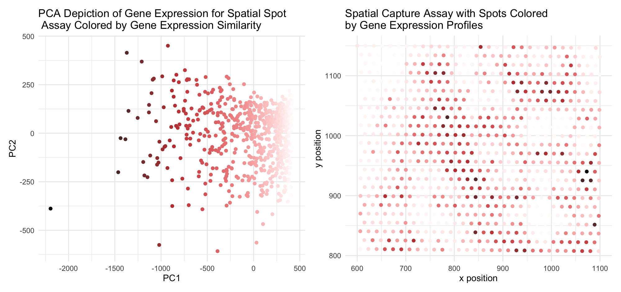
I am visualizing the categorical data of PC1/PC2 categorization of gene expression scoring (which, in turn, is quantitative data) for each spot (left plot) and the quantitative data of the spatial coordinates for each spatial capture spot (right plot). I use the geometric primitive of point in both plots – with each point conveying one spatial capture spot for each of the two subplots. With this primitive, I use the visual channels of color and position. I use a saturation and lightness gradient across the span of the data distribution on the left to assign a visual parameter associating nearby points with each other. With the visual channel of x and y position (PC1 and PC2, respectively), which capture the most significant variance in gene expression profiles in the dataset, I thus can use color as a proxy for gene expression similarity. WIth this visual assocation, I use the same two visual channels on the right side, but with spatial coordinates rather than PC scores, to thus interrogate the similarity between gene expression profile and spatial similarity. I leverage the Gestalt principle of similarity to convey similarity in gene expression (PC1/PC2) for each spatial capture spot via a color gradient. Color similarity, or lack therof, is relatively easy to interpret visually, so this enables interpretation of spatial correlation as well. This also leverages the Gestalt principle of proximity, which is encoded with the spatial clustering of capture spots conveying literal spatial proximity, as well as proximity on the PC1/PC2 plot, conveying similarity in gene expression with position on the plot. This comparison enables a cursory analysis of such a trend. From the spatial plot, now, it is apparent that while not uniformly organized by gene expression, there are certainly clusters of similarly-colored regions across the map, and gradients in color between neighboring regions rather than any dramatic shift. Cell type is directed by gene expres
5. Code (paste your code in between the ``` symbols)
1
2
3
4
5
6
7
8
9
10
11
12
13
14
15
16
17
18
19
20
21
22
23
24
25
26
27
28
29
30
31
32
33
34
35
36
37
38
39
40
41
42
43
44
45
46
47
48
49
50
51
52
53
54
55
56
57
58
59
60
61
62
63
64
65
66
67
68
69
70

# importing data
data <- read.csv('eevee.csv.gz')

# importing libraries
library(ggplot2)
library(dplyr)
library(colorspace)
library(patchwork)

# processing data into dataframes
pos <- data[, 3:4]
rownames(pos) <- data$X
gexp <- data[, 5:ncol(data)]


## normalizing dataset by spot expression
norm <- gexp/rowSums(gexp) * 10000
rowSums(norm)
topgenes <- names(sort(colSums(norm), decreasing=TRUE)[1:1000])
normsub <- norm[,topgenes]


# generating function to create spatial color gradient
get_col <- function(coords) {
  plot_df <- coords

  my_h <- plot_df$xcoord
  my_h <- (my_h - min(my_h))
  #my_h <- 0.2 + my_h * (0.8 / max(my_h))
  my_h <- (plot_df$xcoord - min(plot_df$xcoord)) / (max(plot_df$xcoord) - min(plot_df$xcoord))
  my_s <- rep(0.5, length(my_h))
  my_s <- (plot_df$xcoord - min(plot_df$xcoord)) / (max(plot_df$xcoord) - min(plot_df$xcoord))
  my_l <- plot_df$ycoord
  my_l <- (my_l - min(my_l))
  my_l <- 0.2 + my_l * (0.7 / max(my_l))
  my_l <- (plot_df$xcoord - min(plot_df$xcoord)) / (max(plot_df$xcoord) - min(plot_df$xcoord))
  hls_color <- data.frame(H = my_h, L = my_l, S = my_s)
  rgb_color <- apply(hls_color, 1, function(p) as.character(hex(HLS(p[1], p[3], p[2]))))

  return(rgb_color)
}

a_col <- get_col(data.frame(xcoord = df_norm$PC1,
                            ycoord = df_norm$PC2))


## PCs visualization with color added
pcs <- prcomp(normsub)
df_norm <- data.frame(pcs$x, totalgene=rowSums(normsub))
g1 <- ggplot(df_norm, aes(x = PC1, y = PC2, col=a_col)) + geom_point() +
  scale_color_identity() +
  theme_minimal() +
  ggtitle("PCA Depiction of Gene Expression for Spatial Spot\n Assay Colored by Gene Expression Similarity") +
  xlab("PC1") +
  ylab("PC2")


# spatial visualization with color added
g2 <- ggplot(pos, aes(x = aligned_x, y = aligned_y, col = a_col)) + geom_point() +
  scale_color_identity() +
  theme_minimal() +
  ggtitle("Spatial Capture Assay with Spots Colored \nby Gene Expression Profiles") +
  xlab("x position") +
  ylab("y position")

g1 + g2


###