Analyzing the Relationship between Cell Gene Expression and Position in the Eevee Dataset

1. What data types are you visualizing?
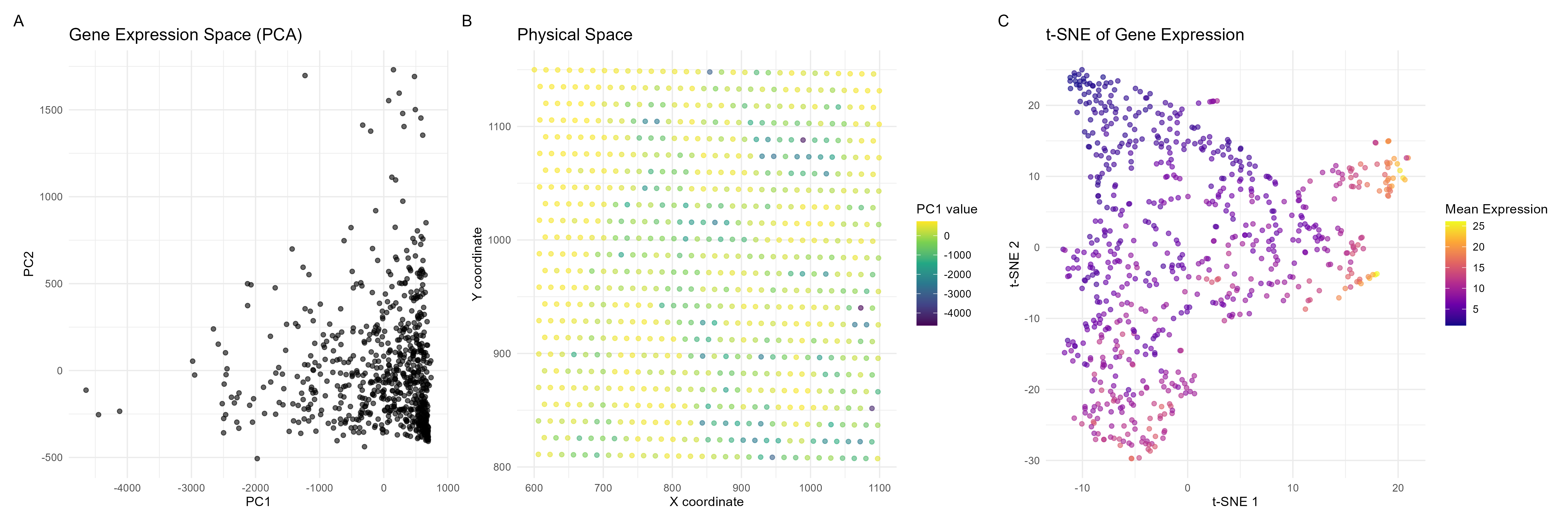
I am visualizing quantitative data, specifically cell gene expression and positional data (x and y coordinates).
2. What data encodings (geometric primitives and visual channels) are you using to visualize these data types?
I am using points as geometric primitives, where each cell is represented by a point in both the PCA plot and the spatial plot. For visual channels, I am using position as the x and y coordinates of the points encode PC1 and PC2 values in plot A, and spatial X and Y coordinates in plot B. A color gradient (purple to yellow) is applied to encode PC1 values in the spatial plot. On the tSNE graph, I am using points as cells, and a color gradient to describe gene expression levels which provides another layer of analysis (as gene expression magnitude is not necessarily explained in plots A and B).
This data visualization is effective because it illustrates that the majority of cells have similar gene expression profiles. This is illustrated by the gestalt principle of proximity, where cells on plot A that are closer in space have similar gene expression profiles. Furthermore, on plot B, cells that are similar in color have similar PC1 values and cells closer in position to one another are closer spatially.
5. Code (paste your code in between the ``` symbols)
1
2
3
4
5
6
7
8
9
10
11
12
13
14
15
16
17
18
19
20
21
22
23
24
25
26
27
28
29
30
31
32
33
34
35
36
37
38
39
40
41
42
43
44
45
46
47
48
49
50
51
52
53
54
55
56
57
58
59
60
61
62
63
64
65
66
67
68
69
70
71
72
library(ggplot2)
library(dplyr)
library(tidyr)
library(RColorBrewer)
library(cowplot) # can also use patchwork package
library(Rtsne)
library(patchwork)
library(viridis)

file <- 'eevee.csv.gz'
data <- read.csv(file)

data[1:5,1:10]

pos <- data[, 5:6]
rownames(pos) <- data$cell_id
gexp <- data[, 7:ncol(data)]
rownames(gexp) <- data$barcode

topgenes <- names(sort(colSums(gexp), decreasing=TRUE)[1:1000])
gene_data <- gexp[,topgenes]

pca_result <- prcomp(gene_data)

# extract first two PCs
pc1 <- pca_result$x[, 1]
pc2 <- pca_result$x[, 2]

plot_data <- data.frame(
  PC1 = pc1,
  PC2 = pc2,
  X = data$aligned_x,
  Y = data$aligned_y
)

# PCA plot for analyzing the gene expression space
p1 <- ggplot(plot_data, aes(x = PC1, y = PC2)) +
  geom_point(alpha = 0.6) +
  theme_minimal() +
  labs(title = "Gene Expression Space (PCA)",
       x = "PC1", y = "PC2")

# Spatial analysis of gene expression using PCA values
p2 <- ggplot(plot_data, aes(x = X, y = Y)) +
  geom_point(aes(color = PC1), alpha = 0.6) +
  scale_color_viridis_c() +
  theme_minimal() +
  labs(title = "Physical Space",
       x = "X coordinate", y = "Y coordinate",
       color = "PC1 value")

# Perform t-SNE
set.seed(42)
tsne_result <- Rtsne(gene_data, dims = 2, perplexity = 30, verbose = TRUE, max_iter = 1000)
mean_expression <- rowMeans(gene_data)

# t-SNE plot
p3 <- ggplot(data.frame(tsne_result$Y), aes(x = X1, y = X2, color = mean_expression)) +
  geom_point(alpha = 0.6) +
  scale_color_viridis_c(option = "plasma") +
  theme_minimal() +
  labs(title = "t-SNE of Gene Expression",
       x = "t-SNE 1", y = "t-SNE 2",
       color = "Mean Expression")

# Combine plots
combined_plot <- (p1 + p2 + p3) + plot_layout(ncol = 3) +
  plot_annotation(tag_levels = 'A')

print(combined_plot)

ggsave("hw2_sraghav9_2.png", combined_plot, width = 18, height = 6, units = "in", dpi = 300)