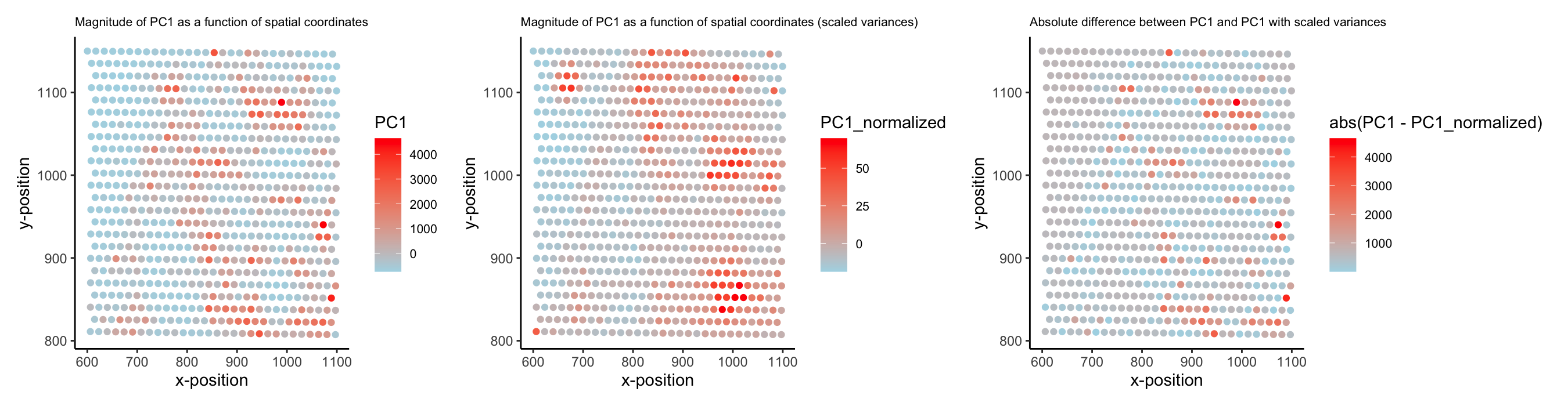
PC1 values (unscaled vs. scaled variances) as a function of spatial coordinates

1. What data types are you visualizing?
I wanted to visualize spatial data (locations of spots on tissue sample) and quantitative data (PC1 values for each spot). I looked at two types of quantitative data: one where PC1 was calculated without changing each gene’s variance, and one where each variance was scaled to 1.
2. What data encodings (geometric primitives and visual channels) are you using to visualize these data types?
I am using the geometric primitive of points to visualize the spatial data, as well as positions on the x- and y-axes (visual channels) to represent spatial coordinates. I am using the visual channels of color hue/saturation (different saturations of blue and red hues) to visualize the quantitative data.
3. What about the data are you trying to make salient through this data visualization?
I first looked at the top 500 expressed genes and performed PCA. I wanted to visualize the value of PC1 at different regions in the tissue sample, as similar values would indicate similar gene expression patterns. Displaying these PC1 values on a visual representation of the spots’ spatial coordinates helps demonstrate whether adjacent regions of the tissue have similar gene expression patterns or not.
Also, I wanted to make salient the difference between scaling and not scaling variances prior to PCA. As such, I showed plots for both approaches next to one another, as well as quantified the absolute difference between the PC1 values at each spot when calculated with each method. Together, these plots show regions of similar gene expression but also exemplify how these identified regions are biased by unequal variances (since the red spots’ locations do change when variances are scaled to 1).
4. What Gestalt principles or knowledge about perceptiveness of visual encodings are you using to accomplish this?
Because x/y positions are being used to encode the spatial data, I chose to use color hue/saturation to show the quantitative data. I also relied on the Gestalt principle of proximity, since nearby spots are also physically near one another in space, and similarity, since spots with similar color hues/saturations have similar PC1 values.
Sources for coding
- https://ggplot2.tidyverse.org/reference/ggtheme.html
- https://stackoverflow.com/questions/28243514/ggplot2-change-title-size
5. Code (paste your code in between the ``` symbols)
1
2
3
4
5
6
7
8
9
10
11
12
13
14
15
16
17
18
19
20
21
22
23
24
25
26
27
28
29
30
31
32
33
34
35
36
37
38
39
40
41
42
43
44
45
library(ggplot2)
library(Rtsne)
library(patchwork)

file <- '/Users/sabahatrahman/Desktop/GDV/genomic-data-visualization-2025/data/eevee.csv.gz'

data <- read.csv(file)
pos <- data[,3:4]
gexp <- data[,5:ncol(data)]
rownames(pos) <- data$barcode
rownames(gexp) <- data$barcode

topgenes <- names(sort(colSums(gexp), decreasing=TRUE)[1:500])
gexp_top <- gexp[,topgenes]

# run PCA on our data (normalized and not)
pcs <- prcomp(gexp_top)
pcs_norm <- prcomp(gexp_top,scale. = TRUE) # changes all variances to 1

# vars for PC1
PC1 <- pcs$x[,1]
PC1_normalized <- pcs_norm$x[,1]

# plot with spatial coords
p1 <- ggplot(pos, aes(x = aligned_x, y = aligned_y, col=PC1)) + geom_point() +
  scale_color_gradient(low = "lightblue", high = "red") +
  theme_classic() +
  theme(plot.title = element_text(size=8), legend.text = element_text(size=8)) +
  labs(x = 'x-position', y = 'y-position', title = 'Magnitude of PC1 as a function of spatial coordinates')

p2 <- ggplot(pos, aes(x = aligned_x, y = aligned_y, col=PC1_normalized)) + geom_point() +
  scale_color_gradient(low = "lightblue", high = "red") +
  theme_classic() +
  theme(plot.title = element_text(size=8), legend.text = element_text(size=8)) +
  labs(x = 'x-position', y = 'y-position', title = 'Magnitude of PC1 as a function of spatial coordinates (scaled variances)')

p3 <- ggplot(pos, aes(x = aligned_x, y = aligned_y, col=abs(PC1 - PC1_normalized))) + geom_point() +
  scale_color_gradient(low = "lightblue", high = "red") +
  theme_classic() +
  theme(plot.title = element_text(size=8), legend.text = element_text(size=8)) +
  labs(x = 'x-position', y = 'y-position', title = 'Absolute difference between PC1 and PC1 with scaled variances')

combined_plot <- p1 | p2 | p3
print(combined_plot)