Cell types characterization

Overview
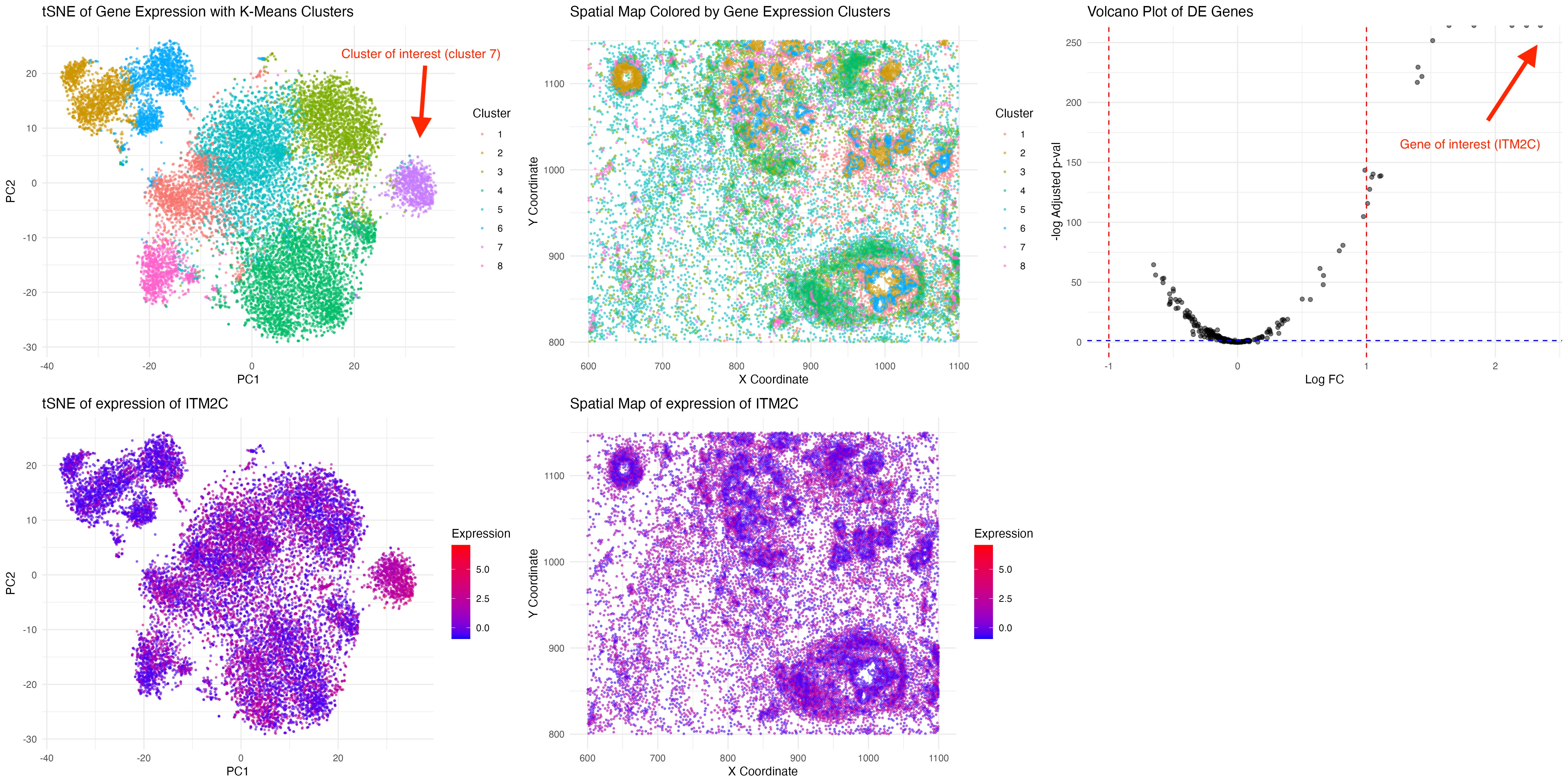
Here, we make a visualization consists of five panels:
-
tSNE plot, where each point represents a cell. Cells are color-coded by cluster assignment, with Cluster 7 distinctly highlighted, showing how it separates from other clusters in reduced-dimensional space. The cells are clustered by k-means clustering.
-
Spatial Distribution of Cluster 7, which maps the cells in physical spatial coordinates
-
Volcano Plot of Differentially Expressed genes in Cluster 7, showing log-fold change on the x-axis and statistical significance (-log10 adjusted p-value) on the y-axis. The strongest DE genes include ITM2C, MZB1, SEC11C, SLAMF7, and TENT5C.
-
tSNE of ITM2C Expression. The color gradient represents the intensity of ITM2C expression, highlighting that Cluster 7 is highly enriched for this gene.
-
Spatial Map of ITM2C Expression, suggesting cluster 7 cell types is more enriched and free flowing across the tissue.
Cluster 7 characterization
Cluster 7 is highly enriched for ITM2C (logFC=1.64, adjusted p-val=0). ITM2C has been associated with plasma cells, memory B cells, and neuronal differentiation. Together with other highly expressed genes including MZB1, SEC11C, SLAMF7 and TENT5C, it suggests that cluster 7 corresponds to plasma cells, which are terminally differentiated B cells responsible for antibody production. Plasma cells usually localized in bone marrow or lymphoid tissues, which correspond to the diffused spatial expression pattern [1].
[1] Pilcher, W., Thomas, B. E., Bhasin, S. S., Jayasinghe, R. G., Yao, L., Gonzalez-Kozlova, E., … & Bhasin, M. (2023). Cross center single-cell RNA sequencing study of the immune microenvironment in rapid progressing multiple myeloma. npj Genomic Medicine, 8(1), 3.
Code (paste your code in between the ``` symbols)
1
2
3
4
5
6
7
8
9
10
11
12
13
14
15
16
17
18
19
20
21
22
23
24
25
26
27
28
29
30
31
32
33
34
35
36
37
38
39
40
41
42
43
44
45
46
47
48
49
50
51
52
53
54
55
56
57
58
59
60
61
62
63
64
65
66
67
68
69
70
71
72
73
74
75
76
77
78
79
80
81
82
83
84
85
86
87
88
library(ggplot2)
library(ggpubr)
library(dplyr)
library(cluster)
library(scales)
library(Rtsne)

file <- "/Users/sky2333/Downloads/genomic-data-visualization-2025/data/pikachu.csv"
data <- read.csv(file)

gene_expr <- data[, 7:ncol(data)]
sample_names <- rownames(gene_expr)
gene_names <- colnames(gene_expr)

gene_expr <- t(apply(log1p(gene_expr / rowSums(gene_expr) * 1e6), 1, scale))
rownames(gene_expr) <- sample_names
colnames(gene_expr) <- gene_names

#pca_result <- prcomp(gene_expr, center = TRUE, scale. = TRUE)
pca_result <- Rtsne(gene_expr, perplexity = 30, theta = 0.5, dims = 2, pca = TRUE, verbose = TRUE)

data$PC1 <- pca_result$Y[, 1]
data$PC2 <- pca_result$Y[, 2]

k <- 8
kmean_result <- kmeans(gene_expr, centers = k, nstart = 25)

data$Cluster <- as.factor(kmean_result$cluster)

pca_plot <- ggplot(data, aes(x = PC1, y = PC2, color = Cluster)) +
    geom_point(alpha = 0.5, size = 0.5) +
    scale_color_manual(values = hue_pal()(k)) +
    labs(title = "tSNE of Gene Expression with K-Means Clusters", x = "PC1", y = "PC2", color = "Cluster") +
    theme_minimal()

spatial_plot <- ggplot(data, aes(x = aligned_x, y = aligned_y, color = Cluster)) +
    geom_point(alpha = 0.5, size = 0.5) +
    scale_color_manual(values = hue_pal()(k)) +
    labs(title = "Spatial Map Colored by Gene Expression Clusters", x = "X Coordinate", y = "Y Coordinate", color = "Cluster") +
    theme_minimal()


cluster_interest <- "7"
genes_pvals <- sapply(gene_names, function(gene) {
    wilcox.test(
        gene_expr[data$Cluster == cluster_interest, gene],
        gene_expr[data$Cluster != cluster_interest, gene]
    )$p.value
})

genes_pvals_adj <- p.adjust(genes_pvals, method = "fdr")

logFC <- apply(gene_expr, 2, function(gene) {
    mean(gene[data$Cluster == cluster_interest]) - mean(gene[data$Cluster != cluster_interest])
})

de_genes <- data.frame(Gene = gene_names, p_value = genes_pvals, adj_p_value = genes_pvals_adj, logFC = logFC)

volcano_plot <- ggplot(de_genes, aes(x = logFC, y = -log10(adj_p_value))) +
    geom_point(alpha = 0.5) +
    geom_vline(xintercept = c(-1, 1), linetype = "dashed", color = "red") +
    geom_hline(yintercept = -log10(0.05), linetype = "dashed", color = "blue") +
    theme_minimal() +
    labs(title = "Volcano Plot of DE Genes", x = "Log FC", y = "-log Adjusted p-val")


top_genes <- arrange(filter(de_genes, adj_p_value < 0.05 & abs(logFC) > 1), adj_p_value)
selected_gene <- top_genes$Gene[1]

pca_gene_plot <- ggplot(data, aes(x = PC1, y = PC2, color = gene_expr[, selected_gene])) +
    geom_point(alpha = 0.5, size = 0.5) +
    scale_color_gradient(low = "blue", high = "red") +
    labs(title = paste("tSNE of expression of", selected_gene), x = "PC1", y = "PC2", color = "Expression") +
    theme_minimal()

spatial_gene_plot <- ggplot(data, aes(x = aligned_x, y = aligned_y, color = gene_expr[, selected_gene])) +
    geom_point(alpha = 0.5, size = 0.5) +
    scale_color_gradient(low = "blue", high = "red") +
    labs(title = paste("Spatial Map of expression of", selected_gene), x = "X Coordinate", y = "Y Coordinate", color = "Expression") +
    theme_minimal()

final_plot <- ggarrange(
    pca_plot, spatial_plot, volcano_plot, pca_gene_plot, spatial_gene_plot,
    ncol = 3, nrow = 2,
    heights = c(6, 6, 6.2)
)

ggsave("plot.jpeg", final_plot, width = 20, height = 10, dpi = 300)