HW3: Identifying and analysing cluters via K-means and dimensionality reduction

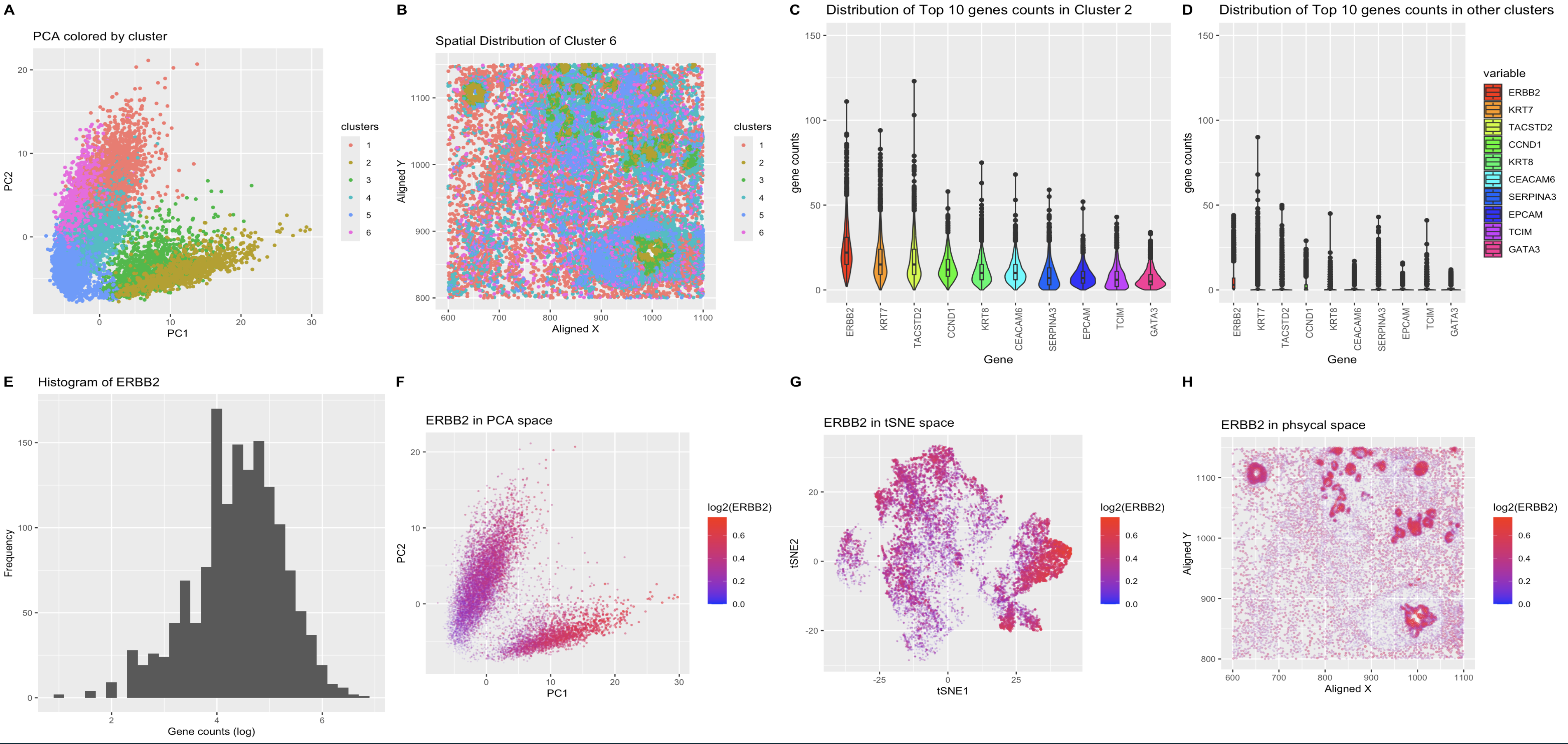
What’s in the figure?
- A: Results of K-means clustering of the cells plotted in the reduced dimensional space using PCA. The cells are color coded by the cluster they belong to. The cluster of interest is shown as the 2. The data was log transformed before applying PCA for better visualization and the first two principal components are plotted.
- B: Spatial distribution of the cells color coded by the cluster they belong to. Cells are then plotted in original spatial coordianation to see if they also spatially cluster. It appears that they do generally follow the underlying physical structure of the cells and cell groups.
- C: Top 10 highly expressive genes for the cluster of interest. Each column resprents the histogram of the count of the specific gene noted. The columns are ordered by the total count in our cluster of interest.
- D: Same as C but it shows the same 10 genes found in the cluster of interest in all other clusters. y-axis are aligned to the same scale for better comparison. It is clear that these genes are dustuctly different in distribution in the cluster of interest compared to other clusters.
- E: Histogram of ERBB2 (log transformed). ERBB2 is the most highly expressed gene in the cluster of interest. The histogram shows the distribution which is relatively normal after the transformation; this is shown as the justification for the t-test analysis, which assumes normal distribution of the data. The t-test and Wilcoxon rank sum test were performed to test the hypothesis that the mean of ERBB2 expression in the cluster of interest is different from the rest of the clusters. The p-values are less than 2.2e-16 for both tests, which indicates that the mean of ERBB2 expression in the cluster of interest is significantly different from the rest of the clusters.
1
2
3
4
5
6
7
8
9
10
	Welch Two Sample t-test

data:  df_cluster_c[top_gene_cluster_c] and df_others[top_gene_cluster_c]
t = 47.737, df = 2852.8, p-value < 2.2e-16
alternative hypothesis: true difference in means is not equal to 0
95 percent confidence interval:
 12.26125 13.31165
sample estimates:
mean of x mean of y
17.071848  4.285397
1
2
3
4
5
6

	Wilcoxon rank sum test with continuity correction

data:  unlist(df_cluster_c[top_gene_cluster_c]) and unlist(df_others[top_gene_cluster_c])
W = 33587004, p-value < 2.2e-16
alternative hypothesis: true location shift is not equal to 0
- F: ERBB2 expression in the reduced dimensional space using PCA. The cells are color coded by the expression level of ERBB2. Note that the most highly expressed in ERBB2 do correspond to the cluster of interest, which is the cluster 2 in the PCA plot A.
- G: Same as F but the genes are plotted in tSNE space. EBRR2 do seem to form cluster in this space as well, but the separation is not as clear as in PCA space.
- H: ERBB2 expression in the spatial space. ERBB2 distribution does appear to follow the underlying structure of the cells, which indicates that the gene maybe a characteristic gene for a specific cell type.
About ERBB2
The ErbB/HER family of receptor tyrosine kinases consists of four cell surface glycoproteins. These receptors play a fundamental role in the development, proliferation, and differentiation of epithelial, mesenchymal, and neuronal tissues; however overexpression, amplification, and activating point mutations of these receptors promote oncogenesis [1]. ErbB2 amplification or overexpression is observed in ~25–30% of breast cancers [1] and is associated with an aggressive clinical phenotype. This is consistent with the fact that this data was obtained from breast cancer cell. The high expression of ERBB2 in the cluster of interest may indicate that the cluster is a cancerous cell type.
About KRT7
Keratin 7 (KRT7), also known as cytokeratin-7 (CK-7) or K7, constitutes the principal constituent of the intermediate filament cytoskeleton and is primarily expressed in the simple epithelia lining the cavities of the internal organs, glandular ducts, and blood vessels. Various pathological conditions, including cancer, have been linked to the abnormal expression of KRT7. KRT7 overexpression promotes tumor progression and metastasis in different human cancers, although the mechanisms of these processes caused by KRT7 have yet to be established.[2] As this gene is also highly expressed in the cluster of interest, this cell type may be a cancerous cell type and may be related to cancer along with the ERBB2 expression.
About TACSTD2
TACSTD2 (tumor-associated calcium signal transducer 2) encodes a transmembrane glycoprotein Trop2 commonly overexpressed in carcinomas. While the Trop2 protein was discovered already in 1981 and first antibody–drug conjugate targeting Trop2 were recently approved for cancer therapy, the physiological role of Trop2 is still not fully understood. [3] TACSTD2 gene expression was seen in all breast cancer subtypes, and correlated with the expression of genes involved in cell epithelial transformation, adhesion, and proliferation, which contribute to tumor growth [3], which also strengthen the hypothesis that the cluster of interest is a cancerous cell type.
Reference
[1] Joshi, S.K., Keck, J.M., Eide, C.A. et al. ERBB2/HER2 mutations are transforming and therapeutically targetable in leukemia. Leukemia 34, 2798–2804 (2020). https://doi.org/10.1038/s41375-020-0844-7 [2] Hosseinalizadeh, H., Hussain, Q.M., Poshtchaman, Z., Ahsan, M., Amin, A.H., Naghavi, S., & Mahabady, M.K. Emerging insights into keratin 7 roles in tumor progression and metastasis of cancers. Frontiers in Oncology, 13, 2024. https://doi.org/10.3389/fonc.2023.1243871
1
2
3
4
5
6
7
8
9
10
11
12
13
14
15
16
17
18
19
20
21
22
23
24
25
26
27
28
29
30
31
32
33
34
35
36
37
38
39
40
41
42
43
44
45
46
47
48
49
50
51
52
53
54
55
56
57
58
59
60
61
62
63
64
65
66
67
68
69
70
71
72
73
74
75
76
77
78
79
80
81
82
83
84
85
86
87
88
89
90
91
92
93
94
95
96
97
98
99
100
101
102
103
104
105
106
107
108
109
110
111
112
113
114
115
116
117
118
119
library(gridExtra)
library(ggplot2)
library(stats)
library(reshape2)
library(patchwork)
library(glue)
library(rlang)
library(Rtsne)
library(MASS)
library(ggpubr)
library(cowplot)

# Change this to your local directory where the data is stored
file <- 'pikachu.csv.gz'
data <- read.csv(file, row.names=1)

gexp <- data[, 7:ncol(data)]
# log transform the gexp data
log_gexp <- log2(gexp+1)

# PCA
pca <- prcomp(log_gexp, scale=TRUE)

# tSNE
emb <- Rtsne(log_gexp, dims=3, pca = TRUE, perplexity=30, verbose=FALSE)

# change the column name to tSNE1, tSNE2, and tSNE3
colnames(emb$Y) <- c("tSNE1", "tSNE2", "tSNE3")

# perform kmeans clustering
df <- cbind(data, pca$x, emb$Y)

k <- 6
# k-means clustering on the original data
kmeans_orig <- kmeans(log_gexp, centers=k)
df$clusters <- as.factor(kmeans_orig$cluster)

c <- 2
# slice out the cluster c=3 and others
df_cluster_c <- df[df$clusters == c,]
df_others <- df[df$clusters != c,]

# A panel visualizing your one cluster of interest in reduced dimensional space (PCA, tSNE, etc)
g1 <- ggplot(df) + geom_point(aes(x=PC1, y=PC2, color=clusters), size=1) + ggtitle("Kmean cluster in PCA space") + theme(aspect.ratio=1.0) + xlab("PC1") + ylab("PC2") + theme(text = element_text(size=10)) #+ theme(legend.position="none")

# visulaize the clusters on tSNE1 and tSNE2
g1.1 <- ggplot(df) + geom_point(aes(x=tSNE1, y=tSNE2, color=clusters), size=1) + ggtitle("tSNE colored by cluster") + theme(aspect.ratio=1.0) + xlab("tSNE1") + ylab("tSNE2") + theme(text = element_text(size=15)) #+ theme(legend.position="none")

# A panel visualizing your one cluster of interest in physical space
g2 <- ggplot(df) + geom_point(aes(x=aligned_x, y=aligned_y, color=clusters), size=1) + ggtitle("Spatial Distribution of Cluster 6") + theme(aspect.ratio=1.0) + xlab("Aligned X") + ylab("Aligned Y") + theme(text = element_text(size=10))

# A panel visualizing differentially expressed genes for your cluster of interest.
# Find the top10 genes for cluster c
top10_genes_cluster_c <- names(sort(colMeans(df_cluster_c[,7:ncol(gexp)]), decreasing=TRUE)[1:10])
print(top10_genes_cluster_c)
# grab the first
top_gene_cluster_c <- top10_genes_cluster_c[1]
sprintf("The highest gene counts in cluster %s :",c)
print(top_gene_cluster_c) #"ERBB2"
# Slice df_cluster_c to only include the top10 genes
df_top10_genes_cluster_c <- df_cluster_c[,top10_genes_cluster_c]
# add the first 6 columns to the data frame
df_top10_genes_cluster_c <- cbind(df_cluster_c[,1:6], df_top10_genes_cluster_c)
# Reshape data to long format
df_top10_genes_cluster_c_long <- melt(df_top10_genes_cluster_c[,7:ncol(df_top10_genes_cluster_c)])

# Create the violin plot
g3 <- ggplot(df_top10_genes_cluster_c_long, aes(x = variable, y = value, fill = variable)) +
  geom_violin() +
  theme(axis.text.x = element_text(angle = 90, hjust = 1)) +
  labs(title = glue("Distribution of Top 10 genes counts in Cluster {c}"), x = "Gene", y = "gene counts") +
  scale_fill_manual(values = rainbow(length(unique(df_top10_genes_cluster_c_long$variable)))) +
  geom_boxplot(width=0.1) +
  coord_cartesian(ylim = c(0, 150)) + theme(legend.position="none")

# do the same for the top 10 genes in the other clusters
df_others_top10_genes <- df_others[,top10_genes_cluster_c]
df_others_top10_genes_long <- melt(df_others_top10_genes)
g4 <- ggplot(df_others_top10_genes_long, aes(x = variable, y = value, fill = variable)) +
  geom_violin() +
  theme(axis.text.x = element_text(angle = 90, hjust = 1)) +
  labs(title = "Distribution of Top 10 genes counts in other clusters", x = "Gene", y = "gene counts") +
  scale_fill_manual(values = rainbow(length(unique(df_others_top10_genes_long$variable)))) +
  geom_boxplot(width=0.1) +
  coord_cartesian(ylim = c(0, 150))

# We focus on "" gene as the most differentially expressed gene
# Test this hypothesis by t-test and wilcox test
# First, plot a histogram of the top gene in cluster c
# Cube Root Transformation
df[[top_gene_cluster_c]] <- sign(df[[top_gene_cluster_c]]) * abs(df[[top_gene_cluster_c]])^(1/3)

g5.0 <- ggplot(df_cluster_c) + geom_histogram(aes(x = log2(!!sym(top_gene_cluster_c)))) + ggtitle(glue("Histogram of {top_gene_cluster_c}")) + theme(aspect.ratio=1.0) + xlab("Gene counts (log)") + ylab("Frequency") + theme(text = element_text(size=10))

# t-test
ttest <- t.test(df_cluster_c[top_gene_cluster_c], df_others[top_gene_cluster_c])
print(ttest)
# wilcox test
wilcox <- wilcox.test(unlist(df_cluster_c[top_gene_cluster_c]), unlist(df_others[top_gene_cluster_c]))
print(wilcox)

# A panel visualizing one of these genes in reduced dimensional space (PCA, tSNE, etc)
# plot the PCA colored by the top gene if cluster 6 in shades of red, and the rest in shades of blue
g5 <- ggplot(df) +  geom_point(aes(x=PC1, y=PC2, colour=log2(!!sym(top_gene_cluster_c))), size=log(df$ERBB2), alpha=log(df$ERBB2)) + ggtitle(glue("{top_gene_cluster_c} in PCA space")) + theme(aspect.ratio=1.0) + xlab("PC1") + ylab("PC2") + theme(text = element_text(size=10)) + scale_color_gradient(low = "blue", high = "red")

# do the same in tSNE
g6 <- ggplot(df) + geom_point(aes(x=tSNE1, y=tSNE2, color=log2(!!sym(top_gene_cluster_c))), size=log2(df$ERBB2), alpha=log2(df$ERBB2)) + ggtitle(glue("{top_gene_cluster_c} in tSNE space")) + theme(aspect.ratio=1.0) + xlab("tSNE1") + ylab("tSNE2") + theme(text = element_text(size=10)) + scale_color_gradient(low = "blue", high = "red")

# A panel visualizing one of these genes in space
g7 <- ggplot(df) + geom_point(aes(x=aligned_x, y=aligned_y, color= log2(!!sym(top_gene_cluster_c))), size=log2(df$ERBB2), alpha=log(df$ERBB2),) + ggtitle(glue("{top_gene_cluster_c} in phsycal space")) + theme(aspect.ratio=1.0) + xlab("Aligned X") + ylab("Aligned Y") + theme(text = element_text(size=10)) + scale_color_gradient(low = "blue", high = "red")

# Arrange plots in a grid with labels
combined_plot <- plot_grid(g1, g2, g3, g4, g5.0, g5, g6, g7,
                           labels = c("A", "B", "C", "D", "E", "F", "G", "H"),
                           ncol = 4,
                           label_size = 14)

print(combined_plot)