Cluster characterization in spatial transcriptomics

Homework 3
Figure description
Here, I am analyzing an imaging-based spatial transcriptomics dataset. To account for the fact that cells can have different sequencing depths, data was normalized: raw counts were divided by total cell counts, multiplied by the scale factor 10000 and the result was log transformed. Likewise, data was scaled to prevent genes with the highest mean from contributing the most to the variabliity. PCA was performed to reduce the dimensionality of the dataset by eliminating the effect of gene correlation. Then, k-means was used to find clusters of cells, using PCs as input. Lastly, t-SNE was used for visual purposes and calculated using PCs as input, were cells with similar transcriptome appear together.
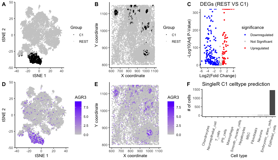
To further understand the tissue, cluster 1 was chosen and characterized. Panel A shows cells and their coordinates in the 1st and 2nd dimensions of the reduced space; highlighting C1 with a distinct color hue. Panel B shows the spatial location of C1 cells which most likely correspond to an specific cell type.
To identify the disctinct features of C1, differentially expressed genes (DEGS) were calculated. A two-sided Wilcoxon-test for each gene was performed comparing cells from C1 vs the REST, using normalized data. This followed by Benjamini Hochberg FDR for multiple test correction. All DEGs having padj<0.05 and abs(log2FC)>0.5 are shown in Panel C. Gene “AGR3” had the smallest padj and a logFC of 3.52. Panel D and Panel E show the normalized expression values of gene “AGR3” for every cell in the t-SNE coordinates and their spatial location.
As a last step, SingleR (Dvir Aran, 2019) package was used to label cells based on their normalized gene expression data using the Human Primary Cell Atlas as a reference panel. Panel F depicts the predicted cell-type frequency across C1 cells. As a verification step, the top “upregulated genes” (e.g. CEACAM8, AGR3, ELF3, C6orf132) were looked up in “THE HUMAN PROTEIN ATLAS” (https://www.proteinatlas.org/) and they were indeed upregulated in epithelial cells.
Code
1
2
3
4
5
6
7
8
9
10
11
12
13
14
15
16
17
18
19
20
21
22
23
24
25
26
27
28
29
30
31
32
33
34
35
36
37
38
39
40
41
42
43
44
45
46
47
48
49
50
51
52
53
54
55
56
57
58
59
60
61
62
63
64
65
66
67
68
69
70
71
72
73
74
75
76
77
78
79
80
81
82
83
84
85
86
87
88
89
90
91
# - Import libraries
library(ggplot2)
library(tidyverse)
library(cowplot)
library(patchwork)
library(Rtsne)
library(DESeq2)
library(SingleR); library(celldex); library(biomaRt)

# - Read data
file <- '/Users/kmlanderos/Documents/Johns_Hopkins/Spring_2025/Genomic_Data_Visualization/genomic-data-visualization-2025/data/pikachu.csv.gz'
data <- read.csv(file, row.names=1)
gexp<-data[,6:ncol(data)]
set.seed(100)

# - Normalize and scale data first
norm_data<-log2(10000*gexp/rowSums(gexp) + 1)
scaled_data<-scale(norm_data)

# - PCA
pca <- prcomp(scaled_data)

<How to choose PCs?: Elbow PLOT>
<How to choose k-means?>

# - K means
k=7
res<-kmeans(pca$x[,1:15], centers=k)
clusters<- as.factor(res$cluster)
# - t-SNE
tsne <- Rtsne(pca$x[,1:15])

popo <- data.frame(data$cell_id, clusters, X_coord=data$aligned_x, Y_coord=data$aligned_y, pca$x[,1:3], tSNE_1= tsne$Y[,1], tSNE_2= tsne$Y[,2])
ggplot(popo, aes(x=tSNE_1, y=tSNE_2, color=clusters)) + geom_point(size=0.1)

# - DEGs
cluster <- 1
condition1_cells <- names(clusters)[clusters == cluster]
condition2_cells <- names(clusters)[clusters != cluster]
# Test all genes
cluster_comparisons <- sapply(1:ncol(norm_data), function(i){
  gene<-colnames(norm_data)[i]
  out <- wilcox.test(norm_data[condition1_cells,i], norm_data[condition2_cells,i], alternative='two.sided'); res <- out$p.value; names(res) <- gene
  res
})
genes_df<-data.frame(clust_mean=colMeans(norm_data[condition1_cells,]), rest_mean=colMeans(norm_data[condition2_cells,]), log2FC=log2(colMeans(norm_data[condition1_cells,])/colMeans(norm_data[condition2_cells,])), p_value=cluster_comparisons, p_adj=p.adjust(cluster_comparisons, method = "BH")) %>% mutate(
    log_p_adj=-log10(p_adj),
    significance = case_when(
      log2FC > 0.50 & p_value < 0.05 ~ "Upregulated",
      log2FC < -0.50 & p_value < 0.05 ~ "Downregulated",
      TRUE ~ "Not Significant"
    )
  )

# Run SingleR
ref <- celldex::HumanPrimaryCellAtlasData() # Load reference (Human Primary Cell Atlas)
singleR_results <- SingleR(test = t(norm_data), ref = ref, labels = ref$label.main)

# - Plots
# Data Frame
df <- data.frame(data$cell_id, clusters, X_coord=data$aligned_x, Y_coord=data$aligned_y, pca$x[,1:3], tSNE_1= tsne$Y[,1], tSNE_2= tsne$Y[,2], celltype_singleR=singleR_results$labels) %>% mutate(Group = case_when(
      clusters == 1 ~ "C1",
      clusters != 1 ~ "REST"
    ))

# Plot Panel A
p1<-ggplot(df, aes(x=tSNE_1, y=tSNE_2, color=Group)) + geom_point(size=0.1) + scale_color_manual(values = c("C1" = "black", "REST" = "gray80")) + labs(x="tSNE 1", y="tSNE 2") + theme_classic()
# Plot Panel B
p2<-ggplot(df, aes(x=X_coord, y=Y_coord, color=Group)) + scale_color_manual(values = c("C1" = "black", "REST" = "gray80")) +
labs(x="X coordinate", y="Y coordinate") + geom_point(size=0.1) + theme_classic()
# Plot Panel C
p3<-ggplot(genes_df, aes(x=log2FC, y=log_p_adj, color=significance)) + geom_point(size=1) + scale_color_manual(values = c("Upregulated" = "red", "Downregulated" = "blue", "Not Significant" = "gray80")) +
  labs(title = "DEGs (REST VS C1)",
       x = "Log2(Fold Change)",
       y = "-Log10(Adj P-Value)") + theme_classic()
# Plot Panel D
gene <- genes_df %>% arrange(p_value) %>% head(1) %>% rownames()
p4<-ggplot(df, aes(x=tSNE_1, y=tSNE_2, color=norm_data[,gene])) + geom_point(size=0.1) +
scale_colour_gradient(low = "gray80", high = "#5800FF") + labs(x="tSNE 1", y="tSNE 2", color=gene) + theme_classic()
# Plot Panel E
p5<-ggplot(df, aes(x=X_coord, y=Y_coord, color=norm_data[,gene])) + geom_point(size=0.1) + scale_colour_gradient(low = "gray80", high = "#5800FF") +
labs(x="X coordinate", y="Y coordinate", color=gene) + theme_classic()
# Plot Panel F
p6<-ggplot(df, aes(x=tSNE_1, y=tSNE_2, color=celltype_singleR)) + geom_point(size=0.1) + labs(x="tSNE 1", y="tSNE 2", color="Cell type") + theme_classic()

ct_df <- df %>% filter(clusters == 1) %>% pull(celltype_singleR) %>% table() %>% sort() %>% reshape2::melt(); colnames(ct_df) <- c('Celltype','cells')
p6<-ggplot(ct_df, aes(x=Celltype, y=cells)) + geom_bar(stat="identity") + labs(x="Cell type", y="# of cells", color="Cell type", title="SingleR C1 celltype prediction") + theme_classic()+ theme(axis.text.x = element_text(angle = 75, vjust = 0.5, hjust=0.5))
genes_df %>% filter(p_adj<0.05) %>% arrange(desc(log2FC)) %>% head()

# Plot all Figures
plot_grid(p1, p2, p3, p4, p5, p6, labels = "AUTO")