Hw3: PCA and Spatial analysis for One Cluster

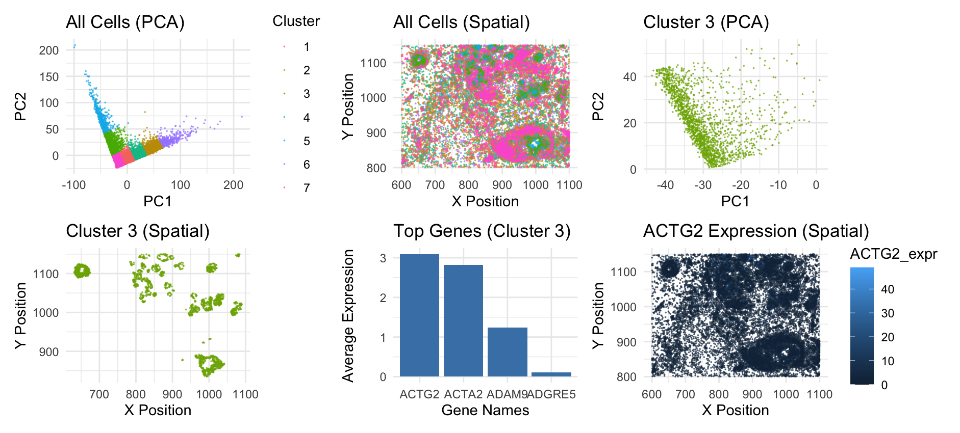
This panel outlines the PCA and spatial analysis for the Pikachu dataset. The first two graphs are from my previous homework, and they give the big picture. Graph 1 shows all the cells in the PCA space, with 7 clusters. Graph 2 shows all the cells in the spatial space, and displays how the clusters of cells are seen in the tissue sample. Graph 3 hones in on just cluster 3 in the PCA space. Graph 4 shows cluster 3, spatially. Here, we can see that these cells generally form rings or other structures, indicating that they might be of the same cell type. I looked into which genes are averagely expressed the most in this cluster and showed the top 4 as a bar graph. The top gene, ACTG2, codes for acting, a protein that helps muscles contract. This gene is specifically found in enteric tissue, which makes me believe that this tissue sample is from the stomach. I didn’t graph the top gene ACTG2 in the PCA space because this data was already one-dimensional so there was no need to do dimensionality reduction on it. However, I did visualize the all the cells spatially with visual channel of saturation to show how much the top gene ACTG2 is expressed in cells. We can see that it is 0 or close to 0 in cells outside of cluster 3. If you look carefully, you can see that some cells near the top and bottom where cluster 3 is are lighter blue, indicating expression.
Source: https://www.ncbi.nlm.nih.gov/gene/72
5. Code (paste your code in between the ``` symbols)
1
2
3
4
5
6
7
8
9
10
11
12
13
14
15
16
17
18
19
20
21
22
23
24
25
26
27
28
29
30
31
32
33
34
35
36
37
38
39
40
41
42
43
44
45
46
47
48
49
50
51
52
53
54
55
56
57
58
59
60
61
62
63
64
65
66
67
68
69
70
71
72
73
74
75
76
77
78
79
80
81
82
83
84
85
86
87
88
89
90
91
92
93
94
95
96
97
98
99
100
101
102
103
104
105
106
107
108
109
110
111
112
113
114
115
116
117
118
119
120
121
file <- '/Users/anishkabhartiya/Desktop/genomic-data-visualization-2025/data/pikachu.csv.gz'
data <- read.csv(file)
data[1:5, 1:10]

area <- data[, 3:4]
pos <- data[, 5:6]
rownames(pos) <- data$barcode
head(pos)
gexp <- data[, 7:ncol(data)]
rownames(gexp) <- data$barcode
gexp[1:5,1:5]
dim(gexp)

norm <- gexp / log10(data$cell_area+1) * 3
norm[1:5, 1:5]

pcs <- prcomp(norm)
set.seed(1)


pca_df <- data.frame(
  PC1 = pcs$x[,1],
  PC2 = pcs$x[,2],
  X = data[,5],
  Y = data[,6]
)

clusters <- kmeans(pca_df[,1:2], centers = 7)$cluster


pca_df$Cluster <- as.factor(clusters)
pca_df_filtered <- pca_df[pca_df$Cluster == "3", ]
cellsOfInterest <- rownames(pca_df)[pca_df$Cluster == "3"]
otherCells <- rownames(pca_df)[pca_df$Cluster != "3"]

results <- sapply(1:ncol(gexp), function(i) {
  genetest <- gexp[,i]
  names(genetest) <- rownames(gexp)

  out <- t.test(genetest[cellsOfInterest], genetest[otherCells], alternative = 'two.sided')
  out$p.value
})

names(results) <- colnames(gexp)
sorted_pvals <- sort(results)
top_4_genes <- names(sorted_pvals)[1:4]
head(top_4_genes)

sig_genes_expr <- gexp[, top_4_genes]
avg_expr <- apply(sig_genes_expr[cellsOfInterest, ], 2, mean)

bar_data <- data.frame(
  Gene = names(avg_expr),
  Expression = avg_expr
)

bar_data <- bar_data[order(-bar_data$Expression), ]

library(ggplot2)
library(patchwork)

g1 <- ggplot(pca_df, aes(x = PC1, y = PC2, color = Cluster)) +
  geom_point(alpha = 0.6, size=0.01) +
  labs(title = "All Cells (PCA)",
       x = "PC1",
       y = "PC2") +
  theme_minimal()

g2 <- ggplot(pca_df, aes(x = X, y = Y, color = Cluster)) +
  geom_point(alpha = 0.6, size=0.01) +
  labs(title = "All Cells (Spatial)",
       x = "X Position",
       y = "Y Position") +
  theme_minimal() +
  theme(legend.position = "none")

g3 <- ggplot(pca_df_filtered, aes(x = PC1, y = PC2, color = Cluster)) +
  geom_point(alpha = 0.6, size=0.01, color = '#7CAE00') +
  labs(title = "Cluster 3 (PCA)",
       x = "PC1",
       y = "PC2") +
  theme_minimal() +
  theme(legend.position = "none")

g4 <- ggplot(pca_df_filtered, aes(x = X, y = Y, color = Cluster)) +
  geom_point(alpha = 0.6, size=0.01, color = '#7CAE00') +
  labs(title = "Cluster 3 (Spatial)",
       x = "X Position",
       y = "Y Position") +
  theme_minimal() +
  theme(legend.position = "none")

sig_genes_expr <- gexp[, significant_genes]
avg_expr <- apply(sig_genes_expr[cellsOfInterest, ], 2, mean)

bar_data <- data.frame(
  Gene = names(avg_expr),
  Expression = avg_expr
)

g5 <- ggplot(bar_data[1:4, ], aes(x = reorder(Gene, -Expression), y = Expression)) +
  geom_bar(stat = "identity", fill = "steelblue") +
  labs(title = "Top Genes (Cluster 3)",
       x = "Gene Names",
       y = "Average Expression") +
  theme_minimal()

actg2_expr <- gexp[,"ACTG2"]
pca_df$ACTG2_expr <- actg2_expr

pca_df$Y <- pos[, 2]

g6 <- ggplot(pca_df, aes(x = X, y = Y, color = ACTG2_expr)) +
  geom_point(alpha = 0.6, size = 0.001) +
  labs(title = "ACTG2 Expression (Spatial)",
       x = "X Position",
       y = "Y Position") +
  theme_minimal()


print(g1 + g2 + g3 + g4 + g5 + g6)