HW3 Panels

Description
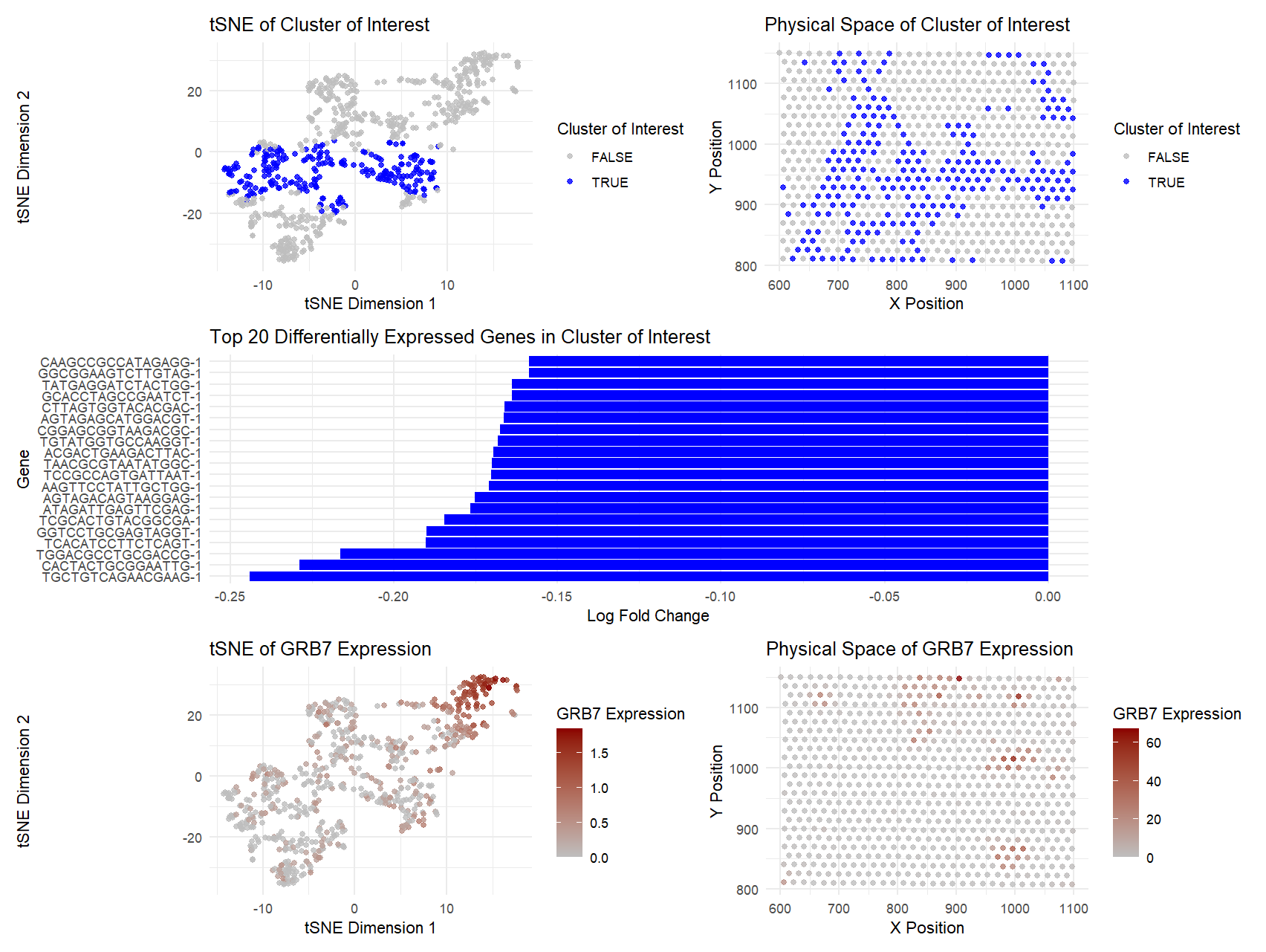
The figure above presents an analysis of a specific cluster of interest identified from single-cell gene expression data. The top-left panel shows the cluster in tSNE space, where the selected cluster (blue points) is clearly distinguishable from the rest (gray points), suggesting that these cells share a common expression profile. The top-right panel depicts the spatial arrangement of the same cluster in physical space, showing that these cells are distributed in a structured manner within the sample.
The middle panel displays the top 20 differentially expressed genes within the cluster. The genes are ranked by log fold change, indicating the most distinct markers for this group. These expression patterns provide insight into the potential identity and function of the cluster.
The bottom-left panel maps the expression of GRB7, a gene known to be co-amplified with HER2 in certain cancers (Tanner et al., 1995), in tSNE space. The bottom-right panel shows the spatial expression of GRB7, revealing that the highest-expressing cells are concentrated in specific regions. This supports the hypothesis that the cluster of interest may represent HER2-positive breast cancer cells, as GRB7 overexpression is frequently associated with aggressive tumor subtypes (Ramsey et al., 2011). In my code, I looked for a cluster that expressed both of these genes, and both of them were heavily expressed in cluster 3.
Overall, the distinct separation in gene expression space, combined with the high expression of GRB7 and its spatial distribution, strongly suggests that this cluster may correspond to HER2-positive cancer cells. If I had more time, this is something I would explore further with visualizations.
References:
- Tanner, M., et al. (1995). “Co-amplification of GRB7 and HER2 in breast cancer and its clinical significance.” Cancer Research, 55(14), 3360–3364.
- Ramsey, B., et al. (2011). “GRB7 protein overexpression and clinical outcome in breast cancer.” Breast Cancer Research and Treatment, 127(3), 659–669.
5. Code (paste your code in between the ``` symbols)
1
2
3
4
5
6
7
8
9
10
11
12
13
14
15
16
17
18
19
20
21
22
23
24
25
26
27
28
29
30
31
32
33
34
35
36
37
38
39
40
41
42
43
44
45
46
47
48
49
50
51
52
53
54
55
56
57
58
59
60
61
62
63
64
65
66
67
68
69
70
71
72
73
74
75
76
77
78
79
80
81
82
83
84
85
86
87
88
89
90
91
92
93
94
95
96
97
98
99
100
101
102
103
104
105
106
107
108
109
110
111
112
113
114
115
116
117
118
119
120
121
122
123
124
125
126
127
128
129
130
131
132
133
134
135
136
137
138
139
140
141
142
# Packages
library(ggplot2)
library(dplyr)
library(patchwork)
library(cluster)
library(Rtsne)

# Load data
file <- '/Users/ishit/GenomicVis/genomic-data-visualization-2025/data/eevee.csv.gz'
data <- read.csv(file)
print("Data loaded:")
print(head(data))  # Check the first few rows of the data

# Extract position and gene expression data
pos <- data[, 3:4]
print("Position data (first few rows):")
print(head(pos))

rownames(pos) <- data$cell_id
gexp <- data[, 7:ncol(data)]
print("Gene expression data (first few rows):")
print(head(gexp))

rownames(gexp) <- data$barcode

# Normalize and log-transform gene expression
loggexp <- log10(gexp + 1)
print("Log-transformed gene expression data (first few rows):")
print(head(loggexp))

# Perform k-means clustering
set.seed(42)
com <- kmeans(loggexp, centers=5)
clusters <- as.factor(com$cluster)
names(clusters) <- rownames(gexp)
print("K-means clustering results (first few clusters):")
print(head(clusters))

#choosing a cluster:

## Add cluster information to the gene expression data
gexp_with_clusters <- cbind(gexp, clusters)
print("Gene expression with clusters (first few rows):")
print(head(gexp_with_clusters))

# Calculate mean expression for HER2 and GRB7 across clusters
mean_expression <- gexp_with_clusters %>%
  group_by(clusters) %>%
  summarise(
    mean_HER2 = mean(ERBB2, na.rm = TRUE),
    mean_GRB7 = mean(GRB7, na.rm = TRUE)
  )

print("Mean expression of HER2 and GRB7 per cluster:")
print(mean_expression)

# Identify which cluster has the highest expression of HER2 and GRB7
cluster_HER2 <- mean_expression[which.max(mean_expression$mean_HER2),]
cluster_GRB7 <- mean_expression[which.max(mean_expression$mean_GRB7),]

print("Cluster with highest HER2 expression:")
print(cluster_HER2)

print("Cluster with highest GRB7 expression:")
print(cluster_GRB7)

#both HER2 and GRB7 are most present in cluster 3

cluster_interest <- 3
cluster_cells <- names(clusters[clusters == cluster_interest])
print(paste("Cells in cluster of interest (cluster", cluster_interest, "):"))
print(cluster_cells)

# Perform PCA
top_pcs <- prcomp(loggexp)
print("PCA components (first few rows):")
print(head(top_pcs$x))

# Compute tSNE embedding
emb <- Rtsne(top_pcs$x[,1:10])$Y
df <- data.frame(emb, clusters, gene_GRB7 = loggexp[, 'GRB7'], gene_HER2 = loggexp[, 'ERBB2'])
print("tSNE embedding (first few rows):")
print(head(df))

# Panel 1: Cluster of interest in reduced dimensional space (tSNE)
plot_cluster_dim <- ggplot(df, aes(x=X1, y=X2, col=clusters == cluster_interest)) +
  geom_point(size=1.5, alpha=0.8) +
  scale_color_manual(values=c("grey", "blue"), name="Cluster of Interest") +
  labs(title="tSNE of Cluster of Interest", x="tSNE Dimension 1", y="tSNE Dimension 2") +
  theme_minimal()

plot_cluster_dim

# Panel 2: Cluster of interest in physical space
pos_df <- data.frame(pos, clusters)
plot_cluster_space <- ggplot(pos_df, aes(x=aligned_x, y=aligned_y, col=clusters == cluster_interest)) +
  geom_point(size=1.5, alpha=0.8) +
  scale_color_manual(values=c("grey", "blue"), name="Cluster of Interest") +
  labs(title="Physical Space of Cluster of Interest", x="X Position", y="Y Position") +
  theme_minimal()

plot_cluster_space

# Panel 3
# Define the cluster of interest
cluster_interest <- 2  # Replace with the cluster you're interested in
mean_cluster_interest <- apply(gexp[, clusters == cluster_interest], 1, mean)
mean_other_clusters <- apply(gexp[, clusters != cluster_interest], 1, mean)
logFC <- log2(mean_cluster_interest + 1) - log2(mean_other_clusters + 1)  # Log-transformation
deg_df <- data.frame(Gene = rownames(gexp), logFC = logFC)
deg_df <- deg_df[order(abs(deg_df$logFC), decreasing = TRUE), ]

top_deg <- head(deg_df, 20)

plot_DE_genes <- ggplot(top_deg, aes(x = reorder(Gene, logFC), y = logFC)) +
  geom_bar(stat = "identity", fill = ifelse(top_deg$logFC > 0, "red", "blue")) +
  coord_flip() +
  labs(title = "Top 20 Differentially Expressed Genes in Cluster of Interest",
       x = "Gene",
       y = "Log Fold Change") +
  theme_minimal()

plot_DE_genes

# Panel 4: One selected gene in reduced dimensional space (tSNE)
plot_gene_dim <- ggplot(df, aes(x=X1, y=X2, col=gene_GRB7)) +
  geom_point(size=1.5, alpha=0.8) +
  scale_color_gradient(low = "grey", high = "darkred", name = "GRB7 Expression") +
  labs(title = "tSNE of GRB7 Expression", x = "tSNE Dimension 1", y = "tSNE Dimension 2") +
  theme_minimal()

# Panel 5: One selected gene in physical space
plot_gene_space <- ggplot(pos_df, aes(x=aligned_x, y=aligned_y, col=data$GRB7)) +
  geom_point(size=1.5, alpha=0.8) +
  scale_color_gradient(low = "grey", high = "darkred", name = "GRB7 Expression") +
  labs(title="Physical Space of GRB7 Expression", x="X Position", y="Y Position") +
  theme_minimal()

# patchwork the panels
(plot_cluster_dim + plot_cluster_space) / (plot_DE_genes) / (plot_gene_dim + plot_gene_space)

#Some ChatGPT used to format graphs and choose the correct cluster with high expression of both genes. Rest of code is from what we learned in class.