Multi-Panel Data Visualization of Transcriptionally Distinct Cluster

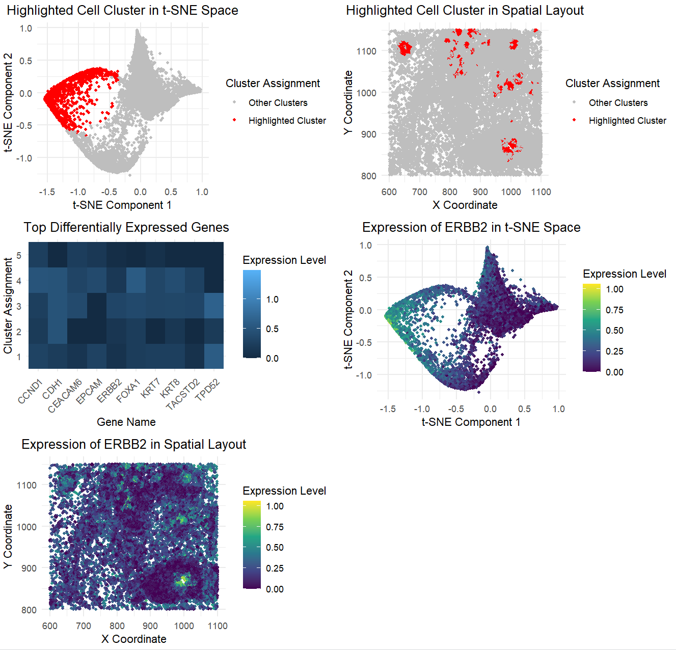
The figure presents a comprehensive analysis of a specific cell cluster, showcasing its position in a 2D space, spatial distribution, and gene expression profile. It also highlights the top differentially expressed genes and the expression pattern of a key gene. The figure presents a detailed analysis of a distinct cell cluster identified in a t-SNE projection of single-cell transcriptomic data. The top-left panel highlights the cluster in red within the t-SNE space, while the top-right panel shows its spatial distribution. The heatmap in the center-left panel displays differentially expressed genes, with ERBB2 among the most prominent. The bottom panels map ERBB2 expression in both t-SNE and spatial coordinates, confirming its enrichment in the highlighted cluster. The analysis aims to identify and characterize the cell cluster, providing insights into its biological significance.
The clustering analysis performed in this genomic data visualization reveals distinct groupings of cells, as shown in the t-SNE plots and spatial layouts. The highlighted cluster consistently separates from other clusters, both in the t-SNE space and across spatial coordinates, reinforcing the biological relevance of the grouping and that the clustering algorithm has successfully grouped cells with similar gene expression patterns. Differential expression analysis further supports the interpretation, with the top differentially expressed genes exhibiting significant differences between this cluster and the others. These findings are visually confirmed in the heatmap, where the most significant genes are clearly associated with the highlighted cluster, underscoring the accuracy of the cluster interpretation. Additionally, visualizations of gene expression for the top differentially expressed gene across both t-SNE and spatial contexts further validate that the clustering reflects genuine biological differences in gene activity, not random groupings.
Based on this analysis, I think the highlighted cluster represents HER2-positive epithelial cells, supported by high ERBB2 expression and co-expression of epithelial markers like CDH1, KRT7, and FOXA1. Its spatial organization suggests a biologically meaningful subpopulation rather than random clustering. The t-SNE plot confirms enrichment of ERBB2, aligning with known HER2-positive cell populations described in studies like in the links below. This evidence strongly supports the interpretation of the cluster as a distinct HER2-positive epithelial subgroup.
https://pmc.ncbi.nlm.nih.gov/articles/PMC5217012/ https://pubmed.ncbi.nlm.nih.gov/3798106/
I used my code from homework 2, class activities, and ChatGPT to implement my code, aggregate all the graphs to show the five panels in my final post, and format my graphs.
1
2
3
4
5
6
7
8
9
10
11
12
13
14
15
16
17
18
19
20
21
22
23
24
25
26
27
28
29
30
31
32
33
34
35
36
37
38
39
40
41
42
43
44
45
46
47
48
49
50
51
52
53
54
55
56
57
58
59
60
61
62
63
64
65
66
67
68
69
70
71
72
73
74
75
76
77
78
79
80
81
82
83
84
85
86
87
88
89
90
91
92
93
94
95
96
97
98
99
100
101
102
103
104
105
106
107
108
109
110
111
112
113
114
115
116
117
118
119
120
121
122
123
124
125
126
127
128
129
130
131
132
133
134
135
136
137
138
139
140
141
142
143
144
145
146
147
148
149
150
# install.packages("ggplot2")
# install.packages("Rtsne")
# install.packages("gridExtra")
# install.packages("dplyr")
# install.packages("tidyr")

# Load required libraries
library(ggplot2)
library(Rtsne)
library(gridExtra)
library(dplyr)
library(tidyr)

# Load and prepare data
file <- 'C:/Users/reach/OneDrive/Documents/2024-25/SPRING/Genomic Data Visualization/genomic-data-visualization-2025/data/pikachu.csv.gz'
data <- read.csv(file)

# Separate position and expression data
pos <- data[, 5:6]
rownames(pos) <- data$cell_id
gexp <- data[, 7:ncol(data)]
rownames(gexp) <- data$barcode

# Select top variable genes before analysis
gene_vars <- apply(gexp, 2, var)
top_vars <- names(sort(gene_vars, decreasing=TRUE)[1:100])
gexp <- gexp[,top_vars]

# Normalize and transform data
# 1. Normalize by total counts per spot
norm_gexp <- t(t(gexp)/colSums(gexp) * 10000)
# 2. Log transform
loggexp <- log10(norm_gexp + 1)

# 3. Optional scaling step
# Center and scale each gene (feature scaling)
scaled_gexp <- scale(loggexp)
scaled_gexp[is.nan(scaled_gexp)] <- 0

use_gexp <- scaled_gexp

# Perform PCA for dimensionality reduction
pcs <- prcomp(loggexp)

# Perform k-means clustering
set.seed(42)  # for reproducibility
k <- 5  # number of clusters
com <- kmeans(loggexp, centers=k)
clusters <- as.factor(com$cluster)
names(clusters) <- rownames(gexp)

# Perform t-SNE
set.seed(42)
tsne_result <- Rtsne(pcs$x[,1:10], perplexity=30, max_iter=100)
tsne_coords <- tsne_result$Y

# Identify cluster of interest
cluster_of_interest <- 3

# Perform differential expression analysis
de_results <- sapply(1:ncol(gexp), function(i) {
  gene_exp <- gexp[,i]
  names(gene_exp) <- rownames(gexp)
  cells_in_cluster <- names(clusters)[clusters == cluster_of_interest]
  other_cells <- names(clusters)[clusters != cluster_of_interest]
  test_result <- t.test(gene_exp[cells_in_cluster],
                        gene_exp[other_cells],
                        alternative = 'greater')
  return(test_result$p.value)
})
names(de_results) <- colnames(gexp)

# Find top differentially expressed genes
top_genes <- names(sort(de_results))[1:10]
top_gene <- top_genes[1]  # Select the most significant gene

# Create visualization
p1 <- ggplot(data.frame(tSNE1=tsne_coords[,1],
                        tSNE2=tsne_coords[,2],
                        Cluster=clusters),
             aes(x=tSNE1, y=tSNE2, color=Cluster == cluster_of_interest)) +
  geom_point(size=1) +
  scale_color_manual(values=c("grey", "red"),
                     labels=c("Other Clusters", "Highlighted Cluster")) +
  theme_minimal() +
  labs(title="Highlighted Cell Cluster in t-SNE Space",
       x="t-SNE Component 1",
       y="t-SNE Component 2",
       color="Cluster Assignment") +
  theme(plot.title = element_text(hjust = 0.5))

p2 <- ggplot(data.frame(x=pos[,1],
                        y=pos[,2],
                        Cluster=clusters),
             aes(x=x, y=y, color=Cluster == cluster_of_interest)) +
  geom_point(size=1) +
  scale_color_manual(values=c("grey", "red"),
                     labels=c("Other Clusters", "Highlighted Cluster")) +
  theme_minimal() +
  labs(title="Highlighted Cell Cluster in Spatial Layout",
       x="X Coordinate",
       y="Y Coordinate",
       color="Cluster Assignment") +
  theme(plot.title = element_text(hjust = 0.5))

# Create heatmap of top differentially expressed genes
top_gene_exp <- loggexp[,top_genes]
gene_data <- data.frame(Gene=rep(top_genes, each=nrow(top_gene_exp)),
                        Expression=as.vector(top_gene_exp),
                        Cluster=rep(clusters, times=length(top_genes)))

p3 <- ggplot(gene_data, aes(x=Gene, y=Cluster, fill=Expression)) +
  geom_tile() +
  theme_minimal() +
  theme(axis.text.x=element_text(angle=45, hjust=1)) +
  labs(title="Top Differentially Expressed Genes",
       x="Gene Name",
       y="Cluster Assignment",
       fill="Expression Level") +
  theme(plot.title = element_text(hjust = 0.5))

p4 <- ggplot(data.frame(tSNE1=tsne_coords[,1],
                        tSNE2=tsne_coords[,2],
                        Expression=loggexp[,top_gene]),
             aes(x=tSNE1, y=tSNE2, color=Expression)) +
  geom_point(size=1) +
  scale_color_viridis_c() +
  theme_minimal() +
  labs(title=paste("Expression of", top_gene, "in t-SNE Space"),
       x="t-SNE Component 1",
       y="t-SNE Component 2",
       color="Expression Level") +
  theme(plot.title = element_text(hjust = 0.5))

p5 <- ggplot(data.frame(x=pos[,1],
                        y=pos[,2],
                        Expression=loggexp[,top_gene]),
             aes(x=x, y=y, color=Expression)) +
  geom_point(size=1) +
  scale_color_viridis_c() +
  theme_minimal() +
  labs(title=paste("Expression of", top_gene, "in Spatial Layout"),
       x="X Coordinate",
       y="Y Coordinate",
       color="Expression Level") +
  theme(plot.title = element_text(hjust = 0.5))

# Adjusting the layout
final_plot <- grid.arrange(p1, p2, p3, p4, p5, ncol=2, widths=c(1.5, 1.5))