Locating fibroblasts in breast tissue using spatial transcriptomics data

Describe your figure briefly so we know what you are depicting (you no longer need to use precise data visualization terms as you have been doing).
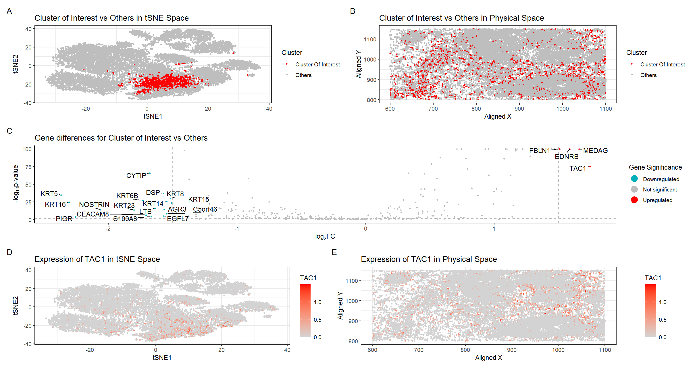
There are five plots in this figure.
Plot A shows the tSNE space with the 25 distinct clusters. Clusters were determined using the kmeans algorithm with k=25 clusters, the number of k determined by plotting total withinness over different k and finding the elbow in the plot.
Plot B shows the physical space located on the tissue with the cluster of interest in red and all other clusters in gray.
Plot C shows a volcano plot of the gene differences for the cluster of interest vs all other clusters. Here, genes in red are upregulated, genes in blue are downregulated, and genes in gray are not significant when taking into account p-values and a fold change greater than 1.5 or less than -1.5. The names of the top genes based on the thresholds mentioned are printed within the plot. Genes were determined to be significant based on their pvalue from the two-sided Wilcoxon Rank Sum test.
Plot D shows the tSNE space with the top gene found from DE analysis, TAC1, in the cluster of interest as a gradient from gray to red.
Plot E shows the physical space with TAC1 expression as a gradient from gray to red.
Write a description to convince me that your cluster interpretation is correct.
After some research, I’ve decided that my cluster of interest best corresponds to fibroblasts within the breast tissue sample. This is based on the expression of the top highly upregulated genes CCDC80 [1], CXCL12 [2], FBLN1 [3], IGF1 [5], MMP2 [4], LUM [6] identified with Wilcox, which are known to be the most highly expressed in fibroblasts. And the gene with the largest fold increase, TAC1, is also specifically upregulated in fibroblasts [7] . In addition to gene signatures, the visualization of this cluster in physical space supports the claim that this cluster represents fibroblasts. Plot C looks similar to immunohistochemical images of stromal fibroblasts in breast cancer tissues in literature, where the stromal cells surround the cancer nests and is distributed among the heterogenous cancer tissue. invasive cancer cells [8]. In conclusion, I believe my cluster of interest represents fibroblasts within the breast tissue sample.
[1] https://www.proteinatlas.org/ENSG00000091986-CCDC80/single+cell/breast
[2] https://www.proteinatlas.org/ENSG00000107562-CXCL12/single+cell/breast
[3] https://www.proteinatlas.org/ENSG00000077942-FBLN1/single+cell/breast
[4] https://www.proteinatlas.org/ENSG00000087245-MMP2/single+cell/breast
[5] https://www.proteinatlas.org/ENSG00000017427-IGF1/single+cell/breast
[6] https://www.proteinatlas.org/ENSG00000139329-LUM/single+cell/breast
[7] https://www.proteinatlas.org/ENSG00000006128-TAC1/single+cell/breast
[8] https://doi.org/10.1038/bjc.2013.768
Code (paste your code in between the ``` symbols)
1
2
3
4
5
6
7
8
9
10
11
12
13
14
15
16
17
18
19
20
21
22
23
24
25
26
27
28
29
30
31
32
33
34
35
36
37
38
39
40
41
42
43
44
45
46
47
48
49
50
51
52
53
54
55
56
57
58
59
60
61
62
63
64
65
66
67
68
69
70
71
72
73
74
75
76
77
78
79
80
81
82
83
84
85
86
87
88
89
90
91
92
93
94
95
96
97
98
99
100
101
102
103
104
105
106
107
108
109
110
111
112
113
114
115
116
117
118
119
120
121
122
123
124
125
126
127
128
129
130
131
132
133
134
135
136
137
138
139
140
141
142
143
144
145
146
147
148
149
150
151
152
153
154
155
156
157
158
159
160
161
162
163
164
165
file <- "data/pikachu.csv.gz"
data <- read.csv(file)

data[1:5,1:10]


dinstall.packages("ggrepel")
library(ggrepel)


pos <- data[, 5:6]
rownames(pos) <- data$cell_id
gexp <- data[, 7:ncol(data)]
rownames(gexp) <- data$barcode
?kmeans

## try many ks
ks = c(5, 10, 15, 20, 25, 30, 35, 40)
totw <- sapply(ks, function(k) {
  print(k)
  com <- kmeans(gexp, centers=k)
  return(com$tot.withinss)
})

## find optimal k from elbow plot
plot(ks, totw)

## normalize and log transform, you can use diff transformations of the gene exp
loggexp<- log10(gexp+1)
hist(rowSums(loggexp))

## k-means clustering
com <- kmeans(loggexp, centers=25)
clusters <- com$cluster
clusters <- as.factor(clusters) ## tell R it's a categorical variable
names(clusters) <- rownames(gexp)
head(clusters)

## Plot 0: A panel visualizing all clusters in reduced dimensional space (tSNE)
emb <- Rtsne::Rtsne(loggexp)
head(emb$Y)
df0 <- data.frame(emb$Y, clusters=clusters)
p0<-ggplot(df0, aes(x=X1, y=X2, col=clusters)) + geom_point(size=1)+
  labs(
    title = "Clusters in tSNE Space",
    color = "Cluster",
    x = "tSNE1",
    y = "tSNE2"
  ) +
  theme_bw()

## characterizing cluster 23
interest <- 23
cellsOfInterest<-names(clusters)[clusters==interest]
OtherCells<-names(clusters)[clusters!=interest]
ClusterOfInterest<- ifelse(clusters==interest,'Cluster Of Interest','Others')

## Plot 1: A panel visualizing your one cluster of interest (cluster 23) in reduced dimensional space (tSNE)
df1 <- data.frame(emb$Y, clusters=clusters,ClusterOfInterest)
p1<-ggplot(df1, aes(x=X1, y=X2, col=ClusterOfInterest)) + geom_point(size=1) +
  scale_color_manual(values = c("red","gray")) +
  labs(
    title = "Cluster of Interest vs Others in tSNE Space",
    color = "Cluster",
    x = "tSNE1",
    y = "tSNE2"
  ) +
  theme_bw()
p1

##Plot 2: A panel visualizing your one cluster of interest in physical space
interest <- 23
ClusterOfInterest<- ifelse(clusters==interest,'Cluster Of Interest','Others')
df2 <- data.frame(aligned_x = data$aligned_x, aligned_y = data$aligned_y, emb$Y, clusters, gene=loggexp[,'SFRP4'],ClusterOfInterest)
p2<-ggplot(df2) + geom_point(aes(x = aligned_x, y = aligned_y,
                             color= ClusterOfInterest), size=1)  +
  scale_color_manual(values = c("red","gray")) +
  labs(
    title = "Cluster of Interest vs Others in Physical Space",
    color = "Cluster",
    x = "Aligned X",
    y = "Aligned Y"
  ) +
  theme_bw()
p2


# do wilcox for DE genes
interest<-23
pv <- sapply(colnames(loggexp), function(i) {
  print(i) ## print out gene name
  wilcox.test(loggexp[clusters == interest, i], loggexp[clusters != interest, i])$p.val
})
head(sort(pv)) # CCDC80 CXCL12  FBLN1   IGF1    LUM   MMP2

logfc <- sapply(colnames(loggexp), function(i) {
  print(i) ## print out gene name
  log2(mean(loggexp[clusters == interest, i])/mean(loggexp[clusters != interest, i]))
})


## Plot 3: volcano plot
df <- data.frame(pv=-(log10(pv+1e-100)), logfc,genes=names(pv))
# add gene names
df$genes <- rownames(df)
# add labeling for 10 fold change
df$delabel <- ifelse(df$logfc > 1.5, df$genes, NA)
df$delabel <- ifelse(df$logfc < -1.5, df$genes, df$delabel)
# add if DE
df$diffexpressed <- ifelse(df$logfc > 1.5, "Upregulated", "Not Significant")  #2 or 1.5
df$diffexpressed <- ifelse(df$logfc < -1.5, "Downregulated", df$diffexpressed)


# plot
p3<-ggplot(df, aes(x = logfc, y = pv, label = delabel, color = diffexpressed)) +
  geom_point(size= 0.75) +
  geom_vline(xintercept = c(-1.5, 1.5), col = "gray", linetype = 'dashed') +
  geom_hline(yintercept = -log10(0.05), col = "gray", linetype = 'dashed') +
  scale_color_manual(values = c("#00AFBB", "grey", "red"),
                     labels = c("Downregulated", "Not significant", "Upregulated")) +
  # theme
  theme_classic() +
  # labels
  labs(color = 'Gene Significance',
       x = expression("log"[2]*"FC"),
       y = expression("-log"[10]*"p-value"),
       title = "Gene differences for Cluster of Interest vs Others") +
  geom_text_repel(aes(label = delabel), na.rm = TRUE,
                  max.overlaps = Inf, box.padding = 0.25, point.padding = 0.25, min.segment.length = 0, size = 4, color = "black") +
  scale_x_continuous(breaks = seq(-5, 5, 1)) +
  guides(size = "none",color = guide_legend(override.aes = list(size=5)))
p3


## Plot 4: A panel visualizing one of these genes (TAC1) in reduced dimensional space (tSNE)
df4 <- data.frame(emb$Y, clusters, gene=loggexp[,'TAC1'])
p4<-ggplot(df4, aes(x=X1, y=X2, col=gene)) + geom_point(size=1) +
  scale_color_gradient(low = 'lightgrey', high='red') +
  labs(
    title = "Expression of TAC1 in tSNE Space",
    color = "TAC1",
    x = "tSNE1",
    y = "tSNE2"
  ) +
  theme_bw()
p4
p1
## Plot 5: A panel visualizing one of these genes in space
df5 <- data.frame(emb$Y, clusters, gene=loggexp[,'TAC1'])
df5 <- data.frame(aligned_x = data$aligned_x, aligned_y = data$aligned_y, emb$Y, clusters, gene=loggexp[,'TAC1'],ClusterOfInterest)
p5<-ggplot(df5) + geom_point(aes(x = aligned_x, y = aligned_y,
                             color= gene), size=1)  +
  scale_color_gradient(low = 'lightgrey', high='red') +
  labs(
    title = "Expression of TAC1 in Physical Space",
    color = "TAC1",
    x = "Aligned X",
    y = "Aligned Y"
  ) +
  theme_bw()


library(patchwork)
# plot using patchwork
(p1 + p2) / (p3) / (p4 + p5) + plot_annotation(tag_levels = 'A')
Code for volcano plot referenced https://jef.works/genomic-data-visualization-2024/blog/2024/02/14/challin1/
COde may not be reproducible because I forgot to set seed…