Visualization of potential B cell populations in the Eevee sequencing data

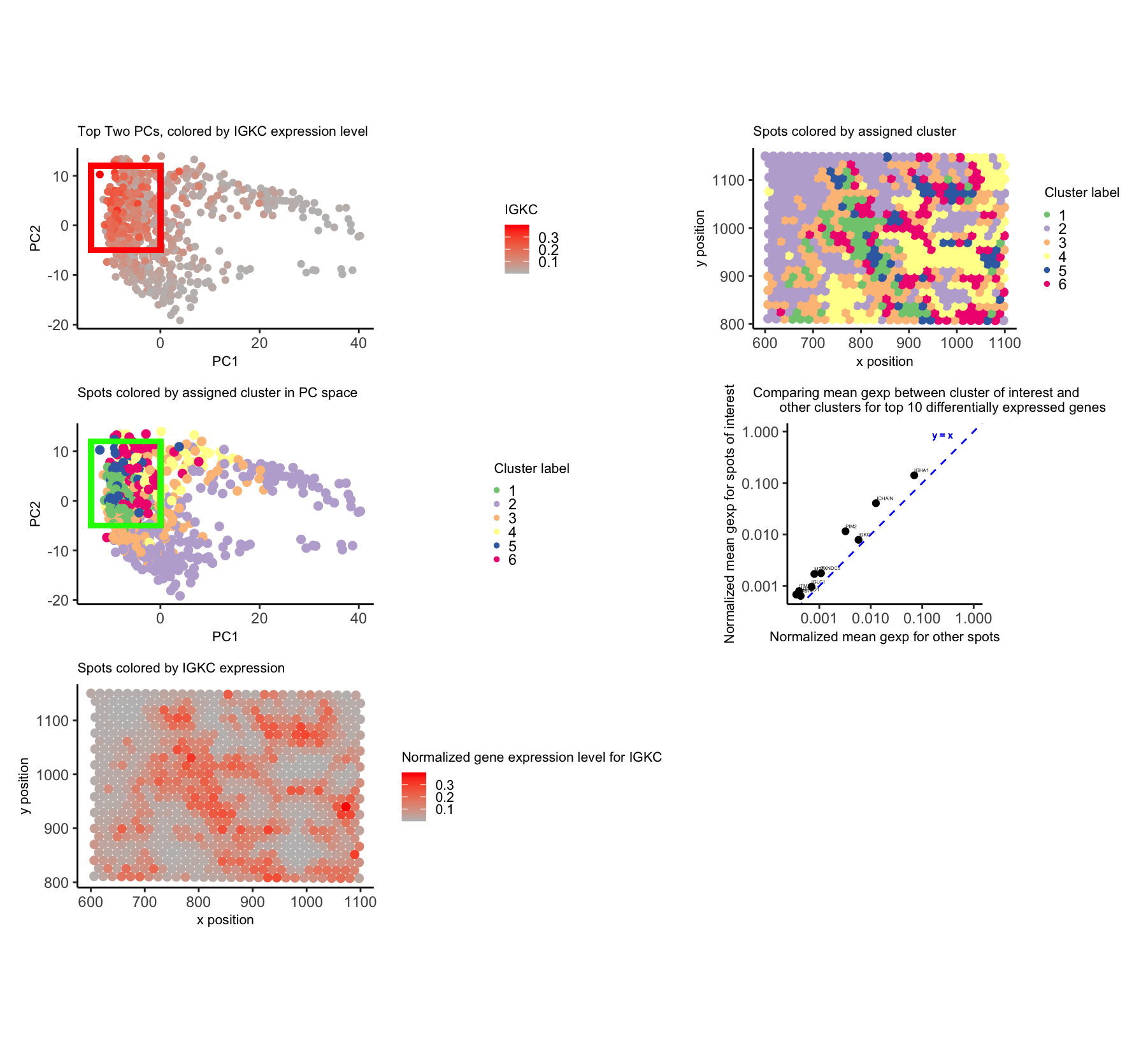
To begin, I normalized by gene expression values by the total counts and subsequently performed PCA. I used a scree plot to verify that PCs 1 and 2 encapsulated much of the variance in the data. I also used k-means clustering on the normalized gene expression data and validated my chosen number of clusters (6) using an elbow plot.
From here, I chose to focus on the cluster in the top left of the PC2 vs. PC1 plot (boxed with a rectangle). I thought this cluster was interesting because it did look distinct in PC space, but—based on coloring the physical locations of the spots by their assigned cluster—I saw the same cells were definitely spread out throughout the tissue. This made me speculate that they may be a cell population that was able to disperse throughout the tissue.
I looked at the top 10 differentially expressed genes in my chosen cluster, compared to all of the other clusters. These genes included IGHG1, IGKC, and IGHM—all of which are associated with immunoglobulin proteins. These are located on B cell surfaces or secreted by B cells; furthermore, it is reasonable that an immune cell population would be found in the breast cancer environment. Nonetheless, I think further analyses would be required to validate the fact that this cluster does indeed represent a B cell population. For instance, it is surprising that CD19 is not one of the top 1000 expressed genes in the Eevee dataset to begin with, given that CD19 is a classic B cell marker.
5. Code (paste your code in between the ``` symbols)
1
2
3
4
5
6
7
8
9
10
11
12
13
14
15
16
17
18
19
20
21
22
23
24
25
26
27
28
29
30
31
32
33
34
35
36
37
38
39
40
41
42
43
44
45
46
47
48
49
50
51
52
53
54
55
56
57
58
59
60
61
62
63
64
65
66
67
68
69
70
71
72
73
74
75
76
77
78
79
80
81
82
83
84
85
86
87
88
89
90
91
92
93
94
95
96
97
98
99
100
101
102
103
104
105
106
107
108
109
110
111
112
113
114
115
116
117
118
119
120
121
122
123
124
125
126
127
128
129
130
131
132
133
134
135
136
137
138
139
140
141
142
143
144
145
146
147
148
149
150
151
152
153
154
155
156
157
158
159
160
161
162
163
164
165
166
167
168
169
170
171
172
173
174
175
176
177
178
179
180
181
182
183
184
185
186
187
188
189
190
191
192
193
194
195
196
197
198
199
200
201
202
203
204
205
206
207
208
209
210
211
library(ggplot2)
library(Rtsne)
library(patchwork)
library(grid)

##### read in data and sort top genes
file <- '~/Desktop/GDV/genomic-data-visualization-2025/data/eevee.csv.gz'

data <- read.csv(file)
pos <- data[,3:4]
gexp <- data[,5:ncol(data)]
rownames(pos) <- data$barcode
rownames(gexp) <- data$barcode

topgenes <- names(sort(colSums(gexp), decreasing=TRUE)[1:1000])
gexp_top <- gexp[,topgenes]

## normalization strategy: can change
norm_gexp_top <- gexp_top/rowSums(gexp_top)

## PCA w/ scaling all variances to 1
pcs <- prcomp(norm_gexp_top, scale. = TRUE)

##### visualize scree plot: is looking at top 2 PCs reasonable?
scree_df <- data.frame(sdev = pcs$sdev, index=1:length(pcs$sdev))
scree_plt <- ggplot(scree_df, aes(x = index, y = sdev)) + geom_point()
top_PCs_scree_plt <- ggplot(scree_df[1:20,], aes(x = index, y = sdev)) +
  geom_point() +
  theme_classic() +
  theme(plot.title = element_text(size = 8),
        axis.title.x = element_text(size = 8),
        axis.title.y = element_text(size = 8),
        legend.title = element_text(size = 8)) +
  coord_fixed(ratio = 1) +
  labs(x = 'PC index', y = 'Standard deviation', title = 'Scree Plot for PCs')
print(top_PCs_scree_plt)

##### visualize PC2 vs. PC1
pcs_df <- data.frame(pcs$x, IGKC = norm_gexp_top[, 'IGKC'],
                     COL1A1 = norm_gexp_top[, 'COL1A1'],
                     IGHG1 = norm_gexp_top[, 'IGHG1'],
                     COL3A1 = norm_gexp_top[, 'COL3A1'],
                     IGHA1 = norm_gexp_top[, 'IGHA1']
                     )

pcs_plt <- ggplot(pcs_df, aes(x = PC1, y = PC2, color = IGKC)) +
  geom_point() +
  theme_classic() +
  theme(plot.title = element_text(size = 8),
        axis.title.x = element_text(size = 8),
        axis.title.y = element_text(size = 8),
        legend.title = element_text(size = 8)) +
  coord_fixed(ratio = 1) +
  geom_rect(aes(xmin = -14, xmax = 0, ymin = -5, ymax = 12),
            fill = "transparent", color = "red", size = 1.5) +
  scale_color_gradient(high = 'red', low = 'grey') +
  labs(title = 'Top Two PCs, colored by IGKC expression level') +
  guides(color = guide_colorbar(barwidth = 1, barheight = 2))

print(pcs_plt)

##### clustering on norm_gexp_top
ks <- c(2,3,4,5,6,7,8,9,10)
totws <- sapply(ks, function(k) {
  print(k)
  clus <- kmeans(norm_gexp_top, centers = k)
  return(clus$tot.withinss)
})

totws_df <- data.frame(k = ks, totw = totws)

##### elbow plot
elbow_plt <- ggplot(totws_df, aes(x = k, y = totw)) +
  geom_point() +
  theme_classic() +
  coord_fixed(ratio = 1) +
  theme(plot.title = element_text(size = 8),
        axis.title.x = element_text(size = 8),
        axis.title.y = element_text(size = 8),
        legend.title = element_text(size = 8)) +
  labs(y = 'Total Withiness',
       title = 'Elbow plot for determining # of clusters')

print(elbow_plt)

##### using labels w/ 6 clusters
clus_labs <- (kmeans(norm_gexp_top, centers = 6))$cluster

##### plotting spots in physical space, colored by cluster
clus_in_space <- ggplot(pos, aes(x = aligned_x, y = aligned_y,
  color = as.factor(clus_labs))) +
  geom_point(size = 2) +
  theme_classic() +
  coord_fixed(ratio = 1) +
  theme(plot.title = element_text(size = 8),
        axis.title.x = element_text(size = 8),
        axis.title.y = element_text(size = 8),
        legend.title = element_text(size = 8),
        legend.key.size = unit(0.1,'cm')) +
  scale_color_brewer(palette="Accent") +
  labs(x = 'x position', y = 'y position',
  title = 'Spots colored by assigned cluster', color = 'Cluster label') +
  guides(color = guide_legend(override.aes = list(size = 1)))

print(clus_in_space)

##### plotting spots in PC space, colored by cluster
clus_in_PC_space <- ggplot(pcs_df, aes(x = PC1, y = PC2,
  color = as.factor(clus_labs))) +
  geom_point(size = 2) +
  theme_classic() +
  theme(plot.title = element_text(size = 8),
        axis.title.x = element_text(size = 8),
        axis.title.y = element_text(size = 8),
        legend.title = element_text(size = 8),
        legend.key.size = unit(0.1,'cm')) +
  coord_fixed(ratio = 1) +
  scale_color_brewer(palette="Accent") +
  geom_rect(aes(xmin = -14, xmax = 0, ymin = -5, ymax = 12),
            fill = "transparent", color = "green", size = 1.5) +
  labs(title = 'Spots colored by assigned cluster in PC space',
       color = 'Cluster label') +
  guides(color = guide_legend(override.aes = list(size = 1)))

print(clus_in_PC_space)

##### going to investigate orange cluster (Cluster 3) further
## has low PC1 and high PC2 value

clus_labs <- as.factor(clus_labs)
# associate each cluster label w/ barcode
names(clus_labs) <- rownames(norm_gexp_top)

# choose cluster of interest + isolate spots of interest
interest <- 6
spots_interest <- names(clus_labs)[clus_labs == interest]
other_spots <- names(clus_labs)[clus_labs != interest]

results <- sapply(1:ncol(norm_gexp_top), function(i) {
  genetest <- norm_gexp_top[,i]
  names(genetest) <- rownames(norm_gexp_top)
  # test that spots of interest have higher gexp than other spots
  out <- wilcox.test(genetest[spots_interest], genetest[other_spots], alternative = 'greater')
  out$p.value
})
names(results) <- colnames(norm_gexp_top)

### visualize significant results
results <- sort(results, decreasing = FALSE)
results <- data.frame(results)
results$gene <- rownames(results)
results_top <- results[1:10,]

### looking at means of normalized gexp vals for most significantly upregulated
### genes in group of interest
norm_cts_int <- norm_gexp_top[rownames(norm_gexp_top) %in% spots_interest,]
norm_cts_other <- norm_gexp_top[!(rownames(norm_gexp_top) %in% spots_interest),]

int_diff_genes <- norm_cts_int[, colnames(norm_cts_int) %in% results_top$gene]
other_diff_genes <- norm_cts_other[, colnames(norm_cts_other) %in% results_top$gene]

int_means <- colMeans(int_diff_genes)
other_means <- colMeans(other_diff_genes)

mean_df <- data.frame(gene = results_top$gene, int_means = int_means,
                      other_means = other_means)

norm_diff_gene_means_plt <- ggplot(mean_df, aes(x = other_means, y = int_means)) +
  geom_point() +
  geom_text(aes(label = gene), vjust = -1, hjust = 0, size = 1) +
  theme_classic() +
  coord_fixed(ratio = 1) +
  theme(plot.title = element_text(size = 8),
        axis.title.x = element_text(size = 8),
        axis.title.y = element_text(size = 8),
        legend.title = element_text(size = 8)) +
  scale_x_log10() +
  scale_y_log10() +
  geom_abline(slope = 1, intercept = 0, linetype = "dashed", color = 'blue') +
  geom_text(aes(x = 1, y = 1, label = "y = x"), size = 2, color = 'blue',
            hjust = 2, vjust = 1) +
  labs(x = 'Normalized mean gexp for other spots',
       y = 'Normalized mean gexp for spots of interest',
       title = 'Comparing mean gexp between cluster of interest and
       other clusters for top 10 differentially expressed genes')

print(norm_diff_gene_means_plt)

##### plotting spots in physical space, colored by IGKC
IGKC_in_space <- ggplot(pos, aes(x = aligned_x, y = aligned_y,
                                 color = norm_gexp_top$IGKC)) +
  geom_point(size = 2) +
  theme_classic() +
  coord_fixed(ratio = 1) +
  theme(plot.title = element_text(size = 8),
        axis.title.x = element_text(size = 8),
        axis.title.y = element_text(size = 8),
        legend.title = element_text(size = 8),
        legend.text = element_text(size = 8)) +
  guides(color = guide_colorbar(barwidth = 1, barheight = 2)) +
  scale_color_gradient(high = 'red', low = 'grey') +
  labs(x = 'x position', y = 'y position',
       title = 'Spots colored by IGKC expression',
       color = 'Normalized gene expression level for IGKC')

print(IGKC_in_space)

wrap_plots(pcs_plt, clus_in_space,
           clus_in_PC_space, norm_diff_gene_means_plt, IGKC_in_space,
           ncol = 2)