Identify Fibroblast-Related Cell Cluster through Spatial Transcriptomics Data Analysis

1. Description of the Figure
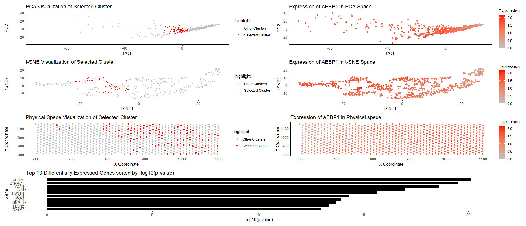
The figure presents a multi-panel visualization of a transcriptionally distinct cell cluster by using dimensionality reduction techniques and differential gene expression analysis. K-means clustering is performed with k=8, and cluster 2 is chosen as the cluster of interest.
Row 1: Both figures on this row utilize PCA. The figure on the left visualizes the cluster in the reduced PCA space (first 2 PCs), and the selected cluster is highlighted in red dots. We could see that the selected cluster is relatively localized and separated from other clusters. The figure on the right visualizes AEBP1 gene expression in the PCA space (with color saturation encoding expression level), and we could also see relatively high expression in the cluster of interest.
Row 2: Both figures on this row utilize tSNE, and are figures that support PCA results. The figure on the left visualizes the cluster in tSNE space (tSNE1 and 2), and the selected cluster is highlighted in red dots. Again, we could observe the localization of the cluster, and relative separation from other clusters. The figure on the right visualizes AEBP1 gene expression in the tSNE space (with color saturation encoding expression level), and we could see relatively high expression in the cluster of interest.
Row 3: Both figures on this row relate to the physical space. The figure on the left visualizes the cluster in the physical space (x and y coordinates), and we could observe that the cluster has distinct spatial patterns (tend to have a large x-coordinate). The figure on the right visualizes the expression of AEBP1 in physical space (with color saturation encoding expression level).
Row 4: The figure summarizes the result from differential gene expression analysis, and presents the top 10 differentially expressed genes sorted by p-value (more significant genes are on the top). Based on the plot, we could see AEBP1 is the most significant gene (has a very small p-value), and is therefore chosen for the gene analysis.
2. Cluster Interpretation
Based on differential gene expression analysis in the cluster, the top 5 most differentially expressed genes are AEBP1, CTHRC1, VCAN, LUM, and POSTN. By researching online, those genes are strongly associated with fibroblasts, in the context of fibrosis and extracellular matrix organization (for some). The strong expression of these markers suggests that this cluster represents a fibroblast-enriched population involved mainly in structural support. Specifically, AEBP1 is a regulator of fibroblast activity; CTHRC1 involves in extracellular matrix organization; VCAN plays role in connecting cells with extracellular matrix; LUM plays role in collagen fibril organization, and POSTN is a marker of fibroblast activation. Within the cluster, all those 5 cells are differentially expressed with significance. Therefore, it’s plausible to conclude that this transcriptionally distinct cluster involves fibroblast-related cells.
Sources:
https://www.proteinatlas.org/ENSG00000106624-AEBP1
https://www.proteinatlas.org/ENSG00000164932-CTHRC1
https://www.proteinatlas.org/ENSG00000038427-VCAN
https://www.proteinatlas.org/ENSG00000139329-LUM
https://www.proteinatlas.org/ENSG00000133110-POSTN
https://pmc.ncbi.nlm.nih.gov/articles/PMC10193374/
3. Code (paste your code in between the ``` symbols)
1
2
3
4
5
6
7
8
9
10
11
12
13
14
15
16
17
18
19
20
21
22
23
24
25
26
27
28
29
30
31
32
33
34
35
36
37
38
39
40
41
42
43
44
45
46
47
48
49
50
51
52
53
54
55
56
57
58
59
60
61
62
63
64
65
66
67
68
69
70
71
72
73
74
75
76
77
78
79
80
81
82
83
84
85
86
87
88
89
90
91
92
93
94
95
96
97
98
99
100
101
102
103
104
105
106
107
108
109
110
## PRE-PROCESSING
library(ggplot2)
library(Rtsne)
library(patchwork)
file <- 'D:/Spring 2025/GDV/genomic-data-visualization-2025/data/eevee.csv.gz'
data <- read.csv(file)
set.seed(40) # set seed for reproducibility
# Extract gene expression data
gexp <- data[, 5:ncol(data)]
rownames(gexp) <- data$barcode

# Limit to top 1000 most highly expressed genes
topgenes <- names(sort(colSums(gexp), decreasing = TRUE)[1:1000])
gexpsub <- gexp[, topgenes]

## FIGURE 1: Cluster of interest in reduced PCA space
pcs <- prcomp(gexpsub, scale. = TRUE) # PCA
com <- kmeans(pcs$x[, 1:5], centers = 8) # K-means on the first 5 PCs
clusters <- as.factor(com$cluster)  # convert to categorical var
names(clusters) <- rownames(gexpsub)
# select cluster of interest
selected_cluster <- 2
selected_cells <- names(clusters)[clusters == selected_cluster] # contains barcodes of cells

# visualize
df <- data.frame(PC1 = pcs$x[, 1], PC2 = pcs$x[, 2], cluster = clusters) # create df for visualization
df$highlight <- ifelse(df$cluster == selected_cluster, "Selected Cluster", "Other Clusters") # highlight selected cluster
g1 <- ggplot(df, aes(x = PC1, y = PC2, col = highlight)) +
  geom_point(size = 0.5) +
  scale_color_manual(values = c("Selected Cluster" = "red", "Other Clusters" = "gray")) +
  theme_classic() +
  labs(title = "PCA Visualization of Selected Cluster", x = "PC1", y = "PC2")

## FIGURE 2: Cluster of interest in tSNE space (similar to Figure 1)
emb <- Rtsne(pcs$x[, 1:5])
df_tsne <- data.frame(tSNE1 = emb$Y[, 1], tSNE2 = emb$Y[, 2], cluster = clusters)
df_tsne$highlight <- ifelse(df_tsne$cluster == selected_cluster, "Selected Cluster", "Other Clusters")
g2 <- ggplot(df_tsne, aes(x = tSNE1, y = tSNE2, col = highlight)) +
  geom_point(size = 0.5) +
  scale_color_manual(values = c("Selected Cluster" = "red", "Other Clusters" = "gray")) +
  theme_classic() +
  labs(title = "t-SNE Visualization of Selected Cluster", x = "tSNE1", y = "tSNE2")

## FIGURE 3: Cluster of interest in physical space
# create a new df to store information
position <- data[,3:4]
rownames(position) <- data$barcode
df_physical <- data.frame(x = position[, 1],y = position[, 2], cluster = clusters)
df_physical$highlight <- ifelse(df_physical$cluster == selected_cluster, "Selected Cluster", "Other Clusters")
g3 <- ggplot(df_physical, aes(x = x, y = y, col = highlight)) +
  geom_point(size = 1.5) +
  scale_color_manual(values = c("Selected Cluster" = "red", "Other Clusters" = "gray")) +
  theme_classic() +
  labs(title = "Physical Space Visualization of Selected Cluster", x = "X Coordinate", y = "Y Coordinate")

## FIGURE 4: Differentially expressed genes for cluster of interest
# compute mean expression
selected_mean <- colMeans(gexpsub[clusters == selected_cluster, , drop = FALSE])
other_mean <- colMeans(gexpsub[clusters != selected_cluster, , drop = FALSE])
# t-test for each gene
pvals <- sapply(1:ncol(gexpsub), function(i) {
  t.test(gexpsub[clusters == selected_cluster, i],
         gexpsub[clusters != selected_cluster, i],
         alternative = "greater")$p.value
})
# create df
df_de <- data.frame(gene = colnames(gexpsub), pval = pvals)
# Select top 10 most differentially expressed genes based on p_value
top_genes <- df_de[order(df_de$pval), ][1:10, ]
# bar plot for the top differentially expressed genes (-log10 transform because raw p-values are so small)
g4 <- ggplot(top_genes, aes(x = -log10(pval), y = reorder(gene, -pval))) +
  geom_bar(stat = "identity", fill = "black") +
  theme_classic() +
  labs(title = "Top 10 Differentially Expressed Genes sorted by -log10(p-value)", x = "-log10(p-value)", y = "Gene")

## FIGURE 5: selected gene in reduced PCA Space
selected_gene <- "AEBP1" # most differentially expressed
df$gene_expression <- gexpsub[, selected_gene]
# plot, using log-transformed expression data
g5 <- ggplot(df, aes(x = PC1, y = PC2, col = log10(gene_expression + 1))) +
  geom_point(size = 1.5) +
  scale_color_gradient(low = "gray", high = "red") +
  theme_classic() +
  labs(title = paste("Expression of", selected_gene, "in PCA Space"), x = "PC1", y = "PC2", col = "Expression")

## FIGURE 6: selected gene in reduced tSNE space
df_tsne$gene_expression <- gexpsub[, selected_gene]
g6 <- ggplot(df_tsne, aes(x = tSNE1, y = tSNE2, col = log10(gene_expression + 1))) +
  geom_point(size = 1.5) +
  scale_color_gradient(low = "gray", high = "red") +
  theme_classic() +
  labs(title = paste("Expression of", selected_gene, "in t-SNE Space"), x = "tSNE1", y = "tSNE2", col = "Expression")

## FIGURE 7: selected gene in physical space
df_physical$gene_expression <- gexpsub[, selected_gene]
g7 <- ggplot(df_physical, aes(x = x, y = y, col = log10(gene_expression + 1))) +
  geom_point(size = 1.5) +
  scale_color_gradient(low = "gray", high = "red") +
  theme_classic() +
  labs(title = paste("Expression of", selected_gene, "in Physical space"), x = "X Coordinate", y = "Y Coordinate", col = "Expression")

## FINAL ASSEMBLY
final_plot <- (g1 + g5) / (g2 + g6) /(g3 + g7) / g4
final_plot

## REFERENCES
# Prof Fan's code for processing eevee dataset in class
# https://www.rdocumentation.org/packages/base/versions/3.6.2/topics/ifelse
# https://www.datacamp.com/tutorial/sorting-in-r
# https://ggplot2.tidyverse.org/reference/geom_bar.html