Eevee Genes DIfferential Expression - MMP2

Use/adapt your code from HW3 to identify the same cell-type in the other dataset. Create a multi-panel data visualization and write a description to convince me you found the same cell-type.
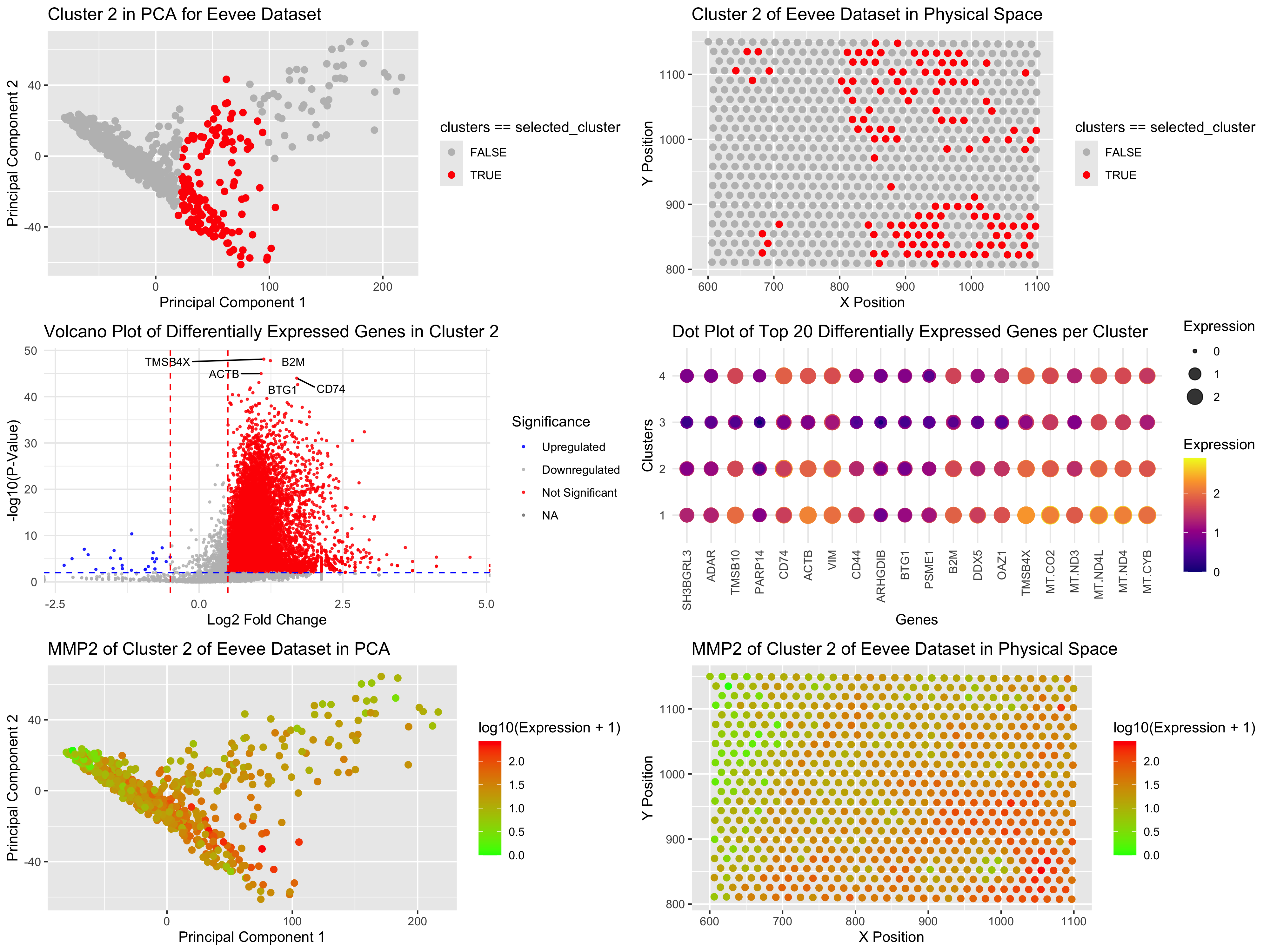
The Eevee Dataset is a genomic dataset with a large number of dimensions and needs dimensional reduction and clustering techniques to explore the biological patterns. I ran k-means clustering and used the elbow method to choose the number of clusters based on within-cluster variance. After checking the results, I chose k = 4 clusters for downstream analysis. Similar to my Pikachu dataset in Homework 3, where I had to choose k = 15 for k-means, I finally had to select cluster 7. So instead of on Cluster 7 in PCA space, I am now training with Cluster 2 in Eevee. In PCA (principal component analysis) space (Plot 1), Cluster 2 is overlaid in red, and all other clusters are grayed out. This plot shows that Cluster 2 is spatially separated from Cluster 3 and Cluster 4, consistent with the idea that they represent separate cell types or functional groups. In the physical space (Plot 2), Cluster 2 could be somewhat dispersed but still quite localized, supporting its prospective biological relevance. To find genes driving uniqueness in Cluster 2, I ran differential gene expression (DGE) analysis using the Wilcoxon rank-sum test. Rather than using a two-sided t-test as I did in Homework 3, I switched to Wilcoxon since it is more robust against non-normally distributed gene expression data. Log2 fold-change (FC) was calculated for each gene and a volcano plot (Plot 3) was plotted to show significantly upregulated (red) or downregulated (blue) genes in Cluster 2. We were also interested in observing the expression of genes across all clusters so I charted the top 20 differentially expressed genes in a dot plot (Plot 4). In contrast to Homework 3, where I only looked at Cluster 7 vs the rest, I am now able to compare all clusters, so I can make a better guess about what type of cells these other clusters might be! Dot size and color intensity indicate expression level for each row, where each row corresponds to a cluster. This method provides a clearer output than the cluttered heatmap from Homework 3. In a PCA space (Plot 5), we find that among the top differentially expressed genes, MMP2 is one of the most significant markers for Cluster 2 and closely matches the same distribution as Cluster 2 further boosting its correlation with this subgroup. When visualized in physical space (Plot 6), MMP2 closely mimics the cluster 2 spatial profile, further confirming its role in defining Cluster 2. Referring back to Homework 3 in which I selected Cluster 7, some of top 20 genes (ex. CXCL12, POSTN, PDGFR, and MMP2) indicate that Cluster 7 is a fibroblast-enriched cluster. (Nurmik, M etc. 2020) And indeed, my current cluster 2 in the eevee dataset, talks much about MMP2, COL14A1, THBS2, DCN, VCAN, COL6A3, and SFRP2, indicating a fibroblast-like cluster. (Sebastian, A. etc 2020) Hence, these are analogous cell types in different clusters in different datasets.
Reference: Nurmik, M., Ullmann, P., Rodriguez, F., Haan, S., & Letellier, E. (2020). In search of definitions: Cancer-associated fibroblasts and their markers. International journal of cancer, 146(4), 895–905. https://doi.org/10.1002/ijc.32193
Sebastian, A., Hum, N. R., Martin, K. A., Gilmore, S. F., Peran, I., Byers, S. W., Wheeler, E. K., Coleman, M. A., & Loots, G. G. (2020). Single-Cell Transcriptomic Analysis of Tumor-Derived Fibroblasts and Normal Tissue-Resident Fibroblasts Reveals Fibroblast Heterogeneity in Breast Cancer. Cancers, 12(5), 1307. https://doi.org/10.3390/cancers12051307
Code (paste your code in between the ``` symbols)
1
2
3
4
5
6
7
8
9
10
11
12
13
14
15
16
17
18
19
20
21
22
23
24
25
26
27
28
29
30
31
32
33
34
35
36
37
38
39
40
41
42
43
44
45
46
47
48
49
50
51
52
53
54
55
56
57
58
59
60
61
62
63
64
65
66
67
68
69
70
71
72
73
74
75
76
77
78
79
80
81
82
83
84
85
86
87
88
89
90
91
92
93
94
95
96
97
98
99
100
101
102
103
104
105
106
107
108
109
110
111
112
113
114
115
116
117
118
119
120
121
122
123
124
125
126
127
128
129
130
131
132
133
134
135
136
137
138
139
140
141
142
143
144
145
146
147
148
149
150
151
152
153
154
155
llibrary(ggplot2)
library(Rtsne)
library(gridExtra)
library(reshape2)
file <- '/Users/harriethe/GenomicDataVisualization/genomic-data-visualization-2025/data/eevee.csv.gz'
data <- read.csv(file)

head(data)
pos <- data[, 3:4]
rownames(pos) <- data$barcode
gexp <- data[, 5:ncol(data)]
rownames(gexp) <- data$barcode
#originally 18085 columns
gexp_log <- log10(gexp + 1)
#after removal of columns with sd of 0(meaning most of rows are 0), it now is 18037 columns
gexp_filtered <- gexp_log[, apply(gexp_log, 2, function(col) sd(col) > 0)]
pcs <- prcomp(gexp_filtered, center = TRUE, scale. = TRUE)
scree_df <- data.frame(PC = 1:length(pcs$sdev), Variance = (pcs$sdev)^2)
scree_plot <- ggplot(scree_df[1:10,], aes(x = PC, y = Variance)) +
  geom_line() +
  geom_point() +
  ggtitle("Scree Plot of PCA") + xlab("Principal Components") + ylab("Variance Explained")

ks <- c(2,4,5,7,10)
totw <- sapply(ks, function(k) {
  com <- kmeans(pcs$x[, 1:10], centers = k)
  return(com$tot.withinss)
})

totw_df <- data.frame(k = ks, WCSS = totw)
elbow_plot <- ggplot(totw_df, aes(x = k, y = WCSS)) +
  geom_line() +
  geom_point() +
  ggtitle("Elbow Method for Optimal Clusters") + xlab("Number of Clusters (k)") + ylab("Within Cluster Sum of Squares")

com <- kmeans(pcs$x[, 1:10], centers = 4)
clusters <- as.factor(com$cluster)

pca_cluster_df <- data.frame(PC1 = pcs$x[, 1], PC2 = pcs$x[, 2], clusters)
ggplot(pca_cluster_df, aes(x = PC1, y = PC2, col = clusters)) +
  geom_point()

emb <- Rtsne(pcs$x[, 1:10])
tsne_df <- data.frame(tSNE1 = emb$Y[, 1], tSNE2 = emb$Y[, 2], clusters)
ggplot(tsne_df, aes(x = tSNE1, y = tSNE2, col = clusters)) +
  geom_point()

selected_cluster <- 2
cells_of_interest <- names(clusters)[clusters == selected_cluster]
other_cells <- names(clusters)[clusters != selected_cluster]
length(cells_of_interest)
length(other_cells)


# 1.A panel visualizing your one cluster of interest in reduced dimensional space (PCA, tSNE, etc)
pca_cluster_df <- data.frame(PC1 = pcs$x[, 1], PC2 = pcs$x[, 2], clusters)
pca_plot <- ggplot(pca_cluster_df, aes(x = PC1, y = PC2, col = clusters == selected_cluster)) +
  geom_point(size = 2) +
  scale_color_manual(values = c("FALSE" = "gray", "TRUE" = "red")) +
  ggtitle("Cluster 2 in PCA for Eevee Dataset") +
  xlab("Principal Component 1") +
  ylab("Principal Component 2")

#2. A panel visualizing your one cluster of interest in physical space
physical_df <- data.frame(x = pos$aligned_x, y = pos$aligned_y, clusters)
physical_plot <- ggplot(physical_df, aes(x = x, y = y, col = clusters == selected_cluster)) +
  geom_point(size = 2) +
  scale_color_manual(values = c("FALSE" = "gray", "TRUE" = "red")) +
  ggtitle("Cluster 2 of Eevee Dataset in Physical Space") + xlab("X Position") + ylab("Y Position")

# 3. A panel visualizing differentially expressed genes for your cluster of interest
log2FC <- apply(gexp, 2, function(gene) {
  mean_cluster <- mean(gene[cells_of_interest])
  mean_other <- mean(gene[other_cells])
  log2(mean_cluster / mean_other)
})
p_values <- apply(gexp, 2, function(gene) {
  wilcox.test(gene[cells_of_interest], gene[other_cells], alternative = 'two.sided')$p.value
})

volcano_df <- data.frame(Gene = names(p_values),
                         Log2FC = log2FC,
                         P_Value = -log10(p_values))
log2FC_cutoff <- 0.5
pval_cutoff <- 0.01

volcano_df$Significance <- ifelse(volcano_df$P_Value > -log10(pval_cutoff) & abs(volcano_df$Log2FC) > log2FC_cutoff,
                                  ifelse(volcano_df$Log2FC > log2FC_cutoff, "Upregulated", "Downregulated"),
                                  "Not Significant")

# Select top 20 significant genes
top_genes <- volcano_df[order(volcano_df$P_Value, decreasing = TRUE),][1:20,]

volcano_plot <- ggplot(volcano_df, aes(x = Log2FC, y = P_Value, col = Significance)) +
  geom_point(size = 0.5, alpha = 0.8) +
  scale_color_manual(values = c("Upregulated" = "red", "Downregulated" = "blue", "Not Significant" = "gray"),
                     labels = c("Upregulated", "Downregulated", "Not Significant")) +
  geom_text_repel(data = top_genes, aes(label = Gene), size = 3, color = "black", box.padding = 0.5, max.overlaps = 20) +
  theme_minimal() +
  xlab("Log2 Fold Change") +
  ylab("-log10(P-Value)") +
  ggtitle("Volcano Plot of Differentially Expressed Genes in Cluster 2") +
  geom_vline(xintercept = c(-log2FC_cutoff, log2FC_cutoff), linetype = "dashed", color = "red") +
  geom_hline(yintercept = -log10(pval_cutoff), linetype = "dashed", color = "blue")

print(volcano_plot)

top_gene_names <- top_genes$Gene
expr_subset <- gexp_filtered[, colnames(gexp_filtered) %in% top_gene_names]
expr_subset$Cluster <- clusters[rownames(expr_subset)]
expr_long <- melt(expr_subset, id.vars = "Cluster")
colnames(expr_long) <- c("Cluster", "Gene", "Expression")
expr_long$Cluster <- as.factor(expr_long$Cluster)
dot_plot <- ggplot(expr_long, aes(x = Gene, y = Cluster, size = Expression, color = Expression)) +
  geom_point(alpha = 0.8) +
  scale_color_viridis_c(option = "plasma") +
  scale_size_continuous(range = c(1, 6)) +
  theme_minimal() +
  theme(axis.text.x = element_text(angle = 90, hjust = 1, vjust = 0.5)) +
  ggtitle("Dot Plot of Top 20 Differentially Expressed Genes per Cluster") +
  xlab("Genes") +
  ylab("Clusters")

print(dot_plot)


#4. A panel visualizing one of these genes in reduced dimensional space (PCA, tSNE, etc)
# I picked the top 1
top_gene <- "MMP2"
df_gene <- data.frame(PC1 = pcs$x[, 1], PC2 = pcs$x[, 2], Expression = gexp[, top_gene])
MMP2_pca_plot <- ggplot(df_gene, aes(x = PC1, y = PC2, col = log10(Expression + 1))) +
  geom_point(size = 2) +
  scale_color_gradient(low = 'green', high = 'red') +
  ggtitle("MMP2 of Cluster 2 of Eevee Dataset in PCA") +
  xlab("Principal Component 1") + ylab("Principal Component 2")

# 5. A panel visualizing one of these genes in space
physical_gene_df <- data.frame(x = pos$aligned_x, y = pos$aligned_y, Expression = gexp[, top_gene])
MMP2_physical_plot <- ggplot(physical_gene_df, aes(x = x, y = y, col = log10(Expression + 1))) +
  geom_point(size = 2) +
  scale_color_gradient(low = 'green', high = 'red') +
  ggtitle("MMP2 of Cluster 2 of Eevee Dataset in Physical Space") +
  xlab("X Position") + ylab("Y Position")

png("hw4_jhe46.png", width = 4000, height = 3000, res = 300)
grid.arrange(
  pca_plot,
  physical_plot,
  volcano_plot,
  dot_plot,
  MMP2_pca_plot,
  MMP2_physical_plot,
  ncol = 2
)
dev.off()