Identification of Adipocyte-like/Lipid-metabolizing Cells in Breast Cancer Tissue

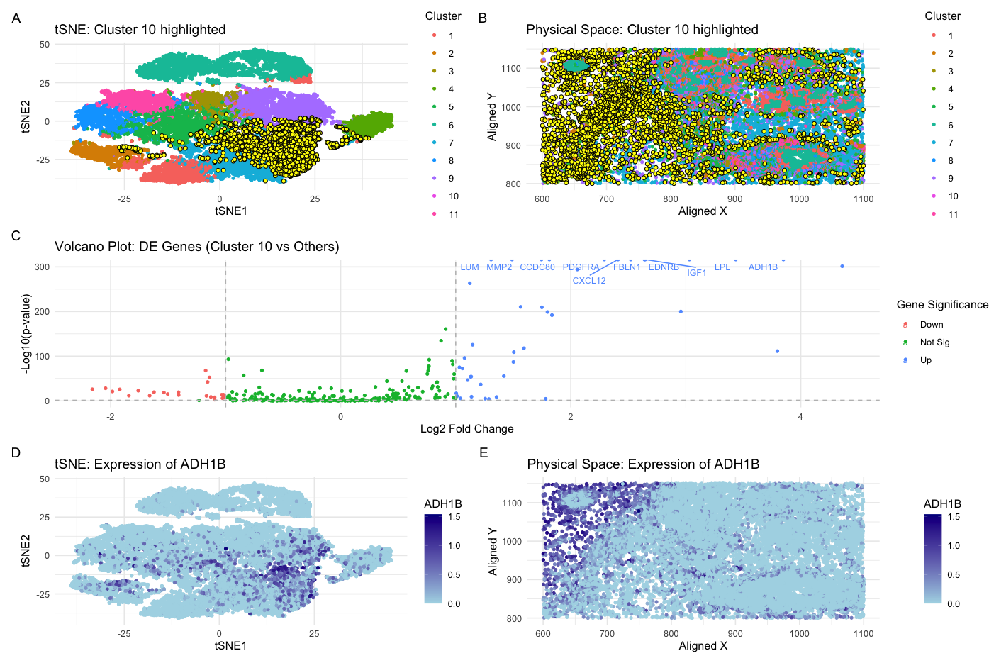
Previously, in HW3, I identified a cluster of cells that were representative of adipocyte-like or lipid-metabolizing cells. This was concluded through the identification of genes GPD1, ADIPOQ, and FABP4 in a cluster. I supported this with a literature search that showed that these genes are known markers of adipocytes and that they play a protective role in the tumor microenvironment by regulating lipid metabolism and promoting anti-cancer pathways. Here, switching from the sequencing-based spatial transcriptomics Eevee dataset to the smFISH-based Pikachu dataset, I was also able to successfully identify the same adipocyte-like cluster of cells.
I made a few changes to tease this cell-type out. At first, I made minimal changes and tried to get this cell type out by clustering with a k of 5 as I had done before, which I determined from using the elbow method of the total withinness plot on the eevee dataset. However, there was too much merging and I found found myself gradually increasing the k-means to 11, which gave me the best resolution. While this deviates from the optimal cluster number of ~6-7 using the elbow method of the total withinness plot, these clusters were not optimal. Thus, this represents a potential limitation of the elbow method in suggesting a mathematically optimal k value but not necessarily biologically relevant and biologically distinct subpopulations. The drastic difference between the number of clusters necessary for this visualization of the Pikachu dataset can also be explained by the technical aspects of its generation. Specifically, the Pikachu data set, which was generated by smFISH, has single-cell resolution which in downstream analysis, allows for more detailed and more “granular” capture of distinct cell types and subpopulations and thus explains the greater number of clusters. In contrast, the previously analyzed Eevee dataset, which was created via a spot-based sequencing capture method, is of lesser resolution because each spot may contain a mixed population of cells. Correspondingly, this leads to less clustering.
Another change I made to capture this cell-type cluster was my gene of interest. When previously analyzing the eevee dataset, I had identified my most upregulated gene as GPD1, a tumor suppressor in breast cancer that influences lipid metabolism through the PI3K/AKT signaling pathway (Xia et al., 2023). However, I could not use this gene marker to identify the adipocyte-like cell type cluster in the Pikachu dataset. The reason for this is that the Pikachu data set has approximately ~200 genes. Comparatively, the Eevee data set has ~17,000 genes, due to it’s sequencing nature. Thus, given the limited scope, I had to alter my approach going into analyzing the Pikachu set. Specifically, I found the gene ADH1B and LPL to be two of the most upregulated genes in one of the clusters (cluster 10), which I classify as the adipocyte-like cluster. These genes were also upregulated in my previous analysis of of the Eevee dataset. In a literature search, I found that ADH1B, the adipocyte-enriched alcohol dehydrogenase, to be the most upregulated gene in adipose tissue (Gautheron et al., 2024). Furthermore, LPL, lipoprotein lipase, is essential for the hydrolysis and distribution of triglyceride-rich lipoprotein-associated fatty acids among extrahepatic tissues (Zechner et al. 2000). To find evidence for the breast cancer-specific tissue section we are looking at, I found evidence that the ADH1B gene represses the proliferation, invasion and migration of breast cancer cells by inactivating the the MAPK signalling pathway (Jiang et al. 2023).Thus, in tweaking the clustering number to reflect the distinction in the two datasets and identifying another gene upregulated in my previously identified adipocyte-like cell cluster, I was able to find the same cell type in the Pikachu dataset.
Xia et al., 2023: https://www.ncbi.nlm.nih.gov/pmc/articles/PMC10362286/ Gautheron et al., 2024: https://pubmed.ncbi.nlm.nih.gov/38838011/ Zechner et al. 2000: https://pubmed.ncbi.nlm.nih.gov/11126243/ Jiang et al. 2023: https://pubmed.ncbi.nlm.nih.gov/38085522/
Code
1
2
3
4
5
6
7
8
9
10
11
12
13
14
15
16
17
18
19
20
21
22
23
24
25
26
27
28
29
30
31
32
33
34
35
36
37
38
39
40
41
42
43
44
45
46
47
48
49
50
51
52
53
54
55
56
57
58
59
60
61
62
63
64
65
66
67
68
69
70
71
72
73
74
75
76
77
78
79
80
81
82
83
84
85
86
87
88
89
90
91
92
93
94
95
96
97
98
99
100
101
102
103
104
105
106
107
108
109
110
111
112
113
114
115
116
117
118
119
120
121
122
123
124
125
126
127
128
129
130
131
132
133
134
135
136
137
138
139
140
141
142
143
144
145
146
147
148
149
150
151
152
153
154
155
156
157
# inspired by code-lesson-8
# libraries
library(ggplot2)
library(Rtsne)
library(patchwork)
library(ggrepel)
library(factoextra) # For WSS plot

file <- "/Users/kevinnguyen/Desktop/genomic-data-visualization-2025/data/pikachu.csv.gz"
data <- read.csv(file, row.names = 1)

# Extract physical coordinates.
pos <- data[, c("aligned_x", "aligned_y")]

# Extract gene expression data
gexp <- data[, 6:ncol(data)]

# Normalize: scale by library size then log10-transform (add 1 to avoid log(0))
totals <- rowSums(gexp)
norm_gexp <- gexp / totals * median(totals)
loggexp <- log10(norm_gexp + 1)

# Determine optimal number of clusters using total within-cluster sum of squares (WSS)
set.seed(2025)
wss <- sapply(2:15, function(k) {
  kmeans(loggexp, centers = k, nstart = 10)$tot.withinss
})
wss_df <- data.frame(Clusters = 2:15, WSS = wss)

# Perform k-means clustering with 11 clusters (using 11 centers)
set.seed(2025)
km_out <- kmeans(loggexp, centers = 11)
clusters <- as.factor(km_out$cluster)
names(clusters) <- rownames(loggexp)

# Dimensionality reduction: PCA on log-transformed data, then tSNE on the first 10 PCs
pcs <- prcomp(loggexp)
tsne_res <- Rtsne(pcs$x[, 1:10])
tsne_df <- data.frame(X1 = tsne_res$Y[, 1],
                      X2 = tsne_res$Y[, 2],
                      clusters = clusters)

# Select cluster "10"
cluster_of_interest <- "10"
cat("Selected cluster of interest:", cluster_of_interest, "\n")

# Differential Expression Analysis: compare cluster 10 vs. all others using Wilcoxon test
cells_interest <- names(clusters)[clusters == cluster_of_interest]
cells_others <- names(clusters)[clusters != cluster_of_interest]

de_pvals <- sapply(colnames(gexp), function(gene) {
  wilcox.test(loggexp[cells_interest, gene],
              loggexp[cells_others, gene],
              alternative = "two.sided")$p.value
})
names(de_pvals) <- colnames(gexp)

# Compute log2 fold-change (using raw expression values) for each gene
log2fc <- sapply(colnames(gexp), function(gene) {
  mean_in <- mean(gexp[cells_interest, gene])
  mean_out <- mean(gexp[cells_others, gene])
  log2((mean_in + 1e-6) / (mean_out + 1e-6))
})
names(log2fc) <- colnames(gexp)

# Create a data frame for the volcano plot
volcano_df <- data.frame(gene = colnames(gexp),
                         log2FC = log2fc,
                         negLogP = -log10(de_pvals))
# Annotate significance
volcano_df$diffexpr <- "Not Sig"
volcano_df$diffexpr[volcano_df$log2FC > 1 & de_pvals < 0.05] <- "Up"
volcano_df$diffexpr[volcano_df$log2FC < -1 & de_pvals < 0.05] <- "Down"

# Label genes in the volcano plot: select the top 10 most significant
sig_genes <- volcano_df[de_pvals < 0.05 & abs(volcano_df$log2FC) > 1, ]
top_labels <- head(sig_genes[order(-sig_genes$negLogP), ], 10)
volcano_df$label <- NA
volcano_df$label[volcano_df$gene %in% top_labels$gene] <- volcano_df$gene[volcano_df$gene %in% top_labels$gene]

# Select the gene of interest: ADH1B
up_gene <- "ADH1B"
cat("Selected gene for analysis:", up_gene, "\n")

# Add gene-specific expression to the tSNE and spatial data
tsne_df$gene_expr <- loggexp[, up_gene]
pos_df <- data.frame(pos, clusters = clusters)
pos_df$gene_expr <- loggexp[, up_gene]

# Panel A: WSS plot for optimal cluster selection
p0 <- ggplot(wss_df, aes(x = Clusters, y = WSS)) +
  geom_point(size = 2) +
  geom_line() +
  labs(title = "Elbow Method for Optimal Clustering",
       x = "Number of Clusters",
       y = "Total Within-Cluster Sum of Squares") +
  theme_minimal()

# Panel B: tSNE plot with the cluster of interest highlighted
p1 <- ggplot(tsne_df, aes(x = X1, y = X2)) +
  geom_point(aes(color = clusters), size = 1) +
  geom_point(data = tsne_df[clusters == cluster_of_interest, ],
             color = "black", size = 1.5, shape = 21, fill = "yellow") +
  labs(title = paste("tSNE: Cluster", cluster_of_interest, "highlighted"),
       color = "Cluster",
       x = "tSNE1",
       y = "tSNE2") +
  theme_minimal()

# Panel C: Physical space plot with the cluster of interest highlighted
p2 <- ggplot(pos_df, aes(x = aligned_x, y = aligned_y)) +
  geom_point(aes(color = clusters), size = 1) +
  geom_point(data = pos_df[clusters == cluster_of_interest, ],
             color = "black", size = 1.5, shape = 21, fill = "yellow") +
  labs(title = paste("Physical Space: Cluster", cluster_of_interest, "highlighted"),
       color = "Cluster",
       x = "Aligned X",
       y = "Aligned Y") +
  theme_minimal()

# Panel D: Volcano plot
p3 <- ggplot(volcano_df, aes(x = log2FC, y = negLogP, color = diffexpr)) +
  geom_point(size = 1) +
  geom_text_repel(aes(label = label), size = 3, max.overlaps = Inf) +
  geom_vline(xintercept = c(-1, 1), linetype = "dashed", color = "gray") +
  geom_hline(yintercept = -log10(0.05), linetype = "dashed", color = "gray") +
  labs(title = paste("Volcano Plot: DE Genes (Cluster", cluster_of_interest, "vs Others)"),
       x = "Log2 Fold Change", y = "-Log10(p-value)",
       color = 'Gene Significance') +
  theme_minimal()

# Panel E: tSNE plot colored by expression of ADH1B
p4 <- ggplot(tsne_df, aes(x = X1, y = X2)) +
  geom_point(aes(color = gene_expr), size = 1) +
  scale_color_gradient(low = "lightblue", high = "darkblue") +
  labs(title = paste("tSNE: Expression of", up_gene),
       color = up_gene,
       x = "tSNE1",
       y = "tSNE2") +
  theme_minimal()

# Panel F: Physical space plot colored by expression of ADH1B
p5 <- ggplot(pos_df, aes(x = aligned_x, y = aligned_y)) +
  geom_point(aes(color = gene_expr), size = 1) +
  scale_color_gradient(low = "lightblue", high = "darkblue") +
  labs(title = paste("Physical Space: Expression of", up_gene),
       color = up_gene,
       x = "Aligned X",
       y = "Aligned Y") +
  theme_minimal()

# Plot all panels
combined_plot <- (p1 + p2) / (p3) / (p4 + p5) + plot_annotation(tag_levels = 'A')
print(combined_plot)