Analyzing PDGFRB Gene Expression in Pikachu Dataset

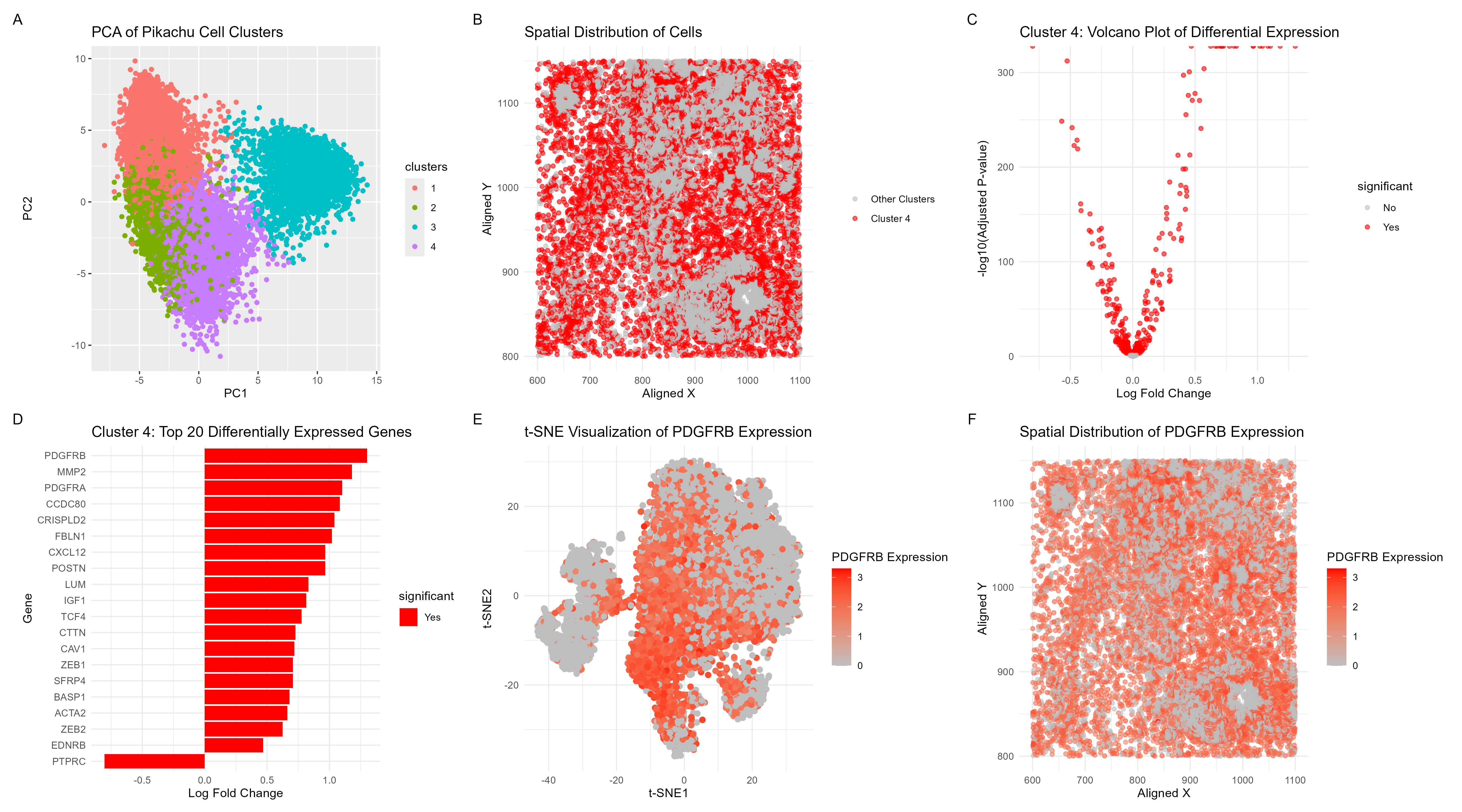
Visualization Summary In this visualization, I analyzed a cluster within the Pikachu dataset responsible for cell growth, and likely cancer. This was a major change from the Eevee sequencing dataset where the top 1000 genes were used in analysis. In the Imaging-based Pikachu dataset, there were 319 genes. All of the genes in the dataset were normalized, log-transformed, and clustered (K = 4). The ideal K was determined through plotting the total-withiness scores for K = [1, 10]. Then, based on the elbow method heuristic, the optimal number of clusters was determined to be 4 (see code for the plot). To understand gene expression similarity profiles and reduce the dimensionality of the dataset, principal component analysis was performed (A). Cluster 4 was chosen and was spatially analyzed (B). Next, differential gene expression analysis was performed to display the statistical significant of changes in gene expression between cluster 4 and other clusters which ultimately highlights genes with large expression differences (C). The top 20 genes in cluster 4 were then displayed, and PDGFRB was chosen as the gene of interest due to its expression level (D). t-distributed Stochastic Neighbor Embedding (t-SNE) analysis was then performed on PDGFRB gene expression to better visualize its expression across cells (E), and spatial analysis was also performed (F).
I am confident in my assessment that cluster 4 contains cell type responsible for cell growth in Breast Cancer due to high expression of PDGFRB [1]. Additionally, MMP2 which was second most differentially expressed gene also plays a critical role in breast tumor invasion and metastasis [2]. Specifically, the overlap between the spatial distribution of PDGFRB (Fig. F) aligns with the spatial distribution of cells in cluster 4 (Fig. B) so I am confident in my characterization of the cell-type of breast cancer cells with a growth mutation. My original analysis of the Eevee dataset identified MMP11 as the gene of interest and a cell type of breast cancer cells. While there were flaws in the original analysis, specifically with identifying the gene of interest (error caused by using a very high K, so the gene was not unique to the cluster and was likely highly expressed throughout the dataset), the cell type identified in both clusters is similar. Due to the difference between the two datasets, many of the genes analyzed in the Eevee dataset, including MMP11, were not present in the Pikachu dataset.
References: [1] Pandey, P., Khan, F., Upadhyay, T. K., Seungjoon, M., Park, M. N., & Kim, B. (2023). New insights about the PDGF/PDGFR signaling pathway as a promising target to develop cancer therapeutic strategies. Biomedicine & pharmacotherapy = Biomedecine & pharmacotherapie, 161, 114491. https://doi.org/10.1016/j.biopha.2023.114491 [2] Jezierska, A., & Motyl, T. (2009). Matrix metalloproteinase-2 involvement in breast cancer progression: a mini-review. Medical science monitor : international medical journal of experimental and clinical research, 15(2), RA32–RA40.
Code (paste your code in between the ``` symbols)
1
2
3
4
5
6
7
8
9
10
11
12
13
14
15
16
17
18
19
20
21
22
23
24
25
26
27
28
29
30
31
32
33
34
35
36
37
38
39
40
41
42
43
44
45
46
47
48
49
50
51
52
53
54
55
56
57
58
59
60
61
62
63
64
65
66
67
68
69
70
71
72
73
74
75
76
77
78
79
80
81
82
83
84
85
86
87
88
89
90
91
92
93
94
95
96
97
98
99
100
101
102
103
104
105
106
107
108
109
110
111
112
113
114
115
116
117
118
119
120
121
122
123
124
125
126
127
128
129
130
131
132
133
134
135
136
137
138
139
140
141
142
143
144
145
146
147
148
149
150
151
152
153
154
155
156
157
158
159
160
161
162
163
164
165
166
167
168
169
170
171
172
173
174
175
176
177
178
179
180
181
182
183
184
185
186
187
188
189
190
191
192
193
194
195
196
197
198
199
200
201
202
203
204
205
206
207
208
library(ggplot2)
library(dplyr)
library(tidyr)
library(RColorBrewer)
library(patchwork)

file <- 'pikachu.csv.gz'
data <- read.csv(file)
data[1:5,1:10]

## K Means Clustering + Principal Component Analysis
pos <- data[, 5:6]
rownames(pos) <- data$cell_id
gexp <- data[, 7:ncol(data)]
rownames(gexp) <- data$barcode
gene_norm <- log10(gexp * 10000 / rowSums(gexp) + 1)

# Compute Total Withiness
compute_wcss <- function(data, k) {
  km <- kmeans(data, centers = k, nstart = 10)
  return(km$tot.withinss)
}

# Compute WCSS for a range of K values
k_values <- 1:10  # You can adjust this range as needed
wcss_values <- sapply(k_values, function(k) compute_wcss(gene_norm, k))

# Create a data frame for plotting
elbow_data <- data.frame(K = k_values, WCSS = wcss_values)

# Plot the elbow curve
elbow_plot <- ggplot(elbow_data, aes(x = K, y = WCSS)) +
  geom_line() +
  geom_point() +
  labs(title = "Elbow Method for Optimal K",
       x = "Number of Clusters (K)",
       y = "Total Within-Cluster Sum of Squares") +
  theme_minimal()

print(elbow_plot)

# K Means Clustering
com <- kmeans(gene_norm, centers=4)
clusters <- com$cluster
clusters <- as.factor(clusters)
names(clusters) <- rownames(gene_norm)
head(clusters)

pca_result <- prcomp(gene_norm, scale. = TRUE)
summary(pca_result)

df <- data.frame(pca_result$x, clusters)
p1 <- ggplot(df, aes(x = PC1, y = PC2, col = clusters)) +
  geom_point() +
  labs(title = "PCA of Pikachu Cell Clusters")

print(p1)

## Spatial Analysis of Cluster 4

spatial_df <- data.frame(
  cell_id = rownames(gene_norm),
  cluster = clusters,
  aligned_x = data$aligned_x,
  aligned_y = data$aligned_y
)

cluster4_spatial <- spatial_df[spatial_df$cluster == 4, ]

p2 <- ggplot(spatial_df, aes(x = aligned_x, y = aligned_y, color = cluster == 4)) +
  geom_point(alpha = 0.6) +
  scale_color_manual(values = c("gray", "red"),
                     labels = c("Other Clusters", "Cluster 4")) +
  labs(title = "Spatial Distribution of Cells",
       x = "Aligned X",
       y = "Aligned Y") +
  theme_minimal() +
  theme(legend.title = element_blank())

print(p2)

## Differential Gene Expression for Cluster 4

# Create a binary vector for cluster 4 vs others
cluster4_vs_others <- ifelse(clusters == 4, 1, 0)

# Function to perform t-test for each gene
perform_t_test <- function(gene) {
  test_result <- t.test(gene_norm[cluster4_vs_others == 1, gene],
                        gene_norm[cluster4_vs_others == 0, gene])
  return(c(p_value = test_result$p.value,
           t_statistic = test_result$statistic))
}

# Perform t-test for all genes
t_test_results <- t(sapply(colnames(gene_norm), perform_t_test))

# Calculate log fold change
log_fc <- sapply(colnames(gene_norm), function(gene) {
  mean(gene_norm[cluster4_vs_others == 1, gene]) -
    mean(gene_norm[cluster4_vs_others == 0, gene])
})

# Combine results
results <- data.frame(
  gene = colnames(gene_norm),
  log_fc = log_fc,
  p_value = t_test_results[, "p_value"],
  t_statistic = t_test_results[, "t_statistic.t"]
)

# Adjust p-values for multiple testing
results$adj_p_value <- p.adjust(results$p_value, method = "BH")

# Sort by adjusted p-value
results <- results[order(results$adj_p_value), ]

# Add significance column
results$significant <- ifelse(results$adj_p_value < 0.05, "Yes", "No")
top_genes <- head(results, 20)

p4 <- ggplot(top_genes, aes(x = reorder(gene, log_fc), y = log_fc, fill = significant)) +
  geom_bar(stat = "identity") +
  scale_fill_manual(values = c("No" = "grey", "Yes" = "red")) +
  coord_flip() +
  labs(title = "Cluster 4: Top 20 Differentially Expressed Genes",
       x = "Gene",
       y = "Log Fold Change") +
  theme_minimal()

print(p4)

# Create a volcano plot
p3 <- ggplot(results, aes(x = log_fc, y = -log10(adj_p_value), color = significant)) +
  geom_point(alpha = 0.6) +
  scale_color_manual(values = c("No" = "grey", "Yes" = "red")) +
  labs(title = "Cluster 4: Volcano Plot of Differential Expression",
       x = "Log Fold Change",
       y = "-log10(Adjusted P-value)") +
  theme_minimal()

print(p3)

# Print top 10 upregulated and downregulated genes
cat("Top 10 upregulated genes in cluster 4:\n")
print(head(results[results$log_fc > 0, ], 10))

cat("\nTop 10 downregulated genes in cluster 4:\n")
print(head(results[results$log_fc < 0, ], 10))


## Visualize PDGFRB using tSNE
library(Rtsne)

PDGFRB_expression <- gene_norm[, "PDGFRB"]
set.seed(42)
tsne_result <- Rtsne(gene_norm, dims = 2, perplexity = 30, verbose = TRUE, max_iter = 1000)

# Combine t-SNE results with PDGFRB expression data
tsne_df <- data.frame(
  tSNE1 = tsne_result$Y[, 1],
  tSNE2 = tsne_result$Y[, 2],
  PDGFRB = PDGFRB_expression
)

# Plot the t-SNE results, coloring by MMP11 expression
p5 <- ggplot(tsne_df, aes(x = tSNE1, y = tSNE2, color = PDGFRB)) +
  geom_point(size = 2) +
  scale_color_gradient(low = "grey", high = "red") +
  labs(
    title = "t-SNE Visualization of PDGFRB Expression",
    x = "t-SNE1",
    y = "t-SNE2",
    color = "PDGFRB Expression"
  ) +
  theme_minimal()

print(p5)

## PDGFRB
# Extract PDGFRB expression and combine with spatial coordinates
spatial_plot_df <- data.frame(
  aligned_x = data$aligned_x,
  aligned_y = data$aligned_y,
  PDGFRB = gene_norm[, "PDGFRB"]
)

# Plot PDGFRB expression in physical space
p6 <- ggplot(spatial_plot_df, aes(x = aligned_x, y = aligned_y, color = PDGFRB)) +
  geom_point(alpha = 0.6) +
  scale_color_gradient(low = "grey", high = "red") +
  labs(
    title = "Spatial Distribution of PDGFRB Expression",
    x = "Aligned X",
    y = "Aligned Y",
    color = "PDGFRB Expression"
  ) +
  theme_minimal()

print(p6)

## Make combined plot
combined_plot <- (p1 + p2 + p3 + p4 + p5 + p6) + plot_layout(ncol = 3) +
  plot_annotation(tag_levels = 'A')

print(combined_plot)

ggsave("hw4_sraghav9.png", combined_plot, width = 18, height = 10, units = "in", dpi = 300)