Differential Gene Expression Analysis- Eevee vs. Pikachu

Description
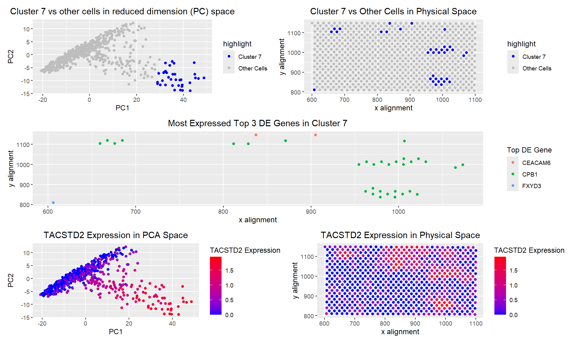
There are a few reasons I am confident in saying that I picked the same cells. First, I looked at TACSTD2 expression in PC space, and it matched very well with where my cluster is highlighted. In my original cluster from HW3, I also had very high TACSTD2 expression. The matching of high TACSTD2 expression was true in physical space as well. I then looked at the top 3 differentially expressed genes in my cluster, which did differ from those in the Pikachu set. However, CEACAM6, which was one of the most commonly overexpressed genes in my cluster, is associated with Crohn’s disease, particularly as a marker of inflammation in gut epithelial cells [1], which is true for TACSTD2 as well. Additionally, the other two highly overexpressed genes, CPB1 and FXYD3, are both overexpressed in cancer cells [2], [3]. Since one of my hypotheses for my cluster from my Pikachu set was that it was gut epithelial cancer cells, I believe it is reasonable to assume that I have isolated the same cluster.
In terms of code changes, I had to edit how I was splicing the dataset because the columns between the Eevee and Pikachu datasets are different. After I changed the splicing, I re-did my K-means clustering. I chose 8 clusters this time rather than 12 because that is where the plateau appeared in my totw plot. I believe that there are fewer clusters in the Eevee dataset because the resolution is much lower, due to spot rather than per-cell analysis. Because each spot contains many cells, there is likely slightly less overall variation, thus resulting in fewer clusters.
I had some issues with my original PCA code stating that I had too many rows in one dataframe. However, upon closer inspection, it appeared that the code which was throwing errors was extraneous, so I simply deleted it. I then changed the names of the variables in my plots and in the code itself to be consistent (i.e. changing ‘Cluster 8’ to ‘Cluster 7’) for clarity in the plots, as well as for code legibility. Finally, I had originally matched my cluster to my cells based on cell index. This was not possible for the Eevee dataset since individual cells are not measured. Instead, I matched the barcodes of the spots to figure out which spots were within my cluster of interest.
- https://www.ncbi.nlm.nih.gov/gene/4680
- https://www.ncbi.nlm.nih.gov/gene/1360
- https://www.genecards.org/cgi-bin/carddisp.pl?gene=FXYD3
Code
1
2
3
4
5
6
7
8
9
10
11
12
13
14
15
16
17
18
19
20
21
22
23
24
25
26
27
28
29
30
31
32
33
34
35
36
37
38
39
40
41
42
43
44
45
46
47
48
49
50
51
52
53
54
55
56
57
58
59
60
61
62
63
64
65
66
67
68
69
70
71
72
73
74
75
76
77
78
79
80
81
82
83
84
85
86
87
88
89
90
91
92
93
94
95
96
97
98
99
100
101
102
103
104
105
106
107
108
109
110
111
112
113
114
115
116
117
118
119
120
121
122
123
124
125
126
127
128
129
130
131
132
133
134
135
136
137
138
139
140
141
142
143
144
145
146
147
148
149
150
151
152
153
154
155
156
157

library(ggplot2)
library(patchwork)

file <- "data/eevee.csv.gz"
data <- read.csv(file)
data[1:5,1:10]

#A panel visualizing your one cluster of interest in reduced dimensional space (PCA, tSNE, etc)
#A panel visualizing your one cluster of interest in physical space
#A panel visualizing differentially expressed genes for your cluster of interest
#A panel visualizing one of these genes in reduced dimensional space (PCA, tSNE, etc)
#A panel visualizing one of these genes in space

pos <- data[, 3:4]
rownames(pos) <- data$cell_id
gexp <- data[, 5:ncol(data)]
rownames(gexp) <- data$barcode

## if you normalize, if you log transform
## you can use different transformations of the gene expression
## for different parts of the analysis
loggexp <- log10(gexp+1)

#Set seed for reproducability with chosen cluster
set.seed(42)
com <- kmeans(loggexp, centers=8)
clusters <- com$cluster
clusters <- as.factor(clusters) ## tell R it's a categorical variable
names(clusters) <- rownames(gexp)
head(clusters)

pcs <- prcomp(loggexp)
df <- data.frame(pcs$x, clusters)
data$PC1 <- pcs$x[,1]
data$PC2 <- pcs$x[,2]

#using this to pick my cluster of interest
ggplot(data) +
  geom_point(aes(x = aligned_x, y=aligned_y, col=clusters)) +
  ggtitle("clusters in real space") +
  theme(plot.title = element_text(hjust=0.5)) +
  xlab("x alignment") + ylab("y alignment")

#Cluster 7 seems to be the most aligned to my original cluster
# in physical space
interest <- 7
cellsOfInterest <- names(clusters)[clusters == interest]
otherCells <- names(clusters)[clusters != interest]

# Create a new column for coloring
data$highlight <- ifelse(clusters == interest, "Cluster 7", "Other Cells")

p1 <- ggplot(data) +
  geom_point(aes(x = PC1, y = PC2, col = highlight)) +
  ggtitle("Cluster 7 vs other cells in reduced dimension (PC) space") +
  theme(plot.title = element_text(hjust = 0.5)) +
  xlab("PC1") +
  ylab("PC2") +
  scale_color_manual(values = c("Cluster 7" = "blue", "Other Cells" = "gray"))

p2 <- ggplot(data) +
  geom_point(aes(x = aligned_x, y = aligned_y, col = highlight)) +
  ggtitle("Cluster 7 vs Other Cells in Physical Space") +
  theme(plot.title = element_text(hjust = 0.5)) +
  xlab("x alignment") +
  ylab("y alignment") +
  scale_color_manual(values = c("Cluster 7" = "blue", "Other Cells" = "gray"))

#Differential gene expression
gexp_cluster7 <- loggexp[cellsOfInterest, ]  # Expression in Cluster 7
gexp_other <- loggexp[otherCells, ]          # Expression in other clusters

pvals <- sapply(1:ncol(loggexp), function(i) {
  wilcox.test(gexp_cluster7[, i], gexp_other[, i], exact = FALSE)$p.value
})

#correction as mentioned in class (i picked bonferroni)
adj_pvals <- p.adjust(pvals, method = "bonferroni")

#mean expression diff
logFC <- colMeans(gexp_cluster7) - colMeans(gexp_other)

# Create a dataframe of results
DE_genes <- data.frame(Gene = colnames(loggexp),
                       logFC = logFC, pval = pvals, adj_pval = adj_pvals)

# Filter p-value < 0.05)
DE_genes <- DE_genes[DE_genes$adj_pval < 0.05, ]

# Sort by mean expression diff
DE_genes <- DE_genes[order(DE_genes$logFC, decreasing = TRUE), ]

# Select the top 5 most differentially expressed genes
top5_genes <- DE_genes$Gene[1:5]
print(top5_genes)

# Subset expression data for the top 5 DE genes within Cluster 8
top5_expr <- loggexp[cellsOfInterest, top5_genes]

# Determine the most highly expressed gene per cell
most_expressed_gene <- apply(top5_expr, 1, function(x) top5_genes[which.max(x)])

# Ensure the spatial coordinates match the selected cells
cell_indices <- match(cellsOfInterest, data$barcode)

# Create a dataframe for plotting
plot_data <- data.frame(
  cell_id = cellsOfInterest,
  aligned_x = data$aligned_x[cell_indices],
  aligned_y = data$aligned_y[cell_indices],
  top_gene = most_expressed_gene
)

p3 <- ggplot(plot_data) +
  geom_point(aes(x = aligned_x, y = aligned_y, color = top_gene)) +
  ggtitle("Most Expressed Top 3 DE Genes in Cluster 7") +
  theme(plot.title = element_text(hjust = 0.5)) +
  xlab("x alignment") +
  ylab("y alignment") +
  labs(color = "Top DE Gene")

#it looks like TACSTD2 is the most preferentially expressed gene,
# so I will further analyze that

# Extract TACSTD2 expression across all cells
tac_expression <- loggexp[, "TACSTD2"]

# Add TACSTD2 expression to the original data
data$tac_expression <- tac_expression

p4 <- ggplot(data, aes(x = PC1, y = PC2, color = tac_expression)) +
  geom_point() +
  scale_color_gradient(low = "blue", high = "red") +
  ggtitle("TACSTD2 Expression in PCA Space") +
  theme(plot.title = element_text(hjust = 0.5)) +
  xlab("PC1") +
  ylab("PC2") +
  labs(color = "TACSTD2 Expression")

p5 <- ggplot(data, aes(x = aligned_x, y = aligned_y, color = tac_expression)) +
  geom_point() +
  scale_color_gradient(low = "blue", high = "red") +
  ggtitle("TACSTD2 Expression in Physical Space") +
  theme(plot.title = element_text(hjust = 0.5)) +
  xlab("x alignment") +
  ylab("y alignment") +
  labs(color = "TACSTD2 Expression")


combined_plot <- (p1 | p2) / p3 / (p4 | p5)

# Display the combined plot
combined_plot