Identification of White Pulp Tissue Structures within CODEX Dataset

1. Create a data visualization and write a description to convince me that your interpretation is correct.
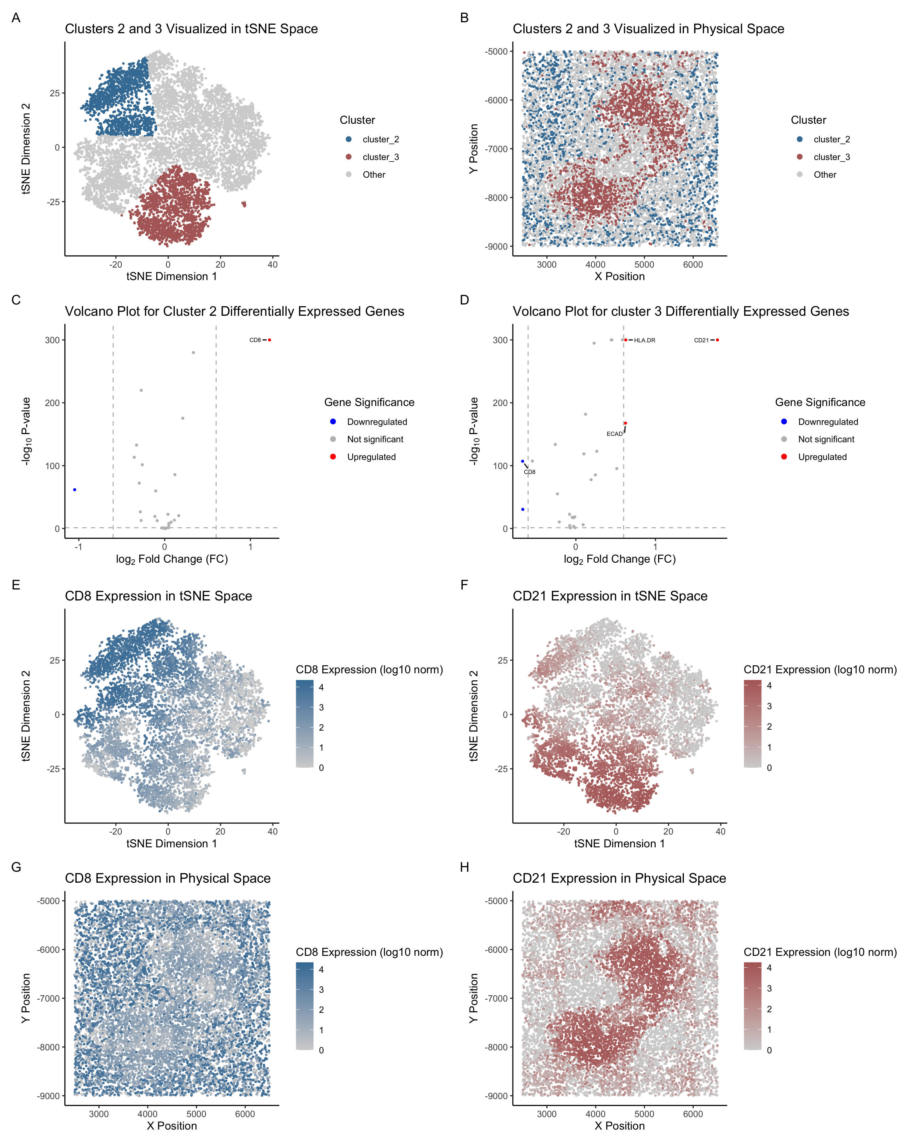
Figure Description and Interpretation
This figure presents a comprehensive analysis of Cluster 2 and Cluster 3, identified through k-means clustering (k = 5), from the CODEX dataset. The analysis includes dimensionality reduction (tSNE and PCA), spatial visualization, and differential expression analysis. The panels are organized into four rows, each providing complementary insights into the clusters’ transcriptional and spatial profiles.
Row 1: Clusters in tSNE and Physical Space The first row visualizes Cluster 2 (blue) and Cluster 3 (red) in both tSNE and physical space. In the tSNE plot (Panel A), the two clusters are well-separated from other clusters, indicating distinct expression profiles. The physical space plot (Panel B) reveals that Cluster 2 and Cluster 3 are localized in specific regions of the spleen tissue. Cluster 2 appears to form a network-like structure, while Cluster 3 is more densely packed, suggesting potential functional and spatial differences between the two clusters.
Row 2: Differential Expression Analysis The second row features volcano plots for Cluster 2 (Panel C) and Cluster 3 (Panel D), highlighting differentially expressed genes. In Cluster 2, CD8 is significantly upregulated, while in Cluster 3, CD21 shows significantly high expression. Interestingly, in Cluster 3, CD8 is significantly downregulated, which contrasts sharply with Cluster 2. This difference makes CD8 an excellent representative marker gene for Cluster 2. These markers provide valuable clues about the biological roles of the clusters.
Row 3: Gene Expression in tSNE Space & Row 4: Gene Expression in Physical Space The third row maps the expression of CD8 (Panel E) and CD21 (Panel F) onto the tSNE space. CD8 expression is higher in the top-left region, which aligns with the location of Cluster 2 in Panel A. In contrast, CD21 expression is higher in the bottom-left region, corresponding to the location of Cluster 3 in Panel A.
The fourth row visualizes CD8 (Panel G) and CD21 (Panel H) expression in the physical tissue space. CD8 expression is more concentrated in discrete regions, although the expression is moderate to high expression across nearly all regions. The main distribution, however, still matches that of Cluster 2. On the other hand, CD21 expression is more densely located in the middle, forming a “bean” shape that mirrors the spatial distribution of Cluster 3.
Conclusion
These patterns further support CD8 and CD21 as strong representative marker genes for Cluster 2 and Cluster 3, respectively. The consistent spatial and expression profiles of these markers reinforce their utility in defining and distinguishing these clusters within the tissue.
Interpretation and Biological Context
Based on the analysis of Cluster 2 and Cluster 3, the tissue structures represented in the data are consistent with the white pulp of the spleen. This interpretation is supported by the spatial distribution of the clusters, the differential expression of key markers, and their alignment with known anatomical features and functions of the spleen’s white pulp.
Cluster 2 is characterized by the significant upregulation of CD8, a marker for cytotoxic T cells, and its network-like spatial distribution. The white pulp contains periarteriolar lymphoid sheaths (PALS), which are rich in T cells, particularly CD8+ T cells, that play a critical role in adaptive immune responses, including targeting intracellular pathogens and tumor cells (Mebius & Kraal, 2005). The spatial localization of Cluster 2 in discrete, organized regions is consistent with the white pulp, which forms structured immune zones surrounding central arterioles (Steiniger, 2015).
Cluster 3 also belongs to the white pulp but is distinguished by the expression of CD21, HLA-DR, and ECAD (E-cadherin). CD21 is a key marker of follicular dendritic cells (FDCs), which are critical for B-cell activation and the formation of germinal centers within the white pulp’s B-cell follicles (Suzuki et al., 1995). The presence of HLA-DR, a major histocompatibility complex (MHC) class II molecule, further supports this classification, as antigen-presenting cells such as dendritic cells and B cells are abundant in the splenic white pulp (Cesta, 2006). The detection of E-cadherin (ECAD) suggests the presence of epithelial-like interactions, possibly linked to stromal components that contribute to follicular structure and organization (Sixt et al., 2004).
The differential expression of markers in these two clusters supports their localization within distinct functional compartments of the white pulp. While Cluster 2 aligns with T-cell-rich zones of the PALS, Cluster 3 corresponds to the B-cell follicles and germinal centers. The spatial separation of these clusters in both tSNE and physical space is consistent with the well-defined compartmentalization of the white pulp (Steiniger, 2015).
Conclusion
In summary, both Cluster 2 and Cluster 3 represent distinct immune microenvironments within the splenic white pulp. Cluster 2, enriched in CD8+ T cells, is likely associated with PALS, whereas Cluster 3, marked by CD21+, HLA-DR+, and ECAD+ cells, corresponds to B-cell follicles and germinal centers.
References
- Cesta, M. F. (2006). Normal structure, function, and histology of the spleen. Toxicologic Pathology, 34(5), 455–465.
- Mebius, R. E., & Kraal, G. (2005). Structure and function of the spleen. Nature Reviews Immunology, 5(8), 606–616.
- Steiniger, B. (2015). Human spleen microanatomy: why mice do not suffice. Blood, 125(13), 1827–1832.
- Suzuki, K., Grigorova, I., Phan, T. G., Kelly, L. M., & Cyster, J. G. (1995). Visualizing B cell capture of cognate antigen from follicular dendritic cells. Nature, 444(7117), 539–542.
- Sixt, M., Kanazawa, N., Selg, M., Samson, T., Roos, G., Reinhardt, D. P., … & Lutz, M. B. (2004). The conduit system transports soluble antigens from the afferent lymph to resident dendritic cells in the T cell area of the lymph node. Immunity, 22(1), 19–29.
2. Code (paste your code in between the ``` symbols)
1
2
3
4
5
6
7
8
9
10
11
12
13
14
15
16
17
18
19
20
21
22
23
24
25
26
27
28
29
30
31
32
33
34
35
36
37
38
39
40
41
42
43
44
45
46
47
48
49
50
51
52
53
54
55
56
57
58
59
60
61
62
63
64
65
66
67
68
69
70
71
72
73
74
75
76
77
78
79
80
81
82
83
84
85
86
87
88
89
90
91
92
93
94
95
96
97
98
99
100
101
102
103
104
105
106
107
108
109
110
111
112
113
114
115
116
117
118
119
120
121
122
123
124
125
126
127
128
129
130
131
132
133
134
135
136
137
138
139
140
141
142
143
144
145
146
147
148
149
150
151
152
153
154
155
156
157
158
159
160
161
162
163
164
165
166
167
168
169
170
171
172
173
174
175
176
177
178
179
180
181
182
183
184
185
186
187
188
189
190
191
192
193
194
195
196
197
198
199
200
201
202
203
204
205
206
207
208
209
210
211
212
213
214
215
216
217
218
219
220
221
222
223
224
225
226
227
228
229
230
231
232
233
234
235
236
237
238
239
240
241
242
243
244
245
# Load the data
data <- read.csv('~/Desktop/genomic_data_visualization/genomic-data-visualization-2025/data/codex_spleen_3.csv.gz',
                 row.names = 1)

head(data)

# Import libraries
library(ggplot2)
library(patchwork)
library(Rtsne)
library(ggrepel)

# Extract position, area, and protein expression data
pos <- data[, 1:2]
area <- data[, 3]
pexp <- data[, 4:31]

## Normalize the protein expression data (log10 normalization)
pexpnorm <- log10(pexp/rowSums(pexp) * mean(rowSums(pexp))+1)

# Set seed for reproducibility
set.seed(5)

## Perform PCA
pvar <- apply(pexpnorm, 2, var)
pmean <- apply(pexpnorm, 2, mean)
sort(apply(pexpnorm, 2, var))
pcs <- prcomp(pexpnorm)
plot(pcs$sdev[1:20])

# Perform tSNE
tsne <- Rtsne::Rtsne(pcs$x[,1:18])$Y

# Check total within-cluster to find optimal k
totw <- sapply(2:25, function(k) {
  com <- kmeans(tsne, centers = k)
  return(com$tot.withinss)
})
plot(2:25, totw, type = "b", pch = 19, col = "purple",
     xlab = "Number of Clusters (k)", ylab = "Total Within-Cluster Sum of Squares",
     main = "Elbow Plot for Optimal k in k-means Clustering")

# Perform k-means clustering with chosen k = 5
kmeans_result <- kmeans(tsne, centers = 5)
clusters <- as.factor(kmeans_result$cluster)

# Plot clusters in tSNE space
p1 <- ggplot(data.frame(tsne, clusters)) +
  geom_point(aes(x = X1, y = X2, col=clusters), size = 0.05) +
  labs(title = "Clusters Visualized in tSNE Space",
       x = "tSNE Dimension 1",
       y = "tSNE Dimension 2",
       color = "Cluster") +
  theme_classic()

p1

# Plot clusters in physical space
p2 <- ggplot(data.frame(pos, clusters)) +
  geom_point(aes(x = x, y = y, col=clusters), size = 0.05) +
  labs(title = "Clusters Visualized in Physical Space",
       x = "X Position",
       y = "Y Position",
       color = "Cluster") +
  theme_classic()

# Define colors for the chosen clusters
cluster.cols <- c("#B36866", "#427DA5", "lightgrey")
names(cluster.cols) <- c("cluster_3", "cluster_2", "Other")

# Specify the selected clusters
selected_cluster_3 <- 3
selected_cluster_2 <- 2

# Create a new data frame for plotting in tSNE space
df_tsne <- data.frame(
  emb1 = tsne[, 1],  # tSNE first dimension
  emb2 = tsne[, 2],  # tSNE second dimension
  cluster = ifelse(
    kmeans_result$cluster == selected_cluster_3, "cluster_3",
    ifelse(kmeans_result$cluster == selected_cluster_2, "cluster_2", "Other")
  )
)

# Plot cluster 2 and 3 in tSNE space
p3 <- ggplot(df_tsne, aes(x = emb1, y = emb2, col = cluster)) +
  geom_point(size = 0.5) +
  theme_classic() +
  scale_color_manual(values = cluster.cols) +
  labs(title = "Clusters 2 and 3 Visualized in tSNE Space",
       x = "tSNE Dimension 1",
       y = "tSNE Dimension 2",
       color = "Cluster") +
  guides(size = "none", color = guide_legend(override.aes = list(size = 2)))


# Create a new data frame for plotting in physical space
df_phys <- data.frame(
  x = data$x, y = data$y,
  cluster = ifelse(
    kmeans_result$cluster == selected_cluster_3, "cluster_3",
    ifelse(kmeans_result$cluster == selected_cluster_2, "cluster_2", "Other")
  )
)

# Plot cluster 2 and 3 in physical space
p4 <- ggplot(df_phys, aes(x = x, y = y, col = cluster)) +
  geom_point(size = 0.5) +
  theme_classic() +
  scale_color_manual(values = cluster.cols) +
  labs(title = "Clusters 2 and 3 Visualized in Physical Space",
       x = "X Position",
       y = "Y Position",
       color = "Cluster") +
  guides(size = "none", color = guide_legend(override.aes = list(size = 2)))

## Wilcoxon Test for Differential Expression (DE) Genes

# Function to perform DE analysis and create a volcano plot
create_volcano_plot <- function(pexpnorm, clusters, selected_cluster, cluster_name) {
  # Perform Wilcoxon test for differential expression
  pv <- sapply(colnames(pexpnorm), function(i) {
    wilcox.test(pexpnorm[as.numeric(clusters) == selected_cluster, i],
                pexpnorm[as.numeric(clusters) != selected_cluster, i])$p.value
  })

  # Avoid p-values of 0
  pv[pv == 0] <- 1e-400

  # Compute log fold change
  logfc <- sapply(colnames(pexpnorm), function(i) {
    log2((mean(pexpnorm[as.numeric(clusters) == selected_cluster, i]) + 1e-6) /
           (mean(pexpnorm[as.numeric(clusters) != selected_cluster, i]) + 1e-6))
  })

  # Disregard extreme outliers
  logfc[logfc < -6] <- NA

  # Create a data frame for the volcano plot
  df <- data.frame(pv = -log10(pv), logfc = logfc)
  df$genes <- rownames(df)

  # Add significance label
  df$diffexpressed <- "Not Significant"
  df$diffexpressed[df$logfc > 0.6 & pv < 0.05] <- "Upregulated"
  df$diffexpressed[df$logfc < -0.6 & pv < 0.05] <- "Downregulated"

  # Cap -log10(p-value) at a max value
  max_pv <- 300  # Adjust based on plot aesthetics
  df$pv <- pmin(df$pv, max_pv)

  # Create volcano plot
  volcano_plot <- ggplot(df, aes(x = logfc, y = pv, color = diffexpressed)) +
    geom_point(size = 0.75) +
    geom_vline(xintercept = c(-0.6, 0.6), col = "gray", linetype = 'dashed') +
    geom_hline(yintercept = -log10(0.05), col = "gray", linetype = 'dashed') +
    scale_color_manual(values = c("blue", "gray", "red"),
                       labels = c("Downregulated", "Not significant", "Upregulated")) +
    theme_classic() +
    labs(color = 'Gene Significance',
         x = expression("log"[2]*" Fold Change (FC)"),
         y = expression("-log"[10]*" P-value"),
         title = paste("Volcano Plot for", cluster_name, "Differentially Expressed Genes")) +
    geom_text_repel(aes(label = ifelse(pv > 100 & (logfc < -0.6 | logfc > 0.6), as.character(genes), "")),
                    max.overlaps = 15,
                    box.padding = 0.5,
                    point.padding = 0.3,
                    min.segment.length = 0,
                    segment.color = "black",
                    force = 5,
                    size = 2, color = "black") +
    scale_x_continuous(breaks = seq(-5, 5, 1)) +
    ylim(0, max_pv + 10) +  # Ensures no cut-off points
    guides(size = "none", color = guide_legend(override.aes = list(size = 2)))

  return(volcano_plot)
}

# Create volcano plot for cluster 2
p5 <- create_volcano_plot(pexpnorm, clusters, selected_cluster_2, "Cluster 2")

# Create volcano plot for cluster 3
p6 <- create_volcano_plot(pexpnorm, clusters, selected_cluster_3, "cluster 3")

# Plot gene CD8 in tSNE space
plot.df <- data.frame(emb1 = tsne[,1],
                      emb2 = tsne[,2],
                      CD8 = pexpnorm$CD8)

p7 <- ggplot(plot.df, aes(emb1, emb2,col=CD8)) +
  geom_point(size = 0.4) +
  theme_classic() +
  scale_color_gradient(low='lightgrey', high='#427DA5') +
  labs(title = "CD8 Expression in tSNE Space",
       x = "tSNE Dimension 1",
       y = "tSNE Dimension 2",
       color = "CD8 Expression (log10 norm)")

# Plot gene CD8 in physical space
plot.df <- data.frame(x = data$x,
                      y = data$y,
                      CD8 = pexpnorm$CD8)

p8 <- ggplot(plot.df, aes(x, y, col=CD8)) +
  geom_point(size=0.5) +
  theme_classic() +
  scale_color_gradient(low='lightgrey', high='#427DA5') +
  labs(title = "CD8 Expression in Physical Space",
       x = "X Position",
       y = "Y Position",
       color = "CD8 Expression (log10 norm)")

# Plot gene CD21 in tSNE space
plot.df <- data.frame(emb1 = tsne[,1],
                      emb2 = tsne[,2],
                      CD21 = pexpnorm$CD21)

p9 <- ggplot(plot.df, aes(emb1, emb2,col=CD21)) +
  geom_point(size = 0.4) +
  theme_classic() +
  scale_color_gradient(low='lightgrey', high='#B36866') +
  labs(title = "CD21 Expression in tSNE Space",
       x = "tSNE Dimension 1",
       y = "tSNE Dimension 2",
       color = "CD21 Expression (log10 norm)")

# Plot gene CD21 in physical space
plot.df <- data.frame(x = data$x,
                      y = data$y,
                      CD21 = pexpnorm$CD21)

p10 <- ggplot(plot.df, aes(x, y, col=CD21)) +
  geom_point(size=0.5) +
  theme_classic() +
  scale_color_gradient(low='lightgrey', high='#B36866') +
  labs(title = "CD21 Expression in Physical Space",
       x = "X Position",
       y = "Y Position",
       color = "CD21 Expression (log10 norm)")

# Display the plots
p3 + p4 + p5 + p6 + p7 + p9 + p8 + p10 +
  plot_annotation(tag_levels = 'A') +
  plot_layout(nrow = 4, ncol = 2)