Identification of White Pulp in CODEX Spleen Data Through Immune Cell Profiling

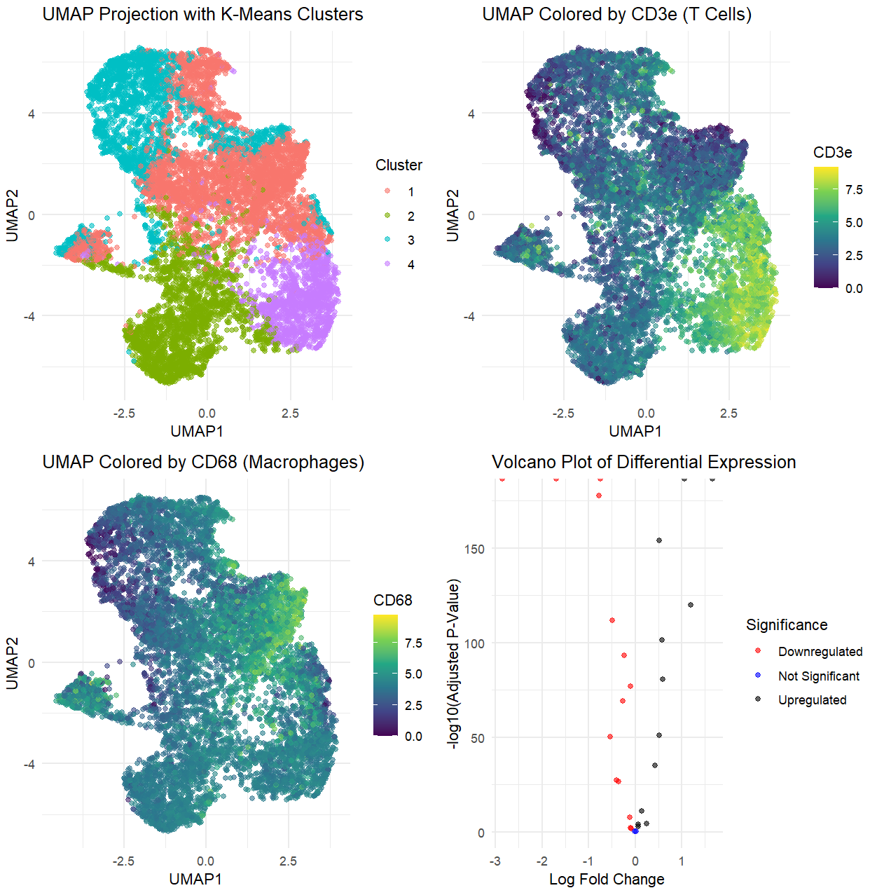
Based on the analysis of the CODEX dataset, I’m interpreting the tissue structure represented as the white pulp of the spleen. This conclusion is drawn from the identification of two specific immune cell types: CD3e (T cells) and CD68 (macrophages), which are prevalent in the white pulp and play crucial roles in the adaptive immune response.
The UMAP visualizations generated from the analysis reveal distinct clusters where both T cells and macrophages coexist, indicating areas of active immune engagement characteristic of white pulp. T cells, marked by CD3e, facilitate immune responses to pathogens, while CD68-positive macrophages are essential for phagocytosis and antigen presentation, particularly in the marginal zone and follicles of the white pulp.
The differential expression analysis, visualized through a volcano plot, highlights the significant upregulation of genes associated with T cell activation and macrophage responses within the cluster of interest. This further supports the interpretation of the tissue as active white pulp.
The data also show a significant amount of downregulation, which provides additional insights into the tissue’s function. The downregulation of genes associated with other splenic regions—such as red pulp macrophages (e.g., F4/80) or endothelial cells—suggests that this cluster does not belong to the red pulp or a vascular structure like an artery/vein. Similarly, a lack of stromal or fibroblast-related gene expression makes capsule/trabecula an unlikely classification. The pattern of downregulated genes could indicate that the white pulp is undergoing a specific immune response, where certain homeostatic or regulatory genes are suppressed in favor of an activated immune state. This would be consistent with the role of the white pulp in antigen presentation and lymphocyte activation, supporting the idea that the identified structure is not just resting white pulp, but an actively responding immune microenvironment.
Together, these findings and analyses strongly suggest that the observed cellular composition within the CODEX dataset aligns with the characteristics of white pulp tissue, demonstrating the active immune processes typical of this region in the spleen.
I used my code from homework 3/4, class activities, and ChatGPT to help in the DE and UMAP analysis as well as format my graphs.
Sources: https://www.science.org/doi/10.1126/sciimmunol.aau6085 https://pubmed.ncbi.nlm.nih.gov/26441984/
1
2
3
4
5
6
7
8
9
10
11
12
13
14
15
16
17
18
19
20
21
22
23
24
25
26
27
28
29
30
31
32
33
34
35
36
37
38
39
40
41
42
43
44
45
46
47
48
49
50
51
52
53
54
55
56
57
58
59
60
61
62
63
64
65
66
67
68
69
70
71
72
73
74
75
76
77
78
79
80
81
82
83
84
85
86
87
88
89
90
91
92
93
94
95
96
97
98
99
100
101
102
103
104
105
106
107
108
109
110
# Import necessary packages
# import.packages("ggplot2")
# import.packages("Seurat")
# import.packages("umap")
# import.packages("dplyr")
# import.packages("patchwork")
# import.packages("gridExtra")

# Load necessary libraries
library(ggplot2)
library(Seurat)
library(umap)
library(dplyr)
library(patchwork)
library(gridExtra)

# Load the dataset
file_path <- "C:/Users/reach/OneDrive/Documents/2024-25/SPRING/Genomic Data Visualization/codex_spleen_3.csv.gz"
df <- read.csv(gzfile(file_path))

# Identify marker columns
marker_cols <- colnames(df)[!(colnames(df) %in% c("X", "x", "y", "area"))]

# ---------- Quality Control (QC) ----------
# Remove cells with too few detected markers
min_detected_markers <- 3  # Adjust this threshold as needed
df <- df[rowSums(df[, marker_cols] > 0) >= min_detected_markers, ]

# Log-transform marker values for better visualization
df[, marker_cols] <- log1p(df[, marker_cols])

# ---------- Perform PCA ----------
pca_result <- prcomp(df[, marker_cols], center = TRUE, scale. = TRUE)

# Perform K-Means Clustering
set.seed(42)
num_clusters <- 4
df$cluster <- as.factor(kmeans(pca_result$x[, 1:10], centers = num_clusters, nstart = 10)$cluster)

# ---------- Reduce Dimensions w/ UMAP ----------
umap_result <- umap(pca_result$x[, 1:10])
df$UMAP1 <- umap_result$layout[,1]
df$UMAP2 <- umap_result$layout[,2]

# UMAP Projection with Clusters
umap_cluster_plot <- ggplot(df, aes(x = UMAP1, y = UMAP2, color = cluster)) +
  geom_point(alpha = 0.6) +
  labs(title = "UMAP Projection with K-Means Clusters", x = "UMAP1", y = "UMAP2", color = "Cluster") +
  theme_minimal()

# ---------- UMAP Colored by Marker Expression ----------
# CD3e (T Cells)
umap_cd3e_plot <- ggplot(df, aes(x = UMAP1, y = UMAP2, color = CD3e)) +
  geom_point(alpha = 0.6) +
  scale_color_viridis_c() +
  labs(title = "UMAP Colored by CD3e (T Cells)", x = "UMAP1", y = "UMAP2", color = "CD3e") +
  theme_minimal()

# CD68 (Macrophages)
umap_cd68_plot <- ggplot(df, aes(x = UMAP1, y = UMAP2, color = CD68)) +
  geom_point(alpha = 0.6) +
  scale_color_viridis_c() +
  labs(title = "UMAP Colored by CD68 (Macrophages)", x = "UMAP1", y = "UMAP2", color = "CD68") +
  theme_minimal()

# ---------- Differential Expression Analysis ----------
# Specify the cluster of interest
cluster_of_interest <- "1"

# Initialize results data frame
de_results <- data.frame(Gene = marker_cols, LogFC = numeric(length(marker_cols)), PValue = numeric(length(marker_cols)))

# Loop through each marker gene
for (i in seq_along(marker_cols)) {
  gene <- marker_cols[i]

  # Get expression values for the cluster of interest and the rest
  expr_cluster <- df[df$cluster == cluster_of_interest, gene]
  expr_other <- df[df$cluster != cluster_of_interest, gene]

  # Perform a t-test and calculate log fold change
  t_test_result <- t.test(expr_cluster, expr_other)
  logFC <- mean(expr_cluster) - mean(expr_other)

  # Store results
  de_results[i, "LogFC"] <- logFC
  de_results[i, "PValue"] <- t_test_result$p.value
}

# Adjust p-values for multiple testing
de_results$AdjPValue <- p.adjust(de_results$PValue, method = "fdr")

# Categorize significance
de_results$Significance <- ifelse(de_results$AdjPValue < 0.05 & de_results$LogFC > 0, "Upregulated",
                                  ifelse(de_results$AdjPValue < 0.05 & de_results$LogFC < 0, "Downregulated", "Not Significant"))

# ---------- Create a Simple Volcano Plot ----------
volcano_plot <- ggplot(de_results, aes(x = LogFC, y = -log10(AdjPValue), color = Significance)) +
  geom_point(alpha = 0.6) +
  scale_color_manual(values = c("red", "blue", "black")) +
  labs(title = "Volcano Plot of Differential Expression",
       x = "Log Fold Change",
       y = "-log10(Adjusted P-Value)") +
  theme_minimal()

# ---------- Arrange All Plots ----------
final_plot <- grid.arrange(umap_cluster_plot, umap_cd3e_plot,
                           umap_cd68_plot, volcano_plot,
                           ncol=2, widths=c(1.5, 1.5))