Normalized vs Unormalized PCA with gganimate

Description
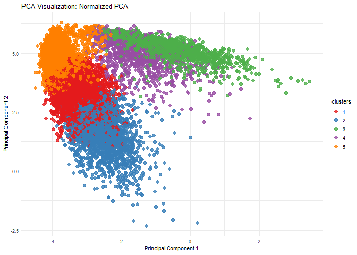
This visualization explores the importance of normalization on gene expression analysis through when performing dimensionality reduction, specifically, Principal Component Analysis. By comparing normalized (log10-transformed and scaled) and unnormalized data, we demonstrate how different preprocessing techniques can dramatically alter the dimensional representation of genomic data. The animation reveals how log transformation and scaling can compress extreme values, reduce technical variations, and uncover biological patterns that might be obscured in raw data. Normalization is crucial because gene expression datasets often contain wide-ranging values, technical noise, and skewed distributions.
Code (paste your code in between the ``` symbols)
1
2
3
4
5
6
7
8
9
10
11
12
13
14
15
16
17
18
19
20
21
22
23
24
25
26
27
28
29
30
31
32
33
34
35
36
37
38
39
40
41
42
43
44
45
46
47
48
49
50
51
52
53
54
55
56
57
58
59
60
61
62
63
64
65
66
67
68
69
70
71
72
73
74
75
76
# Load necessary libraries
library(ggplot2)
library(gganimate)
library(dplyr)

# Load data
file <- '/Users/ishit/GenomicVis/genomic-data-visualization-2025/data/pikachu.csv.gz'
data <- read.csv(file)
gexp <- data

# Normalize expression
loggexp <- log10(gexp + 1)

# Perform k-means clustering
set.seed(42)
com_norm <- kmeans(loggexp, centers=5)
com_unorm <- kmeans(loggexp, centers=5)

# Perform PCA on both normalized and unnormalized data
pcs_norm <- prcomp(loggexp, center = TRUE, scale. = TRUE)
pcs_unorm <- prcomp(loggexp, center = TRUE, scale. = FALSE)

# Prepare data for animation
df_norm <- data.frame(
  PC1 = pcs_norm$x[,1],
  PC2 = pcs_norm$x[,2],
  clusters = as.factor(com_norm$cluster),
  normalization = 'Normalized PCA'
)

df_unorm <- data.frame(
  PC1 = pcs_unorm$x[,1],
  PC2 = pcs_unorm$x[,2],
  clusters = as.factor(com_unorm$cluster),
  normalization = 'Unnormalized PCA'
)

# rescale to fit on same graph
df_norm_scaled <- transform(df_norm,
                            PC1 = scales::rescale(PC1, to = range(df_unorm$PC1)),
                            PC2 = scales::rescale(PC2, to = range(df_unorm$PC2))
)

# combine
df_combined <- rbind(df_norm_scaled, df_unorm)

# Create the animated plot
p <- ggplot(df_combined, aes(x = PC1, y = PC2, color = clusters)) +
  geom_point(size = 3, alpha = 0.8) +
  theme_minimal() +
  labs(
    title = 'PCA Visualization: {closest_state}',
    x = 'Principal Component 1',
    y = 'Principal Component 2'
  ) +
  # Customize color palette
  scale_color_brewer(palette = "Set1") +
  # Smooth transition #from https://stackoverflow.com/questions/56745088/how-to-create-smooth-transition-between-states-in-gganimate-using-geom-point
  transition_states(normalization, transition_length = 2, state_length = 2) +
  enter_fade() +
  exit_fade() +
  ease_aes('cubic-in-out')

# animate
animation <- animate(p,
                     height = 500,
                     width = 700,
                     nframes = 200,
                     fps = 30,
                     renderer = gifski_renderer())

print(animation)

# Save the animation
anim_save("genomic-data-visualization-2025/homework/hwEC1/ishitaunde.gif", animation)