Difference between STDecovolution or K-mean clustering on Eevvee Dataset

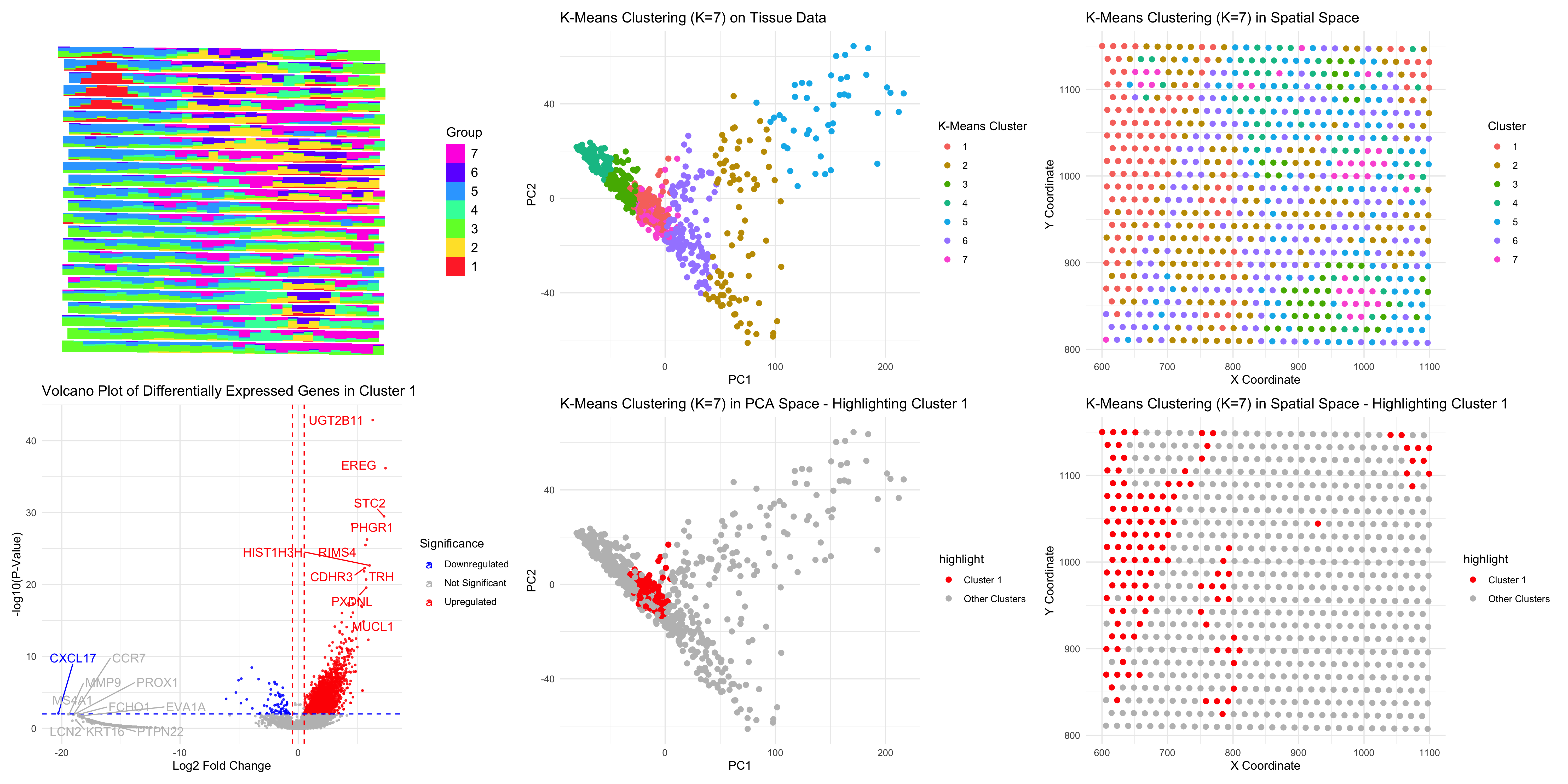
### Same as homework 4, I performed STdeconvolve on the Eevvee dataset to infer cell-type proportions and used K-means clustering (K=7) to analyze tissue organization. The scatterbar plot visualizes the spatial distribution of deconvolved cell types.
Cluster 1, highlighted in spatial and PCA space, shows distinct differentially expressed genes, including EREG, STC2, UGT2B11, HIST1H3H, and MUCL1, which are associated with epithelial and mucosal-related cells (Wang et al., 20202). The volcano plot indicates strongly upregulated genes and implies a functional independence of this cluster.
Compared to previous analyses, STdeconvolve yielded cell-type proportions without knowledge of the cell types being used compared to other analyses, whereas K-means clustering offered a spatial framework for the organization of the respective cells. It underscores spatial heterogeneity and possibly biological relevance of tissue composition by looking at the plot of PCAs and clustering on sptial physical space.
Wang, C., Long, Q., Fu, Q. et al. Targeting epiregulin in the treatment-damaged tumor microenvironment restrains therapeutic resistance. Oncogene 41, 4941–4959 (2022). https://doi.org/10.1038/s41388-022-02476-7
Code (paste your code in between the ``` symbols)
```r
library(STdeconvolve)
library(ggplot2)
library(reshape2)
library(dplyr)
library(scatterbar)
library(ggrepel)
library(patchwork)
set.seed(42)
file <- ‘/Users/harriethe/GenomicDataVisualization/genomic-data-visualization-2025/data/eevee.csv.gz’
data <- read.csv(file)
pos <- data[, 3:4]
colnames(pos) <- c(‘x’, ‘y’)
rownames(pos) <- data$barcode
gexp <- data[, 5:ncol(data)]
rownames(gexp) <- data$barcode
counts <- cleanCounts(t(gexp), min.lib.size = 100, verbose=TRUE, plot=TRUE)
corpus <- restrictCorpus(counts, removeAbove=1.0, removeBelow=0.05, nTopOD=1000)
ldas <- fitLDA(t(as.matrix(corpus)), Ks = seq(5, 8))
optLDA <- optimalModel(models = ldas, opt = “7”)
results <- getBetaTheta(optLDA, perc.filt = 0.05, betaScale = 1000)
deconProp <- results$theta
deconGexp <- results$beta
scatterbar_plot <- scatterbar(deconProp, xy = pos)
group_1_cells <- rownames(deconProp)[apply(deconProp, 1, which.max) == 1]
print(length(group_1_cells))
gexp <- as.matrix(gexp)
gexp[is.na(gexp)] <- 0
dge_results_group1 <- sapply(1:ncol(gexp), function(i) {mean_group1 <- mean(gexp[group_1_cells, i]) + 1e-6
mean_other <- mean(gexp[setdiff(rownames(gexp), group_1_cells), i]) + 1e-6
log2(mean_group1 / mean_other)
})
p_values_group1 <- sapply(1:ncol(gexp), function(i) { wilcox.test(gexp[group_1_cells, i], gexp[setdiff(rownames(gexp), group_1_cells), i], alternative = ‘two.sided’)$p.value })
volcano_df_group1 <- data.frame( Gene = colnames(gexp), Log2FC = dge_results_group1, P_Value = -log10(p_values_group1) ) log2FC_cutoff <- 1 pval_cutoff <- 0.01 volcano_df_group1$Significance <- ifelse( volcano_df_group1$P_Value > -log10(pval_cutoff) & abs(volcano_df_group1$Log2FC) > log2FC_cutoff, ifelse(volcano_df_group1$Log2FC > log2FC_cutoff, “Upregulated”, “Downregulated”), “Not Significant” ) top_upregulated <- volcano_df_group1[order(-volcano_df_group1$Log2FC), ][1:10, ] top_downregulated <- volcano_df_group1[order(volcano_df_group1$Log2FC), ][1:10, ] print(“Top 10 Upregulated Genes in Group 1:”) print(top_upregulated$Gene) volcano_plot <- ggplot(volcano_df_group1, aes(x = Log2FC, y = P_Value, color = Significance)) + geom_point(size = 0.5, alpha = 0.8) + scale_color_manual(values = c(“Upregulated” = “red”, “Downregulated” = “blue”, “Not Significant” = “gray”)) + theme_minimal() + xlab(“Log2 Fold Change”) + ylab(“-log10(P-Value)”) + ggtitle(“Volcano Plot of Differentially Expressed Genes in Cluster 1”) + geom_vline(xintercept = c(-log2FC_cutoff, log2FC_cutoff), linetype = “dashed”, color = “red”) + geom_hline(yintercept = -log10(pval_cutoff), linetype = “dashed”, color = “blue”) + geom_text_repel(data = top_upregulated, aes(x = Log2FC, y = P_Value, label = Gene), size = 4, box.padding = 0.5, max.overlaps = 20) + geom_text_repel(data = top_downregulated, aes(x = Log2FC, y = P_Value, label = Gene), size = 4, box.padding = 0.5, max.overlaps = 20) top_upregulated <- volcano_df_group1[order(-volcano_df_group1$Log2FC), ][1:10, ] print(“Top 10 Upregulated Genes in Cluster 1:”) print(top_upregulated) kmeans_result <- kmeans(pcs$x[, 1:10], centers = 7) pca_embeddings$KMeans_Cluster <- as.factor(kmeans_result$cluster) pca_plot <- ggplot(pca_embeddings, aes(x = PC1, y = PC2, color = KMeans_Cluster)) + geom_point(size = 2) + theme_minimal() + labs(title = “K-Means Clustering (K=7) on Tissue Data”, x = “PC1”, y = “PC2”, color = “K-Means Cluster”)
spatial_kmeans_df <- data.frame( x = pos$x, y = pos$y, Cluster = as.factor(kmeans_result$cluster) )
spatial_plot <- ggplot(spatial_kmeans_df, aes(x = x, y = y, color = Cluster)) + geom_point(size = 2) + theme_minimal() + labs(title = “K-Means Clustering (K=7) in Spatial Space”, x = “X Coordinate”, y = “Y Coordinate”)
pca_highlight <- pca_embeddings pca_highlight$highlight <- ifelse(pca_highlight$KMeans_Cluster == “1”, “Cluster 1”, “Other Clusters”) cluster1_pca<- ggplot(pca_highlight, aes(x = PC1, y = PC2, color = highlight)) + geom_point(size = 2) + scale_color_manual(values = c(“Cluster 1” = “red”, “Other Clusters” = “gray”)) + theme_minimal() + labs(title = “K-Means Clustering (K=7) in PCA Space - Highlighting Cluster 1”, x = “PC1”, y = “PC2”)
spatial_highlight <- spatial_kmeans_df spatial_highlight$highlight <- ifelse(spatial_highlight$Cluster == “1”, “Cluster 1”, “Other Clusters”) cluster1_spatial <- ggplot(spatial_highlight, aes(x = x, y = y, color = highlight)) + geom_point(size = 2) + scale_color_manual(values = c(“Cluster 1” = “red”, “Other Clusters” = “gray”)) + theme_minimal() + labs(title = “K-Means Clustering (K=7) in Spatial Space - Highlighting Cluster 1”, x = “X Coordinate”, y = “Y Coordinate”)
combined_plot <- (scatterbar_plot/volcano_plot)| (pca_plot / cluster1_pca) | (spatial_plot/cluster1_spatial) png(“hwEC2_jhe46.png”, width = 6000, height = 3000, res = 300) print(combined_plot) dev.off()```