Using gganimate to understand different preprocessing methods

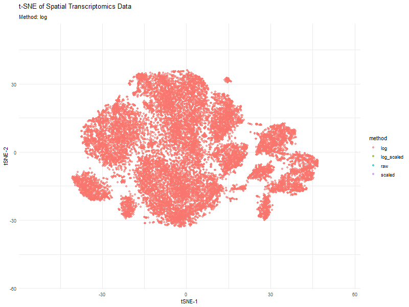
This animation visualizes how different preprocessing methods (raw, log-transformed, scaled, and log-scaled) affect t-SNE dimensionality reduction in spatial transcriptomics data. Each frame represents a different transformation method, highlighting variations in clustering and structure.
The effect of normalization and transformation on dimensionality reduction is clearly evident in the animation. In the raw data analysis, the clusters appear less defined and may be dominated by high-expression genes, leading to less biologically meaningful groupings. The log transformation graph helps mitigate extreme values, leading to a more balanced distribution and better separation of clusters. The scaling graph ensures all genes contribute equally, reducing bias from highly variable genes. This results in a more evenly distributed embedding. The log + scaling graph is a combination that often produces the most distinct and compact clusters, revealing underlying biological patterns more effectively.
The animation visually confirms that unprocessed data often leads to noisy, unstructured embeddings, whereas transformations like log-scaling enhance the clarity of biological groupings.
I used code from in class when we learned about gganimate and ChatGPT to implement and format my animated graph.
1
2
3
4
5
6
7
8
9
10
11
12
13
14
15
16
17
18
19
20
21
22
23
24
25
26
27
28
29
30
31
32
33
34
35
36
37
38
39
40
41
42
43
44
45
46
47
48
49
50
51
52
53
54
55
56
57
install.packages("gganimate")
install.packages("gifski")


library(ggplot2)
library(gganimate)
library(dplyr)
library(tidyr)
library(Seurat)
library(Rtsne)
library(patchwork)

# Load dataset
data <- read.csv(gzfile("C:/Users/reach/OneDrive/Documents/2024-25/SPRING/Genomic Data Visualization/genomic-data-visualization-2025/data/pikachu.csv.gz"))

# Assuming the dataset has gene expression values and spatial coordinates
# Preprocess data with different transformations
process_data <- function(data, method) {
  data_expr <- as.matrix(data[, -c(1:2)])  # Assuming first two columns are spatial coordinates

  if (method == "log") {
    data_expr <- log1p(data_expr)
  } else if (method == "scaled") {
    data_expr <- scale(data_expr)
  } else if (method == "log_scaled") {
    data_expr <- scale(log1p(data_expr))
  }

  pca <- prcomp(data_expr, center = TRUE, scale. = FALSE)
  tsne <- Rtsne(data_expr, dims = 2, perplexity = 30, verbose = FALSE)$Y

  df <- data.frame(
    X = tsne[,1],
    Y = tsne[,2],
    method = method,
    spot = 1:nrow(data)
  )
  return(df)
}

methods <- c("raw", "log", "scaled", "log_scaled")
tsne_results <- bind_rows(lapply(methods, function(m) process_data(data, m)))

# Animated scatter plot
g <- ggplot(tsne_results, aes(x = X, y = Y, color = method)) +
  geom_point(alpha = 0.6) +
  labs(title = 't-SNE of Spatial Transcriptomics Data', subtitle = 'Method: {closest_state}', x = 'tSNE-1', y = 'tSNE-2') +
  theme_minimal() +
  transition_states(method, transition_length = 2, state_length = 1)

# Animate and display the plot
animation <- animate(g, fps = 10, duration = 5, width = 800, height = 600, renderer = gifski_renderer())
animation

# Save the correct animation to the specified path
anim_save("C:/Users/reach/OneDrive/Documents/2024-25/SPRING/Genomic Data Visualization/pca_trajectory_animation.gif", animation = animation)