Comparing Gene Expression in Normalized and Transformed Data

1. Written Answer
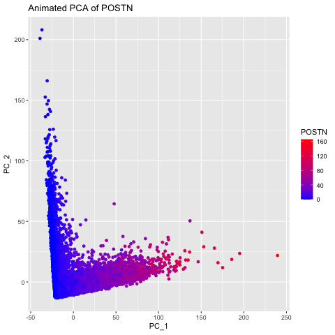
Question: What happens if I do or not not normalize and/or transform the gene expression data (e.g. log and/or scale) prior to dimensionality reduction?
I chose to explore this question to visualize how gene expression data changes when it is not normalized and transformed prior to dimensionality reduction (PCA). I did this by having 3 different groups, the original data, the data normalized using the rowSums(gexp) equation, and the data transformed with the log of the normalized data. The animated gif created shows that each point drastically shifts and it can be seen that the original data (no normalization or transformation) has skewed results and that it is very difficult to accurately compare samples. After normalizing and transforming the data, the PCA visualization provides a much clearer and more accurate representation of gene expression patterns.
2. Code (paste your code in between the ``` symbols)
Note: I used the class code as a base and used ChatGPT to debug some functions.
1
2
3
4
5
6
7
8
9
10
11
12
13
14
15
16
17
18
19
20
21
22
23
24
25
26
27
28
29
30
31
32
33
34
35
36
37
38
39
40
41
42
43
44
45
46
47
48
49
50
51
52
53
54
55
56
57
58
59
60
61
62
63
64
65
66
67
library(ggplot2)
library(Rtsne)
library(gganimate)
library(gifski)
library(av)

# Load Data
data <- read.csv('~/Desktop/genomic-data-visualization-2025/data/pikachu.csv.gz', row.names=1)

# Extract gene expression matrix
gexp <- data[6:ncol(data)]

# Identify Top Expressed Genes
mean_expression <- colMeans(gexp)
top_genes <- names(sort(mean_expression, decreasing = TRUE))
head(top_genes)

selected_gene <- top_genes[1]
geneofinterest <- data[[selected_gene]]

gexpnorm <- gexp / rowSums(gexp) * mean(rowSums(gexp)) + 1
gexpnorm_log <- log10(gexpnorm)

# PCA on Original Data
pc1 <- prcomp(gexp)
df1 <- data.frame(pc1$x[,1:2], gene = geneofinterest)
colnames(df1) <- c('PC_1', 'PC_2', selected_gene)

ggplot(df1) +
  geom_point(aes(PC_1, PC_2, col=.data[[selected_gene]])) +
  labs(title = paste("PCs of Original Data for", selected_gene)) +
  scale_color_gradient(low = "blue", high = "red")

# PCA on Normalized Data
pc2 <- prcomp(gexpnorm)
df2 <- data.frame(pc2$x[,1:2], gene = geneofinterest)
colnames(df2) <- c('PC_1', 'PC_2', selected_gene)

ggplot(df2) +
  geom_point(aes(PC_1, PC_2, col=.data[[selected_gene]])) +
  labs(title = paste("PCs of Normalized Data for", selected_gene)) +
  scale_color_gradient(low = "blue", high = "red")

# PCA on Log-transformed Normalized Data
pc3 <- prcomp(gexpnorm_log)
df3 <- data.frame(pc3$x[,1:2], gene = geneofinterest)
colnames(df3) <- c('PC_1', 'PC_2', selected_gene)

ggplot(df3) +
  geom_point(aes(PC_1, PC_2, col=.data[[selected_gene]])) +
  labs(title = paste("PCs of Log-transformed Normalized Data for", selected_gene)) +
  scale_color_gradient(low = "blue", high = "red")

df <- rbind(cbind(df1, order=1),
            cbind(df2, order=2),
            cbind(df3, order=3))

p <- ggplot(df) +
  labs(title = paste("Animated PCA of", selected_gene)) +
  geom_point(aes(x=PC_1, y=PC_2, col=.data[[selected_gene]])) +
  scale_color_gradient(low = "blue", high = "red")

animated_plot <- p + transition_states(order) + view_follow()
animated_plot

anim_save("~/Downloads/riadani.gif", animated_plot)