Animating the tSNE embedding of CODEX spleen dataset

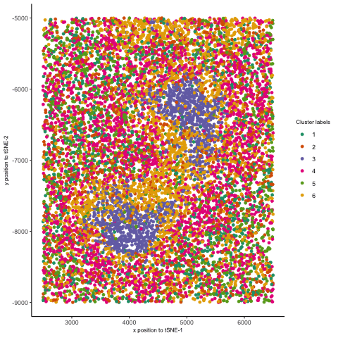
I thought it would be fun to animate the transition from normal space (our x/y positional coordinates) to the tSNE embedded space. Thus, after normalizing my data, I first performed kmeans clustering on the protein levels and visualized these in space. Then, I plotted my points in the tSNE space and colored them by the same cluster labels. Finally, I used gganimate. Doing so helped me better appreciate a few things. I was able to better visualize how tSNE preserves local clusterings by seeing how the points close to one another ended up together in tSNE space. Second, I saw how some initial separation of two clusters in tSNE space could further drive those clusters to be far apart, even if they were close together in physical space. This further affirms how separations between clusters in tSNE embeddings do not necessarily represent how similar/dissimilar those clusters are. Finally, I also animated the transition from normal space to PC space (code is included below), which evidently showed how PCA can be viewed as a projection of the data onto another set of coordinates. This is in stark contrast to tSNE, where there is more of a “smooth” transition from the normal to the tSNE space—consistent with the method of finding a lower-dimensional representation by “placing” points based on a probability distribution.
References:
- https://gganimate.com/reference/transition_states.html
- https://stackoverflow.com/questions/51440496/using-gganimate-to-export-gif
Code (paste your code in between the ``` symbols)
1
2
3
4
5
6
7
8
9
10
11
12
13
14
15
16
17
18
19
20
21
22
23
24
25
26
27
28
29
30
31
32
33
34
35
36
37
38
39
40
41
42
43
44
45
46
47
48
49
50
51
52
53
54
55
56
57
58
59
60
61
62
63
64
65
66
67
68
69
70
71
72
73
74
75
76
77
78
79
80
81
82
83
84
85
86
87
88
89
90
91
92
93
94
95
96
97
98
99
100
101
102
103
104
105
106
107
108
109
110
111
112
113
114
115
116
117
118
119
120
121
122
123
124
125
126
127
128
129
130
131
132
133
134
135
136
137
138
139
140
141
142
143
144
library(ggplot2)
library(patchwork)
library(Rtsne)
library(gganimate)
library(gifski)
library(dplyr)

#### read in data and normalize ####
data <- read.csv('~/Desktop/GDV/genomic-data-visualization-2025/data/codex_spleen_3.csv.gz')
pos <- data[,2:3]
areas <- data[,4]
prots <- data[,5:ncol(data)]
rownames(pos) <- data[,1]
rownames(prots) <- data[,1]

#### set ggplot theme/formatting details
ggtheme <- theme_classic() +
  theme(plot.title = element_text(size = 8),
        axis.title.x = element_text(size = 8),
        axis.title.y = element_text(size = 8),
        legend.title = element_text(size = 8))

# using library size normalization #
norm_prots <- prots/rowSums(prots)

#### look for overall highest vals, formulate hypotheses ####
tot_prots <- colSums(prots)
names(tot_prots) <- colnames(prots)
tot_prots <- sort(tot_prots)

#### visualize spots and kmeans clusters ####

# kmeans
set.seed(10)
ks <- c(2,3,4,5,6,7,8,9,10,11,12)
totws <- sapply(ks, function(k) {
  print(k)
  clus <- kmeans(norm_prots, centers = k)
  return(clus$tot.withinss)
})

totws_df <- data.frame(k = ks, totw = totws)

# elbow plot
elbow_plt <- ggplot(totws_df, aes(x = k, y = totw)) +
  geom_point() + ggtheme +
  labs(x = 'k', y = 'Total Withiness',
       title = 'Elbow plot for determining # of clusters')

# using labels w/ 6 clusters
clus_labs <- (kmeans(norm_prots, centers = 6))$cluster
clus_labs <- as.factor(clus_labs)

# plotting spots in physical space, colored by cluster
clus_in_space <- ggplot(pos, aes(x = x, y = y,
                                 color = clus_labs)) +
  geom_point(size = 1) + ggtheme +
  scale_color_brewer(palette="Dark2") +
  labs(x = 'x position', y = 'y position',
       title = 'Spots colored by assigned cluster', color = 'Cluster label')

print(clus_in_space)

#### PCA ####

pcs <- prcomp(norm_prots)
pcs_df <- data.frame(pcs$x)

pcs_plt <- ggplot(pcs_df, aes(x = PC1, y = PC2, color = clus_labs)) +
  geom_point() + ggtheme +
  scale_color_brewer(palette="Dark2") +
  labs(title = 'Top Two PCs, colored by cluster labels',
       color = 'Cluster label')

print(pcs_plt)

#### tSNE ####

emb <- Rtsne(norm_prots)

tsne_df <- data.frame(tSNE1 = emb$Y[,1], tSNE2 = emb$Y[,2])
tsne_plt <- ggplot(tsne_df, aes(x = tSNE1, y = tSNE2, color = clus_labs)) +
  geom_point() + ggtheme +
  scale_color_brewer(palette="Dark2") +
  labs(title = 't-SNE plot, colored by cluster labels',
       color = 'Cluster label')

print(tsne_plt)

#### gganimate ####

pos$state <- 0
pos$clus_labs <- clus_labs

pcs_df_abr <- pcs_df[,1:2]
pcs_df_abr$state <- 1
pcs_df_abr$clus_labs <- clus_labs

tsne_df$state <- 2
tsne_df$clus_labs <- clus_labs

pos <- pos %>%
  rename('comp1' = x,
         'comp2' = y)

pcs_df_abr <- pcs_df_abr %>%
  rename('comp1' = PC1,
         'comp2' = PC2)

tsne_df <- tsne_df %>%
  rename('comp1' = tSNE1,
         'comp2' = tSNE2)

# plt1
trans_df <- rbind(pcs_df_abr, tsne_df)
trans_plt <- ggplot(trans_df, aes(x = comp1, y = comp2,
                                  color = clus_labs)) +
  geom_point() + ggtheme +
  scale_color_brewer(palette="Dark2")

move_plt <- trans_plt + transition_states(state) + view_follow()

# plt2
trans_df2 <- rbind(pos, pcs_df_abr)
trans_plt2 <- ggplot(trans_df2, aes(x = comp1, y = comp2,
                                  color = clus_labs)) +
  geom_point() + ggtheme +
  scale_color_brewer(palette="Dark2")

move_plt2 <- trans_plt2 + transition_states(state,
                                            transition_length = 15,
                                            state_length = 5) + view_follow()

# plt3
trans_df3 <- rbind(pos, tsne_df)
trans_plt3 <- ggplot(trans_df3, aes(x = comp1, y = comp2,
                                    color = clus_labs)) +
  geom_point() + ggtheme +
  scale_color_brewer(palette="Dark2")

move_plt3 <- trans_plt3 + transition_states(state) + view_follow()

anim_save('~/Desktop/GDV/sabahatrahman.gif', move_plt3)