A descriptive title

1. What data types are you visualizing?
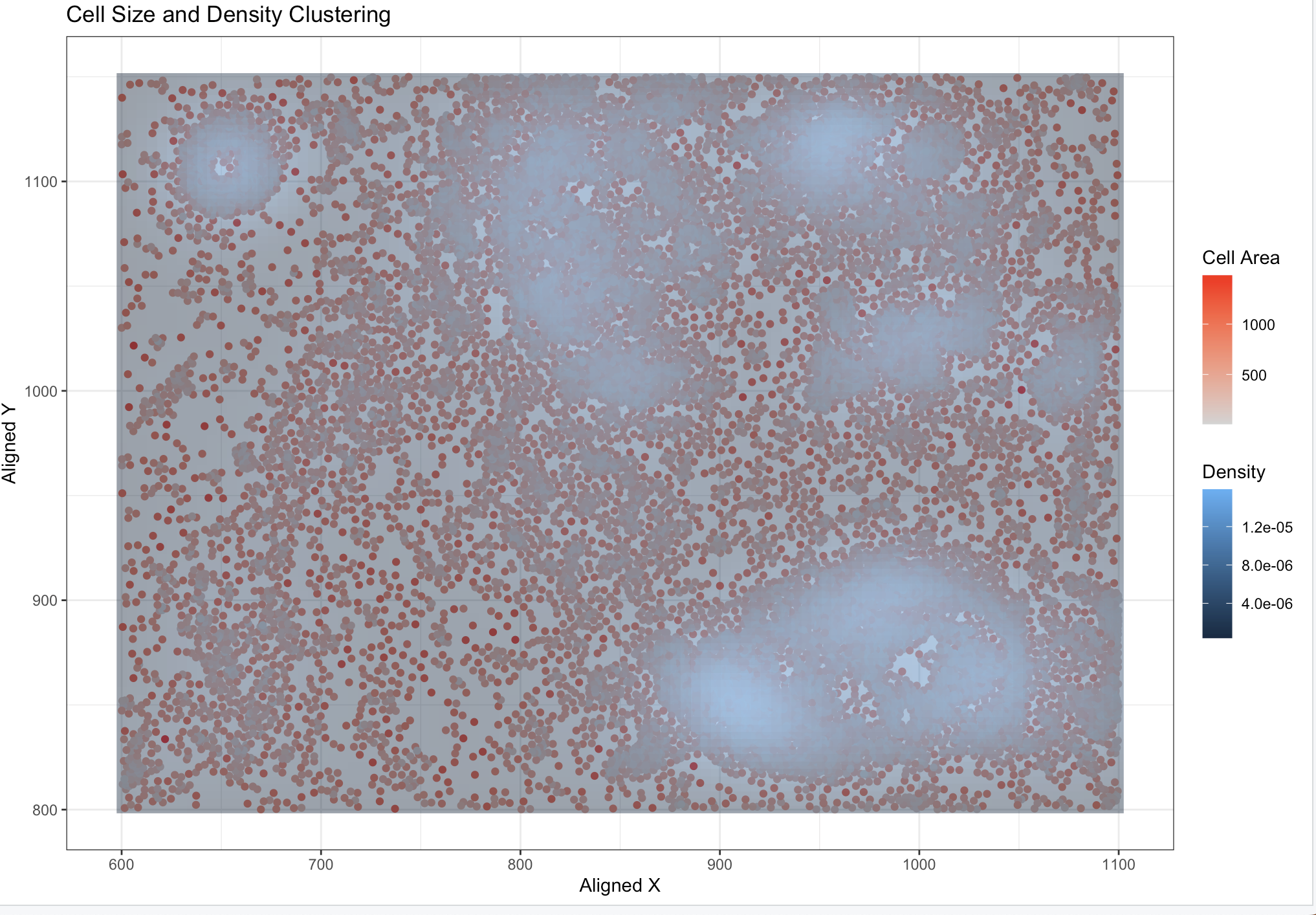
My graph visualizes x,y grid data (spatial) overlaid with the cell areas (quantitative). The overlaid density coloring is also quantitative.
2. What data encodings (geometric primitives and visual channels) are you using to visualize these data types?
This visualization uses the geometric primitive of points to represent each cell. The position along the x-axis encodes the spatial x-coordinate, and the position along the y-axis encodes the spatial y-coordinate. The color saturation (from light grey to red) encodes the quantitative cell size, while the background density uses color gradients to represent clustering patterns.
3. What about the data are you trying to make salient through this data visualization?
I want to see if there is a correlation between the density of the cells and the size of the cells.
4. What Gestalt principles or knowledge about perceptiveness of visual encodings are you using to accomplish this?
I believe there is an argument that the data visualization uses the Gestalt principle of similarity, as points with similar colors are perceived as related groups. It also leverages proximity, as points clustered closely together in spatial coordinates are interpreted as being part of the same group. Additionally, the density overlay enhances enclosure, grouping regions of higher density to highlight spatial clustering patterns.
5. Code (paste your code in between the ``` symbols)
1
2
3
4
5
6
7
8
9
10
11
12
13
14
15
16
17
18
19
20
21
22
23
24
25
26
27
28
29
30
31
32
33
34
35
36
37
38
39
40
41
42
43
44
45
46
47
48
49
50
51
file <- '~/code/genomic-data-visualization-2025/data/pikachu.csv.gz'
data <- read.csv(file)
data[1:5, 1:20]

# compute overall dataset statistics
num_rows <- nrow(data)
num_cols <- ncol(data)
column_names <- colnames(data)
data_types <- sapply(data, class)

print(paste("Number of Rows:", num_rows))
print(paste("Number of Columns:", num_cols))
print("Column Names:")
print(column_names)
print("Data Types:")
print(data_types)

#the rows are individual cells it seems and the columns are a mix of mainly gene expression (integers) and statistics like cell area, x, y coordinates too


# dim(data)
# ncol(data)

# head(sort(colSums(data), decreasing=TRUE), n=20)
library(ggplot2)
# ggplot(data) + geom_point(aes(x=POSTN, y = LUM, col=ERBB2)) + scale_color_gradient(low='lightgrey', high = 'red')

# ggplot(data) + geom_point(aes(x=aligned_x, y = aligned_y, col=cell_area)) + scale_color_gradient(low='lightgrey', high = 'red') + theme_bw()

ggplot(data) +
  geom_point(aes(x = aligned_x, y = aligned_y, col = cell_area)) +
  scale_color_gradient(low = 'lightgrey', high = 'red') +
  stat_density_2d(aes(x = aligned_x, y = aligned_y, fill = ..density..), geom = "raster", contour = FALSE, alpha = 0.5) +
  theme_bw() +
  labs(title = "Cell Size and Density Clustering",
       x = "Aligned X",
       y = "Aligned Y",
       color = "Cell Area",
       fill = "Density")


cor_x <- cor(data$cell_area, data$aligned_x, use = "complete.obs")
cor_y <- cor(data$cell_area, data$aligned_y, use = "complete.obs")

print(paste("Correlation between cell area and X coordinate:", round(cor_x, 3)))
print(paste("Correlation between cell area and Y coordinate:", round(cor_y, 3)))

#a next step I would like to take is to relate the cell size to the density more clearly through partitioning out sections of the x,y grid,
#assigning densities to those regions and then assigning the region's density to the cells inside the region. Therefore, each cell will have two attributes:
# a density and a cell size. I can then do a simple scatter from there to visually inspect if there is a correlation.
utilized this online resource for gradients with ggplot2: https://ggplot2.tidyverse.org/reference/geom_density_2d.html