Relationship between transcriptomic and spatial coordinate using PCA

1. What data types are you visualizing?
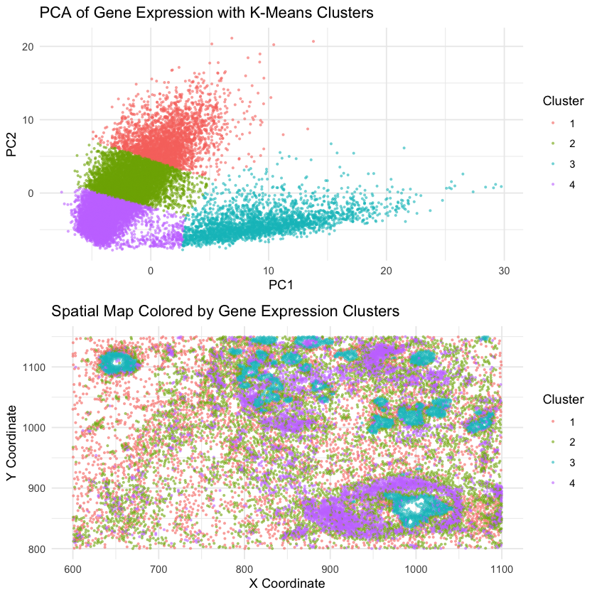
I am visualizing quantitative data of the first two PCs of the gene expression of each cell, as well as the quantitative data of the spatial position x,y to show the position of each cell.
2. What data encodings (geometric primitives and visual channels) are you using to visualize these data types?
We use geometric primitives like points to represent individual cells in both PCA and physical space. We use the visual channels including position to encode PC1 and PC2 in gene expression and the actual physical coordinates, as well as color to represent their kmeans cluster assignment on PCA. It ensures that transcriptionally similar cells are consistently represented for both plots.
3. What about the data are you trying to make salient through this data visualization?
The primary goal is to show the relationship between gene expression and spatial similarity. We do this by clustering in PCA of gene expression space, and color the same cluster in physical space. If transcriptionally similar cells also cluster in the spatial plot, this suggests the relationship. Alternativly, if they are randomly scattered, it indicate indenpendence.
4. What Gestalt principles or knowledge about perceptiveness of visual encodings are you using to accomplish this?
We incorporate similarity that cells with the same cluster is given the same color. We also use proximity that the close points indicate their similar in both space.
5. Code (paste your code in between the ``` symbols)
1
2
3
4
5
6
7
8
9
10
11
12
13
14
15
16
17
18
19
20
21
22
23
24
25
26
27
28
29
30
31
32
33
library(ggplot2)
library(ggpubr)
library(dplyr)
library(cluster)
library(scales)

file <- "/Users/sky2333/Downloads/genomic-data-visualization-2025/data/xenium.csv"
data <- read.csv(file)
gene_expr <- data[, 7:ncol(data)]
gene_expr <- scale(log1p(gene_expr))
gene_expr
pca_result <- prcomp(gene_expr, center = TRUE, scale. = TRUE)

data$PC1 <- pca_result$x[, 1]
data$PC2 <- pca_result$x[, 2]
k <- 4
kmean_result <- kmeans(pca_result$x[, 1:2], centers = k, nstart = 25)

data$Cluster <- as.factor(kmean_result$cluster)

pca_plot <- ggplot(data, aes(x = PC1, y = PC2, color = Cluster)) +
    geom_point(alpha = 0.5, size = 0.5) +
    scale_color_manual(values = hue_pal()(k)) +
    labs(title = "PCA of Gene Expression with K-Means Clusters", x = "PC1", y = "PC2", color = "Cluster") +
    theme_minimal()

spatial_plot <- ggplot(data, aes(x = aligned_x, y = aligned_y, color = Cluster)) +
    geom_point(alpha = 0.5, size = 0.5) +
    scale_color_manual(values = hue_pal()(k)) +
    labs(title = "Spatial Map Colored by Gene Expression Clusters", x = "X Coordinate", y = "Y Coordinate", color = "Cluster") +
    theme_minimal()

ggarrange(pca_plot, spatial_plot, ncol = 1, nrow = 2)