Visualization of cells in physical space vs gene expression space (HW2 for Yi Yang)

1. Description
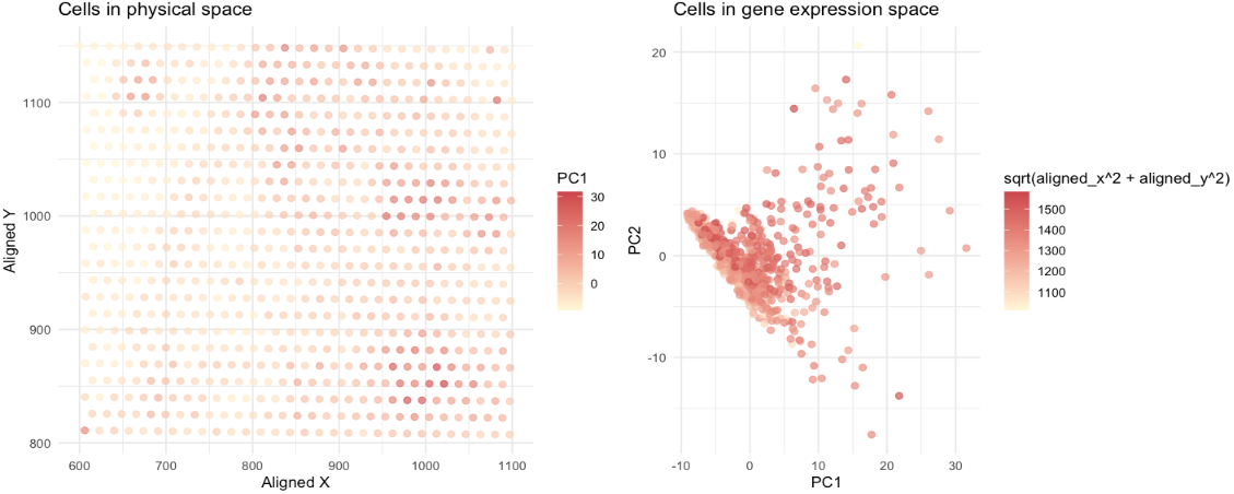
It uses quantitative data (x and y coordinates of cells and gene expression data) to visualize how cells relates in gene expression space versus physical space. Original data are processed by PCA analysis (gene expression data) and Euclidean distance (physical coordinates data) before the visualization. The left plot shows the cells colored by PC1 values in a 2D spatial layout, where points, positions and saturation in color are used. Points (representing cells) have similar color saturation and positions are perceived as being a related group (Similarity and proximity). The right plot shows the cells colored in Euclidean distances in gene expression space, where points, positions, and saturation in color are used. Points (representing cells) have similar color saturation and positions are perceived as being a related group (Similarity and proximity). Two visualization together indicate that there are some cells with similar gene expression closer to each other physically, but the correlation is not very strong (supporting by numerical numbers: correlation = 0.197).
5. Code (paste your code in between the ``` symbols)
1
2
3
4
5
6
7
8
9
10
11
12
13
14
15
16
17
18
19
20
21
22
23
24
25
26
27
28
29
30
31
32
33
34
35
36
37
# IMPORT AND CLEAN UP
data = read.csv('./data/eevee.csv.gz')
gexp = data[,5:ncol(data)]
rownames(gexp) = data$barcode
topgenes = names(sort(colSums(gexp),decreasing = T)[1:100])
gexpsub = gexp[,topgenes]
# POSITIONS
pos = data[,3:4]
rownames(pos) = data$barcode
# RUN PCA
pca_result <- prcomp(gexpsub, center = TRUE, scale. = TRUE)
pc_data <- as.data.frame(pca_result$x[, 1:2])
colnames(pc_data) <- c("PC1", "PC2")
combined_data <- cbind(pc_data, pos)
# VISUALIZATION
library(ggplot2)
p1=ggplot(combined_data, aes(x = aligned_x, y = aligned_y, color = PC1)) +
  geom_point(size = 2, alpha = 0.7) +
  scale_color_gradient(low = "#FFF8DC", high = "#CD5555") +
  labs(title = "Cells in physical space",
       x = "Aligned X",
       y = "Aligned Y") +
  theme_minimal()
p2=ggplot(combined_data, aes(x = PC1, y = PC2, color = sqrt(aligned_x^2 + aligned_y^2))) +
  geom_point(size = 2, alpha = 0.7) +
  scale_color_gradient(low = "#FFF8DC", high = "#CD5555") +
  labs(title = "Cells in gene expression space",
       x = "PC1",
       y = "PC2") +
  theme_minimal()
library(gridExtra)
grid.arrange(p1, p2, ncol = 2)
# QUANTIFY
expr_dist <- dist(pc_data)
spatial_dist <- dist(pos)
correlation <- cor(as.vector(expr_dist), as.vector(spatial_dist))
print(correlation)