Dimensionality Reduction using PCA

Homework 2
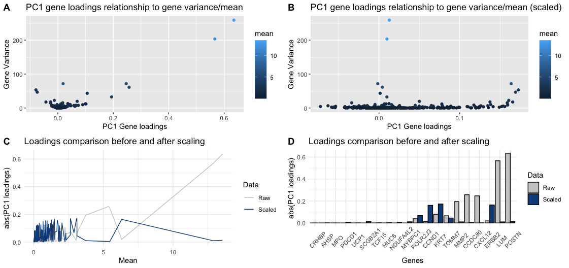
Q2. How do the gene loadings on the first PC relate to features of the genes such as its mean or variance? Do the results change if you scale or don’t scale the genes?
Ideally when performing PCA, genes with higher variance across cells have higher absolute loadings (either positive or negative) because they contribute more to the variability in the data. However, gene expression counts follow a distribution, such that genes with higher mean expression naturally have higher variance, which is an artifact that most be corrected.
To show the importance of SCALING THE DATA, panels A and B use the geometric primitive of “point” to represent genes, and use “x axis position” and “y axis position”, to encode for PC1 loadings and variance (of raw values) respectively, the visual channel of color saturation encodes the gene mean (of raw values). The difference between those plots is the PC1 loadings: A-raw, B-scaled. As can be seen, there are 2 genes on panel A that have the highest mean and variance, and “coincidentally” have the highest loadings. After scaling, as shown in panel B, those genes no longer have the highest loadings, giving room for some other genes.
To show the change that scaling can create on a gene level, panel C encodes the mean in the “x axis position” and the absolute value of the PC1 loadings in the “y axis position”. The geometric primitive of “line” and the principle of “continuity” help differentiate between raw and scaled data. The plot is making salient the trend that genes with small mean are given higher loadings when the data is scaled, and viceversa.
Lastly, panel D shows the same information that panel C, but this time only focusing on the top 10 and bottom 10 genes after sorting them ascendingly (left->right) based on Mean. In this case, the categorical variable “Gene name” is shown in the “x axis position”, so that the change in loadings of the highest and lowest expressed genes is more salient.
5. Code
1
2
3
4
5
6
7
8
9
10
11
12
13
14
15
16
17
18
19
20
21
22
23
24
25
26
27
28
29
30
31
32
33
34
35
36
37
38
39
40
41
42
43
44
# Import libraries
library(ggplot2)
library(tidyverse)
library(cowplot)
library(patchwork)

# Read data
file <- '/Users/kmlanderos/Documents/Johns_Hopkins/Spring_2025/Genomic_Data_Visualization/genomic-data-visualization-2025/data/pikachu.csv.gz'
data <- read.csv(file, row.names=1)
data<-data[,6:ncol(data)]

# - Plot 1: NO Data scaling
# PCA
pca <- prcomp(data)
# Get cells info
df <- data.frame(pc1_loadings=pca$rotation[,"PC1"], mean=colMeans(data), var=sapply(data, var))
# Create plots
p1<-df %>% ggplot(aes(x=pc1_loadings, y=var, color=mean)) + geom_point() + labs(x="PC1 Gene loadings", y="Gene Variance", title="PC1 gene loadings relationship to gene variance/mean")
df %>% ggplot(aes(x=pc1_loadings, y=mean, color=var)) + geom_point() + labs(x="PC1 Gene loadings", y="Gene Mean", title="PC1 gene loadings vs gene variance/mean")

# - Plot 2: Data scaling
scaled_data <- scale(data)
# PCA
pca_scaled <- prcomp(scaled_data)
# Get cells stats
df_scaled <- data.frame(pc1_loadings=pca_scaled$rotation[,"PC1"], mean=colMeans(data), var=sapply(data, var))
# Create plots
p2<-df_scaled %>% ggplot(aes(x=pc1_loadings, y=var, color=mean)) + geom_point() + labs(x="PC1 Gene loadings", y="Gene Variance", title="PC1 gene loadings relationship to gene variance/mean (scaled)")
df_scaled %>% ggplot(aes(x=pc1_loadings, y=mean, color=var)) + geom_point() + labs(x="PC1 Gene loadings", y="Gene Mean", title="PC1 gene loadings vs gene variance/mean")

###

merged_df <- merge(df, df_scaled[, c('pc1_loadings'), drop=F], suffixes=c('','_scaled'), by=0)  %>% mutate(pc1_loadings = abs(pc1_loadings), pc1_loadings_scaled = abs(pc1_loadings_scaled))
plot_df <- merged_df %>% pivot_longer(cols = starts_with("pc1_"), names_to = "data_type", values_to = "pc1_loadings") %>% arrange(mean)
plot_df$Row.names <- factor(plot_df$Row.names, levels=unique(plot_df$Row.names))

# - Plot 3: Comparison across all genes
p3<-plot_df %>% ggplot(aes(x=mean, y=pc1_loadings, color=data_type)) + geom_line() + labs(title="Loadings comparison before and after scaling", x="Mean", y="abs(PC1 loadings)") + scale_color_manual(values = c("pc1_loadings" ="gray80", "pc1_loadings_scaled" = "dodgerblue4"), name = "Data", labels = c("Raw", "Scaled")) + theme_minimal()

# - Plot 4: Comparison across top genes
p4<-plot_df %>% slice(-(21:606)) %>% ggplot(aes(x=Row.names, y=pc1_loadings, fill=data_type)) + geom_bar(position = "dodge", stat = "identity", color='black') + labs(title="Loadings comparison before and after scaling", x="Genes", y="abs(PC1 loadings)") + scale_fill_manual(values = c("pc1_loadings" ="gray80", "pc1_loadings_scaled" = "dodgerblue4"), name = "Data", labels = c("Raw", "Scaled")) + theme_minimal() + theme(axis.text.x = element_text(angle = 45, vjust = 0.5, hjust=0.3))

plot_grid(p1, p2, p3, p4, labels = "AUTO")