Using PCA to continue visualizing tumor cells

Just for future reference, this is how I will address each graph in my data visualization: Graph 1 the one in the top left, Graph 2 is top right, Graph 3 is bottom left, Graph 4 is bottom right.
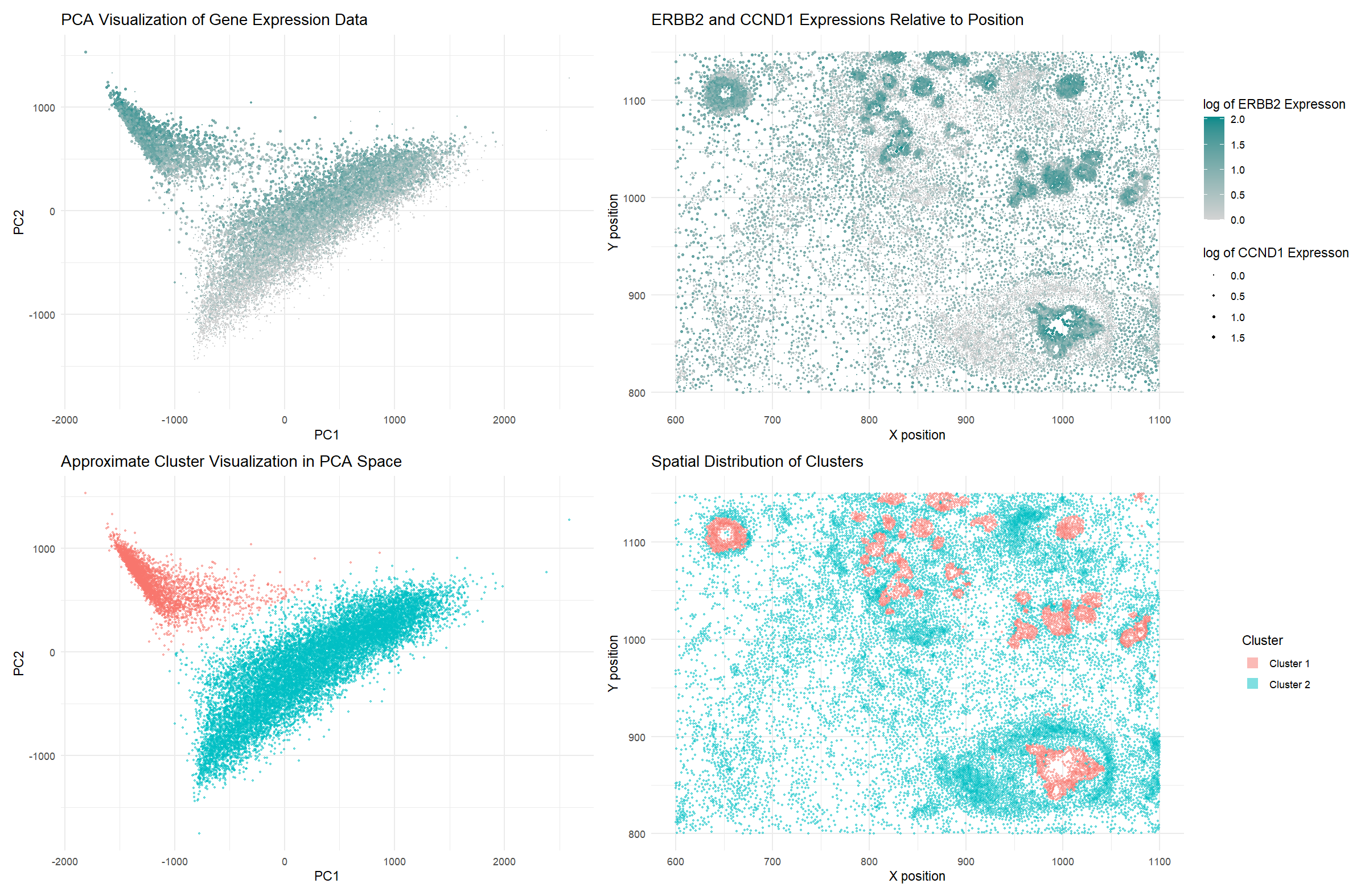
1. What data types are you visualizing?
Quantitative data (gene expression counts for ERBB2 and CCND1 genes, as well as PCA loading values for all cells) and spatial data (the positions of the cells on the tissue).
2. What data encodings (geometric primitives and visual channels) are you using to visualize these data types?
I used the geometric primitive of points to represent cells. I am also using area to show expression of CCND1 in Graph 2.
I used the visual channels of color saturation to show ERBB2 expression in Graphs 1 and 2, and color hues to show the two different clusters in Graphs 3 and 4. I am also using size to show the CCND1 expression in cells in Graphs 1 and 2. Finally, I am also using position to show the cell positions (their spatial x position is encoded in the x axis, and their spatial y axis is encoded in the y axis).
3. What about the data are you trying to make salient through this data visualization?
I’m trying to show two things through this visualization. First, overexpression of ERBB2 and CCND1 implies a cancerous cell, since both genes, when overexpressed, indicate cancer. By building upon my graph from HW1 and visualizing the same information this time on a PCA visualization graph, I hope to show that the cancerous cells are more prominent towards the top left of the PCA data. Secondly, I want to show that the upper cluster in Graph 3 (the top left) correlates to tumor cells, which I’ve done by highlighting it in red and then showing the same cells in their spatial positions in Graph 4, highlighting the same patterns which we saw in Graph 2 of very likely tumor cells. Through these efforts, I hope to make the tumor cells in the tissue more salient and also show that they have mostly been clustered in the top left of the PCA graph.
4. What Gestalt principles or knowledge about perceptiveness of visual encodings are you using to accomplish this?
I’m using the Gestalt principle of similarity (using color and size) to show groups of cells which are intended to be seen together - particularly, the tumor cells should be of a different color/size/both. Additionally, since hues are the best way to encode categorical data, the clusters of distinct cells should be very evident in both Graph 3 and 4.
5. (HW2-Specific Question) Focus on cells: How do cells relate in gene expression space versus physical space? For example, are cells that are more transcriptionally similar to each other also physically closer to each other?
In Graph 3, we can see that there is an evident divide between two clusters in the PCA data. I wanted to see how they would correlate spatially, so I split them into two clusters and visualized them spatially, in Graph 4. They appeared to be in very similar spots to the high ERBB2 and CCND1 expression cells from Graph 2. I had predicted such a pattern following my HW1 observations between ERBB1 and CCND1 and visualizing that data through the PCA data in Graph 1, where it seemed like the more cancerous cells were concentrated towards the top left cluster of the PCA data. Essentially, although the cancerous cells were grouped together in PCA and quite transcriptionally similar, they were not close in terms of their spatial positions in the tissue. However, they also weren’t evenly spread all around the tissue, but rather concentrated around the tumorous areas of the tissue. This shows that cells which are generally transcriptionally similar and grouped in gene expression space also seem to be grouped with similar cells in small clusters, but they do not always form a large cluster in physical space.
6. Code
## Source for some starter code: Dr. Fan's code from class, with slight modifications


## Getting the Pikachu dataset
file <- "~/Desktop/genomic-data-visualization-2025/data/pikachu.csv.gz"
data <- read.csv(file)
head(data)
names(data)


## Let's load the libraries used in this HW
library(ggplot2)
library(patchwork)
library(tidyverse)


## Making a matrix with only cells vs. genes (removing position/area data)
pos <- data[, 5:6]
rownames(pos) <- data$barcode
gexp <- data[, 7:ncol(data)]
rownames(gexp) <- data$barcode
gexp[1:10,1:10] # columns are genes, rows are cells
dim(gexp) # 17136 rows, 313 columns


## Running PCA!
pca <- prcomp(gexp)

## Getting the names of all the variables in PCA
names(pca)


### An explanation of PCA (written by me):

## Basically, PC1 is a the line of best fit through a 313-dimension graph where each
## axis is the gene expression values and the points are the cell. The line captures
## the most variance of the distance from the origin of the projections of the points
## onto the PC1 line.

## PC2 will be the line orthogonal to PC1 which captures the second most variance.

## And so on, each PC will be orthogonal to all other PCs--think of it like building
## a new coordinate system at the origin. In our traditional coordinate system, x, y,
## and z are orthogonal to each other, and a fourth dimension would be orthogonal to
## those three--it's just hard to visualize because we're so used to 3D.

## Since we eventually do end up visualizing the PCs as axes, we are essentially
## building a new set of axes at the calculated origin (mean of all points in all
## dimensions). Hope PCA makes a little more sense!


## Let's make a scree plot!

stdev_df <- data.frame(stdev = pca$sdev, PCs = 1:length(pca$sdev))

ggplot(stdev_df[1:10,], aes(x=PCs, y = stdev)) +
  geom_line() +
  theme_minimal()


## Let's compare two PCs, but before that, we should normalize our data!

gexp_normalized <- gexp/rowSums(gexp) * 10000
pca_norm <- prcomp(gexp_normalized)


## Let's make some visualizations

x_df <- data.frame(pca_norm$x, totalgene = rowSums(gexp), gene1 = gexp[,"ERBB2"], gene2 = gexp[,"CCND1"], x = data$aligned_x, y = data$aligned_y)

g1 <- x_df %>%
  ggplot() +
  aes(x=PC1, y=PC2, col=log10(gene1+1), size=log10(gene2+1)) +
  geom_point() +
  scale_size_continuous(range = c(0.2, 1)) +
  scale_color_gradient(low='lightgray', high='cyan4') +
  theme_minimal() +
  labs(x = "PC1", y = "PC2", title='PCA Visualization of Gene Expression Data')

## Wanted to remove the legend from this graph, so I used:
## https://www.datanovia.com/en/blog/how-to-remove-legend-from-a-ggplot/
g1 <- g1 + guides(col=FALSE, size=FALSE)

g2 <- x_df %>%
  ggplot() +
  aes(x=x, y=y, col=log10(gene1+1), size=log10(gene2+1)) +
  geom_point() +
  scale_size_continuous(range = c(0.2, 1)) +
  scale_color_gradient(low='lightgray', high='cyan4') +
  theme_minimal() +
  labs(x = "X position", y = "Y position", title='ERBB2 and CCND1 Expressions Relative to Position')

g2 <- g2 + labs(col="log of ERBB2 Expresson", size="log of CCND1 Expresson")

g3 <- g1 + g2


## Trying something new: getting a cluster in the PCA data by roughly separating
## the points using the line approximately written as PC2 = 0.5 * PC1 - 500.

## I asked ChatGPT for some help on how to split the data based on that line (I
## found the equation myself, by eyeing the PCA graph) - it told me about the
## ifelse statement I've used on line 108. I had to readjust the values, for
## example, +500 gave a better split in the data than -500.

pca_norm_df <- data.frame(pca_norm$x, x = data$aligned_x, y = data$aligned_y)

pca_norm_df$cluster <- ifelse(pca_norm_df$PC2 > (0.5 * pca_norm_df$PC1 + 500), "Cluster 1", "Cluster 2")

g4 <- pca_norm_df %>%
  ggplot() +
  aes(x=PC1, y=PC2, color=cluster) +
  geom_point(alpha=0.5, size = 0.5) +
  theme_minimal() +
  labs(title="Approximate Cluster Visualization in PCA Space")

g4 <- g4 + guides(color=FALSE)

g5 <- pca_norm_df %>%
  ggplot() +
  aes(x=x, y=y, color=cluster, size=0.01) +
  geom_point(alpha=0.5, size = 0.5) +
  theme_minimal() +
  labs(x = "X position", y = "Y position", title="Spatial Distribution of Clusters") +
  guides(color = guide_legend(override.aes = list(size = 4, shape = 15)))

g5 <- g5 + labs(color="Cluster")

g6 <- g4 + g5

g7 <- g3 / g6

g7