PCA and Spatial Distribution Multi Panels

1. Why is My Data Visualization Effective?
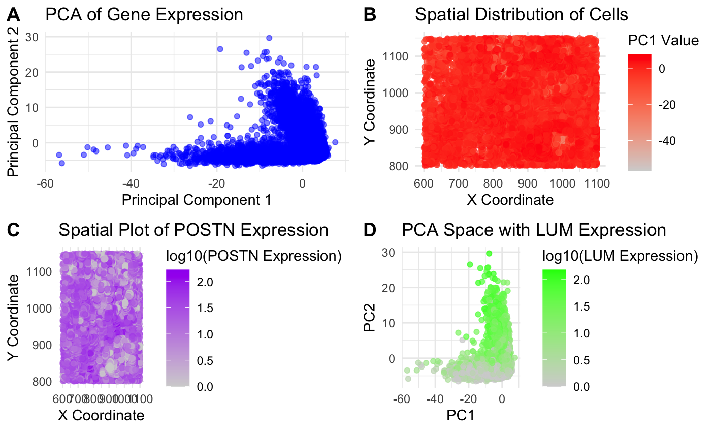
I was looking to answer the first question (How do cells relate in gene expression space versus physical space? For example, are cells that are more transcriptionally similar to each other also physically closer to each other?) by exploring the relationship between gene expression similarity (PCA space) and physical space (spatial coordinates) for various genes. My goal was to see if cells that were clustered in PCA space (transcriptionally similar) were also physically close together in the sample. I did this by creating four plots and visualizing quantitative data with the PCA scores calculated and gene expression levels for POSTN and LUM and spatial data for the x and y coordinates of the cells.
I first made a PCA plot in Panel A. This plot uses the geometric primitive of points to represent cells and graphs the first two principal components to identify if cells cluster together based on gene expression similarity. In Panel B, I made a spatial plot using PC1 value. This is a spatial plot that also uses points to represent cells and now encodes the location of each cell in the tissue sample as well as a color gradient (hue) for the PC1 value. This plot examines whether cells physically located near each other also have similar gene expression patterns. Both of these plots used the Gestalt principle of proximity, showing that clustered points had similar transcriptional profiles.
I also wanted to explore this question for specific highly expressed genes, so elaborating on my first homework, I decided to look at POSTN and LUM (the two highest expressed genes). I looked at the specific location (physical space) of POSTN expression to see if POSTN was localized in specific tissue regions and used geometric points and color (hue) to examine this. I also looked at how LUM expression was related to PCA clustering (in panel D) to see how gene expression could influence clustering. From my graphs, it seems like cells clustered in PCA space also tend to be close together by spatial position. I used the code from Lesson 5 as the base of my code and then used some of my code from homework 1 to sort by most expressed genes and to graph scatter plots using ggplot. I also used online R resources and ChatGPT to help me debug and implement the graphs into one panel.
2. Code (paste your code in between the ``` symbols)
1
2
3
4
5
6
7
8
9
10
11
12
13
14
15
16
17
18
19
20
21
22
23
24
25
26
27
28
29
30
31
32
33
34
35
36
37
38
39
40
41
42
43
44
45
46
47
48
49
50
51
52
53
54
55
56
57
58
59
60
61
62
63
64
65
66
67
68
69
70
71
72
73
74
75
76
77
78
79
library(ggplot2)
library(ggpubr)

file <- '~/desktop/genomic-data-visualization-2025/data/pikachu.csv.gz'
data <- read.csv(file)
data[1:5,1:10]

# Extract spatial coordinates (aligned_x, aligned_y)
pos <- data[, 5:6]
rownames(pos) <- data$cell_id

# Extract gene expression matrix
gexp <- data[, 7:ncol(data)]
rownames(gexp) <- data$barcode

gene_sums <- colSums(gexp, na.rm = TRUE)

# Select the top 1000 most highly expressed genes
topgenes <- names(sort(colSums(gexp, na.rm = TRUE), decreasing = TRUE)[1:1000])
topgenes <- intersect(topgenes, colnames(gexp))
gexpsub <- gexp[, topgenes]

# Perform PCA on the selected genes
pcs <- prcomp(gexpsub, center = TRUE, scale. = TRUE)

# Extract PCA results
pca_data <- as.data.frame(pcs$x)  # PC scores for cells
pca_data$aligned_x <- data$aligned_x
pca_data$aligned_y <- data$aligned_y

selected_genes <- c("POSTN", "LUM", "ERBB2", "CXCL12")
selected_genes <- intersect(selected_genes, colnames(gexp))
for (gene in selected_genes) {
  pca_data[[gene]] <- gexp[, gene]
}

# Panel 1: PCA plot of cells in gene expression space
pca_plot <- ggplot(pca_data, aes(x = PC1, y = PC2)) +
  geom_point(alpha = 0.5, color = "blue") +
  labs(title = "PCA of Gene Expression",
       x = "Principal Component 1",
       y = "Principal Component 2") +
  theme_minimal()

# Panel 2: Spatial distribution of cells, colored by PC1 value
spatial_plot <- ggplot(pca_data, aes(x = aligned_x, y = aligned_y, color = PC1)) +
  geom_point(alpha = 0.7) +
  scale_color_gradient(low = "lightgrey", high = "red") +
  labs(title = "Spatial Distribution of Cells",
       x = "X Coordinate",
       y = "Y Coordinate",
       color = "PC1 Value") +
  theme_minimal()

# Panel 3: Spatial Plot Colored by Specific Gene Expression (POSTN)
gene1_plot <- ggplot(pca_data, aes(x = aligned_x, y = aligned_y, color = log10(POSTN + 1))) +
  geom_point(alpha = 0.7) +
  scale_color_gradient(low = "lightgrey", high = "purple") +
  labs(title = "Spatial Plot of POSTN Expression",
       x = "X Coordinate",
       y = "Y Coordinate",
       color = "log10(POSTN Expression)") +
  theme_minimal()

# Panel 4: Spatial Plot Colored by Specific Gene Expression (LUM)
gene2_plot <- ggplot(pca_data, aes(x = PC1, y = PC2, color = log10(LUM + 1))) +
  geom_point(alpha = 0.7) +
  scale_color_gradient(low = "lightgrey", high = "green") +
  labs(title = "PCA Space with LUM Expression",
       x = "PC1",
       y = "PC2",
       color = "log10(LUM Expression)") +
  theme_minimal()

# Combine plots into a single figure
combined_plot <- ggarrange(pca_plot, spatial_plot, gene1_plot, gene2_plot,
                           ncol = 2, nrow = 2, labels = c("A", "B", "C", "D"))
print(combined_plot)