Top 5 Genes with Highest PC1 Loads

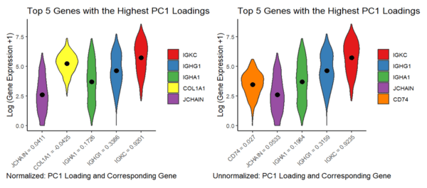
This visualization addressed the second aim, specifically how gene loadings on the first PC relate to features of the gene when scaled and unscaled. Particularly, I used a violin plot to best capture the genes’ distributions, along with their means and PC1 loadings. Due to the spatial constraints of violin plots, I focused on visualizing a subset of genes - the Top 5 Genes with the Highest PC1 Loadings for the normalized and unnormalized data.
Description:
This visualization addressed the second aim, specifically how gene loadings on the first PC relate to features of the gene when scaled and unscaled. Particularly, I used a violin plot to best capture the genes’ distributions, along with their means and PC1 loadings. Due to the spatial constraints of violin plots, I focused on visualizing a subset of genes - the Top 5 Genes with the Highest PC1 Loadings for the normalized and unnormalized data. Note that to rank the “top 5 highest PC1 loadings” I ignored the effects of directionality, since magnitude of the PC load value is primarily what I am interested in, thus I took the absolute values of the PCA loads prior to comparison. I plotted the log transform of the gene expression values, as we did in class, to enable easier pattern identification, which is still representative of general visual trends.
I am visualizing quantitative data, specifically PC1 Loading values and the distributions of gene expression levels for the Top 5 Genes with the Highest PC1 Loadings for the normalized and unnormalized datasets. Qualitative data for the types of genes are also shown. I am using the geometric primitives of areas for the distribution of gene expression values and points for the mean values. The visual channels are different colors for the different genes in each plot, size and shape to show the distribution of gene expression, and position to show the PC1 Loadings on the x axis and the mean values along the y axis.
Through this visualization I am trying to make salient the difference in PC1 Load values when scaling and unscaling (normalizing and unnormalizing) the data, in which there was an obvious difference, to the point that the normalized and unnormalized data actually differ by a gene, and the PC1 load values are different. I employed Gestalt’s principle of proximity to display the difference in load values (since they are shown in order to lowest to highest on each plot), which particularly makes this salient. Most notably however, this visualization is particularly effective in making salient the general relation between means and PC1 load values - at least for the top 3 PC1 load values, the means seem to increase as the PC1 values increase. General trends, such as how spread apart the gene expression values are within themselves and shape of the genes’ distributions, also are present due to the nature of a violin plot . Overall I believe this visualization is rich in the terms of information it can display, and visualization techniques used.
Sources: https://www.sthda.com/english/wiki/ggplot2-violin-plot-quick-start-guide-r-software-and-data-visualization#add-mean-and-median-points, https://r-statistics.co/Top50-Ggplot2-Visualizations-MasterList-R-Code.html#Tufte%20Boxplot
Code:
1
2
3
4
5
6
7
8
9
10
11
12
13
14
15
16
17
18
19
20
21
22
23
24
25
26
27
28
29
30
31
32
33
34
35
36
37
38
39
40
41
42
43
44
45
46
47
48
49
50
51
52
53
54
55
56
57
58
59
60
61
62
63
64
65
66
67
68
69
70
71
72
73
74
75
76
77
78
79
80
81
file <- 'C:\\Hopkins School Stuff\\GenomicDataVis\\data\\eevee.csv.gz'
data <- read.csv(file)
data[1:5,1:10]
pos<- data[,3:4]
rownames(pos) <- data$barcode
gexp <- data[,5:ncol(data)]
rownames(gexp) <- data$barcode
gexp[1:5,1:5]
#dim(gexp)

## limiting to top 10,000 most expressed genes

topgenes <-names(sort(colSums(gexp),decreasing=TRUE)[1:10000])
gexpsub<- gexp[,topgenes]
gexpsub[1:5,1:5]
#dim(gexpsub)

library(ggplot2)
library(patchwork)
##Unnormalized:
#running pca
pcs <- prcomp(gexpsub)
pcs$sdev
pcs$rotation[1:5,1:5] ## beta values representing PCs as linear combinations of genes
pcs$x[1:5,1:5]
#get the first 5 genes that have largest ABSOLUTE loadings on pc1, and show the loadings
pc1_loadings <- pcs$rotation[, 1]
top5_genes <- names(sort(abs(pc1_loadings), decreasing = TRUE)[1:5])
top5_loadings <- pc1_loadings[top5_genes]
top5_loadings
#now display the original dataset but just those 5 genes
top5_data <- gexp[, top5_genes]
long_data <- reshape2::melt(top5_data) # transforming data to long format to make the violin plotting easier
pc1_loadings <- c(IGKC = 0.9235, IGHG1 = .3159, IGHA1 = 0.1964, JCHAIN = .0533, CD74 = .0270)
long_data$PC1_loading <- pc1_loadings[long_data$variable]

long_data$PC1_loading_label <- factor(paste(long_data$variable, "=", round(long_data$PC1_loading, 4)), levels = rev(paste(names(pc1_loadings), "=", round(pc1_loadings, 4))))

unnormalized_plot<-ggplot(long_data, aes(x = PC1_loading_label, y = log(value+1), fill = variable)) +
  geom_violin() +
  stat_summary(fun = mean, geom = "point", shape = 21, size = 3, fill = "black") +
  labs(x = "Unnormalized: PC1 Loading and Corresponding Gene", y = "Log (Gene Expression +1)", title = "Top 5 Genes with the Highest PC1 Loadings ") +
  theme_classic() +
  theme(axis.text.x = element_text(angle = 45, hjust = 1)) + guides(fill = guide_legend(title = NULL))


## Now with Normalized Gene Data
## normalize by dividing each row by its row sum
norm <- gexp/rowSums(gexp)
#rowSums(norm) ## sanity check

pcs <- prcomp(norm)
pcs$sdev
pcs$rotation[1:5,1:5] ## beta values representing PCs as linear combinations of genes
pcs$x[1:5,1:5]
#get the first 5 genes that have largest ABSOLUTE loadings on pc1, and show the loadings
pc1_loadings <- pcs$rotation[, 1]
top5_genes <- names(sort(abs(pc1_loadings), decreasing = TRUE)[1:5])
top5_loadings <- pc1_loadings[top5_genes]
top5_loadings
#now display the original dataset but just those 5 genes
top5_data <- gexp[, top5_genes]
long_data <- reshape2::melt(top5_data) # transforming data to long format to make the violin plotting easier
pc1_loadings <- c(IGKC = 0.9201, IGHG1 = .3386, IGHA1 = 0.1726, COL1A1 = -.0425, JCHAIN = .0411)
long_data$PC1_loading <- pc1_loadings[long_data$variable]

long_data$PC1_loading_label <- factor(paste(long_data$variable, "=", round(long_data$PC1_loading, 4)), levels = rev(paste(names(pc1_loadings), "=", round(pc1_loadings, 4))))

normalized_plot<-ggplot(long_data, aes(x = PC1_loading_label, y = log(value+1), fill = variable)) +
  geom_violin() +
  stat_summary(fun = mean, geom = "point", shape = 21, size = 3, fill = "black") +
  labs(x = "Normalized: PC1 Loading and Corresponding Gene", y = "Log (Gene Expression +1)", title = "Top 5 Genes with the Highest PC1 Loadings ") +
  theme_classic() +
  theme(axis.text.x = element_text(angle = 45, hjust = 1))  + guides(fill = guide_legend(title = NULL))

##Plotting both plots in One Panel
library(RColorBrewer)
gene_colors <- setNames(brewer.pal(6, "Set1"), c("IGKC", "IGHG1", "IGHA1", "JCHAIN", "CD74", "COL1A1"))
unnormalized_plot <- unnormalized_plot + scale_fill_manual(values = gene_colors)
normalized_plot <- normalized_plot + scale_fill_manual(values = gene_colors)
normalized_plot + unnormalized_plot