Homework 2 submission

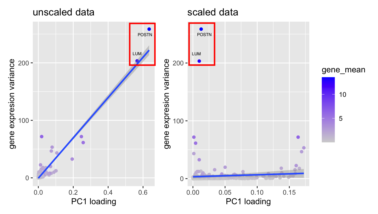
[description] In my visualization, I use points as the geometric primitive, angle and color for visual channel. The x-axis represents the PCA loadings for each gene, while the y-axis shows the variance in gene expression across all cells. Since both axes represent quantitative data, each point stands for a gene, with its color indicating the gene’s average expression level.
This point plot effectively reveals the overall data distribution, which is further highlight with a trend line. The trend line takes advantage of the Gestalt principle of continuity, smoothly guiding the eye through the data pattern. Meanwhile, using similarity in our design makes it easy to recognize the same genes across two different plots.
When you compare the plots, you’ll notice that the trend line shifts from steep to flat. I used an enclosure to focus attention on two specific genes, “POSTN” and “LUM.” Before scaling, both genes show high loadings and high variance. However, after scaling, their loadings become much smaller. This is because PCA picks out the directions with the highest variance, so genes with high variance tend to have high loadings—but once the data is scaled, that relationship changes.
library(tidyverse)
library(ggplot2)
library(patchwork)

pikachu <- read.csv("~/Documents/genom_visual/hw1/pikachu.csv")

pca=prcomp(pikachu[,-c(1:6)],center = TRUE)
scale_pca=prcomp(pikachu[,-c(1:6)],center = TRUE, scale. = TRUE)

pca_plot=data.frame(pca$x, x=pikachu$aligned_x, y=pikachu$aligned_y)


##gene loading and features of gene
gene_mean=colMeans(pikachu[,-c(1:6)])
gene_var=apply(pikachu[,-c(1:6)], 2, var)
loading_1=pca$rotation[,1]
scale_loading_1=scale_pca$rotation[,1]

p2=ggplot()+
  geom_point(aes(y=gene_var, x=abs(loading_1), colour=gene_mean))+
  geom_smooth(aes(y=gene_var, x=abs(loading_1)),method = "lm")+
  scale_color_gradient(low="lightgray", high="blue")+
  xlab("PC1 loading")+
  ylab("gene expresion variance")+
  ggtitle("unscaled data")+
  theme(legend.position = "none")

p3=ggplot()+
  geom_point(aes(y=gene_var, x=abs(scale_loading_1), colour=gene_mean))+
  geom_smooth(aes(y=gene_var, x=abs(scale_loading_1)),method = "lm")+
  scale_color_gradient(low="lightgray", high="blue")+
  xlab("PC1 loading")+
  ylab("gene expresion variance")+
  ggtitle("scaled data")


p2+p3