HW2: Exploring PC1 Loading Vs. Gene Expression Variance Before and After Normalization

1. How do the gene loadings on the first PC relate to features of the genes such as its variance?
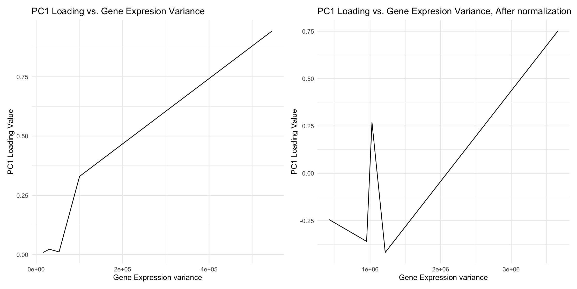
Using the raw data, when the gene expression variance is large, the corresponding gene loading dominates PC1. Similarly, when the gene expression variance is small, its gene loading in PC1 is negligible. This is because PCA finds directions of maximum variance. Without centering the mean, variance includes contributions from the gene expression spread.
2. Do the results change if you scale or don’t scale the genes?
Yes. After normalization and scaling to 10,000, some genes with smaller variances now have increased gene loading values in PC1.
3.Description of data visualization.
My data type is quantitative.
I used lines as geometric primitives.
I used the y-position (PC1 loading) and x-position (gene expression variances) as visual channels. I chose these visual channels because they are the best options for representing quantitative data.
For the Gestalt Principle, I used similarity by placing two similar graphs side by side with minimal stylistic changes to indicate that these two graphs are produced by the same functions. This makes the difference in results more obvious: some lower gene expression variances now have increased loading values.
Additionally, I maintained the order of gene expression variances to clearly show the before-and-after effect after normalization.
4. Code
1
2
3
4
5
6
7
8
9
10
11
12
13
14
15
16
17
18
19
20
21
22
23
24
25
26
27
28
29
30
31
32
33
34
35
36
37
38
39
40
41
42
43
44
45
46
47
48
49
50
51
library(ggplot2)
library(patchwork)

file <- "~/Downloads/eevee.csv.gz"
data <- read.csv(file)

pos <- data[, 3:4]
rownames(pos) <- data$barcode
gexp <- data[, 5:ncol(data)]
rownames(gexp) <- data$barcode
dim(gexp)

# subset to top genes
topgenes <- names(sort(colSums(gexp),decreasing=TRUE)[1:5])
gexpsub <- gexp[,topgenes]

row_means <- apply(gexpsub, 2, mean)
row_vars <- apply(gexpsub, 2, var)
row_means[1:5]
mean(gexpsub$IGKC)


pcs <- prcomp(gexpsub)

pcs$sdev
pcs$rotation
pcs$x


df <- data.frame(means = row_means, vars = row_vars, PC1 = pcs$rotation[1:5,1])
g1 <- ggplot(df, aes(y = PC1, x = vars)) + geom_line() + labs(title = "PC1 Loading vs. Gene Expresion Variance",
                                                         y = "PC1 Loading Value",
                                                         x = "Gene Expression variance") + theme_minimal()


norm <- gexpsub/rowSums(gexpsub) *10000


row_means_norm <- apply(norm, 2, mean)
row_vars_norm <- apply(norm, 2, var)
pcs_norm <- prcomp(norm)

df_norm <- data.frame(means = row_means_norm, vars = row_vars_norm, PC1 = pcs_norm$rotation[1:5,1])
g2 <- ggplot(df_norm, aes(y = PC1, x = vars)) + geom_line() + labs(title = "PC1 Loading vs. Gene Expresion Variance, After normalization",
                                                         y = "PC1 Loading Value",
                                                         x = "Gene Expression variance") + theme_minimal()


g1 + g2