Comparing PCA and t-SNE Dimensionality Reduction on Spatial Transcriptomics Dataset

In many tissues, cells with similar gene expression patterns tend to cluster together both in a dimensionality-reduced “gene expression space” (like the PCA or t-SNE plots) and in their actual physical locations in the tissue, because local microenvironments and functional requirements often cause similar cell types to reside near one another. However, this doesn’t always hold. While dimensionality reduction can reveal strong transcriptional clusters—suggesting that certain groups of cells perform similar functions—there may be instances where physically adjacent cells have diverging gene programs (for example, at transition zones between different tissue types). Conversely, a cluster in gene expression space might include cells that are spread out across different regions of the tissue if they share a particular functional or transcriptional profile. Thus, although a correlation between transcriptional similarity and physical proximity often exists, it should be cross checked by directly comparing the spatial coordinates of the cells with their clusters in PCA or t-SNE space.
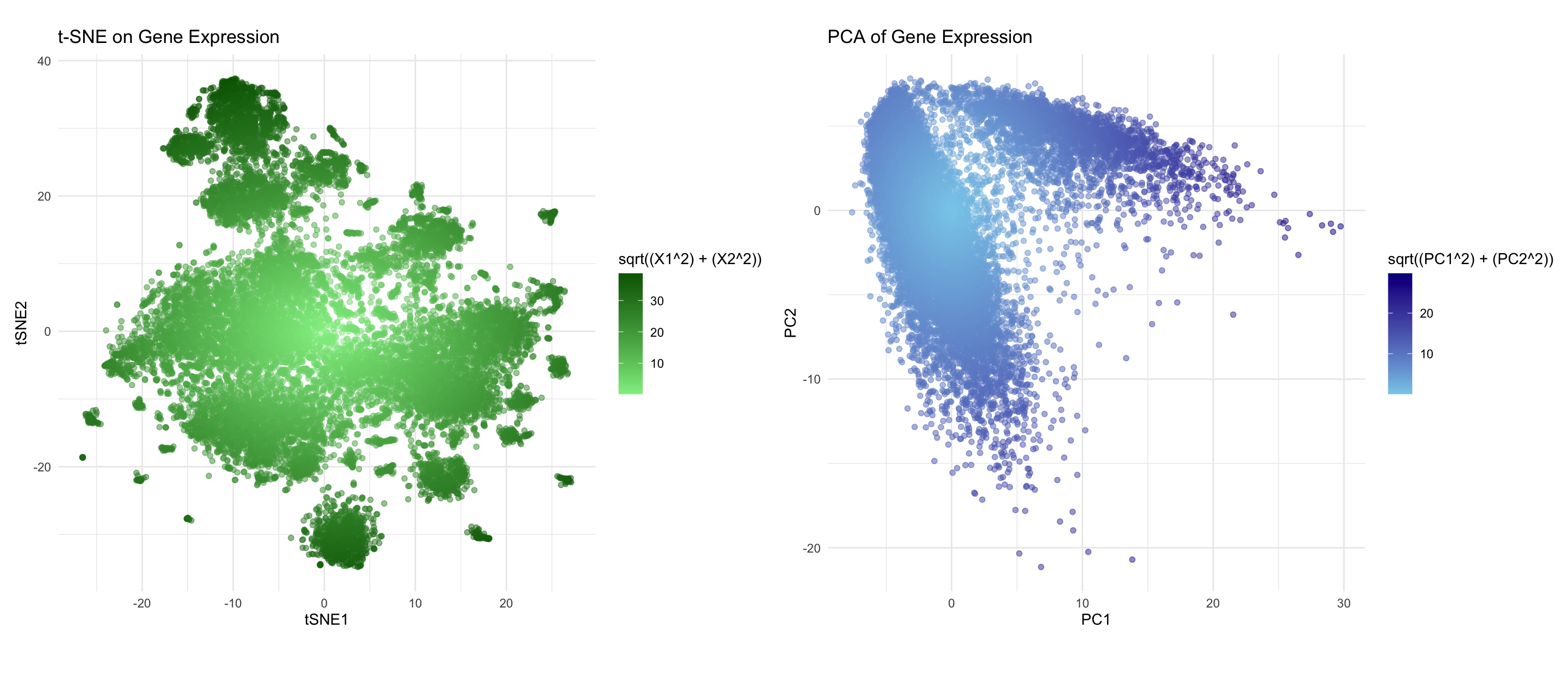
Here, using the Pikachu data set, I perform a log transform and normalization of the gene expression matrix, and then apply two dimensionality-reduction techniques: PCA and t-SNE. I am trying to make salient how the cells are distributed and clustered in terms of their gene expression profiles. By plotting each cell in two-dimensional space and coloring points according to their radial distance from the origin, I attempt to makes clear which cells have similar transcriptional programs (since they appear close together on the plots) and highlight cells that may be outliers or otherwise unusual. Additionally, I am making salient how “extreme” certain points are in the gene expression landscape by using a gradient color scale that represents their distance from the plot’s center. This approach also offers a visual comparison between linear (PCA) versus nonlinear (t-SNE) embeddings, exposing how cell groupings may shift or become more clearly defined under different dimensionality reduction techniques.
I am visualizing quantitative data from the high-dimensional gene expression values for each cell, alongside their spatial data. Each cell is shown as a point (geometric primitive) in a scatter plot, and the position of the point in the PCA or t-SNE 2D plane encodes its relationship to other cells in terms of transcriptional similarity. A color gradient is then applied to represent the radial distance from the origin, creating a secondary cue for interpreting how “far” a cell’s expression profile is from the center of the plot. Additionally, the Gestalt principles of proximity (points close together are perceived as related) and similarity (cells with similar color saturation are viewed as having comparable distances or expression levels) are used to help with the visualization.
5. Code
1
2
3
4
5
6
7
8
9
10
11
12
13
14
15
16
17
18
19
20
21
22
23
24
25
26
27
28
29
30
31
32
33
34
35
36
37
38
39
40
41
42
43
44
45
library(ggplot2)
library(Rtsne)
library(gridExtra)

file <- "/Users/kevinnguyen/Desktop/genomic-data-visualization-2025/data/pikachu.csv.gz"
data <- read.csv(file)

gexp <- data[, 6:ncol(data)]
gexp_log <- log10(gexp + 1)

# Normalize
gexp_norm <- scale(gexp_log, center = TRUE, scale = TRUE)

# PCA
pcs <- prcomp(gexp_norm)
pca_data <- data.frame(pcs$x[, 1:2])

# PCA plot
pca_plot <- ggplot(pca_data, aes(x = PC1, y = PC2)) +
  geom_point(aes(color = sqrt((PC1^2) + (PC2^2))), alpha = 0.5) +
  labs(title = 'PCA of Gene Expression', x = 'PC1', y = 'PC2') +
  theme_minimal() +
  scale_color_gradient(low = "skyblue", high = "darkblue") +
  theme(aspect.ratio = 1)

# t-SNE
tsne_res <- Rtsne(gexp_norm, pca = FALSE)
tsne_data <- data.frame(X1 = tsne_res$Y[, 1], X2 = tsne_res$Y[, 2])

# t-SNE plot
tsne_plot <- ggplot(tsne_data, aes(x = X1, y = X2)) +
  geom_point(aes(color = sqrt((X1^2) + (X2^2))), alpha = 0.5) +
  labs(title = 't-SNE on Gene Expression', x = 'tSNE1', y = 'tSNE2') +
  theme_minimal() +
  scale_color_gradient(low = "lightgreen", high = "darkgreen") +
  theme(aspect.ratio = 1)

# plot_layout <- grid.arrange(pca_plot, tsne_plot, ncol = 2, widths = c(1, 1))

plot_layout <- grid.arrange(pca_plot, tsne_plot, ncol = 2, widths = c(1.5, 1.5), heights = c(1, 1))
ggsave("combined_plots.png", plot = plot_layout, width = 16, height = 6, dpi = 300)
install.packages("patchwork")
library(patchwork)
tsne_plot + pca_plot