hw 3 DEG analysis

Description of analysis
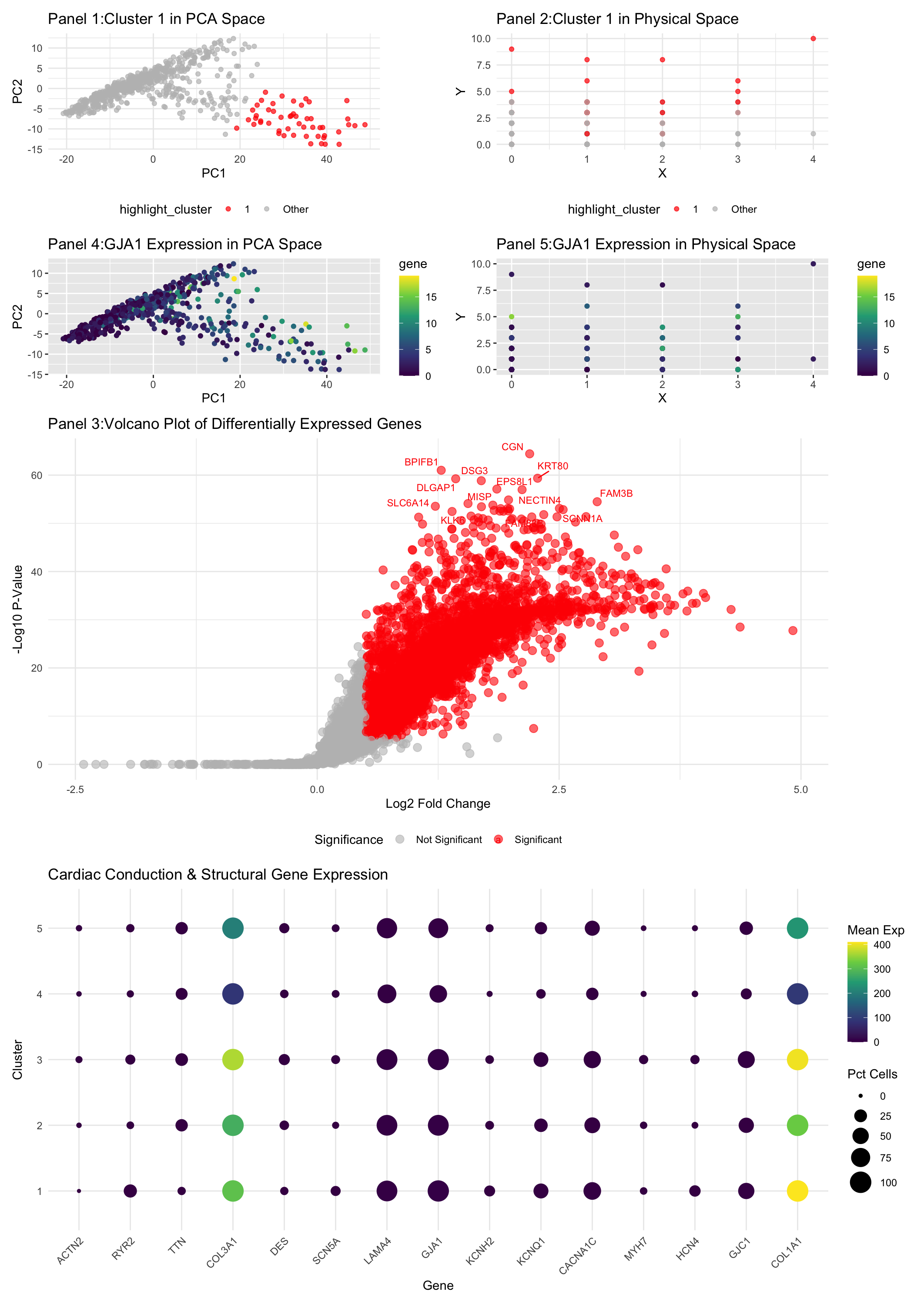
This differential gene expression analysis explores a transcriptionally distinct cluster of cells related to the cardiac conduction system, with a focus on the GJA1 gene, which encodes Connexin 43, a key gap junction protein widely expressed in ventricular myocytes. Gap junctions are essential for electrical coupling between cardiac cells, enabling rapid propagation of action potentials necessary for synchronized heart contractions (Severs et al., 2008). Connexin 43 is particularly abundant in ventricular myocardium, where it facilitates coordinated electrical activity crucial for efficient pumping function (Gutstein et al., 2001). Disruptions in Connexin 43 expression have been linked to cardiac arrhythmias and conduction disorders, underscoring its critical role in maintaining normal cardiac rhythm (Ai & Pogwizd, 2005). Panel 1 visualizes the cluster of interest in PCA space, showing a distinct grouping separate from other clusters, suggesting a unique transcriptional profile. Panel 2 maps the same cluster in physical space, indicating its spatial organization within the tissue. The distinct localization supports the hypothesis that these cells have specialized functional roles. Panel 3 presents a volcano plot of differentially expressed genes, generated by comparing the cluster of interest to all other clusters using a Wilcoxon rank-sum test. Genes with significant differential expression (adjusted p-value < 0.05 and absolute log2 fold change > 0.5) are highlighted in red. The plot shows a number of significantly upregulated genes in this cluster, suggesting specialized cellular functions. Panel 4 visualizes GJA1 expression in PCA space, confirming its high expression in the cluster of interest. Panel 5 shows the spatial distribution of GJA1 expression, aligning with its known role in forming gap junctions that facilitate electrical coupling in ventricular myocytes. The final panel provides an overview of gene expression for other cardiac conduction and structural genes across clusters. GJA1 is notably expressed in the cluster of interest, consistent with its role in ventricular electrical propagation. The expression patterns of other conduction system-related genes further support the identification of this cluster as specialized ventricular conduction cells. This interpretation is corroborated by previous studies linking GJA1 expression to ventricular myocyte function and electrical coupling. The unique transcriptional and spatial profiles observed here align with the specialized role of Connexin 43 in maintaining synchronized ventricular contraction, validating the cluster as a component of the ventricular conduction system.
References
Severs et al., 2008 https://pubmed.ncbi.nlm.nih.gov/18519446/ Gutstein et al., 2001 https://pubmed.ncbi.nlm.nih.gov/11179202/ Ai & Pogwizd, 2005 https://pubmed.ncbi.nlm.nih.gov/15576650/
file <- '~/Desktop/genomic-data-visualization-2025/data/eevee.csv.gz'
data <- read.csv(file)

# Load required libraries
library(ggplot2)
library(Rtsne)
library(ggrepel)
library(patchwork)
# Extract positions and gene expression data
pos <- data[, 5:6]
rownames(pos) <- data$barcode
gexp <- data[, 7:ncol(data)]
rownames(gexp) <- data$barcode
loggexp <- log10(gexp + 1)

# Perform k-means clustering
set.seed(123)  # For reproducibility
k <- 5  # Number of clusters
com <- kmeans(loggexp, centers = k)
clusters <- as.factor(com$cluster)
names(clusters) <- rownames(gexp)
head(data)
colnames(data)
pos <- data[, c(5, 6)]
rownames(pos) <- data$cell_id
head(pos)
colnames(pos) <- c("X", "Y")

# Perform PCA for dimensionality reduction
pcs <- prcomp(loggexp)
df <- data.frame(pcs$x, clusters)
# Cluster selection based on gene of interest
# Calculate mean expression of GJA1 and GJC1 by cluster
avg_expr <- data.frame(
  Cluster = levels(clusters),
  GJA1 = tapply(gexp[, 'GJA1'], clusters, mean),
  GJC1 = tapply(gexp[, 'GJC1'], clusters, mean)
)

# Determine the cluster with the highest expression
max_gja1_cluster <- as.numeric(avg_expr$Cluster[which.max(avg_expr$GJA1)])
max_gjc1_cluster <- as.numeric(avg_expr$Cluster[which.max(avg_expr$GJC1)])

# Choose the cluster to highlight (change to max_gjc1_cluster for GJC1)
interest <- max_gja1_cluster
interest2 <- max_gjc1_cluster
cat("Cluster with highest GJA1 expression:", interest, "\n")
cat("Cluster with highest GJC1 expression:", interest2, "\n")

# Define cluster of interest
interest <- 1

# Create a new factor to highlight the cluster of interest
highlight_cluster <- ifelse(clusters == interest, as.character(interest), "Other")
highlight_cluster <- factor(highlight_cluster, levels = c(as.character(interest), "Other"))


# Panel 1:
df_highlight <- data.frame(pcs$x, highlight_cluster)
p1 <- ggplot(df_highlight, aes(x = PC1, y = PC2, color = highlight_cluster)) +
  geom_point(alpha = 0.7) +
  scale_color_manual(values = c("red", "gray")) +
  ggtitle(paste('Panel 1:Cluster', interest, 'in PCA Space')) +
  theme_minimal() +
  theme(legend.position = "bottom")


# Panel 2:
df_pos_highlight <- data.frame(pos, highlight_cluster)

p2 <- ggplot(df_pos_highlight, aes(x = X, y = Y, color = highlight_cluster)) +
  geom_point(alpha = 0.7) +
  scale_color_manual(values = c("red", "gray")) +
  ggtitle(paste('Panel 2:Cluster', interest, 'in Physical Space')) +
  theme_minimal() +
  theme(legend.position = "bottom")

# Differential Expression Analysis
interest <- 1  # Choose cluster of interest
cellsOfInterest <- names(clusters)[clusters == interest]
otherCells <- names(clusters)[clusters != interest]

# Calculate differential expression using Wilcoxon test
results <- sapply(1:ncol(gexp), function(i) {
  genetest <- gexp[, i]
  names(genetest) <- rownames(gexp)
  test_result <- wilcox.test(genetest[cellsOfInterest], genetest[otherCells], alternative = 'greater')
  test_result$p.value
})
names(results) <- colnames(gexp)

# Adjust p-values
adjusted_p_values <- p.adjust(results, method = 'bonferroni')
log2FC <- sapply(1:ncol(gexp), function(i) {
  mean_expression_interest <- mean(gexp[cellsOfInterest, i] + 1)
  mean_expression_other <- mean(gexp[otherCells, i] + 1)
  log2(mean_expression_interest / mean_expression_other)
})
names(log2FC) <- colnames(gexp)

# Panel 3 Volcano plot
de_results <- data.frame(
  Gene = names(results),
  log2FC = log2FC,
  pValue = results,
  adjPValue = adjusted_p_values
)

# Label significant genes
de_results$Significance <- "Not Significant"
de_results$Significance[de_results$adjPValue < 0.05 & abs(de_results$log2FC) > 0.5] <- "Significant"

# Select top genes
top_degs <- de_results[order(de_results$adjPValue), ][1:25, ]

# Volcano plot
p3 <- ggplot(de_results, aes(x = log2FC, y = -log10(pValue), color = Significance, label = Gene)) +
  geom_point(alpha = 0.6, size = 3) +
  scale_color_manual(values = c("gray", "red")) +
  geom_text_repel(data = top_degs, aes(label = Gene), size = 3, max.overlaps = 10) +
  theme_minimal() +
  ggtitle("Panel 3:Volcano Plot of Differentially Expressed Genes") +
  xlab("Log2 Fold Change") +
  ylab("-Log10 P-Value") +
  theme(legend.position = "bottom")

print(p_volcano)

# Panel 4: GJA1 in Reduced Dimensional Space (PCA)
df_gja1 <- data.frame(pcs$x, gene = gexp[, 'GJA1'])
p4 <- ggplot(df_gja1, aes(x = PC1, y = PC2, col = gene)) +
  geom_point() +
  scale_color_viridis_c() +
  ggtitle('Panel 4:GJA1 Expression in PCA Space')

# Panel 5: GJA1 in Physical Space
df_pos_gja1 <- data.frame(pos, gene = gexp[, 'GJA1'])
p5 <- ggplot(df_pos_gja1, aes(x = X, y = Y, col = gene)) +
  geom_point() +
  scale_color_viridis_c() +
  ggtitle('Panel 5:GJA1 Expression in Physical Space')

# Panel 6:dot plot
# Define genes of interest
genes_of_interest <- c("SCN5A", "KCNQ1", "KCNH2", "CACNA1C", "GJA1", "GJC1",
                       "HCN4", "RYR2", "TTN", "MYH6", "MYH7", "COL1A1",
                       "COL3A1", "LAMA4", "ACTN2", "DES")

# Filter gene expression data
gene_exp_subset <- gexp[, colnames(gexp) %in% genes_of_interest]

# Convert to long format for ggplot
library(reshape2)
gene_exp_long <- melt(as.matrix(gene_exp_subset))
colnames(gene_exp_long) <- c("Cell", "Gene", "Expression")

# Add cluster annotations
gene_exp_long$Cluster <- clusters[gene_exp_long$Cell]

# Calculate percentage of cells expressing each gene per cluster
expr_summary <- aggregate(Expression ~ Cluster + Gene, data = gene_exp_long,
                          FUN = function(x) c(mean = mean(x), pct = mean(x > 0) * 100))

# Convert back to dataframe
expr_summary <- do.call(data.frame, expr_summary)
colnames(expr_summary) <- c("Cluster", "Gene", "MeanExp", "PctExp")

# Create dot plot

p6 <- ggplot(expr_summary, aes(x = Gene, y = Cluster, size = PctExp, color = MeanExp)) +
  geom_point() +
  scale_size_continuous(range = c(1, 8)) +
  scale_color_viridis_c() +
  theme_minimal() +
  labs(title = "Panel 6:Cardiac Conduction & Structural Gene Expression",
       x = "Gene", y = "Cluster", size = "Pct Cells", color = "Mean Exp") +
  theme(axis.text.x = element_text(angle = 45, hjust = 1))

print(p6)

# Patchwork
combined_plot <- (p1 + p2 + p4 + p5) / p3 / p6
print(combined_plot)