Using PCA and tSNE to visualize an upregulated differentially expressed gene and cluster for cell type annotation

Describe your figure briefly so we know what you are depicting (you no longer need to use precise data visualization terms as you have been doing).
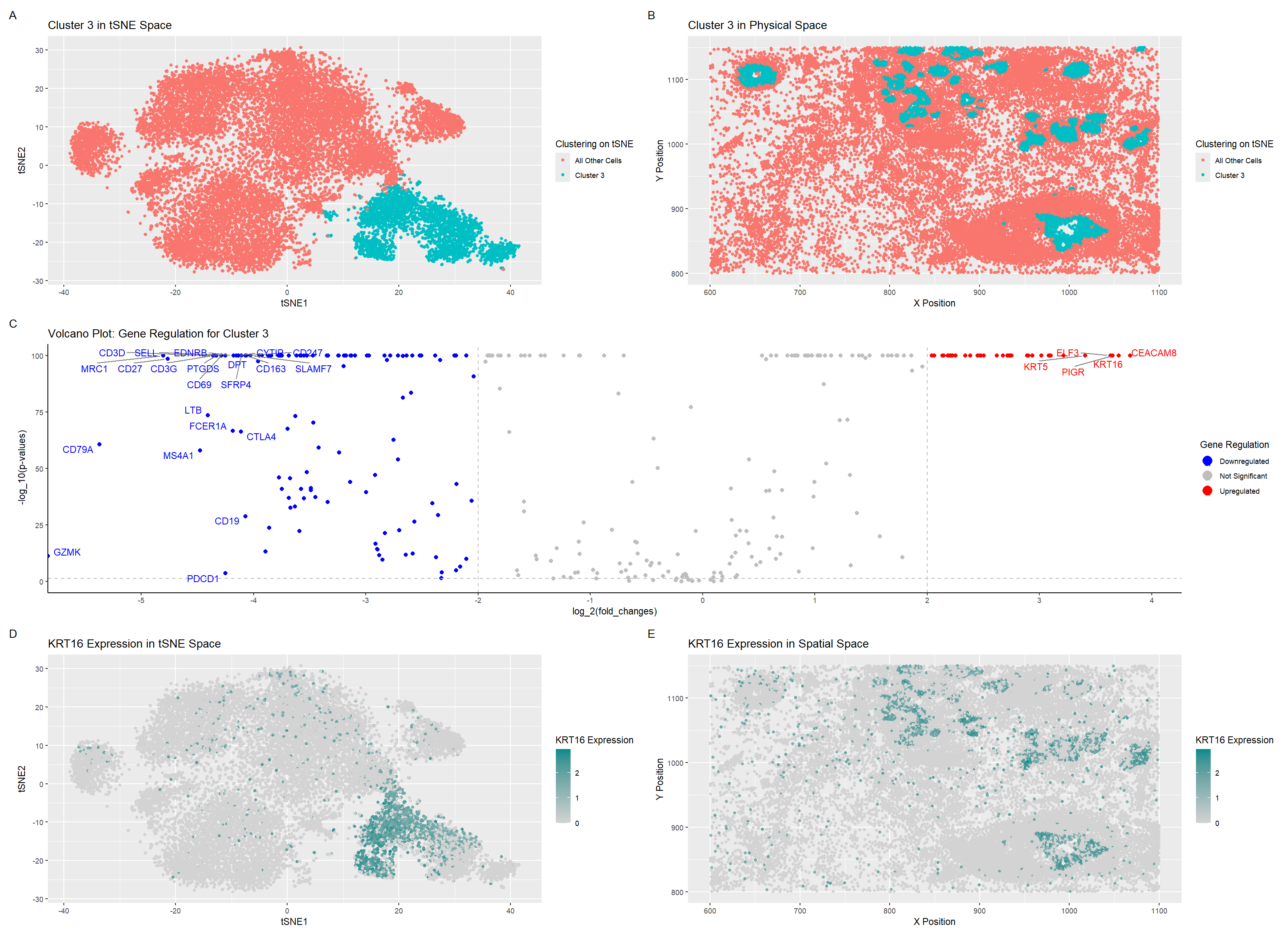
I’ve plotted 5 graphs. Graph A depicts a distinct cluster visualized in tSNE space highlighted using the visual channel of color, determined using the k-means clustering algorithm with 5 centers. Graph B depicts the same cells from the graph A’s cluster but this time in the spatial tissue data. Graph C depicts a volcano plot of the differentially expressed genes, highlighting and labeling which ones are upregulated, downregulated, and insignificant. This was calculated using the Wilcox Test and the differences were shown through color. One of the very top upregulated genes, KRT16, was plotted in tSNE space in graph D and then plotted in spatial tissue space in graph E, with a dark cyan representing higher expression.
Write a description to convince me that your cluster interpretation is correct. Your description may reference papers and content that allowed you to interpret your cell cluster as a particular cell-type. You must provide attribution to external resources referenced. Links are fine; formatted references are not required.
After looking at KRT16 data on the Protein Atlas (https://www.proteinatlas.org/ENSG00000186832-KRT16/single+cell#single_cell_type_summary), I saw that the KRT16 gene was expressed the most in Basal Keratinocytes, as well as another significantly upregulated gene, KRT5 (https://www.proteinatlas.org/ENSG00000186081-KRT5/single+cell). This made me decide that the cells in my cluster of interest are Basal Keratinocytes. Just to be sure, I checked the ELF3 gene as well (https://www.proteinatlas.org/ENSG00000163435-ELF3/single+cell) and saw that Basal Keratinocytes also had a moderately high expression of the ELF3 gene, so I decided that this cluster consisted primarily of Basal Keratinocytes.
Code
### Ayan Vaishnav
### Genomic Data Visualization 2025
### Homework Assignment 3

## Source for most of the initial code: Ayan's HW2 + some of Dr. Fan's code

## Let's load the libraries
library(ggplot2)
library(patchwork)
library(tidyverse)
library(Rtsne)

set.seed(6)

## Loading the Pikachu (imaging) dataset
file <- "~/Desktop/genomic-data-visualization-2025/data/pikachu.csv.gz"
data <- read.csv(file)
head(data)
names(data)


## Making a matrix with only cells vs. genes (removing position/area data)
pos <- data[, 5:6]
rownames(pos) <- data$barcode
gexp <- data[, 7:ncol(data)]
rownames(gexp) <- data$barcode
gexp[1:10,1:10] # columns are genes, rows are cells
dim(gexp) # 17136 rows, 313 columns


## Normalize + log transform data
gexp_norm <- gexp / rowSums(gexp) # normalize!
gexp_norm <- gexp_norm * 10000
gexp_norm <- log10(gexp_norm + 1) # transform!
# gexp_scaled <- scale(gexp_norm)
# ?scale
# head(gexp_scaled)


## Dimensionality reduction - both PCA and tSNE
pca <- prcomp(gexp_norm)
emb <- Rtsne(gexp_norm)


## Getting the names
names(pca)
names(emb)


## Cluster on PCA, but plot on tSNE
pca_kmeaned <- kmeans(pca$x, centers=6)
pca_clusters <- as.factor(pca_kmeaned$cluster)
names(pca_clusters) <- rownames(gexp)

## Let's visualize these clusters (tSNE now)
tsne_df <- data.frame(emb$Y, pca_clusters, pos)

ggplot(tsne_df, aes(x=X1, y=X2, col=pca_clusters)) + geom_point()

ggplot(tsne_df, aes(x=aligned_x, y=aligned_y, col=pca_clusters)) + geom_point()


## Let's visualize Cluster 3 in tSNE space

g1 <- ggplot(tsne_df, aes(x=X1, y=X2, col = ifelse(pca_clusters == 3, "Cluster 3", "All Other Cells"))) + labs(col = "Clustering on tSNE",  x = "tSNE1", y = "tSNE2", title = "Cluster 3 in tSNE Space") + geom_point()

g1

## Let's visualize Cluster 3 in physical space

g2 <- ggplot(tsne_df, aes(x=aligned_x, y=aligned_y, col = ifelse(pca_clusters == 3, "Cluster 3", "All Other Cells"))) + labs(col = "Clustering on tSNE",  x = "X Position", y = "Y Position", title = "Cluster 3 in Physical Space") + geom_point()

g2

### Differential Gene Expression

## Wilcox test for PCA clusters
# For this code, I referred to my code from my Intersession 2025 course,
# Introduction to Spatial Omics Data Analysis taught by GDV2024 TA Rafael Peixoto

volcano_data = list()
num_clusters <- 6
num_genes = ncol(gexp_norm)

for (i in 1:num_clusters) {
  pvals = numeric(num_genes)
  fold_changes = numeric(num_genes)

  curr_cluster <- gexp_norm[pca_clusters == i, ]
  other_clusters <- gexp_norm[pca_clusters != i, ]

  for (j in 1:num_genes) {
    fold_change <- mean(curr_cluster[, j]) / mean(other_clusters[, j])
    fold_changes[j] <- fold_change

    pval <- wilcox.test(curr_cluster[, j], other_clusters[, j])$p.value
    pvals[j] <- pval
  }

  volcano_data[[i]] <- data.frame(fold_changes = fold_changes, pvalues = pvals)
}

saveRDS(volcano_data, "HW3_volcano.RDS")


## CLUSTER 2

summary(volcano_data[[3]])

rownames(volcano_data[[3]]) <- colnames(gexp)

head(volcano_data[[3]])

head(rownames(volcano_data[[3]])[order(volcano_data[[3]]$pvalues)], 5)
## AGR3, AIF1, BASP1, C6orf132, CCDC6

## Volcano Plot

library(ggrepel)

df <- data.frame(
  pv = -log10(volcano_data[[3]]$pvalues + 1e-100),
  logfc = log2(volcano_data[[3]]$fold_changes),
  genes = colnames(gexp)
)

df$delabel <- ifelse(df$logfc > 3.4, df$genes, NA)
df$delabel <- ifelse(df$logfc < -4, df$genes, df$delabel)

df$diffexpressed <- ifelse(df$logfc > 2, "Upregulated", "Not Significant")
df$diffexpressed <- ifelse(df$logfc < -2, "Downregulated", df$diffexpressed)


# For this code, I had to ask Microsoft Copilot for some help with formatting
# and labeling using ggrepl

# Select top 5 genes for labeling based on p-value
top_genes <- df[order(df$pv, decreasing = TRUE), ][1:5, ]

g3 <- ggplot(df, aes(x = logfc, y = pv, label = delabel, color = diffexpressed)) +
  geom_point(size = 2) +
  geom_vline(xintercept = c(-2, 2), col = "gray", linetype = 'dashed') +
  geom_hline(yintercept = -log10(0.05), col = "gray", linetype = 'dashed') +
  scale_color_manual(values = c("Downregulated" = "blue", "Not Significant" = "grey", "Upregulated" = "red"),
                     labels = c("Downregulated", "Not Significant", "Upregulated")) +
  theme_classic() +
  labs(color = 'Gene Regulation',
       x = expression("log_2(fold_changes)"),
       y = expression("-log_10(p-values)"),
       title = "Volcano Plot: Gene Regulation for Cluster 3") +
  geom_text_repel(aes(label = delabel),
                  box.padding = 0.35, point.padding = 0.5, segment.color = 'grey50',
                  max.overlaps = getOption("ggrepel.max.overlaps", default = 60)) +
  scale_x_continuous(breaks = seq(-5, 5, 1)) +
  guides(size = "none", color = guide_legend(override.aes = list(size = 5)))

g3

## Let's visualize KRT16 (a very upregulated DEG) in tSNE space

specific_gene_df <- data.frame(emb$Y, pca_clusters, gene = gexp_norm[, "KRT16"], pos)

g4 <- ggplot(specific_gene_df, aes(x=X1, y=X2, col=gene)) +
  geom_point() +
  scale_color_gradient(low='lightgray', high='cyan4') +
  labs(color = "KRT16 Expression", x = "tSNE1", y = "tSNE2", title = "KRT16 Expression in tSNE Space")

g4

g5 <- ggplot(specific_gene_df, aes(x=aligned_x, y=aligned_y, col=gene)) +
  geom_point() +
  scale_color_gradient(low='lightgray', high='cyan4') +
  labs(color = "KRT16 Expression", x = "X Position", y = "Y Position", title = "KRT16 Expression in Spatial Space")

g5

(g1 + g2) / (g3) / (g4 + g5) + plot_annotation(tag_levels = 'A')