Pikachu Genes DIfferential Expression - CXCL12

Describe your figure briefly so we know what you are depicting (you no longer need to use precise data visualization terms as you have been doing). Write a description to convince me that your cluster interpretation is correct.
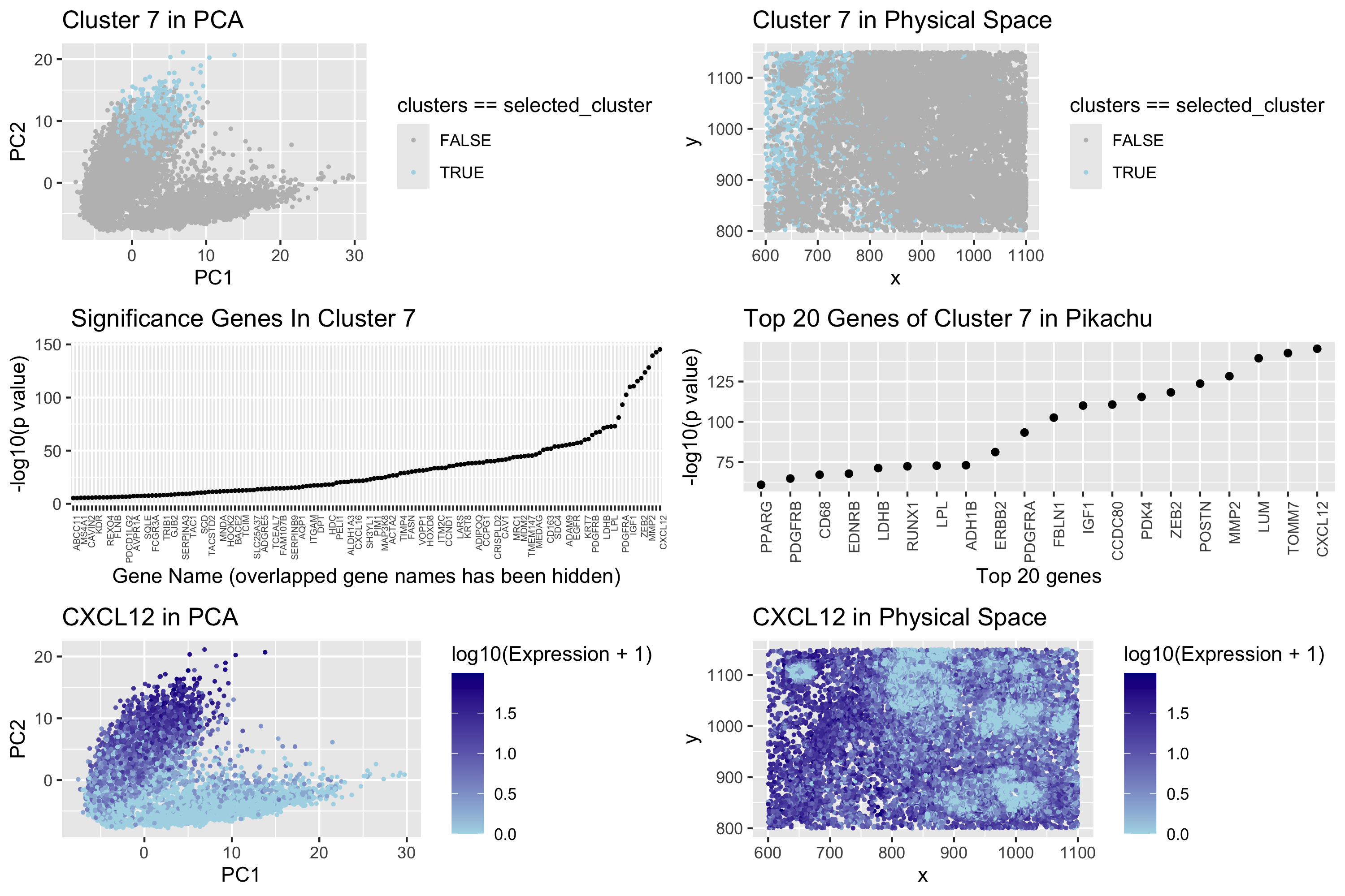
The Pikachu dataset is a large genomic dataset that needs dimensionality reduction and clustering to identify biological patterns. I found that k = 10 and k = 15 had the biggest drop in the within cluster mean when determining the number of clusters for k-means. While k = 15 has not the lowest within-cluster mean, the elbow method indicates that after k = 15 the mean starts to decrease at a lower rate. Since there is a kink in k = 15 I decided that 15 clusters is the best number of clusters. In the PCA space(Plot 1), Cluster 7 stands out drastically and hence interestingly stands out as a good contender to be our overall differentiation target. To show how distinctive it is, I grayed out all other clusters and only highlighted Cluster 7 in light blue. The PCA plot illustrates that Cluster 7 sits in the upper right corner, distanced visually from the other clusters. In physical space (Plot 2), with the other clusters grayed out, Cluster 7 is still a tight and compact cluster very much limited to the top-left side of the plot. Collectively, these observations validate that cluster 7 is a unique and biologically meaningful cluster. To visualize genes within Cluster 7, I conducted differential gene expression analysis with a t-test. Instead of looking at whether genes in Cluster 7 are upregulated or down regulated, I wanted to compare genes in Cluster 7 with other clusters. My goal was to determine if genes in Cluster 7 were significantly different from those in other clusters. Since the data was log-transformed and normalized, a two-sided t-test was appropriate, rather than a Wilcoxon test. In Plot 3 (Volcano Plot), I used the threshold of -log10(p-value) = 0.00001 to find the most significantly different genes. The -log10 transformation of P-values makes the small p-values easier to visualize. But even with the threshold, the scatter plot was too cluttered for interpretation. To do this I kept only the top 20 genes with the lowest p-values (the most significant genes), seen as Plot 4. Notably, CXCL12 was shown to harbor the greatest differential expression and was therefore selected for subsequent studies. Due to its excellent statistical significance, I wanted to examine the function and expression pattern of CXCL12 in the pre-defined Cluster 7. Let’s find out what CXCL12 gene is before we dive into the Plot 5 and Plot 6. CXCL12 is a chemokine that binds to the CXCR4 receptor to mediate cell migration, survival, proliferation, and gene transcription. It is implicated in immune cell trafficking, tumor progression, angiogenesis, and metastasis, and is a therapeutic target in cancer research (Teicher & Fricker, 2010). CXCL12 has been associated with both breast cancer (Hayasaka et al., 2022) and gastrointestinal cancers (Lombardi et al., 2013), where it is most often upregulated and promotes tumor proliferation and metastasis. CXCL12 expression plotted in PCA space (Plot 5) shares a clustering pattern with Cluster 7, consistent with CXCL12 being associated with this discrete cluster. In physical space (Plot 6), a gradient from light blue (low expression) to dark blue (high expression) is visible, with enrichment of CXCL12 expression on the left side of this visual display. This spatial pattern suggests that CXCL12 may be a defining feature of Cluster 7, reinforcing its potential biological relevance. Thus, based on both statistical significance and biological function, CXCL12 is a key marker of Cluster 7 and it’s worthy for further investigation.
Reference: Hayasaka, H., Yoshida, J., Kuroda, Y., Nishiguchi, A., Matsusaki, M., Kishimoto, K., Nishimura, H., Okada, M., Shimomura, Y., Kobayashi, D., Shimazu, Y., Taya, Y., Akashi, M., & Miyasaka, M. (2022). CXCL12 promotes CCR7 ligand-mediated breast cancer cell invasion and migration toward lymphatic vessels. Cancer science, 113(4), 1338–1351. https://doi.org/10.1111/cas.15293
Lombardi, L., Tavano, F., Morelli, F., Latiano, T. P., Di Sebastiano, P., & Maiello, E. (2013). Chemokine receptor CXCR4: role in gastrointestinal cancer. Critical reviews in oncology/hematology, 88(3), 696–705. https://doi.org/10.1016/j.critrevonc.2013.08.005
Teicher, B. A., & Fricker, S. P. (2010). CXCL12 (SDF-1)/CXCR4 pathway in cancer. Clinical cancer research : an official journal of the American Association for Cancer Research, 16(11), 2927–2931. https://doi.org/10.1158/1078-0432.CCR-09-2329
Code (paste your code in between the ``` symbols)
1
2
3
4
5
6
7
8
9
10
11
12
13
14
15
16
17
18
19
20
21
22
23
24
25
26
27
28
29
30
31
32
33
34
35
36
37
38
39
40
41
42
43
44
45
46
47
48
49
50
51
52
53
54
55
56
57
58
59
60
61
62
63
64
65
66
67
68
69
70
71
72
73
74
75
76
77
78
79
80
81
82
83
84
85
86
87
88
89
90
91
92
93
94
95
96
97
98
99
100
101
102
103
104
105
106
107
108
109
110
111
112
113
114
library(ggplot2)
library(Rtsne)
library(gridExtra)

file <- '/Users/harriethe/GenomicDataVisualization/genomic-data-visualization-2025/data/pikachu.csv.gz'
data <- read.csv(file)
head(data)
pos <- data[, 5:6]
rownames(pos) <- data$cell_id
head(pos)
gexp <- data[, 7:ncol(data)]
rownames(gexp) <- data$cell_id
head(gexp)
log_gexp <- log10(gexp + 1)
head(log_gexp)
pcs <- prcomp(log_gexp, center = TRUE, scale. = TRUE)

scree_df <- data.frame(PC = 1:length(pcs$sdev), Variance = (pcs$sdev)^2)
ggplot(scree_df[1:10,], aes(x = PC, y = Variance)) +
  geom_line() +
  geom_point()

pca_df <- data.frame(PC1 = pcs$x[, 1], PC2 = pcs$x[, 2], totalgexp = rowSums(gexp))
ggplot(pca_df, aes(x = PC1, y = PC2, col = log10(totalgexp + 1))) +
  geom_point() +
  scale_color_gradient(low = 'lightgrey', high = 'darkblue')

ks <- c(5, 10, 15, 20,30,50)
totw <- sapply(ks, function(k) {
  com <- kmeans(pcs$x[, 1:10], centers = k)
  return(com$tot.withinss)
})
totw_df <- data.frame(k = ks, WCSS = totw)
ggplot(totw_df, aes(x = k, y = WCSS)) +
  geom_line() +
  geom_point()

com <- kmeans(pcs$x[, 1:10], centers = 15)
clusters <- as.factor(com$cluster)

pca_cluster_df <- data.frame(PC1 = pcs$x[, 1], PC2 = pcs$x[, 2], clusters)
ggplot(pca_cluster_df, aes(x = PC1, y = PC2, col = clusters)) +
  geom_point()

emb <- Rtsne(pcs$x[, 1:10])
tsne_df <- data.frame(tSNE1 = emb$Y[, 1], tSNE2 = emb$Y[, 2], clusters)
ggplot(tsne_df, aes(x = tSNE1, y = tSNE2, col = clusters)) +
  geom_point()

tsne_pos_df <- data.frame(tSNE1 = emb$Y[, 1], tSNE2 = emb$Y[, 2], x = data$aligned_x, y = data$aligned_y)
ggplot(tsne_pos_df, aes(x = tSNE1, y = tSNE2, col = y)) +
  geom_point() +
  scale_color_gradient(low ='lightblue', high = 'darkblue')

#picked cluster 7
selected_cluster <- 7
cells_of_interest <- names(clusters)[clusters == selected_cluster]
other_cells <- names(clusters)[clusters != selected_cluster]
length(cells_of_interest)
#2264
length(other_cells)
#14872

# 1.A panel visualizing your one cluster of interest in reduced dimensional space (PCA, tSNE, etc)
pca_plot <- ggplot(pca_cluster_df, aes(x = PC1, y = PC2, col = clusters == selected_cluster)) +
  geom_point(size = 0.5) +
  scale_color_manual(values = c("FALSE" = "grey", "TRUE" = "lightblue"))+ ggtitle("Cluster 7 in PCA")

#2. A panel visualizing your one cluster of interest in physical space
physical_df <- data.frame(x = pos$aligned_x, y = pos$aligned_y, clusters)
physical_plot <- ggplot(physical_df, aes(x = x, y = y, col = clusters == selected_cluster)) +
  geom_point(size = 0.5) +
  scale_color_manual(values = c("FALSE" = "grey", "TRUE" = "lightblue")) + ggtitle("Cluster 7 in Physical Space")

# 3. A panel visualizing differentially expressed genes for your cluster of interest
results <- apply(gexp, 2, function(gene) {
  t.test(gene[cells_of_interest], gene[other_cells], alternative = 'two.sided')$p.value
})
names(results) <- colnames(gexp)
results <- sort(results, decreasing = FALSE)

#too crowded
filtered_results <- results[results < 0.00001]
df_volcano <- data.frame(Gene = names(filtered_results), P_Value = -log10(filtered_results))
volcano_plot <- ggplot(df_volcano, aes(x = reorder(Gene, P_Value), y = P_Value)) +
  geom_point(size = 0.5) + scale_x_discrete(guide = guide_axis(check.overlap = TRUE))+
  theme(axis.text.x = element_text(angle = 90, hjust = 1, size = 4.9)) + xlab("Gene Name (overlapped gene names has been hidden)") + ylab("-log10(p value)") + ggtitle("Significance Genes In Cluster 7")

#picked top 20
top_genes <- head(df_volcano, 20)
top_genes_plot <- ggplot(top_genes, aes(x = reorder(Gene, P_Value), y = P_Value)) +
  geom_point() +
  theme(axis.text.x = element_text(angle = 90, hjust = 1, size = 8))+
  xlab("Top 20 genes")+
  ylab("-log10(p value)") +ggtitle("Top 20 Genes of Cluster 7 in Pikachu")

#4. A panel visualizing one of these genes in reduced dimensional space (PCA, tSNE, etc)
# I picked the top 1
top_gene <- names(filtered_results)[1]
df_gene <- data.frame(PC1 = pcs$x[, 1], PC2 = pcs$x[, 2], Expression = gexp[, top_gene])
CXCL12_pca_plot <- ggplot(df_gene, aes(x = PC1, y = PC2, col = log10(Expression + 1))) +
  geom_point(size = 0.5) +
  scale_color_gradient(low = 'lightblue', high = 'darkblue') + ggtitle("CXCL12 in PCA")

# 5. A panel visualizing one of these genes in space
physical_gene_df <- data.frame(x = pos$aligned_x, y = pos$aligned_y, Expression = gexp[, top_gene])
CXCL12_physical_plot <- ggplot(physical_gene_df, aes(x = x, y = y, col = log10(Expression + 1))) +
  geom_point(size = 0.5) +
  scale_color_gradient(low = 'lightblue', high = 'darkblue') +
  ggtitle("CXCL12 in Physical Space")

png("hw3_jhe46.png", width = 3000, height = 2000, res = 300)
grid.arrange(pca_plot, physical_plot, volcano_plot, top_genes_plot, CXCL12_pca_plot, CXCL12_physical_plot, ncol = 2)
dev.off()