Exploring GJB2 Expression in Breast Cancer Tissue Through Data Visualization

This visualization examines the expression of GJB2 (Gap Junction Protein Beta 2), a gene associated with intercellular communication and epithelial differentiation, within a breast tissue sample. GJB2 encodes connexin 26, a protein that forms gap junctions and facilitates direct intercellular signaling, playing essential roles in epithelial homeostasis, development, and cancer progression. The visualization provides evidence for the identity and biological relevance of the cluster of interest, supporting the hypothesis that it represents an epithelial or luminal progenitor cell population.
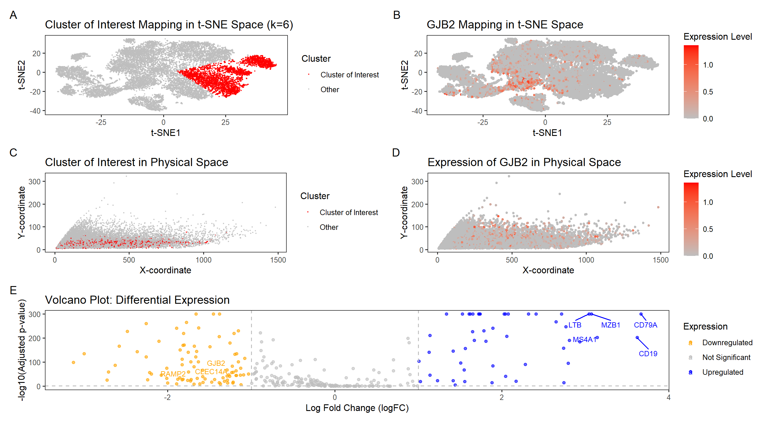
Cluster Analysis
Panel A (tSNE Clustering of Cells) shows a well-defined cluster of interest in reduced dimensional space using tSNE. After performing k-means clustering (k=6), color was used as a visual channel to distinguish the cluster of interest from the rest of the data. The cluster is distinct from the rest of the dataset, suggesting a unique transcriptional signature.
Panel B (GJB2 Expression in tSNE Space) visualizes GJB2 expression levels across all cells, revealing strong enrichment in a specific subpopulation. This suggests a functional role for GJB2 in defining this cell type. A hue gradient was employed to emphasize high and low expression levels across the dataset.
Panels C (Cluster Localization in Physical Space) and D (GJB2 Spatial Expression in Tissue) show the spatial distribution of the data in physical tissue space. Panel C highlights the selected cluster using Gestalt’s principle of similarity, where cells with shared identity are encoded in the same color, reinforcing their biological relationship. It also shows that cells in the GJB2-expressing cluster are concentrated in a specific anatomical region of the tissue, reinforcing that these cells belong to a biologically relevant epithelial structure. Panel D maps GJB2 expression levels across the tissue using a color intensity gradient, demonstrating its spatial localization. This further confirms that GJB2 expression is non-random, aligning with known locations of epithelial and luminal progenitor cells in breast tissue.
Panel E is a Volcano plot of Differential Expression. It highlights GJB2 as significantly upregulated in this cluster compared to others, supporting its role as a marker of the identified cell type. Each point represents a gene, with hue encoding expression status—blue for upregulated, orange for downregulated, and grey for non-significant genes. Gestalt’s principle of proximity helps viewers quickly identify gene clusters with similar expression trends, while labeled genes like GJB2 enhance readability and interpretation.
Cluster Interpretation
The study by Smith et al. (1998) explores GJB2-related autosomal recessive nonsyndromic hearing loss (GJB2-AR NSHL), specifically looking into the gene’s critical role in sensory epithelial function. GJB2 encodes Connexin 26, a protein essential for forming gap junctions that mediate intercellular communication, particularly in epithelial cells. This importance is further supported by Oguchi et al. (2005), whose findings on subcellular localization of mutant Connexin 26 proteins suggest that intact gap junction networks are essential for epithelial function. Given that GJB2 is highly expressed in epithelial cells and maintains tissue integrity, its significant upregulation in our cluster of interest strongly suggests that these cells belong to an epithelial lineage.
The strong expression of GJB2 in the cluster and its well-documented role as an epithelial differentiation marker further supports the hypothesis that these cells maintain epithelial characteristics. Additionally, GJB2 is highly expressed in luminal progenitor cells and epithelial tissues, particularly in mammary gland development and early-stage breast cancer, which aligns with our observed clustering patterns. The spatial distribution of this cluster (Panels C & D) aligns with known epithelial structures in breast tissue, reinforcing that these cells are part of an epithelial network rather than a diffuse stromal population. Furthermore, the absence of mesenchymal markers and immune markers in this cluster rules out alternative cell-type identities, strengthening the conclusion that this cluster represents an epithelial/luminal progenitor population. Based on the distinct clustering pattern, upregulation of GJB2, and its established role in epithelial integrity and sensory function, this cluster could represent an epithelial-like cell population, potentially involved in sensory communication or tissue barrier functions. The evidence from genomic studies, protein localization research, and spatial tissue analysis strongly suggests that this cluster is not just epithelial but may play a specialized role in intercellular signaling, similar to its role in sensory epithelial tissues. Further investigation into co-expressed genes and functional assays would provide deeper insight into the exact nature of these cells and their role within the tissue microenvironment.
Sources
-
Smith RJH, Azaiez H, Booth K. GJB2-Related Autosomal Recessive Nonsyndromic Hearing Loss. 1998 Sep 28 [Updated 2023 Jul 20]. In: Adam MP, Feldman J, Mirzaa GM, et al., editors. GeneReviews® [Internet]. Seattle (WA): University of Washington, Seattle; 1993-2025. Available from: https://www.ncbi.nlm.nih.gov/books/NBK1272/
-
Oguchi, T., Ohtsuka, A., Hashimoto, S. et al. Clinical features of patients with GJB2 (connexin 26) mutations: severity of hearing loss is correlated with genotypes and protein expression patterns. J Hum Genet 50, 76–83 (2005). https://doi.org/10.1007/s10038-004-0223-7
-
The Human Protein Atlas - GJB2 Single Cell and Tissue Expression. https://www.proteinatlas.org/ENSG00000165474-GJB2
-
Zhang et al. (2021). https://www.ncbi.nlm.nih.gov/pmc/articles/PMC8416790/
-
Naoi et al. (2016). https://www.nature.com/articles/srep33860
-
Schalper et al. (2017). https://www.frontiersin.org/articles/10.3389/fimmu.2017.01139/full
#import libraries
library(ggplot2)
library(patchwork)
library(Rtsne)
library(ggrepel)

set.seed(42)

# Read in data. Cells in rows, genes in columns
data <- read.csv("~/Desktop/pikachu.csv.gz", row.names =1)

# Drop first 5 columns for gene expression (cell_id, cell_area etc)
gexp = data[, -c(1:5)]
rownames(gexp) <- data$cell_id

# Normalize gene expression
gexpnorm <- log10(gexp / rowSums(gexp) * mean(rowSums(gexp)) + 1)

# Perform PCA dimensionality reduction
pcs = prcomp(gexpnorm)
plot(pcs$sdev[1:100])

# Perform t-SNE dimensionality reduction to generate embedding of PCA
emb = Rtsne(pcs$x[,1:20])$Y
df_tsne = data.frame(emb)

#------------------------------------------------------------------------------------------

# Find optimal k using Elbow Method
results <- sapply(2:15, function(i) {
  com <- kmeans(emb, centers = i)
  return(com$tot.withinss)
})
plot(2:15, results, type = "b", xlab = "Number of Clusters (K)", ylab = "Total Within-Cluster Sum of Squares")

# Based on Elbow plot, optimal k appears to be at k = 5
# Perform k-means clustering, using a quantitative variable for future changes.
k = 5
com <- as.factor(kmeans(emb, centers = k)$cluster)

df_clusters <- data.frame(tsne_X = emb[,1], tsne_Y = emb[,2],
                          pca_X = pcs$x[,1], pca_Y = pcs$x[,2],
                          cluster = com)

ggplot(df_clusters) + geom_point(aes(x = tsne_X, y = tsne_Y, col=cluster), size=0.5) + theme_bw()


# Store 'com' as a factor
df_clusters$cluster <- as.factor(df_clusters$cluster)

# Choose the cluster to analyze, using a quantitative variable
cluster_of_interest <- 3

# Create a new column to highlight only the selected cluster
df_clusters$highlight <- ifelse(df_clusters$cluster == cluster_of_interest, "Cluster of Interest", "Other")

# Check if 'highlight' column was created correctly
table(df_clusters$highlight)

#------------------------------------------------------------------------------------------

p1 <- ggplot(df_clusters, aes(x = tsne_X, y = tsne_Y, color = highlight)) +
  geom_point(alpha = 0.6, size = 0.3) +
  theme_minimal() +
  scale_color_manual(values = c("red", "grey")) +
  labs(title = "Cluster of Interest Mapping in t-SNE Space (k=6)",
       x = "t-SNE1",
       y = "t-SNE2",
       color = "Cluster") +
  theme(plot.title = element_text(size = 7)) +
  theme(legend.key.size = unit(0.3, "cm")) +
  theme_bw() +
  theme(panel.grid.major = element_blank(), panel.grid.minor = element_blank())

#------------------------------------------------------------------------------------------

# Extract physical coordinates x, y positions
df_clusters$aligned_x <- data[,2]
df_clusters$aligned_y <- data[,3]

p2 <- ggplot(df_clusters, aes(x = aligned_x, y = aligned_y, color = highlight)) +
  geom_point(alpha = 0.6, size = 0.3) +
  theme_minimal() +
  scale_color_manual(values = c("red", "grey")) +
  labs(title = "Cluster of Interest in Physical Space",
       x = "X-coordinate",
       y = "Y-coordinate",
       color = "Cluster") +
  theme(plot.title = element_text(size = 7)) +
  theme(legend.key.size = unit(0.3, "cm")) +
  theme_bw() +
  theme(panel.grid.major = element_blank(), panel.grid.minor = element_blank())

#------------------------------------------------------------------------------------------

# Compute differential expression for the selected cluster using Wilcox for all genes
pv <- sapply(colnames(gexpnorm), function(i) {
  print(i)
  wilcox.test(gexpnorm[com == cluster_of_interest, i],
              gexpnorm[com != cluster_of_interest, i])$p.val
})

# Compute log2 fold change
logfc <- sapply(colnames(gexpnorm), function(i) {
  print(i)
  log2(mean(gexpnorm[com == cluster_of_interest, i]) /
         mean(gexpnorm[com != cluster_of_interest, i]))
})

#------------------------------------------------------------------------------------------

# Create a dataframe for the Volcano plot
df_volcano <- data.frame(Gene = colnames(gexpnorm), p_value = pv, logFC = logfc)

# Adjust p-values for multiple testing using FDR correction
df_volcano$adj_p_value <- p.adjust(df_volcano$p_value, method = "fdr")

# Convert p-values to -log10 scale for better visualization
df_volcano$logP <- -log10(df_volcano$adj_p_value + 1e-300)

# Define Upregulated and Downregulated Genes
df_volcano$Expression <- "Not Significant"
df_volcano$Expression[df_volcano$logFC > 1 & df_volcano$adj_p_value < 0.05] <- "Upregulated"
df_volcano$Expression[df_volcano$logFC < -1 & df_volcano$adj_p_value < 0.05] <- "Downregulated"

# Create Volcano Plot
p5 <- ggplot(df_volcano, aes(x = logFC, y = logP, color = Expression)) +
  geom_point(alpha = 0.6) +
  geom_text_repel(aes(label = ifelse((logP<75 & logFC < -1.5) & (logP>25 & logFC > -1.6) |
                                       (logP>200 & logFC > 3),
                                     as.character(Gene), "")),
                  size = 3,
                  max.overlaps = Inf,
                  box.padding = 0.95) +

  scale_color_manual(values = c("Upregulated" = "blue",
                                "Not Significant" = "grey",
                                "Downregulated" = "orange")) +
  labs(title = "Volcano Plot: Differential Expression",
       x = "Log Fold Change (logFC)",
       y = "-log10(Adjusted p-value)") +
  geom_hline(yintercept = -log10(0.05), linetype = "dashed", color = "grey") +
  geom_vline(xintercept = c(-1, 1), linetype = "dashed", color = "grey") +
  theme(plot.title = element_text(size = 7)) +
  theme_bw() +
  theme(panel.grid.major = element_blank(), panel.grid.minor = element_blank())

#------------------------------------------------------------------------------------------

# Select a highly significant gene (e.g., the most upregulated gene)
# selected_gene <- df_volcano$Gene[which.max(df_volcano$logFC)]
# Focus on GJB2
selected_gene = "GJB2"

# Extract expression of the selected gene from normalized data
df_clusters$gene_expression <- gexpnorm[, selected_gene]

print(selected_gene)
df_volcano[df_volcano$Gene == selected_gene,]

#------------------------------------------------------------------------------------------

# Visualize Gene Expression in t-SNE Space
p3 <- ggplot(df_clusters, aes(x = tsne_X, y = tsne_Y, color = gene_expression)) +
  geom_point(alpha = 1, size = 1) +
  theme_minimal() +
  scale_color_gradient(low="grey", high="red")+
  labs(title = paste(selected_gene,"Mapping in t-SNE Space"),
       x = "t-SNE1",
       y = "t-SNE2",
       color = "Expression Level") +
  theme(plot.title = element_text(size = 7)) +
  theme(legend.key.size = unit(0.3, "cm")) +
  theme_bw() +
  theme(panel.grid.major = element_blank(), panel.grid.minor = element_blank())

#------------------------------------------------------------------------------------------

p4 <- ggplot(df_clusters, aes(x = aligned_x, y = aligned_y, color = gene_expression)) +
  geom_point(alpha = 1, size = 1) +
  theme_minimal() +
  scale_color_gradient(low="grey", high="red")+
  labs(title = paste("Expression of", selected_gene,"in Physical Space"),
       x = "X-coordinate",
       y = "Y-coordinate",
       color = "Expression Level") +
  theme(plot.title = element_text(size = 7)) +
  theme(legend.key.size = unit(0.3, "cm")) +
  theme_bw() +
  theme(panel.grid.major = element_blank(), panel.grid.minor = element_blank())

#------------------------------------------------------------------------------------------

#plots
(p1 + p3) / (p2 + p4) / p5 +
  plot_annotation(tag_levels = 'A')