Multi-Panel Data Visualization of Epithelial Cell Cluster in Pikachu Dataset

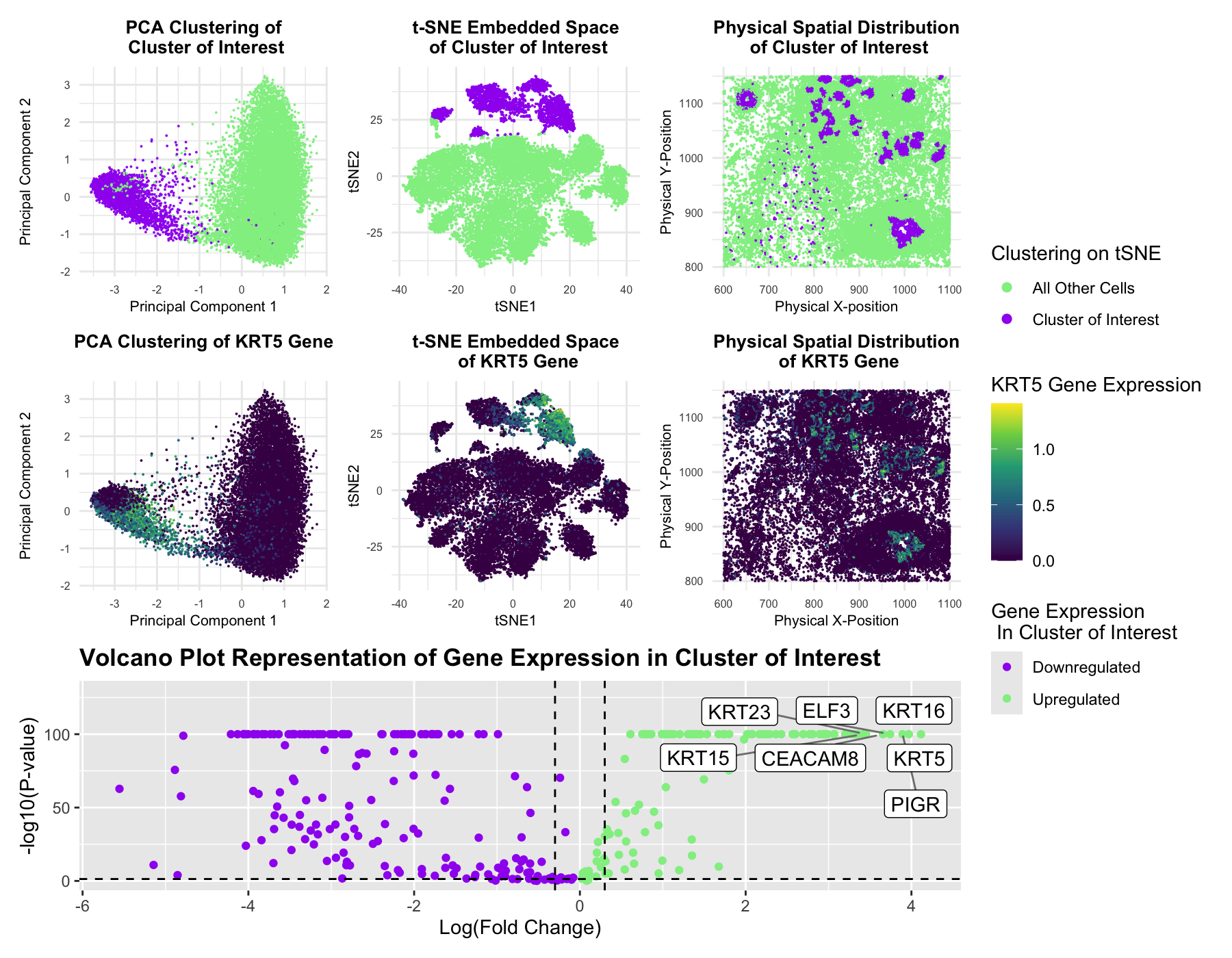
This figure presents an analysis of cellular clusters within the dataset, focusing on the identification and characterization of a biologically relevant cluster using k-means clustering, dimensionality reduction techniques (PCA and t-SNE), differential gene expression analysis, and statistical analysis through volcano plots. The goal is to determine whether the identified cluster represents an epithelial cell population with potential tumorigenic properties. Principal Component Analysis (PCA) was performed to reduce the dimensionality of the gene expression dataset, improving clustering performance by filtering noise. K-means clustering was then applied to the top principal components to obtain the optimal number of clusters. The top-left PCA plot and top-middle t-SNE plot visualize these clusters, with the cluster of interest highlighted in purple out of the remaining cells highlighted in green. The top-right physical space plot further confirms that this cluster exhibits a distinct spatial organization within the sample.
To assess the biological relevance of this cluster, differentially expressed genes were identified using the Wilcoxon rank-sum test. After the Wilcoxon test, the volcano plot (bottom panel) highlights significantly downregulated (purple) and upregulated (green) genes within the cluster. Notably, seven genes (KRT5, KRT15, KRT16, KRT23, ELF3, CEACAM8, and PIGR) were found to be significantly upregulated, indicating the potential of a biologically relevant cluster within the data. In particular, the KRT (Keratin) genes are well-documented markers of epithelial cells and have been implicated in epithelial differentiation, structural integrity, and tumorigenesis (Human Protein Atlas: https://www.proteinatlas.org/). KRT5 (Keratin 5) is a basal epithelial marker commonly found in stratified squamous epithelia and has been strongly linked to basal-like breast cancer and other aggressive epithelial cancers. KRT16 (Keratin 16) is a stress-induced keratin expressed in hyperproliferative epithelial cells, frequently upregulated in wound healing and squamous cell carcinoma. In addition, ELF3, CEACAM8, and PIGR serve as cancer transcription factors, CD markers, as well as immunoglobulin transporters across epithelial cells and have been associated with epithelial-mesenchymal transition (EMT) in cancer progression.
To further investigate the association of these genes with the cluster of interest, the expression levels of the most highly expressed gene, KRT5, were mapped in PCA space (middle-left), t-SNE space (middle-center), and physical space (middle-right). The clear upregulation of these genes within the cluster suggests that KRT5 is highly enriched for epithelial cells, potentially undergoing transformation associated with malignancy. Current research corroborates this idea with strong evidence supporting the role of KRT5, KRT16, and PIGR in cancer biology. KRT5 and KRT16 are frequently upregulated in basal-like breast cancer and aggressive squamous cell carcinomas, while PIGR expression has been associated with epithelial-to-mesenchymal transition (EMT), a key process in cancer metastasis. The combination of these gene expression patterns suggests that this cluster represents an epithelial tumor-like population with potential invasive properties.
By integrating clustering, spatial mapping, and differential gene expression analysis, this multi-panel visualization of the Pikachu dataset suggests that Cluster 2, the cluster of interest, likely represents a tumorigenic epithelial cell population, providing insights into potential disease states and cellular differentiation pathways of the tissue.
Sources:
- Human Protein Atlas: https://www.proteinatlas.org/
- Prat A, Karginova O, Parker JS, et al. Characterization of cell lines derived from breast cancers and normal mammary tissues for the study of the intrinsic molecular subtypes. Breast Cancer Res Treat. 2013;142(2):237-255. doi:10.1007/s10549-013-2743-3
- Huang X, Xu H, Zeng Y, et al. Identification of a 3-gene signature for predicting the prognosis of stage II colon cancer based on microsatellite status. J Gastrointest Oncol. 2021;12(6):2749-2762. doi:10.21037/jgo-21-405
- Enfield, K.S.S., Marshall, E.A., Anderson, C. et al. Epithelial tumor suppressor ELF3 is a lineage-specific amplified oncogene in lung adenocarcinoma. Nat Commun 10, 5438 (2019). https://doi.org/10.1038/s41467-019-13295-y
- Götz L, Rueckschloss U, Najjar SM, Ergün S, Kleefeldt F. Carcinoembryonic antigen-related cell adhesion molecule 1 in cancer: Blessing or curse?. Eur J Clin Invest. 2024;54 Suppl 2(Suppl 2):e14337. doi:10.1111/eci.14337
- Johansen, FE., Kaetzel, C. Regulation of the polymeric immunoglobulin receptor and IgA transport: new advances in environmental factors that stimulate pIgR expression and its role in mucosal immunity. Mucosal Immunol 4, 598–602 (2011). https://doi.org/10.1038/mi.2011.37
1
2
3
4
5
6
7
8
9
10
11
12
13
14
15
16
17
18
19
20
21
22
23
24
25
26
27
28
29
30
31
32
33
34
35
36
37
38
39
40
41
42
43
44
45
46
47
48
49
50
51
52
53
54
55
56
57
58
59
60
61
62
63
64
65
66
67
68
69
70
71
72
73
74
75
76
77
78
79
80
81
82
83
84
85
86
87
88
89
90
91
92
93
94
95
96
97
98
99
100
101
102
103
104
105
106
107
108
109
110
111
112
113
114
115
116
117
118
119
120
121
122
123
124
125
126
127
128
129
130
131
132
133
134
135
136
137
138
139
140
141
142
143
144
145
146
147
148
149
150
151
152
153
154
155
156
157
158
159
160
161
162
163
164
165
166
167
168
169
170
171
172
173
174
175
176
177
178
179
180
181
182
183
184
185
186
187
188
189
190
191
192
193
194
195
196
197
198
199
200
201
202
203
204
205
# Necessary libraries loaded
library(ggplot2)
library(Rtsne)
library(patchwork)
library(dplyr)
library(cluster)
library(factoextra)
library(ggrepel)

# Loads Pikachu dataset
file <- '~/Desktop/genomic-data-visualization-2025/data/pikachu.csv.gz'
data <- read.csv(file)

# Extracts spatial coordinates and gene expression data from aligned_x and aligned_y columns
pos <- data[, c('aligned_x', 'aligned_y')]
rownames(pos) <- data$cell_id
gexp <- data[, 7:ncol(data)]
rownames(gexp) <- data$cell_id

# Log-transform gene expression data and normalizes gexp
normgexp <- log10(gexp/rowSums(gexp) * mean(rowSums(gexp)) + 1)

# Performs PCA on gene expression data
pcs <- prcomp(normgexp)
plot(pcs$sdev[1:40])

# Sets seed so kMeans clustering can be reproduced each time
set.seed(5)

# Performs t-SNE on data and organizes into clusters and plots
tsne_emb <- Rtsne(pcs$x[,1:20])$Y
df_tsne <- data.frame(tsne_emb)
colnames(df_tsne) <- c("tSNE1", "tSNE2")
df_tsne$clusters <- as.factor(com$cluster)
ggplot(df_tsne) + geom_point(aes(x = tSNE1, y = tSNE2), size = 0.01) + theme_classic()

# Performs k-means clustering and plots results
results <- sapply(2:15, function(i) {
  com <- kmeans(tsne_emb, centers = i)
  return(com$tot.withinss)
})
plot(results, type = 'l')

# Finds coefficient k on tSNE and creates data.frame variables for clusters, pca, and spatial position
com <- kmeans(tsne_emb, centers = 5)
df_clusters <- data.frame(pos, tsne_emb = df_tsne, kmeans = as.factor(com$cluster))
df_pca <- data.frame(pcs = pcs$x, kmeans = as.factor(com$cluster))
df_pos <- data.frame(pos, clusters = as.factor(com$cluster))


# Define cluster of interest
cluster_interest <- 2


# Visualizes cluster of interest, Cluster 2, in PCA space
#ggplot(df, aes(x = PC1, y = PC2, col = clusters)) + geom_point() # Identifies cluster 2 as cluster of interest
p1 <- ggplot(df_pca) + geom_point(aes(x = pcs.PC1, y = pcs.PC2,
                         col = ifelse(kmeans == cluster_interest, "Cluster of Interest", "All Other Cells")),
                         size = 0.01) +
  theme_minimal() +
  labs(title = "PCA Clustering of\n Cluster of Interest",
       x = "Principal Component 1", y = "Principal Component 2", color = "Clustering on tSNE") +
  theme(
    plot.title = element_text(size = 10, face = "bold", hjust = 0.5),
    axis.title = element_text(size = 8),
    axis.text = element_text(size = 6)
  ) + guides(color = guide_legend(override.aes = list(size = 2)))  +
  scale_color_manual(values = c("lightgreen", "purple"))


# Visualizes cluster of interest, CLuster 2, in t-SNE space
p2 <- ggplot(df_clusters) +
  geom_point(aes(x = tsne_emb.tSNE1, y = tsne_emb.tSNE2,
                 col = ifelse(kmeans == cluster_interest, "Cluster of Interest", "All Other Cells")),
             size = 0.01) +
  theme_minimal() +
  labs(title = "t-SNE Embedded Space\n of Cluster of Interest",
       x = "tSNE1", y = "tSNE2", color = "Clustering on tSNE") +
  theme(
    plot.title = element_text(size = 10, face = "bold", hjust = 0.5),
    axis.title = element_text(size = 8),
    axis.text = element_text(size = 6)
  ) + guides(color = guide_legend(override.aes = list(size = 2)))  +
  scale_color_manual(values = c("lightgreen", "purple"))


# Visualizes cluster of interest, Cluster 2, in physical space
p3 <- ggplot(df_clusters) +
  geom_point(aes(x = aligned_x, y = aligned_y,
                 col = ifelse(kmeans == cluster_interest, "Cluster of Interest", "All Other Cells")),
             size = 0.01) +
  theme_minimal() +
  labs(title = "Physical Spatial Distribution\n of Cluster of Interest",
       x = "Physical X-position", y = "Physical Y-Position", color = "Clustering on tSNE") +
  theme(
    plot.title = element_text(size = 10, face = "bold", hjust = 0.5),
    axis.title = element_text(size = 8),
    axis.text = element_text(size = 6)
  ) + guides(color = guide_legend(override.aes = list(size = 2)))  +
  scale_color_manual(values = c("lightgreen", "purple"))

# A panel visualizing differentially expressed genes for your cluster of interest
com_categories = as.factor(com$cluster)
p_value = sapply(colnames(normgexp), function(i){
  print(i)
  wilcox.test(normgexp[com_categories == cluster_interest, i], normgexp[com_categories!= cluster_interest, i])$p.val
})

logfc = sapply(colnames(normgexp), function(i){
  print(i)
  log2(mean(normgexp[com_categories == cluster_interest, i])/mean(normgexp[com_categories != cluster_interest, i]))
})


# Creates a volcano plot
df_volcano <- data.frame(p_value = -(log10(p_value + 1e-100)), logfc)

# Adds genes as a column
df_volcano$genes <- rownames(df_volcano)
rownames(df_volcano) <- NULL
head(df_volcano)

# Generates volcano plot of gene expression in Cluster 2
volcano_plot <- ggplot(df_volcano) + geom_point(aes(x = logfc, y = p_value, col = ifelse(logfc > 0,'Upregulated', 'Downregulated'))) +
  geom_label_repel(aes(x = logfc, y = p_value, label=ifelse( p_value == 100 & (logfc < -4.5 | logfc >3.4), as.character(genes),NA)),
                   box.padding   = 0.35, point.padding = 0.5, segment.color = 'grey50',
                   max.overlaps = getOption("ggrepel.max.overlaps", default = 60)) +
  ylim(-.05, 130) +
  geom_hline(yintercept = -log10(0.05), linetype = "dashed") +
  geom_vline(xintercept = c(-0.3, 0.3), linetype = "dashed") +
  labs(
    col = "Gene Expression\n In Cluster of Interest",
    title = "Volcano Plot Representation of Gene Expression in Cluster of Interest",
    x = "Log(Fold Change)", y = "-log10(P-value)") + theme(plot.title = element_text(face = "bold")) +
  scale_color_manual(values = c("purple", "lightgreen"))

# Defines a specific gene to visualize
selected_gene <- "KRT5"

# Assigns selected gene expression values as numeric value
df_pca$gene <- as.numeric(normgexp[, selected_gene])
df_tsne$gene <- as.numeric(normgexp[, selected_gene])
df_pos$gene <- as.numeric(normgexp[, selected_gene])

# Visualizes selected gene in PCA space
p4 <- ggplot(df_pca, aes(x = pcs.PC1, y = pcs.PC2, col = gene)) +
  geom_point(size = 0.01) +
  scale_color_viridis_c() +
  theme_minimal() +
  labs(title = "PCA Clustering of KRT5 Gene",
       x = "Principal Component 1", y = "Principal Component 2", color = "KRT5 Gene Expression") +
  theme(
    plot.title = element_text(size = 10, face = "bold", hjust = 0.5),
    axis.title = element_text(size = 8),
    axis.text = element_text(size = 6)
  )

# Visualizes selected gene in t-SNE space
df_tsne$gene <- normgexp[, selected_gene]
p5 <- ggplot(df_tsne, aes(x = tSNE1, y = tSNE2, col = gene)) +
  geom_point(size = 0.01) +
  scale_color_viridis_c() +
  theme_minimal() +
  labs(title = "t-SNE Embedded Space\n of KRT5 Gene",
       x = "tSNE1", y = "tSNE2", color = "KRT5 Gene Expression") +
  theme(
    plot.title = element_text(size = 10, face = "bold", hjust = 0.5),
    axis.title = element_text(size = 8),
    axis.text = element_text(size = 6)
  )

# Visualizes selected gene in physical space
df_pos$gene <- normgexp[, selected_gene]
p6 <- ggplot(df_pos, aes(x = aligned_x, y = aligned_y, col = gene)) +
  geom_point(size = 0.01) +
  scale_color_viridis_c() +
  theme_minimal() +
  labs(title = "Physical Spatial Distribution\n of KRT5 Gene",
       x = "Physical X-Position", y = "Physical Y-Position", color = "KRT5 Gene Expression") +
  theme(
    plot.title = element_text(size = 10, face = "bold", hjust = 0.5),
    axis.title = element_text(size = 8),
    axis.text = element_text(size = 6)
  )

# Combines all plots together for visualization

(p1 | p2 | p3) / (p4 | p5 | p6) / volcano_plot + plot_layout(guides = "collect")

# Sources:
# https://www.datacamp.com/doc/r/cluster
# https://rpkgs.datanovia.com/factoextra/
# https://ggrepel.slowkow.com/
# code-lesson-5.R
# code-lesson-6.R
# code-lesson-7.R
# code-lesson-8.R
# https://www.statology.org/set-seed-in-r/
# https://www.appsilon.com/post/r-tsne
# https://www.datacamp.com/tutorial/k-means-clustering-r
# https://www.rdocumentation.org/packages/base/versions/3.6.2/topics/data.frame
# https://stackoverflow.com/questions/21271449/how-to-apply-the-wilcox-test-to-a-whole-dataframe-in-r
# https://biostatsquid.com/volcano-plots-r-tutorial/
# https://www.geeksforgeeks.org/how-to-create-and-visualise-volcano-plot-in-r/
# https://sjmgarnier.github.io/viridis/reference/scale_viridis.html