Spatial and Transcriptomic Characterization of a Fibroblast-to-Adipocyte Transition Cell Population

Describe your figure briefly so we know what you are depicting
(you no longer need to use precise data visualization terms as you have been doing).
The figure presents five distinct visualizations that collectively characterize a subgroup of cells identified via unsupervised clustering and differential expression analysis.
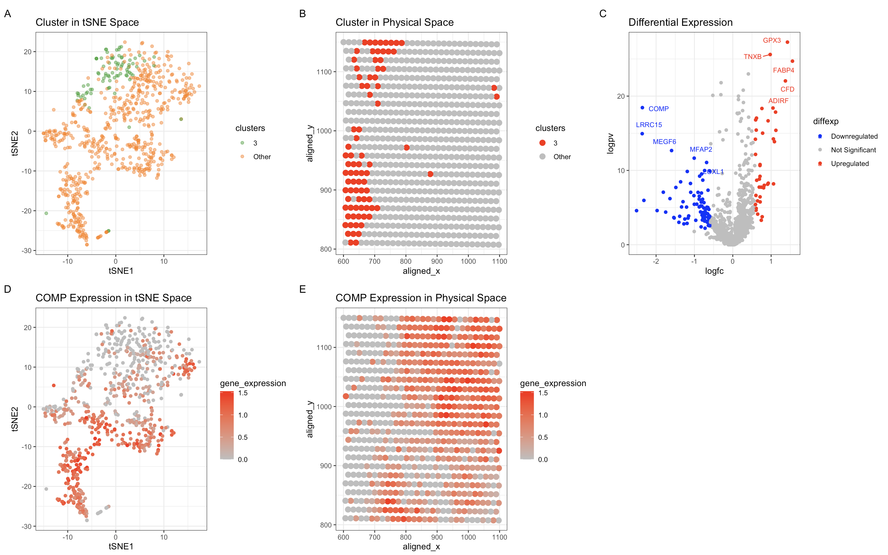
Panel A is a tSNE plot displaying the spatial distribution of cells in a low-dimensional representation. Cluster 3 (green) is clearly separated but partially overlaps with other clusters, suggesting a transitional or progenitor-like state. Panel B is a spatial transcriptomics plot showing the physical localization of Cluster 3 (red). The cluster is spatially constrained, supporting the hypothesis that it represents a biologically distinct population. Panel C is a volcano plot illustrating differentially expressed genes in Cluster 3. Upregulated genes (red) include TNXB, GPX5, FABP4, CFD, and ADIRF, while downregulated genes (blue) include COMP and other fibroblast-associated genes. Panel D is a tSNE feature plot showing COMP expression across all clusters. The weak expression of COMP within Cluster 3 suggests it is not a chondrocyte or cartilage-associated fibroblast population. Panel E is a spatial feature plot demonstrating that COMP expression is weakly localized in Cluster 3, reinforcing that this population is distinct from fibrocartilage-related fibroblasts.
Write a description to convince me that your cluster interpretation is correct.
Your description may reference papers and content that allowed you to interpret
your cell cluster as a particular cell-type. You must provide attribution to
external resources referenced. Links are fine; formatted references are not required.
You must include the entire code you used to generate the figure so that it can be reproduced.
The combination of differentially expressed markers and transcriptional features suggests
that Cluster 3 represents fibroblast-derived adipocyte progenitors or
fibroblast-to-adipocyte transition (FAT) cells rather than mature adipocytes or fibroblasts.
Three of the five most upregrulated genes (FABP4, CFD and ADIRF) are all characterisitc
of adipocytes. FABP4 (Fatty Acid Binding Protein 4) is a well-known marker of early
adipocyte differentiation. CFD (Complement Factor D) is secreted by adipocytes
and plays a role in adipogenesis. ADIRF (Adipogenesis Regulatory Factor) regulates
the differentiation of preadipocytes into mature adipocytes. The presence of TNXB,
a well-characterized fibroblast marker, alongside adipogenic genes suggests a
fibroblast-to-adipocyte transition, rather than a fully differentiated adipocyte state.
We know that this cluster isn’t likely to be fibroblasts because of the downregulation
of COMP excludes which excludes the possibility of fibrocartilage or chondrogenic
fibroblasts. In conclusion, based on the differentially expressed markers,
transcriptional signatures, and spatial localization, Cluster 3 is most likely a
population of fibroblast-derived adipocyte progenitors or preadipocytes
undergoing differentiation. This aligns with previous studies that describe
fibroblasts as precursors to adipocytes in wound healing and adipogenesis.
Sources: FABP4: https://www.ncbi.nlm.nih.gov/gene/2167 CFD: https://www.ncbi.nlm.nih.gov/gene/1675 ADIRF: https://www.uniprot.org/uniprotkb/Q15847/entry TNXB: https://www.ncbi.nlm.nih.gov/gene/7148 COMP: https://www.ncbi.nlm.nih.gov/gene/1311 General: https://www.nature.com/articles/s41467-018-08247-x
1
2
3
4
5
6
7
8
9
10
11
12
13
14
15
16
17
18
19
20
21
22
23
24
25
26
27
28
29
30
31
32
33
34
35
36
37
38
39
40
41
42
43
44
45
46
47
48
49
50
51
52
53
54
55
56
57
58
59
60
61
62
63
64
65
66
67
68
69
70
71
72
73
74
75
76
77
78
79
80
81
82
83
84
85
86
87
88
89
90
91
92
93
94
95
96
97
98
99
100
101
102
103
library(ggplot2)
library(patchwork)
library(Rtsne)
library(ggrepel)
library(dplyr)

# Load data
file <- 'eevee.csv.gz'
data <- read.csv(file, row.names = 1)

# Extract position and gene expression data
pos <- data[, c("aligned_x", "aligned_y")]
gexp <- data[, 4:ncol(data)]

# Filter and normalize gene expression
gexpfilter <- gexp[, colSums(gexp) > 1000]
gexpnorm <- log10(gexpfilter / rowSums(gexpfilter) * mean(rowSums(gexpfilter)) + 1)

# Clustering using k-means
set.seed(40)
kmeans_result <- kmeans(gexpnorm, centers = 6)
clusters <- as.character(kmeans_result$cluster)
clusters[clusters != "3"] <- "Other"
clusters <- as.factor(clusters)

# PCA analysis
pcs <- prcomp(gexpnorm)

# t-SNE embedding
set.seed(40)
tsne_result <- Rtsne(pcs$x, perplexity = 30)
tsne_df <- data.frame(tsne_result$Y, clusters)
colnames(tsne_df) <- c("tSNE1", "tSNE2", "clusters")


# Cluster visualization with improved coloring and a single boundary around Cluster 3
p1 <- ggplot(tsne_df, aes(x = tSNE1, y = tSNE2, color = clusters)) +
  geom_point(alpha = 0.5) +
  scale_color_manual(values = c("Other" = "#ff7f0e", "3" = "#2ca02c")) +
  ggtitle("Cluster in tSNE Space") + theme_bw()

# Update labels for physical space visualization
pos_df <- data.frame(pos, clusters)
p2 <- ggplot(pos_df, aes(x = aligned_x, y = aligned_y, color = clusters)) +
  geom_point(size = 3) +
  scale_color_manual(values = c("Other" = "grey", "3" = "red")) +
  ggtitle("Cluster in Physical Space") + theme_bw()

# Differential expression analysis with limited labels
pv <- sapply(colnames(gexpnorm), function(i) {
  wilcox.test(gexpnorm[clusters == "3", i], gexpnorm[clusters != "3", i])$p.value
})
logfc <- sapply(colnames(gexpnorm), function(i) {
  log2(mean(gexpnorm[clusters == "3", i]) / mean(gexpnorm[clusters != "3", i]))
})

df_diffexp <- data.frame(gene = colnames(gexpnorm), logfc, logpv = -log10(pv))
df_diffexp$diffexp <- "Not Significant"
df_diffexp[df_diffexp$logpv > 2 & df_diffexp$logfc > 0.58, "diffexp"] <- "Upregulated"
df_diffexp[df_diffexp$logpv > 2 & df_diffexp$logfc < -0.58, "diffexp"] <- "Downregulated"

df_diffexp$diffexp <- as.factor(df_diffexp$diffexp)

# Select top 5 upregulated and downregulated genes for labeling
upregulated_genes <- df_diffexp %>%
  filter(diffexp == "Upregulated") %>%
  arrange(desc(logpv)) %>%
  head(5)

downregulated_genes <- df_diffexp %>%
  filter(diffexp == "Downregulated") %>%
  arrange(desc(logpv)) %>%
  head(5)

labeled_genes <- bind_rows(upregulated_genes, downregulated_genes)

p3 <- ggplot(df_diffexp, aes(x = logfc, y = logpv, color = diffexp)) +
  geom_point() +
  geom_text_repel(data = labeled_genes, aes(label = gene), size = 3, box.padding = 0.5) +
  scale_color_manual(values = c("blue", "grey", "red")) +
  ggtitle("Differential Expression") + theme_bw()

# Gene expression visualization
selected_gene <- "COMP"
tsne_df$gene_expression <- gexpnorm[, selected_gene]
p4 <- ggplot(tsne_df, aes(x = tSNE1, y = tSNE2, color = gene_expression)) +
  geom_point() +
  scale_color_gradient(low = "grey", high = "red") +
  ggtitle(paste(selected_gene, "Expression in tSNE Space")) + theme_bw()

pos_df$gene_expression <- gexpnorm[, selected_gene]
p5 <- ggplot(pos_df, aes(x = aligned_x, y = aligned_y, color = gene_expression)) +
  geom_point(size = 3) +
  scale_color_gradient(low = "grey", high = "red") +
  ggtitle(paste(selected_gene, "Expression in Physical Space")) + theme_bw()

# Combine all plots
(p1 + p2 + p3 + p4 + p5) +
  plot_annotation(tag_levels = 'A') +
  plot_layout(nrow = 2, ncol = 3)

# ChatGPT was used to help generate the code for plotting and usage of ggrepel
# and dplyr libraries.