HW3 Data Exploration - Cluster 3 and CCN1 Gene

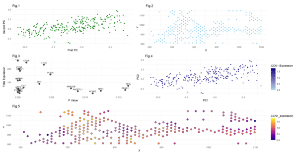
In the first figure, I have visualized cluster 3 in the PCA space by plotting the first and second principal components (quantitative data). I have used points to do so, and the visual channel of the color green. In the second panel, I have plotted the points from that same cluster 3 in physical space, with relation to their x and y positions. I have used dots to represent them and the color skyblue. In the 3rd plot, I have identified the top 20 most differentially expressed, upregulated, genes in cluster 3. I have attempted to plot them in the format of a volcano plot (but since I am only showing upregulated genes, it does not look like a volcano). I have visualized quantitative data of the statistical significance(p value) and the gene expression. The fourth display shows levels of CCN1 expression (log expression) as displayed by color intensity, and the values of the first and second principal components. This is meant to visualize the CCN1 expression in cluster 3 in the lower dimension space. Notice that most of the points are dark, indicating high levels of CCN1 expression within this cluster. Logically, this makes sense since from our analysis, CCN1 was the most statistically significant upregulated gene, which would mean there is higher CCN1 expression. This is a good sanity check. The final plot is intended to display the expression of CCN1 (via color gradient) from cluster 3 in the physical space of x and y positions. This is also a good sanity checkpoint, ensuring that the overall shape follows the same as the plot from the second plot. Overall, my visualizations aim to uncover upregulated genes in cluster 3, so as to provide insight into cluster 3’s cell type and/or state. Through this exercise, I found that the most statistically significant upregulated gene in cluster 3 is CCN1, and thus I focused on visualizing CCN1 expression in the latter portion of the exercise. I am confident that these interpretations are correct, as I employed several “sanity checks” and additional methods we learned in class. For example, I am confident in selecting 6 as the optimal number of clusters, since I plotted the “total withinness” measure against different cluster numbers, and I found 6 to rest in that optimal “elbow,” as we learned about in class (I commented this out in the code so it would not interfere with my outputs). In that same step of deciding the number of clusters, I also plotted gene expression across all the clusters, visually identifying cluster 3 to be the one expressing CCN1 the most. This step required some iterations to find the correct gene and its corresponding cluster; through these steps I was very careful in selecting my cluster and corresponding gene expression. Note that the expression values are actually log transformed all throughout, for the sake of consistency. When identifying CNN1 as the most statistically significant upregulated gene in plot 3, I also confirmed my “sanity check” I performed earlier, further providing validity to my method. Another check I did was to make sure the shapes of graphs 5 and 2 match, and 4 and 1 match (since we are plotting the same locations and principal components). Due to these checks, I have reason to believe in the validity of my results that CCN1 is highly upregulated in the 3rd cluster. Along with CCN1 being highly upregulated, I discovered in my data visualizations that genes ALPL, ATF3, C1QB, PROX1, and VCAM1 are also upregulated. CCN1 is associated with connective tissue growth factor and cell migration, and it is found upregulated in cancer-associated fibroblasts. ALPL can also be expressed in cancer-associated fibroblasts and associated with metastasis. ATF3 is a stress-response gene expressed in fibroblasts and immune cells, and it plays a role in tumor progression. C1QB and VCAM1 expression are also linked to immune cells. PROX1 can be linked to lymphangiogenesis, possibly indicating metastasis. This leads me to believe that cluster 3 could represent cancer-associated fibroblasts, immune cells, and/or lymphatic endothelial cells.
Sources:
https://pmc.ncbi.nlm.nih.gov/articles/PMC8700172/#:~:text=CCN1%20proteins%20are%20found%20to,recovery%20in%20breast%20cancer%20patients.
https://pmc.ncbi.nlm.nih.gov/articles/PMC9234708/
https://aacrjournals.org/cancerres/article/68/9_Supplement/5280/546193/The-roles-of-ATF3-an-adaptive-response-gene-in
https://pubmed.ncbi.nlm.nih.gov/22014578/#:~:text=Abstract,%2DPI3K/Akt%20survival%20pathway.
https://www.frontiersin.org/journals/oncology/articles/10.3389/fonc.2021.642144/full
https://pubmed.ncbi.nlm.nih.gov/35342346/
https://biostatsquid.com/volcano-plots-r-tutorial/
5. Code:
1
2
3
4
5
6
7
8
9
10
11
12
13
14
15
16
17
18
19
20
21
22
23
24
25
26
27
28
29
30
31
32
33
34
35
36
37
38
39
40
41
42
43
44
45
46
47
48
49
50
51
52
53
54
55
56
57
58
59
60
61
62
63
64
65
66
67
68
69
70
71
72
73
74
75
76
77
78
79
80
81
82
83
84
85
86
87
88
89
90
91
92
93
94
95
96
97
98
99
100
101
102
103
104
105
106
107
library(ggplot2)
library(patchwork)
file <- 'C:\\Hopkins School Stuff\\GenomicDataVis\\data\\eevee.csv.gz'
data <- read.csv(file)
data[1:5,1:10]
pos <- data[, 3:4]
rownames(pos) <- data$barcode
head(pos)
gexp <- data[, 5:ncol(data)]
rownames(gexp) <- data$barcode
gexp[1:5,1:5]
dim(gexp)
#applying log transform
loggexp <- log10(gexp+1)
#trying k's (creating elbow plot) to determine best k for kmeans
#use kmeans
## try many ks
ks = c(2,3,4,5,6,7,8,9,10)
totw <-sapply(ks,function(k){
  print(k)
  com <-kmeans(loggexp,centers=k)
  return(com$tot.withinss)
})
plot(ks,totw)
# from the plot, it appears that the elbow is at 6. Thus choose 6 clusters
com <- kmeans(loggexp, centers=6)
clusters <- com$cluster
clusters <- as.factor(clusters) ## tell R its ctaegorical
names(clusters) <-rownames(gexp)
head(clusters)
pcs <-prcomp(loggexp)
#sanity check to try to visualize where cnn1 is most expressed. It appears in 3, I will put cluster 3 as cluster of interest
df <- data.frame(pcs$x, clusters, gene = loggexp[, 'CCN1'])
ggplot(df, aes(x=PC1, y=PC2, col=gene)) + geom_point()
ggplot(df, aes(x=PC1, y=PC2, col=clusters)) + geom_point()
df <- data.frame(pcs$x, clusters)
ggplot(df, aes(x=PC1, y=PC2, col=clusters)) + geom_point()
#cluster of interest is cluster 3

interest <- 3
cellsOfInterest <- names(clusters)[clusters == interest]
otherCells <- names(clusters)[clusters != interest]

##Visualizing my cluster of interest in PCA space:
df_cluster3 <- df[df$clusters == 3, ] #isolating my cluster 3
plot1<-ggplot(df_cluster3, aes(x=PC1, y=PC2)) + geom_point(color='forestgreen') + labs(title = 'Fig.1', x = 'First PC', y = 'Second PC')+ theme_minimal()


## Visualizing Cluster 3 in Physical Space
plot2<-ggplot(pos[cellsOfInterest,], aes(x=pos[cellsOfInterest,]$aligned_x, y=pos[cellsOfInterest,]$aligned_y)) + geom_point(color='skyblue')+labs(title='Fig.2', x='X', y='Y ')+theme_minimal()

##visualizing differentially expressed genes for your cluster of interest. Identifying upregulation, so looking for "greater" expression

#only selecting top 2000 genes for computational efficiency
results <- sapply(1:2000, function(i) {
  genetest <- loggexp[,i]
  names(genetest) <- rownames(loggexp)
  out <- wilcox.test(genetest[cellsOfInterest], genetest[otherCells], alternative = 'greater')
  out$p.value
})
names(results) <- colnames(loggexp[,1:2000])

diff_genes <-sort(results, decreasing = FALSE)[1:20] ## printing the 20 most statistically significant outcomes (aka most differentially expressed upregulated genes)

#Graphing on histogram:
#convert to dataframe for graphing
df_diff_genes <- data.frame(
  gene = names(diff_genes),
  expression = as.numeric(diff_genes)
)

ggplot(df_diff_genes, aes(x = reorder(gene, expression), y = expression, fill = gene)) +
  geom_bar(stat = "identity") +
  coord_flip() +  # Flip
  labs(title = "Statistical Significance of Upregulated Genes in Cluster 3", x = "Gene", y = " Statistical Significance (P value)") +
  theme_minimal() +
  theme(legend.position = "none")  # Remove unnecessary legend


## try volcano plot. note that I am only  including the upregulated genes, do it doesnt really look like a volcano lol
total_expression=colSums(loggexp[cellsOfInterest, names(diff_genes)])
volcano_df<- cbind(df_diff_genes, total_expression)
#plotting
plot3<-ggplot(volcano_df, aes(x = expression, y = total_expression, label = gene)) +
  geom_point(size = 3, alpha = 0.7) +
  geom_text(aes(label = gene), size = 3, vjust = -0.75) +
  labs(title = "Fig.3",
       x = "P Value",
       y = "Total Expression") +
  theme_minimal() +
  theme(legend.position = "none")

##  visualizing one of these genes in reduced dimensional space (PCA)
## we will visualize the CCN1 gene, as we can see it is the most statistically significant upregulated
CCN1_Clust3_df <- df[cellsOfInterest,1:2]
CCN1_Clust3_df$CCN1_expression <- loggexp[cellsOfInterest, 'CCN1']
plot4<-ggplot(CCN1_Clust3_df, aes(x = PC1, y = PC2, color = CCN1_expression)) + geom_point() + scale_color_gradient(low = "lightblue", high = "navyblue") + labs(title = "Fig.4",x = "PC1", y = "PC2", color = "CCN1 Expression") + theme_minimal()

library(viridis)
## visualizing CCN1 in space
CCN1_Clust3_df$x_pos <- pos[cellsOfInterest, 'aligned_x']
CCN1_Clust3_df$y_pos <- pos[cellsOfInterest, 'aligned_y']

plot5<-ggplot(CCN1_Clust3_df, aes(x = x_pos, y = y_pos, fill = CCN1_expression)) + geom_point(shape = 21, stroke = 0.8, color = "navyblue", size = 3) + scale_fill_viridis_c(option = "C") +  labs(title = "Fig.5",x = "X", y = "Y", color = "CCN1 Expression") + theme_minimal()
combined_plot <- (plot1 | plot2) / (plot3 | plot4) / plot5

combined_plot