Analyzing MMP11 Gene Expression

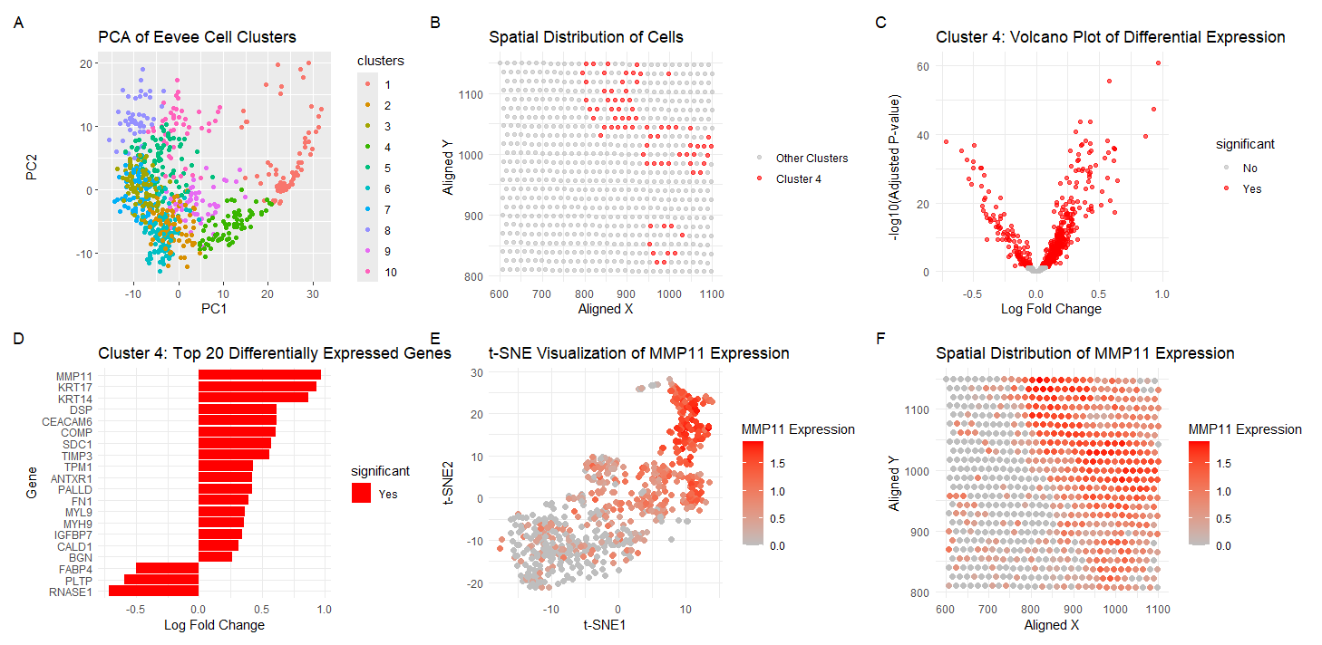
Visualization Summary In this visualization, I am analyzing the Eevee sequencing spatial transcriptomics dataset. The 1000 most highly expressed genes were normalized, log-transformed, and clustered (K = 10). To understand gene expression similarity profiles and reduce the dimensionality of the dataset, principal component analysis was performed (A). Cluster 4 was chosen and was spatially analyzed (B). Next, differential gene expression analysis was performed to display the statistical significant of changes in gene expression between cluster 4 and other clusters which ultimately highlights genes with large expression differences (C). The top 20 genes in cluster 4 were then displayed, and MMP11 was chosen as the gene of interest due to its expression level (D). t-distributed Stochastic Neighbor Embedding (t-SNE) analysis was then performed on MMP11 gene expression to better visualize its expression across cells (E), and spatial analysis was also performed (F).
Cluster 4 has biological meaning since many of the genes expressed are related to cell growth and migration and cancer progression. Specifically, MMP11 has been previously associated with breast cancer cell migration [1]. IGFBP7 has also been previously shown to have both pro- and anti-angiogenic properties in different tissue remodeling states which can influence tumor growth [2]. As such, I am interpreting my cell cluster as cancer-causing or full-blown cancer cells. Although, I would need to confirm this theory with the content of the other clusters to get a full understanding.
References: [1] Zhuang Y, Li X, Zhan P, Pi G, Wen G. MMP11 promotes the proliferation and progression of breast cancer through stabilizing Smad2 protein. Oncol Rep. 2021 Apr;45(4):16. doi: 10.3892/or.2021.7967. Epub 2021 Mar 2. PMID: 33649832; PMCID: PMC7876999. [2] Lit KK, Zhirenova Z, Blocki A. Insulin-like growth factor-binding protein 7 (IGFBP7): A microenvironment-dependent regulator of angiogenesis and vascular remodeling. Front Cell Dev Biol. 2024 Jul 9;12:1421438. doi: 10.3389/fcell.2024.1421438. PMID: 39045455; PMCID: PMC11263173.
Code (paste your code in between the ``` symbols)
1
2
3
4
5
6
7
8
9
10
11
12
13
14
15
16
17
18
19
20
21
22
23
24
25
26
27
28
29
30
31
32
33
34
35
36
37
38
39
40
41
42
43
44
45
46
47
48
49
50
51
52
53
54
55
56
57
58
59
60
61
62
63
64
65
66
67
68
69
70
71
72
73
74
75
76
77
78
79
80
81
82
83
84
85
86
87
88
89
90
91
92
93
94
95
96
97
98
99
100
101
102
103
104
105
106
107
108
109
110
111
112
113
114
115
116
117
118
119
120
121
122
123
124
125
126
127
128
129
130
131
132
133
134
135
136
137
138
139
140
141
142
143
144
145
146
147
148
149
150
151
152
153
154
155
156
157
158
159
160
161
162
163
164
165
166
167
168
169
170
171
172
173
library(ggplot2)
library(dplyr)
library(tidyr)
library(RColorBrewer)

file <- 'eevee.csv.gz'
data <- read.csv(file)
data[1:5,1:10]

## K Means Clustering + Principal Component Analysis
pos <- data[, 5:6]
rownames(pos) <- data$cell_id
gexp <- data[, 7:ncol(data)]
rownames(gexp) <- data$barcode
topgenes <- names(sort(colSums(gexp), decreasing=TRUE)[1:1000])
gene_data <- gexp[,topgenes]

gene_norm <- log10(gene_data * 10000 / rowSums(gene_data) + 1)

# K Means Clustering
com <- kmeans(gene_norm, centers=10)
clusters <- com$cluster
clusters <- as.factor(clusters)
names(clusters) <- rownames(gene_norm)
head(clusters)

pca_result <- prcomp(gene_norm, scale. = TRUE)
summary(pca_result)

df <- data.frame(pca_result$x, clusters)
p1 <- ggplot(df, aes(x = PC1, y = PC2, col = clusters)) +
  geom_point() +
  labs(title = "PCA of Eevee Cell Clusters")

## Spatial Analysis of Cluster 4

spatial_df <- data.frame(
  cell_id = rownames(gene_norm),
  cluster = clusters,
  aligned_x = data$aligned_x,
  aligned_y = data$aligned_y
)

cluster4_spatial <- spatial_df[spatial_df$cluster == 4, ]

p2 <- ggplot(spatial_df, aes(x = aligned_x, y = aligned_y, color = cluster == 4)) +
  geom_point(alpha = 0.6) +
  scale_color_manual(values = c("gray", "red"),
                     labels = c("Other Clusters", "Cluster 4")) +
  labs(title = "Spatial Distribution of Cells",
       x = "Aligned X",
       y = "Aligned Y") +
  theme_minimal() +
  theme(legend.title = element_blank())

## Differential Gene Expression for Cluster 4

# Create a binary vector for cluster 4 vs others
cluster4_vs_others <- ifelse(clusters == 4, 1, 0)

# Function to perform t-test for each gene
perform_t_test <- function(gene) {
  test_result <- t.test(gene_norm[cluster4_vs_others == 1, gene],
                        gene_norm[cluster4_vs_others == 0, gene])
  return(c(p_value = test_result$p.value,
           t_statistic = test_result$statistic))
}

# Perform t-test for all genes
t_test_results <- t(sapply(colnames(gene_norm), perform_t_test))

# Calculate log fold change
log_fc <- sapply(colnames(gene_norm), function(gene) {
  mean(gene_norm[cluster4_vs_others == 1, gene]) -
    mean(gene_norm[cluster4_vs_others == 0, gene])
})

# Combine results
results <- data.frame(
  gene = colnames(gene_norm),
  log_fc = log_fc,
  p_value = t_test_results[, "p_value"],
  t_statistic = t_test_results[, "t_statistic.t"]
)

# Adjust p-values for multiple testing
results$adj_p_value <- p.adjust(results$p_value, method = "BH")

# Sort by adjusted p-value
results <- results[order(results$adj_p_value), ]

# Add significance column
results$significant <- ifelse(results$adj_p_value < 0.05, "Yes", "No")
top_genes <- head(results, 20)

p4 <- ggplot(top_genes, aes(x = reorder(gene, log_fc), y = log_fc, fill = significant)) +
  geom_bar(stat = "identity") +
  scale_fill_manual(values = c("No" = "grey", "Yes" = "red")) +
  coord_flip() +
  labs(title = "Cluster 4: Top 20 Differentially Expressed Genes",
       x = "Gene",
       y = "Log Fold Change") +
  theme_minimal()

# Create a volcano plot
p3 <- ggplot(results, aes(x = log_fc, y = -log10(adj_p_value), color = significant)) +
  geom_point(alpha = 0.6) +
  scale_color_manual(values = c("No" = "grey", "Yes" = "red")) +
  labs(title = "Cluster 4: Volcano Plot of Differential Expression",
       x = "Log Fold Change",
       y = "-log10(Adjusted P-value)") +
  theme_minimal()

# Print top 10 upregulated and downregulated genes
cat("Top 10 upregulated genes in cluster 4:\n")
print(head(results[results$log_fc > 0, ], 10))

cat("\nTop 10 downregulated genes in cluster 4:\n")
print(head(results[results$log_fc < 0, ], 10))

## Visualize MMP11 using tSNE

mmp11_expression <- gene_norm[, "MMP11"]
set.seed(42)
tsne_result <- Rtsne(gene_norm, dims = 2, perplexity = 30, verbose = TRUE, max_iter = 1000)

# Combine t-SNE results with MMP11 expression data
tsne_df <- data.frame(
  tSNE1 = tsne_result$Y[, 1],
  tSNE2 = tsne_result$Y[, 2],
  MMP11 = mmp11_expression
)

# Plot the t-SNE results, coloring by MMP11 expression
p5 <- ggplot(tsne_df, aes(x = tSNE1, y = tSNE2, color = MMP11)) +
  geom_point(size = 2) +
  scale_color_gradient(low = "grey", high = "red") +
  labs(
    title = "t-SNE Visualization of MMP11 Expression",
    x = "t-SNE1",
    y = "t-SNE2",
    color = "MMP11 Expression"
  ) +
  theme_minimal()


## MMP11
# Extract MMP11 expression and combine with spatial coordinates
spatial_plot_df <- data.frame(
  aligned_x = data$aligned_x,
  aligned_y = data$aligned_y,
  MMP11 = gene_norm[, "MMP11"]
)

# Plot MMP11 expression in physical space
p6 <- ggplot(spatial_plot_df, aes(x = aligned_x, y = aligned_y, color = MMP11)) +
  geom_point(size = 2) +
  scale_color_gradient(low = "grey", high = "red") +
  labs(
    title = "Spatial Distribution of MMP11 Expression",
    x = "Aligned X",
    y = "Aligned Y",
    color = "MMP11 Expression"
  ) +
  theme_minimal()

## Make combined plot
combined_plot <- (p1 + p2 + p3 + p4 + p5 + p6) + plot_layout(ncol = 3) +
  plot_annotation(tag_levels = 'A')

print(combined_plot)

ggsave("hw3_sraghav9.png", combined_plot, width = 18, height = 6, units = "in", dpi = 300)