Differential Gene Expression Analysis- TACSTD2
Description
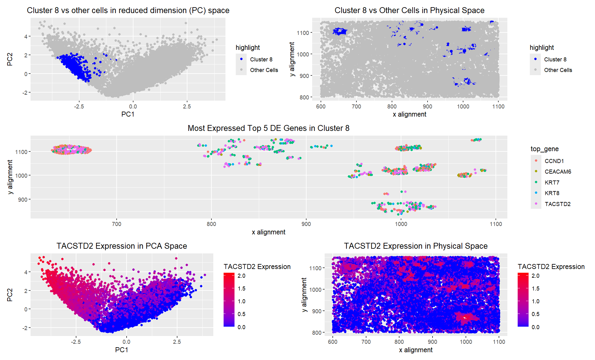
I created 5 visualizations of a particular cluster from a KNN clustering process. I chose the cluster which corresponded to a circle of cells in the upper left corner of visual space, because I was interested in what all of these cells had in common. This cluster was also very tightly packed on the PC graph, so I figured it likely represented a particular cell type. The 5 most differentially expressed genes in this cluster were TACSTD2, KRT7, KRT8, CEACAM6, and CCND1. In the third panel of the visualization, I showed which of these genes was the most expressed out of the set in each cell in my cluster. I found that TACSTD2 was most likely to be the max expressed gene in my cluster of interest, so I then visualized expression of that gene in both PC space and real space. As expected, high expression of TACSTD2 corresponded very closely with the location of my cell clusters in physical space. However, there were many cells in a different cluster in PC space that also had high expression, so this gene is likely one that is present in multiple cell types, but often cell types that stay close together. This gene is an epithelial marker, but is particularly associated with various cancers, particularly carcinomas [1]. KRT7 and KRT8 are both keratin genes, meaning that they are also epithelial markers, and they are particularly overexpressed in lung adenocarcinoma [2]. CEACAM6 is abnormally expressed in Crohns and other GI carcinoma [3]. Both of these conditions also involve issues with epithelial cells, as these are the cells that line the gut. CCND1 is a cell cycle mediator gene, and its overexpression also contributes to malignancies in various cancers, although it is not epithelial- specific [4]. Overall, based on the expression of genes associated with epithelial cells and carcinomas, as well as cell-cycle transition, I believe that cluster 8 definitively represents an epithelial cancer. More specifically, these cells are likely either lung or intestinal epithelial cells.
- https://www.neobiotechnologies.com/product/tacstd2-trop2-epithelial-marker/?srsltid=AfmBOopmBukiSrOGfIUOLlZDhUlvgwfhcAhe5vNHRM6KWmqXuRRCaQx-
- https://www.sciencedirect.com/science/article/pii/S2405844024005802
- https://www.genecards.org/cgi-bin/carddisp.pl?gene=CEACAM6
- https://www.uniprot.org/uniprotkb/P24385/entry
Code
1
2
3
4
5
6
7
8
9
10
11
12
13
14
15
16
17
18
19
20
21
22
23
24
25
26
27
28
29
30
31
32
33
34
35
36
37
38
39
40
41
42
43
44
45
46
47
48
49
50
51
52
53
54
55
56
57
58
59
60
61
62
63
64
65
66
67
68
69
70
71
72
73
74
75
76
77
78
79
80
81
82
83
84
85
86
87
88
89
90
91
92
93
94
95
96
97
98
99
100
101
102
103
104
105
106
107
108
109
110
111
112
113
114
115
116
117
118
119
120
121
122
123
124
125
126
127
128
129
130
131
132
133
134
135
136
137
138
139
140
141
142
143
144
145
146
147
148
149
150
151
152
153
154
155
156

library(ggplot2)
library(patchwork)

file <- "data/pikachu.csv.gz"
data <- read.csv(file)
data[1:5,1:10]

pos <- data[, 5:6]
rownames(pos) <- data$cell_id
gexp <- data[, 7:ncol(data)]
rownames(gexp) <- data$barcode

names(pcs)
pcs$sdev
pcs$rotation[1:5,1:5] ## beta values representing PCs as linear combinations fo genes
pcs$x[1:5,1:5]

data$total_gene_expression <- rowSums(data[, 7:ncol(data)])
data$PC1 <- pcs$x[,1]
data$PC2 <- pcs$x[,2]

## if you normalize, if you log transform
## you can use different transformations of the gene expression
## for different parts of the analysis
loggexp <- log10(gexp+1)

#Set seed for reproducability with chosen cluster
set.seed(42)
com <- kmeans(loggexp, centers=12)
clusters <- com$cluster
clusters <- as.factor(clusters) ## tell R it's a categorical variable
names(clusters) <- rownames(gexp)
head(clusters)

pcs <- prcomp(loggexp)
df <- data.frame(pcs$x, clusters)

#using this to pick my cluster of interest
ggplot(data) +
  geom_point(aes(x = aligned_x, y=aligned_y, col=clusters)) +
  ggtitle("clusters in real space") +
  theme(plot.title = element_text(hjust=0.5)) +
  xlab("x alignment") + ylab("y alignment")

#Cluster 8 seems to be the most interesting due to how close the cells are
# in physical space
interest <- 8
cellsOfInterest <- names(clusters)[clusters == interest]
otherCells <- names(clusters)[clusters != interest]

# Create a new column for coloring
data$highlight <- ifelse(clusters == interest, "Cluster 8", "Other Cells")

p1 <- ggplot(data) +
  geom_point(aes(x = PC1, y = PC2, col = highlight)) +
  ggtitle("Cluster 8 vs other cells in reduced dimension (PC) space") +
  theme(plot.title = element_text(hjust = 0.5)) +
  xlab("PC1") +
  ylab("PC2") +
  scale_color_manual(values = c("Cluster 8" = "blue", "Other Cells" = "gray"))

p2 <- ggplot(data) +
  geom_point(aes(x = aligned_x, y = aligned_y, col = highlight)) +
  ggtitle("Cluster 8 vs Other Cells in Physical Space") +
  theme(plot.title = element_text(hjust = 0.5)) +
  xlab("x alignment") +
  ylab("y alignment") +
  scale_color_manual(values = c("Cluster 8" = "blue", "Other Cells" = "gray"))

#Differential gene expression
gexp_cluster8 <- loggexp[cellsOfInterest, ]  # Expression in Cluster 8
gexp_other <- loggexp[otherCells, ]          # Expression in other clusters

pvals <- sapply(1:ncol(loggexp), function(i) {
  wilcox.test(gexp_cluster8[, i], gexp_other[, i], exact = FALSE)$p.value
})

#correction as mentioned in class (i picked bonferroni)
adj_pvals <- p.adjust(pvals, method = "bonferroni")

#mean expression diff
logFC <- colMeans(gexp_cluster8) - colMeans(gexp_other)

# Create a dataframe of results
DE_genes <- data.frame(Gene = colnames(loggexp),
                       logFC = logFC, pval = pvals, adj_pval = adj_pvals)

# Filter p-value < 0.05)
DE_genes <- DE_genes[DE_genes$adj_pval < 0.05, ]

# Sort by mean expression diff
DE_genes <- DE_genes[order(DE_genes$logFC, decreasing = TRUE), ]

# Select the top 5 most differentially expressed genes
top5_genes <- DE_genes$Gene[1:5]
print(top5_genes)

# Subset expression data for the top 5 DE genes within Cluster 8
top5_expr <- loggexp[cellsOfInterest, top5_genes]

# Determine the most highly expressed gene per cell
most_expressed_gene <- apply(top5_expr, 1, function(x) top5_genes[which.max(x)])

# Ensure the spatial coordinates match the selected cells
cell_indices <- match(cellsOfInterest, rownames(data))

# Create a dataframe for plotting
plot_data <- data.frame(
  cell_id = cellsOfInterest,
  aligned_x = data$aligned_x[cell_indices],
  aligned_y = data$aligned_y[cell_indices],
  top_gene = most_expressed_gene
)

p3 <- ggplot(plot_data) +
  geom_point(aes(x = aligned_x, y = aligned_y, color = top_gene)) +
  ggtitle("Most Expressed Top 5 DE Genes in Cluster 8") +
  theme(plot.title = element_text(hjust = 0.5)) +
  xlab("x alignment") +
  ylab("y alignment") +
  labs(color = "Top DE Gene")

#it looks like TACSTD2 is the most preferentially expressed gene,
# so I will further analyze that

# Extract TACSTD2 expression across all cells
tac_expression <- loggexp[, "TACSTD2"]

# Add TACSTD2 expression to the original data
data$tac_expression <- tac_expression

p4 <- ggplot(data, aes(x = PC1, y = PC2, color = tac_expression)) +
  geom_point() +
  scale_color_gradient(low = "blue", high = "red") +
  ggtitle("TACSTD2 Expression in PCA Space") +
  theme(plot.title = element_text(hjust = 0.5)) +
  xlab("PC1") +
  ylab("PC2") +
  labs(color = "TACSTD2 Expression")

p5 <- ggplot(data, aes(x = aligned_x, y = aligned_y, color = tac_expression)) +
  geom_point() +
  scale_color_gradient(low = "blue", high = "red") +
  ggtitle("TACSTD2 Expression in Physical Space") +
  theme(plot.title = element_text(hjust = 0.5)) +
  xlab("x alignment") +
  ylab("y alignment") +
  labs(color = "TACSTD2 Expression")


combined_plot <- (p1 | p2) / p3 / (p4 | p5)

# Display the combined plot
combined_plot