Locating fibroblasts in breast tissue using spatial transcriptomics data

Describe your figure briefly so we know what you are depicting (you no longer need to use precise data visualization terms as you have been doing).
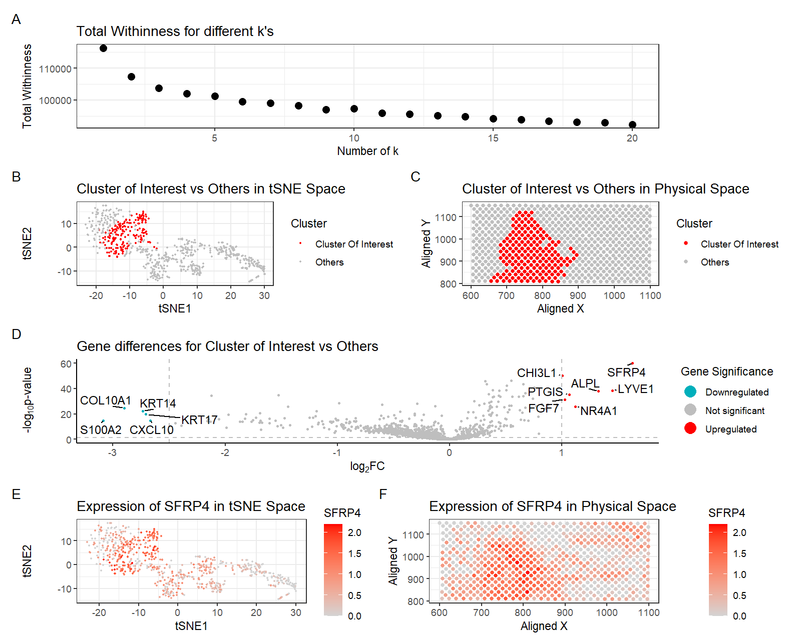
There are six plots in this figure.
Only the top 2000 genes were used to speed up the algorithm. The gene expressions were normalized by count per 10000 and log transformed.
Plot A shows the total withineness for different k’s. I previously performed k-means clustering with k=25 with the pikachu dataset. Now I performed k-means clustering with k=7. This is because I found the optimal K based on total-withinness to be only 7 for this dataset. I think there is a lower optimal number of transcriptionally distinct cell-clusters in the spot-based Eevee dataset compared to the single-cell resolution Pikachu dataset because the Eevee dataset (spot-based) captures gene expression data from multiple cells within a single spatial location (spot) of about 100um. Each spot contains a mixture of transcriptomes from multiple neighboring cells, leading to a blended signal. In contrast, the Pikachu dataset (single-cell) profiles the transcriptome of individual cells, allowing for a finer resolution of distinct cell states and phenotypes. Since each spot in Eevee contains multiple cells, the measured gene expression represents an average of multiple cell types within that region. This blending effect results in smoother transcriptomic variation, reducing the ability to distinguish transcriptionally distinct clusters. The Pikachu dataset avoids this issue by isolating individual cells, allowing for precise identification of rare or subtle cell states.
Plot B shows the clusters in tSNE space, with the cluster of interest in red and all other clusters in gray. Cluster 3 was determined as the cluster of interest since CCDC80, the gene found to be most highly upregulated in the fibroblast cluster in the pikachu dataset, was most highly upregulated in this cluster in this eevie dataset.
Plot C shows the physical space located on the tissue with the cluster of interest in red and all other clusters in gray.
Plot D shows a volcano plot of the gene differences for the cluster of interest vs all other clusters. Here, genes in red are upregulated, genes in blue are downregulated, and genes in gray are not significant when taking into account p-values and a fold change greater than 1 or less than -2.5. The names of the top genes based on the thresholds mentioned are printed within the plot. Genes were determined to be significant based on their pvalue from the two-sided Wilcoxon Rank Sum test.
Plot E shows the tSNE space with the top gene found from DE analysis, SFRP4, in the cluster of interest as a gradient from gray to red.
Plot F shows the physical space with SFRP4 expression as a gradient from gray to red.
Write a description to convince me that your cluster interpretation is correct.
Cluster 3 was determined as the cluster of interest since CCDC80, the gene found to be most highly upregulated in the fibroblast cluster in the pikachu dataset, was most highly upregulated in this cluster in this eevie dataset.
After some research, my cluster of interest still best corresponds to fibroblasts within the breast tissue sample. This is based on the expression of the top highly upregulated genes SFRP4 [1], CHI3L1 [2], FOS [3], C1R [4], RNASE1 [5], MGP [6], identified with Wilcox, which are known to be the most highly expressed exclusively in fibroblasts in breast tissue. In addition to gene signatures, the visualization of this cluster in physical space supports the claim that this cluster represents the previously identified fibroblasts. The physical location of cells of this cluster in Plot C overlaps with that of the fibroblasts identified in the last homework. The patterns do not look exactly the same, but this could be explained by the fact that each spot might be capturing more than one cell type. And since fibroblasts are interspersed within the tissue, the gene expressions specific to fibroblasts in the previously observed areas could be skewed and reduced by the inclusion of other cell types in the same spot. All in all, I believe my cluster of interest represents fibroblasts within the breast tissue sample.
[1] https://www.proteinatlas.org/ENSG00000091986-SFRP4/single+cell/breast
[2] https://www.proteinatlas.org/ENSG00000107562-CHI3L1/single+cell/breast
[3] https://www.proteinatlas.org/ENSG00000077942-FOS/single+cell/breast
[4] https://www.proteinatlas.org/ENSG00000087245-C1R/single+cell/breast
[5] https://www.proteinatlas.org/ENSG00000017427-RNASE1/single+cell/breast
[6] https://www.proteinatlas.org/ENSG00000139329-MGP/single+cell/breast
Code (paste your code in between the ``` symbols)
1
2
3
4
5
6
7
8
9
10
11
12
13
14
15
16
17
18
19
20
21
22
23
24
25
26
27
28
29
30
31
32
33
34
35
36
37
38
39
40
41
42
43
44
45
46
47
48
49
50
51
52
53
54
55
56
57
58
59
60
61
62
63
64
65
66
67
68
69
70
71
72
73
74
75
76
77
78
79
80
81
82
83
84
85
86
87
88
89
90
91
92
93
94
95
96
97
98
99
100
101
102
103
104
105
106
107
108
109
110
111
112
113
114
115
116
117
118
119
120
121
122
123
124
125
126
127
128
129
130
131
132
133
134
135
136
137
138
139
140
141
142
143
144
145
146
147
148
149
150
151
152
153
154
155
156
157
158
159
160
161
162
163
164
165
166
167
168
169
170
171
172
173
174
175
176
177
178
179
180
181
182
183
184
185
186
187
188
189
190
191
192
193
194
195
196
197
198
199
200
201
202
203
204
205
206
207
208
209
210
211
212
213


## set seed
set.seed(1)

# read file ---------------------------------------------------------------
file <- "data/eevee.csv.gz"

data <- read.csv(file)
data[1:5,1:10]

pos <- data[, 3:4]
rownames(pos) <- data$barcode
head(pos)
gexp <- data[, 5:ncol(data)]
rownames(gexp) <- data$barcode
gexp[1:5,1:5]
dim(gexp)


## limiting to top 2000 most highly expressed genes
## to explore: what happens if you use top 2000, or all genes?
topgenes <- names(sort(colSums(gexp), decreasing=TRUE)[1:2000])
gexpsub <- gexp[,topgenes]
gexpsub[1:5,1:5]
dim(gexpsub)

## normalize by total expression
norm <- gexpsub/rowSums(gexpsub) * 10000
norm[1:5,1:5]
loggexp <- log10(norm + 1)


library(ggrepel)


## try many ks
ks = seq.int(1, 20, 1)
totw <- sapply(ks, function(k) {
  print(k)
  set.seed(1)
  com <- kmeans(loggexp, centers=k)
  return(com$tot.withinss)
})

## find optimal k from elbow plot
df6<-data.frame(ks,totw)
p6<-ggplot(df6, aes(x=ks, y=totw)) + geom_point(size=3)+
  labs(
    title = "Total Withinness for different k's",
    x = "Number of k",
    y = "Total Withinness"
  ) +
  theme_bw()
p6


## k-means clustering
set.seed(1)
com <- kmeans(loggexp, centers=7)
clusters <- com$cluster
clusters <- as.factor(clusters) ## tell R it's a categorical variable
names(clusters) <- rownames(gexp)
head(clusters)

## Plot 0: A panel visualizing all clusters in reduced dimensional space (tSNE)
set.seed(1)
emb <- Rtsne::Rtsne(loggexp)
head(emb$Y)
df0 <- data.frame(emb$Y, clusters=clusters)
p0<-ggplot(df0, aes(x=X1, y=X2, col=clusters)) + geom_point(size=3)+
  labs(
    title = "Clusters in tSNE Space",
    color = "Cluster",
    x = "tSNE1",
    y = "tSNE2"
  ) +
  theme_bw()
p0


## which cluster might correspond to fibroblasts
i <- "CCDC80"
genetest <- loggexp[,i]
names(genetest) <- rownames(gexp)
results <- sapply(1:10, function(interest) {
  cellsOfInterest <- names(clusters)[clusters == interest]
  otherCells <- names(clusters)[clusters != interest]
  out <- wilcox.test(genetest[cellsOfInterest], genetest[otherCells], alternative = 'greater')
  print(interest)
  print(out$p.value)
})
#cluster 3 has most upregulated CCDC80


## characterizing cluster 3
interest <- 3
cellsOfInterest<-names(clusters)[clusters==interest]
OtherCells<-names(clusters)[clusters!=interest]
ClusterOfInterest<- ifelse(clusters==interest,'Cluster Of Interest','Others')

## Plot 1: A panel visualizing your one cluster of interest (cluster 3) in reduced dimensional space (tSNE)
df1 <- data.frame(emb$Y, clusters=clusters,ClusterOfInterest)
p1<-ggplot(df1, aes(x=X1, y=X2, col=ClusterOfInterest)) + geom_point(size=0.5) +
  scale_color_manual(values = c("red","gray")) +
  labs(
    title = "Cluster of Interest vs Others in tSNE Space",
    color = "Cluster",
    x = "tSNE1",
    y = "tSNE2"
  ) +
  theme_bw()
p1

##Plot 2: A panel visualizing your one cluster of interest in physical space
interest <- 3
ClusterOfInterest<- ifelse(clusters==interest,'Cluster Of Interest','Others')
df2 <- data.frame(aligned_x = data$aligned_x, aligned_y = data$aligned_y, emb$Y, clusters, ClusterOfInterest)
p2<-ggplot(df2) + geom_point(aes(x = aligned_x, y = aligned_y,
                                 color= ClusterOfInterest), size=1.5)  +
  scale_color_manual(values = c("red","gray")) +
  labs(
    title = "Cluster of Interest vs Others in Physical Space",
    color = "Cluster",
    x = "Aligned X",
    y = "Aligned Y"
  ) +
  theme_bw()
p2


# do wilcox for DE genes
interest<-3
pv <- sapply(colnames(loggexp), function(i) {
  print(i) ## print out gene name
  wilcox.test(loggexp[clusters == interest, i], loggexp[clusters != interest, i])$p.val
})
head(sort(pv)) # SFRP4       CHI3L1          FOS          C1R       RNASE1          MGP


logfc <- sapply(colnames(loggexp), function(i) {
  print(i) ## print out gene name
  log2(mean(loggexp[clusters == interest, i])/mean(loggexp[clusters != interest, i]))
})


## Plot 3: volcano plot
df <- data.frame(pv=-(log10(pv+1e-100)), logfc,genes=names(pv))
# add gene names
df$genes <- rownames(df)
# add labeling for 10 fold change
df$delabel <- ifelse(df$logfc > 1, df$genes, NA)
df$delabel <- ifelse(df$logfc < -2.5, df$genes, df$delabel)
# add if DE
df$diffexpressed <- ifelse(df$logfc > 1, "Upregulated", "Not Significant")  #2 or 1.5
df$diffexpressed <- ifelse(df$logfc < -2.5, "Downregulated", df$diffexpressed)


# plot
p3<-ggplot(df, aes(x = logfc, y = pv, label = delabel, color = diffexpressed)) +
  geom_point(size= 0.75) +
  geom_vline(xintercept = c(-2.5, 1), col = "gray", linetype = 'dashed') +
  geom_hline(yintercept = -log10(0.05), col = "gray", linetype = 'dashed') +
  scale_color_manual(values = c("#00AFBB", "grey", "red"),
                     labels = c("Downregulated", "Not significant", "Upregulated")) +
  # theme
  theme_classic() +
  # labels
  labs(color = 'Gene Significance',
       x = expression("log"[2]*"FC"),
       y = expression("-log"[10]*"p-value"),
       title = "Gene differences for Cluster of Interest vs Others") +
  geom_text_repel(aes(label = delabel), na.rm = TRUE,
                  max.overlaps = Inf, box.padding = 0.25, point.padding = 0.25, min.segment.length = 0, size = 4, color = "black") +
  scale_x_continuous(breaks = seq(-5, 5, 1)) +
  guides(size = "none",color = guide_legend(override.aes = list(size=5)))
p3


## Plot 4: A panel visualizing one of these genes (SFRP4) in reduced dimensional space (tSNE)
df4 <- data.frame(emb$Y, clusters, gene=loggexp[,'SFRP4'])
p4<-ggplot(df4, aes(x=X1, y=X2, col=gene)) + geom_point(size=0.5) +
  scale_color_gradient(low = 'lightgrey', high='red') +
  labs(
    title = "Expression of SFRP4 in tSNE Space",
    color = "SFRP4",
    x = "tSNE1",
    y = "tSNE2"
  ) +
  theme_bw()
p4

## Plot 5: A panel visualizing one of these genes in space

df5 <- data.frame(aligned_x = data$aligned_x, aligned_y = data$aligned_y, emb$Y, clusters, gene=loggexp[,'SFRP4'],ClusterOfInterest)
p5<-ggplot(df5) + geom_point(aes(x = aligned_x, y = aligned_y,
                                 color= gene), size=1.5)  +
  scale_color_gradient(low = 'lightgrey', high='red') +
  labs(
    title = "Expression of SFRP4 in Physical Space",
    color = "SFRP4",
    x = "Aligned X",
    y = "Aligned Y"
  ) +
  theme_bw()
p5

library(patchwork)
# plot using patchwork
p6/(p1 + p2) / (p3) / (p4 + p5) + plot_annotation(tag_levels = 'A')
Code for volcano plot referenced https://jef.works/genomic-data-visualization-2024/blog/2024/02/14/challin1/